Documentation
Changelog
Fortunest was called Portfolio Dash until August 2026 — older entries below shipped under that name. What changed in Fortunest, newest first — the features and fixes you can actually see. Each day is condensed to its essentials; the chapters above describe how everything works today.
15 August 2026
- Portfolio Dash is now Fortunest: new name, new home — the site lives at fortunest.ai and the app at app.fortunest.ai (old links keep working and redirect where they can). Same product, same data, nothing to redo; the desktop app picks up the new name with its next release and keeps all your data. The logo grew into the name too: the wireframe folder became a bird’s nest, with the spinning coin nestled in it — your nest egg.
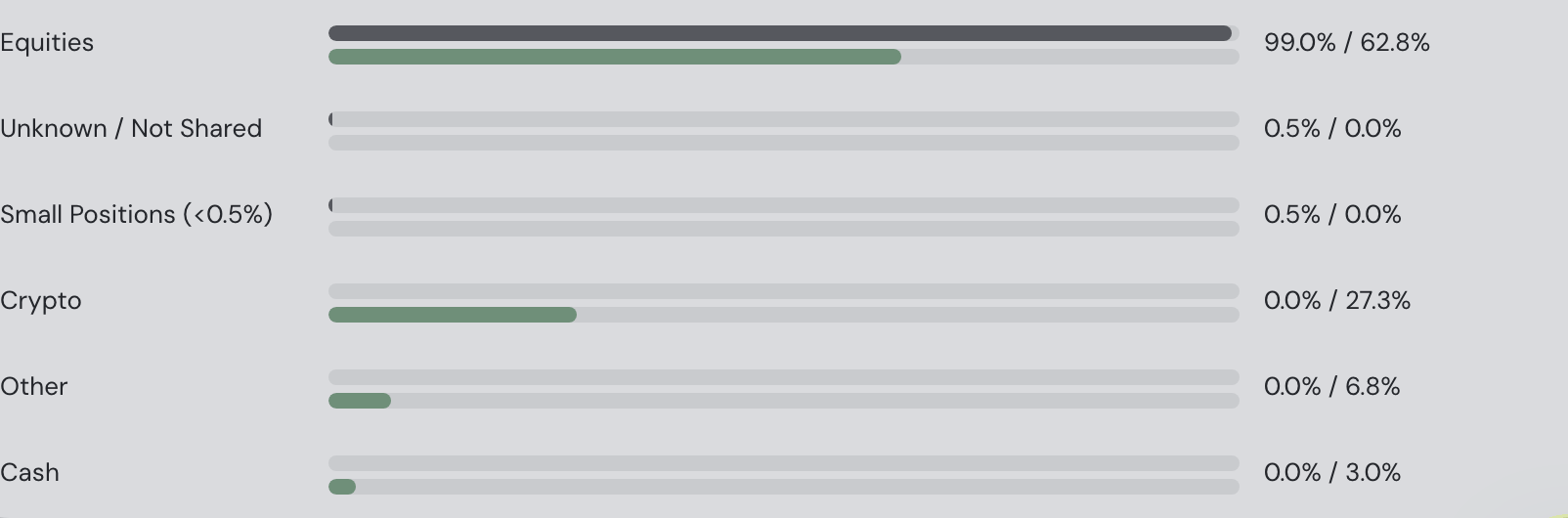
- Index funds now count as what they hold (ETF look-through): the Allocation card used to file a broad ETF’s whole value under one “Funds (diversified)” bucket, so a well-spread index-fund portfolio could read “Highly concentrated”. Each equity fund’s value is now split across the real sectors, regions and company sizes it holds — live fund weightings where the provider publishes them, index factsheet tables otherwise. The diversification score, its sub-scores, the score history and the Sector-tilt comparison all use the honest split; the tilt’s “excluded from your side” share shrinks to just crypto and unclassifiable assets.
- Alert emails are readable now — and there’s just one: alert emails arrive as a proper HTML digest instead of walls of plain text — the earnings digest is a table (symbol, report date, EPS vs. estimate, a green ✓ for beats and a red ✗ for misses, not-yet-reported holdings dimmed below), large moves get symbol / day-move / change columns, and the portfolio brief shows its totals, best and worst movers and largest positions as small tables. Everything due the same morning goes out as one combined email, at most one per your chosen frequency — weekly and monthly readers get mid-period moves in the app immediately and in the next digest email under “since your last digest”. Plain text stays included for mail clients that prefer it.
- Move alerts get per-category and per-asset rules: the “large single-day moves” alert’s single threshold became a rule list in ⚙ Settings → Alerts — add rows watching the whole portfolio, one asset class (equities, crypto, bonds, gold & commodities…) or a single holding, each with its own threshold. The most specific rule wins per holding, uncovered holdings aren’t checked, and when rules differ each alert line names the rule it crossed. The assistant can edit them too: “alert me when crypto moves 10%”.
- Desktop app 0.2.0 for Mac — the first Fortunest build: installs as Fortunest.app (your existing “Portfolio Dash” data carries over automatically) and ships everything above — ETF look-through, the combined HTML alert digest, per-category move-alert rules — plus live prices from the server’s shared cache without signing in. Signed and notarized, on the download page now.
14 August 2026
- Desktop app: live prices without signing in (next release): the desktop app will pull market data from the server’s shared cache even before you sign in — installs prove they are the genuine app and get a fair per-connection budget. Until then, signed-out installs show imported holdings without live prices, so signing in (a free account is enough) is still the way to get market data today.
- Failed symbol lookups now retry on their own: if the market-data provider was briefly unreachable while an import matched your holdings to live symbols, the miss used to stick forever — the position stayed priced from its own trades, with no sector or region. A failed match now expires after 15 minutes and the app re-asks, healing itself once the provider recovers.
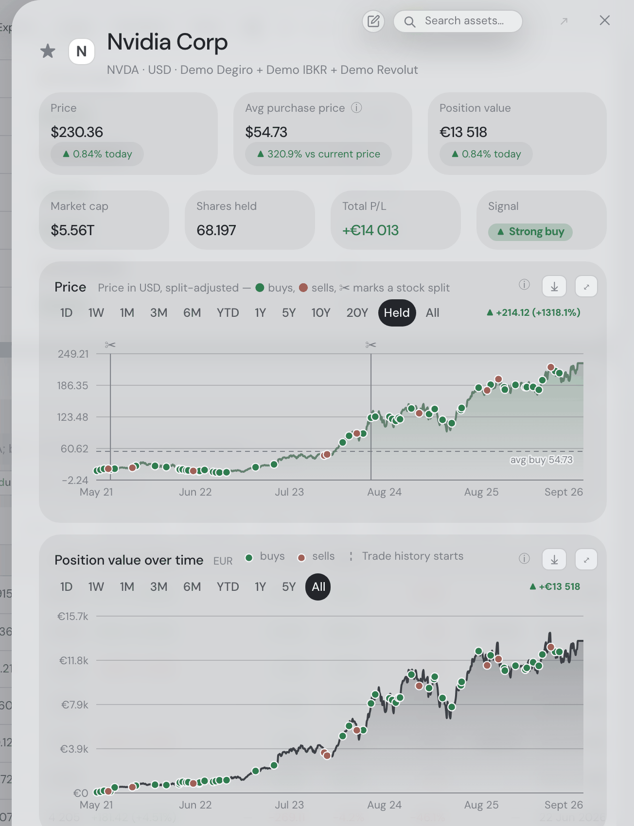
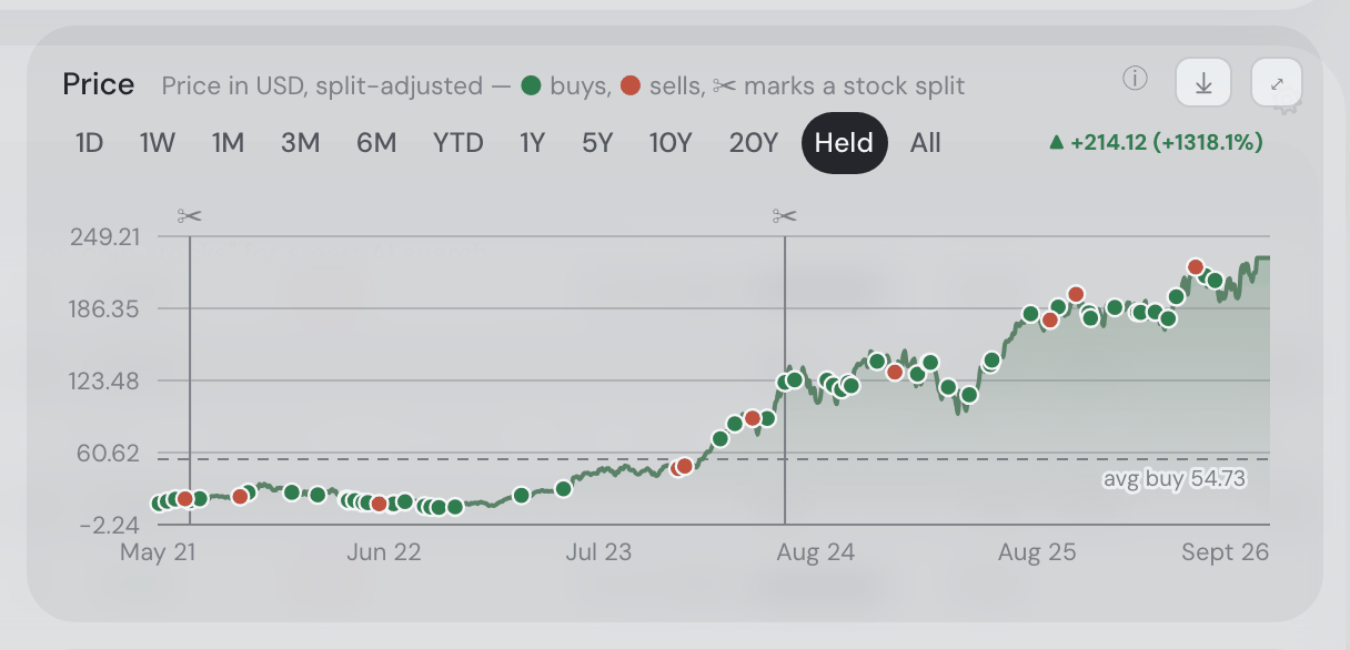
- Historical chart values corrected for split stocks: for a few hours today the portfolio-value history could show inflated values before a stock split (a phantom hump ending at the split date — NVDA and TSLA holders were most visible). The market-data feed reports pre-split prices inconsistently per stock; the app now detects and corrects the regime per split instead of assuming it.
- Desktop activation for Google and two-step accounts: the account page grew a Copy licence token button — if you sign in with Google (no password to type into the desktop app) or have two-step verification on, copy the token there and paste it into the desktop app’s account dialog to activate it.
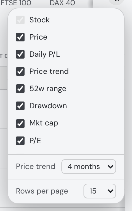
- Explore tables start at 15 stocks: the market tables load 15 rows by default now (was 20) — quicker to appear, and the size stays adjustable in ⚙ Settings → General.
- Quote refresh follows the market feed: the auto-refresh cadence now starts at 15 minutes (default 15, up to 120) — the market data itself arrives in 15-minute steps, so faster settings only re-read the same prices — and each fetch is timed to land just after fresh prices publish on the quarter-hour.
- “Prices updated” now shows your local time: the stamp in Settings → Data reported the server’s clock (UTC), so refreshes looked hours stale on European machines. The quotes were always fresh — only the label was wrong; it now converts to your time zone.
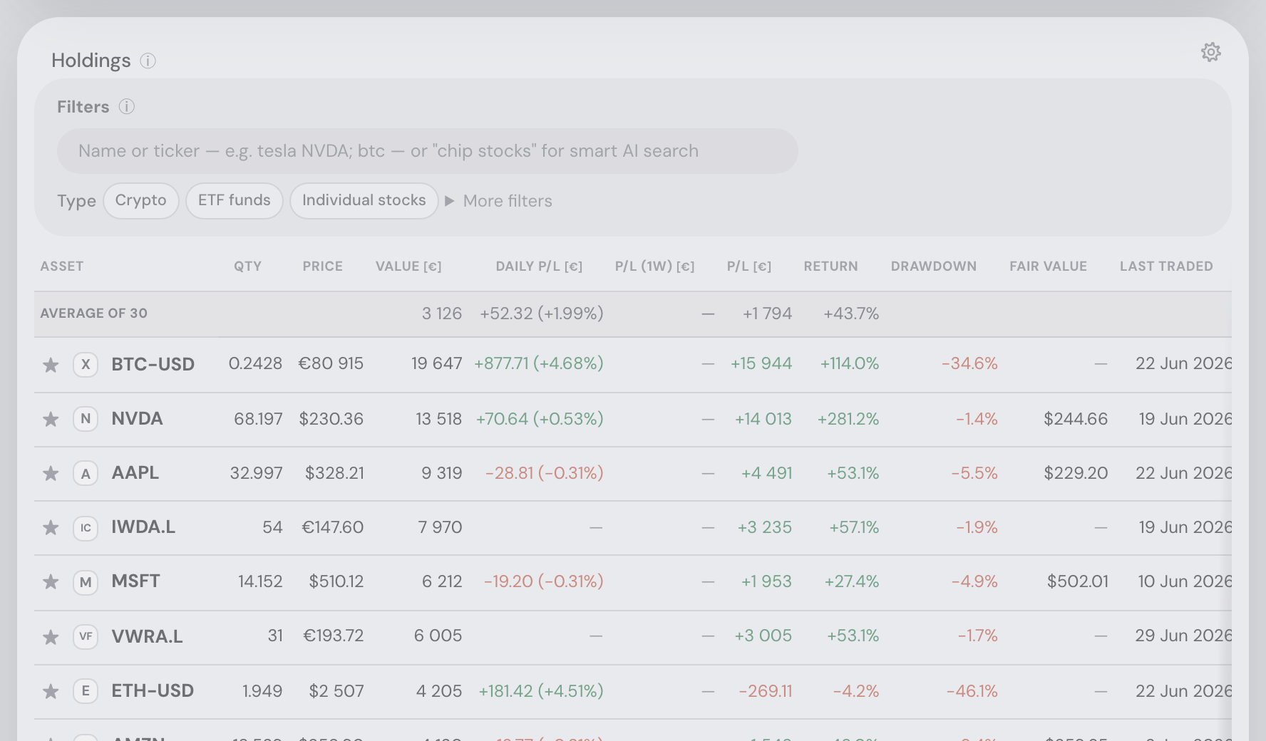
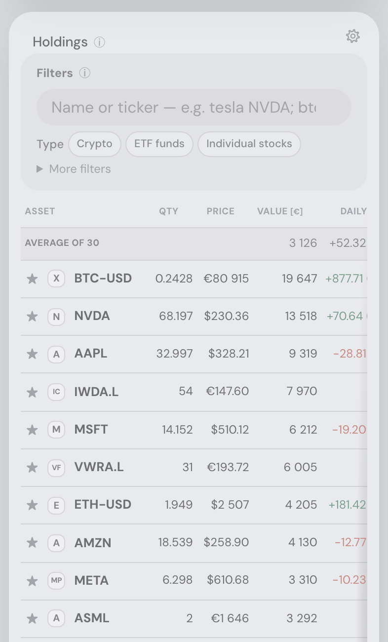
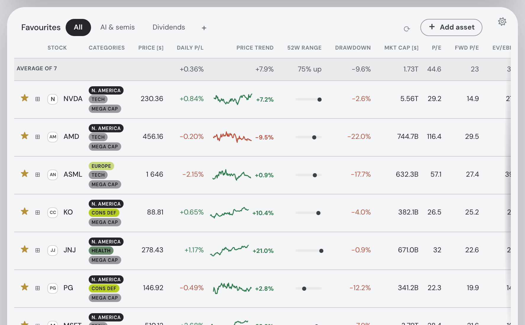
- Every table opens with its averages: the Holdings table’s first row is now Average of N over the currently filtered positions (each column’s mean in its own format — value, P/L, return, weight, TER…), and the Explore tables’ summary row moved from the Favourites footer to the first row of every table with more than one stock. Prices only average within a single currency; missing values never dilute the mean.
- The minimized Social rail sticks on desktop: collapsing Friends & Leaderboards to the narrow rail now holds at any window width on a computer — only touch devices use the fold layout.
- The phone header holds one button row: the account, settings and feedback buttons now stay on the search pill’s line at every width — the pill gives up width on narrow screens instead of pushing buttons onto a second row — and the tab strip takes the full second line. And on the Social tab, the Friends & Leaderboards column now runs all the way to the bottom of the window, like the feed beside it.
- Market data from a licensed provider: daily price histories and US intraday charts can now come from a licensed market-data feed, with automatic fallback to the previous public source for outages and for everything the feed doesn’t cover (non-US listings, crypto, FX, fundamentals, news, search) — so charts keep working either way, and nothing changes in how you use the app.
- The desktop app now reads market data from the Fortunest server: prices, charts, news and search come from the server’s shared, licensed data cache instead of your computer calling Yahoo Finance itself — sign in with your (free) account licence once and the app reads the same pooled data the hosted app serves, while keeping its own local cache so everything still works offline. Those requests carry only the ticker symbols you view — your portfolio never leaves the machine.
- Bigger touch targets on phones: the phone header’s controls and search pill grew by half — the search pill, the notes pill, the account and settings buttons and their glyphs are all 50% larger, so they are comfortable to tap. Tablet and desktop layouts are unchanged.
- Swipe between tabs on a phone: at phone widths a horizontal swipe anywhere on the page switches to the next tab (swipe left) or the previous one (swipe right), in the tab strip’s order, with no wrap-around at the ends. Swipes that belong to something else — a sideways-scrolling table, a chart’s drag-zoom, a text field, the assistant, an open dialog — are left alone.
- The Social side column stands perfectly still: the Friends & Leaderboards column no longer creeps up with the first pixels of feed scroll before pinning — it holds its place from the very first pixel, level with the feed’s top, and scrolls only inside itself (its own scrollbar appears just when its cards outgrow the window).
- The Social side column collapses to a rail: the « beside your @handle shrinks the Friends & Leaderboards column to two narrow vertical buttons and gives the feed the width; each button opens its card full-size in a dialog, the pending-request count stays visible on the minimized Friends button, and the choice is remembered. Details.
- Feed cards keep their content inside: on a narrow Social column the byline (handle, badges, “2d ago”) now wraps inside the card instead of bleeding past its edge, long unbroken text folds, and a phone-width page no longer scrolls sideways under the tab strip.
- Cleaner narrow-window layout beside the assistant: the search pill and buttons hold their top-right row at every width; squeezed, the tabs first scroll in place behind the buttons and only take a full-width second row when a window gets truly narrow — and the gutters left and right of the dashboard read the same.
- A squeezed header keeps its shape: when a narrow window wraps the tabs onto a second line, the frosted top gradient now covers both rows (the tabs stay readable over content), and the account/settings/feedback buttons hold their usual top-right spots on one row.
- A slimmer search pill: the top-bar search sits at just its “Search assets…” width until focused, giving the tab row more room.
- Social’s side column scrolls like the feed: the Friends & Leaderboards column’s rows now slide under the same frosted header strip the feed dissolves beneath.
- The server IP is copyable: the address to allow-list at your LLM provider now sits directly under the API-key field with a Copy button, instead of living only inside the tooltip.
- Social’s side column holds still: scrolling the feed all the way down no longer nudges the pinned Friends & Leaderboards column off the top — it keeps its own scrollbar and its place, to the last pixel of the feed.
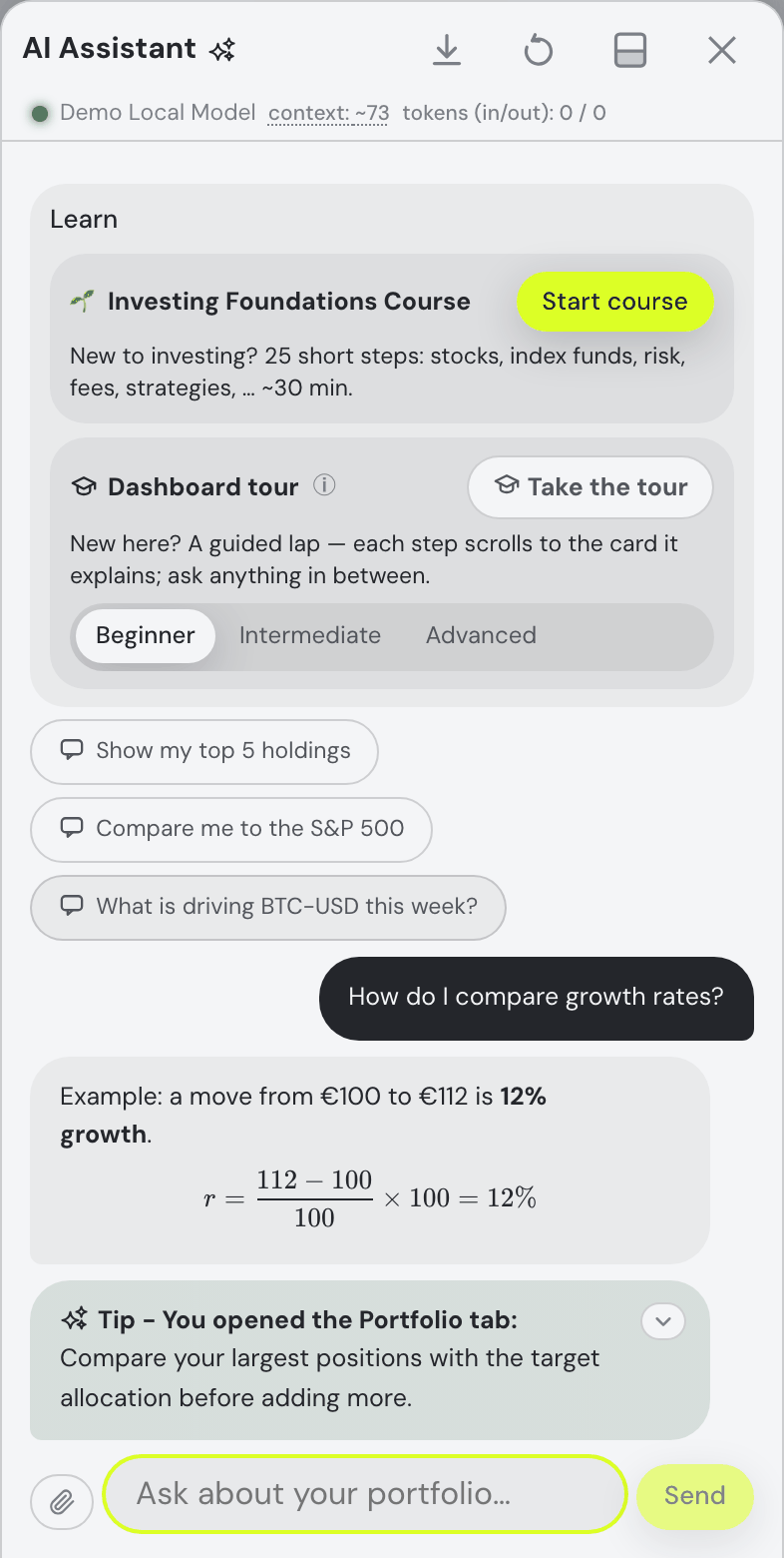
- The walkthroughs teach the new features: the intermediate tour now covers the morning Alerts and the value chart’s Trades / Transfers markers; the advanced tour shows how a skill file can call assistant actions by name. Chat text also renders the notes and AI-insight icons as the same artwork the real buttons wear.
- No more sideways-scrolling pages: hover tooltips kept an invisible box in the page even when hidden, so a tipped control near the right edge — the Favourites strip’s + — could give the whole app a horizontal scrollbar. Idle tooltips now occupy no space at all; hover behaviour is unchanged.
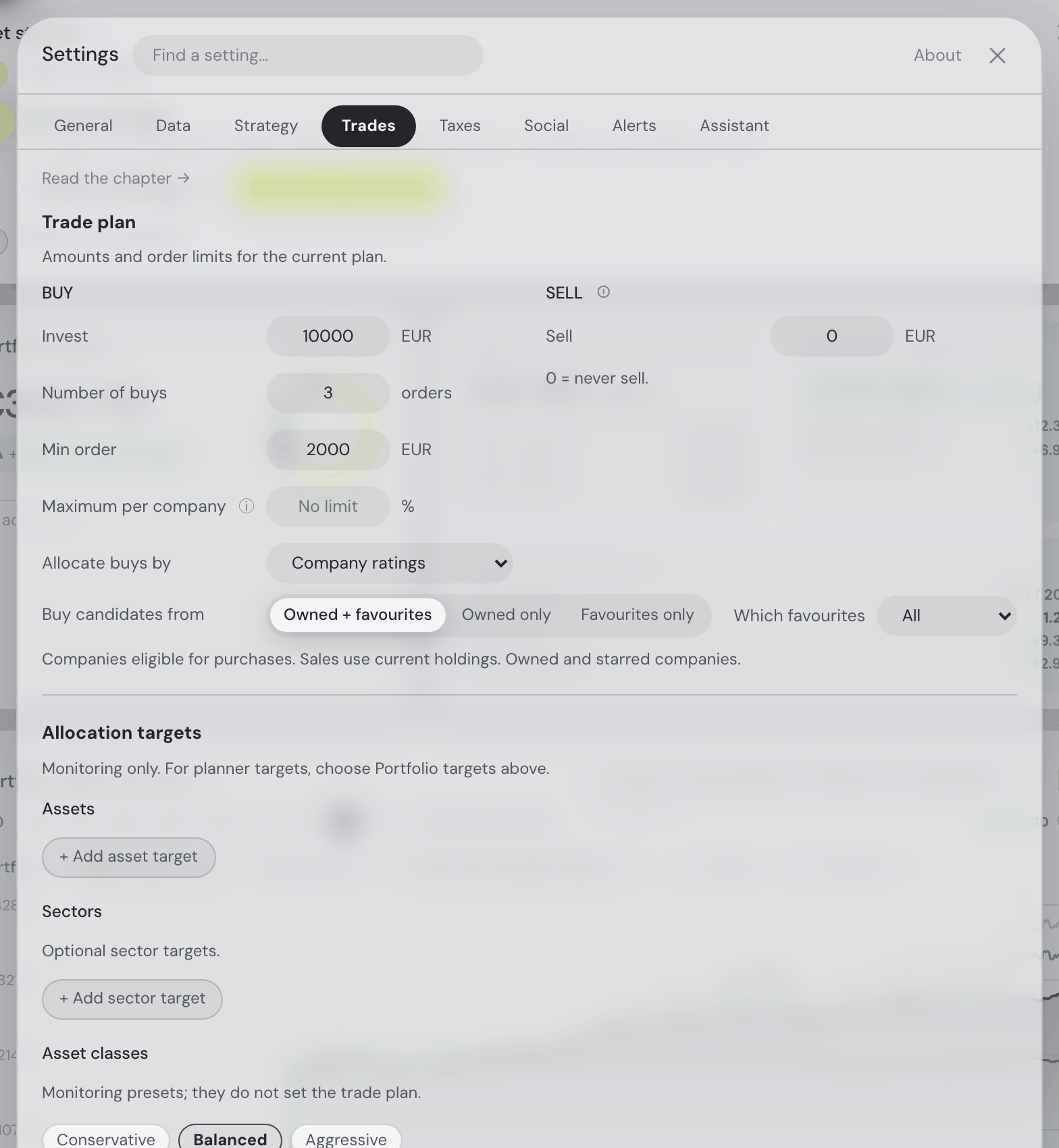
- Alerts — morning digests that arrive with the app closed: a new Settings → Alerts tab (free, for signed-in accounts) has the server compute digests in your morning hour and timezone, every day, weekly or monthly: a portfolio brief, an earnings-season digest once more than 80% of your reporting holdings have published (who beat, who missed), any position that moved more than your threshold in a day, and what friends posted. They land in the Insights card — which now wears an unread-count chip, each alert a 🔔 pill that unfolds on click — and optionally in your inbox too. Your own AI model may polish the wording; without one the plain text goes out. If the server can’t send email, the panel says so instead of pretending.
- Offline mode for the desktop app: a switch in the same Alerts tab stops every outbound call the app makes on its own — licence refreshes, exchange syncs, the Social and Taxes tabs — with honest copy about what keeps working offline (your portfolio, cached prices frozen at their last values, a local AI model) and what cannot (fresh prices, Social, server-computed taxes, alerts).
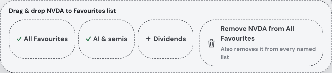
- Drag any Explore row into a Favourites list: every row of the Explore tables — Favourites, Largest companies, Most active today — and every search result can now be dragged onto a list tab (added and starred in one gesture), onto the Favourites table itself (joins whichever tab it is showing; on All it simply stars), or onto the +, which opens the new-list naming with the ticker waiting — Enter creates the list holding it. Targets ring themselves as you hover; a drop that changes nothing gets a quiet “already there” note, and one the server refuses shows its reason. Touch screens keep the ⊞ picker.
- The Mac app has a download page: the website's new Download page carries the signed & notarized Mac build (v0.1.1, Apple Silicon) with the plain install steps — open the disk image, drag Fortunest into Applications, launch it from Spotlight; no Gatekeeper workarounds, just the ordinary “downloaded from the Internet” confirmation. The unsigned Windows installer sits beside it with its SmartScreen note, and the landing page’s desktop section now links there instead of saying “coming soon”.
- The manual now lists every assistant action: the assistant chapter gained a complete action reference — all 38 commands the assistant can perform, with their exact parameters, allowed values and what each does, grouped by area. And the Skills section now shows that a skill’s Markdown can reference these actions by name (“on app start, use the show_card action…”) — with a ready-to-copy example.
- Lock your own LLM key to the app’s server: if you use your own OpenAI or OpenRouter key, you can now restrict it at the provider so it works from Fortunest and nowhere else — the ⓘ beside the API-key field (⚙ Settings → Assistant) names the server address to allow-list, alongside the standing advice: set a spend cap and use a dedicated key. On the desktop app in local mode the calls leave your own computer instead, and the tooltip says so rather than showing a server address that doesn’t apply. Full write-up in The Assistant → Locking your API key down.
- The sharing settings use their width: in Settings → Social the Presence section now sits beside Activity instead of below it (they stack again in a narrow window), and the ⓘ next to the Trade-events checkbox sits right after the label text rather than drifting to the far edge of its column.
- The badge shine travels the grid again: aiming each trophy-case model’s light at its widest face had quietly broken the case’s ripple — tiles flashed at arbitrary, sometimes simultaneous, moments. The continuous sweep is back (bottom-right tile first, travelling left, then the row above from its right edge, one tile every 0.21s), and each model now simply starts its revolution rotated so the light still lands square on its broadest face — at every pass, not just the first. Symmetric models, which look the same from everywhere, keep their natural phase.
- Trade events are dated by the trade: when a month of trading reached a friend’s feed it arrived as a block of rows all stamped with the same minute and ordered by size, each claiming to have happened moments ago. They now sit at the days they actually happened, newest trade first — size still decides which of the month’s trades are shared, the date decides how they read. The stamp is a day (“today”, “yesterday”, “3d ago”, then the date, with the full date on hover), because a day’s buying and selling of one asset is summed into a single decision before anything is published — there is no clock time to show. The unread badge deliberately still counts by arrival, so an event for an older trade is not silently invisible to a friend who has been away.
13 August 2026
- A badge named after somebody now tells you who: The Graham is a joke you can only get if you know the man — so the tile carries an ⓘ beside the name with the background. Benjamin Graham (1894–1976) invented value investing, wrote Security Analysis and The Intelligent Investor, gave the field the margin of safety and Mr Market (the neighbour who knocks every morning with a price and never minds being ignored), and taught Warren Buffett. Fifteen times earnings was roughly his own ceiling for a defensive investor, which is why the badge waits for it. Only the badges with a story carry the glyph, and the one-line blurb underneath is untouched — it is still the joke, and still the thing you read first.
- The light on a turning badge now lands on the badge: the band of light that crosses a model in the trophy case was landing on it edge-on about as often as face-on, and differently every time the case was opened. The cause was structural rather than a matter of taste — the light was timed from the moment the tile appeared on screen, while the model turns on the page’s own clock, so the two met at a fresh random angle each time. They are locked together now, and each model is aimed individually: a shield, a die, a bucket and a magnifier do not turn their broad face to you at the same moment, so each one’s widest angle is measured and the light pointed there. The few marks that look the same all the way round — the cairn on its pond, the brilliant — are left alone.
- Fourteen more badges, and thirty in the case: the collection nearly doubles. Ten new ones read what the portfolio is made of — The Graham (a book on fifteen times earnings), Growth Story, Long Tail (thirty positions, twenty of them under half a percent), Globalist, Dollar Zone, Dry Powder, Quiet Life, The Sharpe, On Target and its mirror Best Laid Plans (one target ten points adrift — and no portfolio can wear both, since ten is bigger than two), plus Standing Order for a monthly plan spread over several names. Two read nothing but your own account: Good Sport, for twenty-five reactions handed to other people’s posts, and Lurker — ninety days in, still publishing, not one word written, which is a perfectly good way to use the tab. Each has its own outlined 3D model: a mouse with an absurd tail, a ten-gallon hat, a periscope, a sharpened pencil, a teacup, a paper aeroplane nose-down in the ground. The rule that governs all of them is unchanged — a badge is only ever awarded from a section you already share.
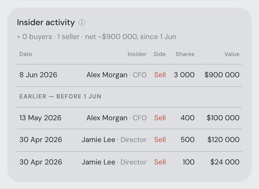
- “The Alpha” — three points a year clear of your benchmark: an index fund hands out the benchmark for nine basis points, so beating it by three points a year for a year or more is either skill or a very good run — and both spend the same. The figure is worked out on your own device when a snapshot is published, from the same benchmark line you have ticked on the portfolio chart (the US dollar line does not count — it is cash, not a market), and it travels inside the Performance section, so it appears and disappears with that one tick like everything else there. It is a plain excess return — your annualised return minus the index’s over the same window — and, like every other figure Social shares, a percentage with no amount behind it. Under a year of history it publishes nothing at all rather than an annualised guess.
- Diamond Hands got harder — and now matches the chart under it: at “a 30% drawdown and still in the green” it was earned by almost exactly the same portfolios as Iron Stomach, because 30% volatility produces a 30% drawdown as a matter of routine — two badges for one fact, sitting side by side. It now wants a 40% hole and a cumulative return of at least +20%: a genuinely bad episode, sat through, and come out ahead rather than merely level. It also reads the drawdown off the return curve you actually share rather than off a risk figure measured over a different window — so the badge and the chart beside it can no longer disagree about a dent that is not in the picture.
- Badges you have not earned yet no longer flash at you: in your trophy case (⚙ Settings → Social, and behind the “not earned yet” fold) every badge is drawn as its own little wireframe model, and what you earn is the motion: the ones you hold turn and catch a band of light, the rest sit still. The light was still crossing the still ones — a highlight that never resolves into anything, just an accent tint drifting over a greyed-out tile. It is gone from them entirely now (not dimmed — never drawn), so an unearned badge is a quiet grey wireframe and the ones you hold are the only things moving on the shelf.
- Fixed — a locked badge said “your” twice: each unearned badge prints a line saying what it reads, and three of them read “reads your shared your posts”, “…your snapshot”, “…your account”. They read as sentences now — and more honestly: OG, Chatterbox and Ghost read nothing but your own account, so they say “reads your account” rather than pointing at a “shared” toggle that does not exist for them, while the twelve portfolio badges still name the section you need to be sharing.
- A friend’s return no longer reads two different ways on one screen: the friends card printed “@laradgo +18.1% p.a.” while the leaderboard directly under it put the same friend last, with a dash claiming they did not share that figure. They did share it. Some apps publish the return curve without the yearly rate on top of it — every version older than the headline-return feature, and every desktop build that has not been updated — and the rate can be read straight back out of the curve, which the server had always done for the name beside the figure and never for anything else. It now hands that recovered number to the boards and the friend’s portfolio dialog too, for the time-weighted return as well as the money-weighted one, so the two can no longer disagree. Nothing new is shared: the figure comes from the very curve that friend published, under the same tick-box, and a portfolio with under a year of history still shows no yearly rate at all rather than an extrapolated one. And the dash’s tooltip stopped inventing a choice nobody made: it now separates “@x does not share this” from “@x shares their performance, but no Return p.a. came with it — they may have none to show yet, or publish from an app version that predates this figure. Not something they chose to hide.” The second case is ordinary rather than exotic — a portfolio of ETFs reports none of the five company fundamentals, a beta needs a benchmark — and it was being reported as a privacy setting on twelve of the thirteen ranked figures.
- The Mac app is signed and notarized by Apple: downloading the macOS build used to end at Gatekeeper’s flat “app is damaged” refusal, with no way past it on recent macOS. The disk image and everything in it — including the compiled backend and all 138 native libraries it ships — now carry an Apple Developer ID signature and a stapled notarization ticket, so opening a downloaded copy asks the ordinary one-click “downloaded from the Internet” confirmation and nothing more. The Windows build is still unsigned for now (SmartScreen’s More info → Run anyway).
- Automatic trade events now stop being shared after a month: a “bought a new asset” or “sold out of X” event is news for a few days — and a steadily worse description of your portfolio after that, since the position it announces may have been trimmed or closed since. From now on an automatic event drops out of your friends’ feeds 30 days after it was posted, by itself, and stops counting towards their unread badge with it. Posts you wrote yourself are untouched, at any age: you chose to write them, so they stay until you delete them. The limit is the server’s, and the ⓘ on Settings → Social → Trade events now quotes it beside the other four — from the same constant the feed applies, so the tooltip cannot promise one thing while the feed does another.
- “Why can’t my friend see any of my purchases?” — trade events are now your five largest trades of the last month: they used to be worked out by comparing your holdings list against the last one you published, which meant an event could only ever fire when a position appeared from nothing or went to zero. Buying more of something you already own — the commonest trade there is — moved no name in or out, so it posted nothing: a month of buying drew a row of green Buy markers on your own value chart and left your friend’s feed empty. Any trade counts now. Everything you traded in the last 30 days is a candidate, the five largest are shared, one line each — “bought NVDA · about 3% of the portfolio” — whether the trade opened a position, closed one, topped one up or trimmed it. Three things follow. Size is always relative: a trade is ranked and described by its value as a percentage of your portfolio, and that percentage is the only size that ever leaves your device — never a quantity, a price or an amount, and no denominator to work one out from. The same trade is never posted twice, however often your app publishes (up to twelve times an hour), and deleting an event — or deleting your shared data outright — does not bring it back. It no longer needs the Holdings box, so you can share what you trade without sharing what you own. The guards you would want are all still there: transfers between your own accounts, ledger corrections, staking credits and corporate actions are not trades and are never posted, a trade worth under 0.05% of your portfolio is dust and is skipped, at most five go out a day, each stops being shared after 30 days, and unticking Trade events hides every one of them immediately. Two rules went away with the old one: the week-long silence after an event about a given asset, and the rule that made a publish moving more than ten holdings post nothing at all — a broker sync landing a batch of positions used to silence the whole thing. “Too many” now just means “take the five largest”.
- Your own @handle now shows you exactly what your friends see: the handle at the top of the Social tab was the one name on the tab that did nothing when you pressed it. It is a button now, and it opens the same dialog a friend opens on you — your published snapshot, in their words, with only the sections you ticked. What makes it worth having is that it shows what is actually published, not a fresh calculation of what would be: the stored snapshot is read back off the server, filtered by your toggles the same way a friend’s read is. So it can legitimately disagree with the dashboard behind it, and those disagreements are the point — a section you ticked but which has not gone out yet, a snapshot from this morning while today’s figures have moved, a section that is empty because there is no history to report. The header says which vintage you are reading (“shared 2h ago”). Being your own sheet, it drops Unfriend and Block — the way out of your own sharing is ⚙ Settings → Social — and opens on a line saying what it is, because everything below stays written in your friends’ words. Two plain answers instead of a spinner that never resolves: nothing published yet (a new account, or every box unticked) says so and says that ticking a section sends the first snapshot within seconds, and a snapshot that exists but carries no sections says that instead — it is on the server with its timestamp, and a friend opening it sees your @handle, your badges and nothing else. Your row on a leaderboard and your byline on your own posts open it too, so every @handle on the tab now behaves the same way.
- Four more ways to answer a post: the feed’s reaction palette grows from ten to fourteen — 👏 applause and 🥳 celebration next to ❤️, and 🧠 and 🤯 after the faces, because those two answer an idea rather than a mood: “well reasoned” and “that changes how I see it”, which a feed about investing wants and a row of faces cannot say. They fall as three tidy rows in the picker you already know, grouped by what they answer.
- The Social tab works from your first visit — and still shares nothing: a new account used to open Social and find a locked door: a card reading “Social is off” and an instruction to go and find a checkbox in Settings. Social is now on for a new account, so the tab is the tab — your @handle, the friends pane, the leaderboards, the composer and the feed — and people can find you by handle or email and send you a friend request. What has not changed is the part that matters: every one of the ten sharing boxes is still off until you tick it. Being findable is not being readable. A brand-new account has nothing published on the server at all, so a friend you accept sees an empty profile until you decide otherwise, and the first thing of yours that ever leaves your device is a section you ticked yourself. The master switch stays, because it is worth having in the other direction: once you do have friends and a shared snapshot, you can go quiet for a while and come back with one tick, keeping your friendships, badges and settings meanwhile. If you had switched Social off, it stays off — nobody’s setting was changed.
- Three fixes in Settings → Social: the sharing labels no longer strand a fragment on a line of its own — “Performance (TWR/IRR curves, returns p.a. & overall P/L %)” was dropping the final “%)” onto a second line, two characters under a full one — and now break where a reader would break them, at every window width. Trade events has an ⓘ that answers what it costs you: an automatic post needs a position worth at least 0.05% of your portfolio, everything one update moved shares a single line, at most five a day, the same asset at most once a week, and nothing at all from an update that moves more than ten holdings. It also answers “for how long” — a month, per the entry above — and unticking the box hides the events you already posted from your friends straight away. And your own badge case now shows the 3D models the friend view has, with the ones you have not earned tucked behind a collapsed “15 not earned yet” expander so the section stays short as the collection grows — the heading still counts the whole catalogue, so nothing is hidden by folding it.
- The light on a turning badge now crosses its face, not its edge: each badge in a trophy case is a little wireframe model that turns, with a band of light travelling across it twice per revolution. It was firing while the model was side-on — the narrow moment, where there is almost no surface to catch it — so the highlight kept missing the object it was meant to be lighting. It has been shifted by a quarter turn: the light now arrives as a broad face comes square to you. In a case of sixteen they still ripple a fifth of a second apart rather than flashing in unison, and reduced-motion settings still stop the whole thing dead.
- Hover a profile picture to see it properly: avatars are drawn small — a circle in the account settings rows and one beside every name on the Social tab. Small enough to recognise a friend, far too small to check that the picture you just uploaded is the one you meant. Now the picture is the affordance: rest the pointer on an avatar and it opens beside it, several hundred pixels wide. That is everywhere they appear — the Public profile row and its editor, feed and event bylines, your friends list, pending requests, user search, the leaderboards and the friend’s portfolio dialog. It waits a moment first, so running the pointer down a friends list does not flash a dozen pictures at you, and it always opens beside the avatar rather than off the edge of the screen — including the rows at the very bottom of the settings sheet. Not hover-only: tapping an avatar opens the picture and tapping again puts it away, so it works on a phone, and moving to one with the keyboard shows it too. The generated stand-in picture enlarges as well — it is drawn as artwork, so it stays sharp at any size, and its face is the part you cannot make out at 18 pixels. The round account button in the top bar is the exception, on purpose: it is a way to the account menu rather than a face to look at, and a picture opening from the end of the top row covered the page heading and the controls you were reaching for. It keeps its plain “Signed in as …” label, and your own picture is one click further on, full size, in the account sheet.
- Settings → Social now says how often your friends get an update: the panel explained what friends may see and never when they see it — and what they read is a snapshot, not a live feed, re-published while you use the app rather than while you are away. The mechanics sit in the Enable Social ⓘ, beside the switch that turns them on: a new snapshot goes out a few seconds after your portfolio changes (a broker sync, an import, an edit), when you open the app if the last one is more than six hours old, and straight away when you change the share boxes — at most twelve times an hour. Close every device and your shared figures simply stop moving, which is worth knowing before you read a friend’s numbers as today’s.
- “Sync my Kraken” now works: a directly connected exchange or broker could only be re-synced by opening Settings → Data and pressing its button. Ask the assistant instead — “sync my Kraken”, “refresh my exchange data”, “are my trades up to date?” — from any tab, and it runs exactly that sync. The account name is matched loosely (“kraken”, “Trading 212”), and naming none syncs every connection you have. It tells you what actually arrived — new transactions, positions, totals — and the dashboard updates in place when the data lands, with no page reload. A first Binance sweep takes minutes, so past a short wait it says the sync is still running in the background rather than claiming a finish it hasn’t seen, and picks up the result when it arrives. If something goes wrong you get the exchange’s own words — not connected, the key was rejected or has expired, the exchange is rate-limiting us are three different things to do about it, and it repeats the one it was given. It never asks for, repeats or guesses an API key: keys are only ever typed into Settings → Data, and no part of one reaches the chat.
- The guided walkthroughs caught up with the last month: the tours had gone quiet about a good deal of what shipped since they were written. Getting started now ends its lap on the Social tab — friendship as request-and-accept, the shared feed, the boards — and spends most of that step on the half worth reading twice: nothing leaves your device until you switch it on, every section is its own tick and every tick starts off, and what a tick shares is always relative, never an amount, a balance or a quantity. It is worded to be true whether or not you are signed in, since Social needs a (free) account and a guest lands on the offer of one rather than on the feed. The same tour now teaches the watchlist as named lists — the tabs, dragging a row or a search result onto one, and the summary row that says what a tab looks like taken together — and its “connect a broker” step was simply out of date: it still described one route to a live account when there are now three, and listed Kraken, Coinbase, Trading 212 and Interactive Brokers as broker sign-ins when those are direct read-only keys. It now names Direct API, SnapTrade and CSV as what they are, and repeats that every one of them is read-only. The Simulation, taxes & pro tools tour gains a step on badges and leaderboards — why a badge whose rule reads a section you keep private is never awarded, and why the boards are computed on your own device — and now mentions that the conversation itself can be downloaded.
- Two things the manual never mentioned at all: Getting your data in read as though CSV files were the only way in, months after they stopped being. It opens with a new section, Connecting an account instead of uploading: the one searchable list in ⚙ Settings → Data and the three marks an entry can carry, which platforms are reachable with a read-only key of your own (Kraken, Binance, Coinbase, Coinmate, Trading 212, Interactive Brokers) against the ones you reach by signing in at the broker, why a platform never offers both, what happens to a key you paste (checked live, stored encrypted, never readable back — only the public half of it is ever shown), and what the Connected accounts list tells you about each link. And The Social tab mentioned leaderboards three times without ever describing them; it now has a section of its own for the boards, including the two facts that matter — a friend who shares nothing still appears rather than being dropped to look like a loser, and the boards are assembled on your own device with no leaderboard endpoint behind them, so your own standing on a figure you share with nobody is yours alone to see.
- “Share my portfolio with my friends now”: your friends get a fresh snapshot automatically, a few seconds after anything in your portfolio changes — but if you want one to go out this second, you can now simply say so. And if it cannot, you are told which of four quite different things is in the way rather than that it did not work: you are signed out, Social is switched off, you have not ticked anything to share, or you have already had twelve snapshots go out this hour. That last one means wait and nothing more — your friends still have the last snapshot, and the next change to your portfolio publishes by itself.
- “Show me @ada’s portfolio” opens it: the assistant could switch you to the Trades tab and to the Taxes tab, but had nothing at all for Social — so after a conversation about a friend’s allocation it could not put that friend’s portfolio in front of you. Now “open the Social tab”, “show me the feed”, “open my friends list” and “show me @ada’s portfolio” all land where they say — the friend’s view being the same dialog their name in the friends list opens, and on a phone the friends fold opens with it instead of scrolling you to something shut. A handle that is not one of your friends is refused, with the friends who are named, rather than leaving you on the tab with nothing opened.
- Tell the assistant what to share: “turn off sharing my trade activity”, “share only my holdings and allocation”, “hide my online status”, “switch Social off” — the switches in Settings → Social now answer to a sentence, like the rest of the settings do. Asked to turn something off, the assistant used to go looking in the manual, because those switches are kept somewhere else entirely from the ones it could change. Several at once stay one change: your friends get a fresh snapshot every time these boxes move, and that is capped at twelve times an hour, so “share only my holdings and allocation” is one save and one update rather than ten of each. Turning a box off hides that section from your friends straight away; turning one on takes effect on the update the same request sends, so on never quietly means on, but they still see nothing. The Social tab and the settings panel both catch up on the spot, with no page reload. Deleting what you have already shared is deliberately not something it can do — that wipes the stored snapshot and re-ticking a box will not bring it back, so it stays the Delete shared data button, which the assistant points you at.
- Ask the assistant what your friends have been posting — and who is waiting on you: “anything new on the feed?”, “did anyone react to my post?”, “who has sent me a friend request?” now work from any tab, where before it could see the feed only while you were standing on the Social tab. It reads the posts exactly as you see them, treats them as quoted words rather than as instructions to itself, and repeats the same rule the tab does about reactions: the number on a chip is the true total, while the names it can show you are only the people you are allowed to be told about. Friend requests come back with the day each was sent — and that is all it does with them: the assistant cannot accept, decline or send a friend request, by design. It tells you who is waiting and points you at the Social tab, because deciding who your friends are should not turn on a chatbot reading “sure, go ahead”.
- “What are the top holdings of all my friends?” — answered, not deflected: the assistant can read one friend’s shared portfolio on request, and it used to stop there: asked about all of them it replied that it could only do one at a time and asked you to name the handles. It could always have done several in one go — it just had never been told so. Now it fetches each friend in turn and answers the question as asked, using a shorter form when several are involved (their biggest positions, how they are allocated, their headline return, risk and valuation figures) so that four friends fit in one reply, and telling you plainly what the short form left out. One friend on their own still gets the full read. If you have more friends than fit, it says so and picks the rest up in the next message rather than quietly answering from half the data.
- The assistant knows who your friends are from every tab: ask it “who are my friends?” or “what am I sharing with them?” from Explore or your Portfolio and it answers, instead of knowing nothing about Social unless you happened to be standing on that tab. It now carries a small roster with every message: your @handle and which sharing boxes are ticked, each friend’s handle and the date their snapshot was published (or that they publish nothing), and how many friend requests are waiting. It is a list of names, not data — there are no figures in it at all — so a question about what a friend actually holds still goes and fetches that friend’s shared snapshot, which is what makes “what are the top holdings of all my friends?” answerable at last: one fetch each, rather than a polite refusal because it could not name a single one of them. Deliberately not in the roster: who is online, which changes every twenty seconds and would cost you money on every message for a fact no answer needs. Nothing at all when you are signed out or Social is off.
- Settings → Social now says how often your friends get an update: the panel explained what friends may see and never when they see it — and what they read is a snapshot, not a live feed. It is refreshed a few seconds after your portfolio changes (a broker sync, an import, an edit), when you open the app if the last one is more than six hours old, and straight away when you change the share boxes — at most twelve times an hour, and only while the app is open on one of your devices. Close everything and your shared figures simply stop moving, which is worth knowing before you read a friend’s numbers as today’s.
- Fixed — a holding that lost its proper name kept the wrong one until the next restart: when the market data provider is busy it answers a name lookup with nothing, and that nothing was remembered as if it were the answer — so a coin that should read XRP USD showed the raw code your broker sends, XRP, in the holdings table and in every chart label, for as long as the app kept running. Which assets it hit depended on the minute they happened to be looked up, so two accounts — or two coins side by side — could disagree. A blank answer is now only trusted for about a quarter of an hour: the next lookup asks again and the name comes back on its own, while a burst of lookups during a busy spell still costs a single request. The same applied to a holding’s trading currency, and is fixed with it.
- Fixed — a tick floating above its own label: in Settings → Social, under Portfolio data, the two main switches — Holdings and Performance — carry long labels, and whenever one of them needed a second line the checkbox jumped above the words instead of staying beside them: a stray tick with a caption underneath, on the very block that says what leaves your device. The box now stays to the left of its label at every window width, with the text wrapping neatly under itself — matching the shorter switches below it.
- Fixed — switching Social on now lights the tab up, without a page reload: the Settings dialog opens over the Social tab, so somebody ticking Enable Social and pressing Save is looking straight at the tab they have just switched on — and it kept showing “Social is off” until the page was reloaded by hand. It now drops that card the moment Save lands and loads itself right there: your @handle, your friends, the leaderboards, the composer and the feed, with the nav tab’s unread badge starting its poll at the same time. Switching Social back off is the same in reverse — the tab returns to its off state immediately and stops polling, instead of leaving a badge and a live loop behind.
- Fixed — the weight bars in a friend’s Holdings list are one column now: in the shared-portfolio dialog each position shows a bar for its weight, and every bar began wherever that row’s company name happened to end — so down a 26-position list the bars were staggered by some 27 pixels, and comparing one with the one above it, which is the entire point of drawing them, meant comparing two lines that did not start in the same place. The cause was the two number columns on the right: each row measured them against its own figures, and a row printing +153.5% left less room for the bar than a row printing a dash. Those columns are now a fixed width — wide enough for any weight, and for any gain short of a hundredfold — so every row splits the same space and the bars share one left edge, one length scale and one right edge, including the smaller positions hidden behind the expander. The weight percentage is right-aligned with it, like every other figure in the app, and a long company name still shortens with an ellipsis rather than pushing its bar out of line.
- Ask the assistant about a friend’s portfolio from anywhere: it can now fetch what a friend shares on request — “which of my watchlist lists would @ada like?”, “is their tech weight higher than mine?” — instead of telling you it cannot see them. Until now a friend’s figures reached it only while that friend’s portfolio dialog was open on the Social tab, and even then it sometimes read the section as a description of your screen rather than as numbers to work with, so it declined questions it could actually answer. Both are fixed: it knows those figures are data, that comparing them with your own is a fair question (each side always labelled, never merged), and that it can go and get a friend’s snapshot when it does not have one. What it reads is exactly what you can see — relative figures only, never amounts — and a handle that is not a friend, or a friend sharing nothing, comes back as a plain refusal rather than a guess.
- A friend’s feed events say something now — and there are five of them, not twenty: one friend’s automatic events could fill a whole day of your Social feed, most of them the identical line “rebalanced their portfolio”, with the same coins “bought” on three consecutive days. That line is gone: it was never a reallocation, it was the overflow bucket for a publish in which more than ten holdings moved at once — an import landing or a broker backfill, not eleven decisions — and such a publish now posts nothing at all. The repeats had one cause behind them: the feed compared holdings by the name you see, and that name is re-derived on every rebuild from whichever price source won it, so the same coin is XRP priced off its exchange and XRP USD priced off Yahoo (Dogecoin USD, NEAR Protocol USD). One rate-limited quote fetch renames a whole exchange’s coins at once, which read as a dozen sales and a dozen purchases out of nothing having happened. Positions are now matched by symbol — already in your snapshot beside the name, so nothing new is shared — and only reported by name. On top of that: everything that moved in one publish now shares one line (“bought 3 new assets: XRP, SKY and NEAR”), a given holding can make news once a week in either direction, and a friend adds at most five automatic posts a day to your feed whatever their portfolio does. Publishing itself is untouched — a friend’s shared portfolio is as live as it ever was, only the posting about it is rationed. The “rebalanced” posts already in feeds have been deleted rather than left to age out, since the feed shows the newest first. Unchanged: names only and never amounts, no first-publish spam, dust and reconciled positions still silent, all of it behind the Trade events toggle, and every event still yours to delete.
- What a watchlist tab looks like taken together: the Favourites table now ends in a summary row — Average of 6, and under each column what those six look like as a group: the average P/E, EV/EBITDA, growth, ROE, daily move, signal and the rest. It covers the whole tab rather than the page you are on, and counts every stock once. Two columns are deliberately not averages: In portfolio shows their combined weight in your portfolio (a real number, unlike their average weight), and Price stays blank, because the average of a €2 000 share and a €3 one is not a price. Columns nothing on the tab knows stay empty rather than reading zero, and a tab holding one stock gets no summary at all.
- Drag a stock into a list — and the lists keep up with you: a ticker can now be dragged onto a list tab, either from a row of the Favourites table or straight from a result in the search bar at the top of the page (that drop stars it on the way in, so finding an asset and filing it is one gesture). The tab you are hovering rings itself; dropping something a list already holds simply does nothing. Fixed with it: ticking a list in the ⊞ menu added the stock but left the tick empty, a list made from that menu got its tab only after a page refresh, and a rename or delete needed one too — all three now show the moment they happen. The +, ✎ and ✕ controls got tooltips, the delete confirmation’s buttons match the rest of the app, and the card’s head is one line shorter: the tabs moved up beside the title and its subtitle became the title’s tooltip.
- The picture you get before you upload one is a person now: an account with no profile picture was given a white shape on a grey circle — and one of those shapes was a pair of upright bars, which at the size of the account button in the top bar is a pause button with a haircut nobody asked for. You now get a friendly flat figure instead: eight of them — short crop, bob, bunches, topknot, curls, a cap, a beard, a braid — on seven colours taken from the app’s own palette, so several people side by side in a list are visibly different people. It is still yours and only yours: the same handle always draws the same picture, on every device, and it is drawn inside your browser — nothing is downloaded and nothing about you is sent anywhere to make it. A picture you uploaded is untouched; this is only what stands in when there isn’t one.
- Your watchlist can be several lists now: the Favourites — side by side table on Explore has tabs. All is your watchlist exactly as before;
+makes a list of your own (“AI plays”, “Dividends”), ✎ renames it and ✕ deletes it. A stock can sit in several lists at once — click the ⊞ next to a row’s star to tick which lists it belongs to, or name a new one right there. A list is a view of your watchlist rather than a separate one: putting a stock in a list stars it, unstarring takes it out of every list, and deleting a list never unstars anything (the confirmation says so). The tab you were last on is remembered, and switching tabs loads nothing — the rows are already there. The assistant handles lists too: “add ASML to my AI list”, “take NVDA out of my Semis list”, “make a list called Dividends”, “what’s in my dividends list?”. Everything else keeps using the whole watchlist — the buy candidates on Trades still consider every starred name. - The assistant conversation is yours to keep: a new ⇩ button beside ⟲ in the chat header saves what you are reading as a self-contained HTML file — or opens the print dialog, where “Save as PDF” is a destination. Both are built inside your browser: nothing is uploaded, the file opens with the network unplugged (its styling, its images and the charts as pictures all travel inside it), and it holds only what the bubbles showed. The portfolio context the model was given, the model and provider names, the token counters, your account and your API keys are not in it — and the export reports nothing to us either, not even that it happened.
- A non-US company’s results panel now tells you where its report actually is: clicking a past earnings event for a Frankfurt, London or Tokyo listing used to say only that no SEC filing was found — and then offer to search the SEC’s database, which by definition cannot hold that company’s report. There is no second EDGAR to point at: no open pan-European index of quarterly reports exists, and company investor-relations pages are JavaScript shells with nothing in them to link to. So the panel now answers the question EDGAR cannot — where this report is published: the market’s own official repository (the Bundesanzeiger and Unternehmensregister for a German listing; the FCA’s National Storage Mechanism and RNS for a British one; Euronext, the AMF, CNMV, SIX, eMarket STORAGE, Nasdaq Nordic, Oslo Børs, SEDAR+, ASX, HKEXnews, EDINET, DART, SGX, BSE, the JSE and CVM elsewhere), the company’s own site, and a prepared web search for the report document itself — restricted to the company’s own domain and dated by the month the results came out, so the first hits are its own PDF rather than commentary about it. Underneath, what was written about the results that week, with the ✨ summary reading those articles and saying so plainly — press coverage stands in for the report, it does not pretend to be it. A US listing whose filing is simply running late still gets the EDGAR search, as before.
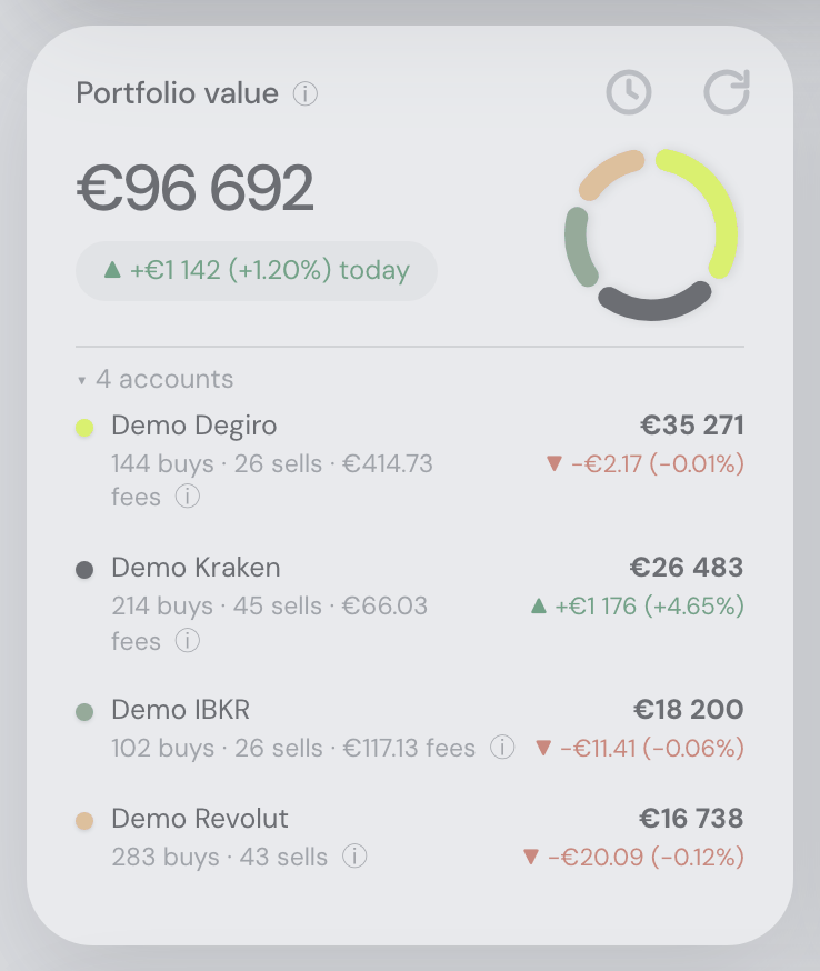
- The value ring no longer offers a click it does not have: hovering an account’s arc on the Portfolio value ring turned the pointer into a hand — the standard promise that pressing does something. Pressing does nothing: the arcs show a tooltip on hover and that is all they have ever done. The hand is gone; the arc still dims slightly under the pointer, which says what you are pointing at without claiming to be a button.
- The search at the top now finds crypto — and your own holdings: typing
luninto the search pill returned five listed companies and nothing else, while the filter on the Holdings card just below it found the LUNC you actually own on the same three letters. Two things were wrong. The search asked the market for shares and ETFs only, so every crypto answer was thrown away before it reached you — typingluncin full returned nothing at all, because everything it matches is a cryptocurrency. It now searches everything a portfolio can hold: shares, ETFs, funds, indices, crypto, futures and currencies. And it now searches your own positions as well as the market, by the same rule the Holdings filter uses, listing what you hold first — which is what actually fixes those three letters, since the market’s own search matches tickers from the beginning and can never reachLUNC-USDfromlun. Anything you own is now findable up there by the typing that finds it in the table below, and “No matches” no longer appears above a list of your own holdings. - You can see which API key a connection runs on, and copy it: a connected exchange would not show you any part of its key, so once you had two keys for the same exchange — or replaced one — nothing on screen could tell you which was in there. Earlier today that was answered by letting you name the connection; a name records what you chose to call it, not which key is in there, and your keys are already named at the exchange. So the row now shows the key itself, shortened: eight characters of its public identifier beside the Direct API mark —
8kQr2pLm…. Where that identifier is a path (Coinbase’sorganizations/…/apiKeys/…) the part that identifies anything is at its end, so the end is what you see (…2b7e4a19…); a short one — Coinmate’s Client ID, an IBKR Flex query ID — is shown whole. Click it and the whole key appears, selectable, with a Copy button, for reading against the exchange’s own list of keys or pasting into a message; where a browser has no clipboard or refuses it, the key is selected for you instead. Escape or a click outside closes it. Hovering gives the detail rather than the value: which credential field it is, when the key currently in there was stored, and that it is read-only. That identifier is the half of a key pair that authenticates nothing on its own, which is precisely why it can be shown. The secret half is still never displayed — not masked, not truncated, not the last four characters. It is sealed when you save it and cannot be read back by anyone, ourselves included. Trading 212, whose only credential is a secret token, shows nothing at all there rather than a placeholder. The optional “name this connection” field on the connect form is gone with it; any name you gave one today is simply no longer shown. - The docs now explain a holding you never held: if your chart shows a coin on a date you know you did not own it, that is an inference, and the rules behind it were nowhere a reader could find them. Getting your data in gains a chapter section, When your history doesn’t reach back far enough. It separates the two halves of the problem — how many units you hold today is known, because the exchange says so and the import is made to end on those numbers, while when they arrived and what they cost is inferred wherever no purchase is in the record — then says why the record is short (an exchange API serves trades for a limited window while its deposits and withdrawals reach back to the account’s first day; a CSV covers only the range you asked for; Earn and staked balances are outside the spot account altogether). The dating rules are written out in the order they apply, with the principle they follow: units that appear from nowhere are dated as late as the data allows, units that vanish into nowhere are written off as early as it allows, so the stretch of time being guessed at is always the shortest one that fits. The example that forced it is there in full — 4 241 LUNC bought for pocket money as Terra collapsed, dated to a 2017 account opening and valued as pre-crash Terra all the way up, a phantom 10.9 million CZK at the April 2022 peak for a position worth about 6 CZK — along with the price of the fix, which is that a genuinely old holding no export mentions is dated late and your earliest years then show too little rather than too much. It ends with the two ways out: an export covering the gap, or an Opening-balance lot on the Taxes tab. The value chart section points at it, since that is where you see it.
- Fixed — a key that did not work said nothing at all: pasting an API key with a character missing, or the wrong half of a Coinbase key file, and pressing Connect appeared to do nothing whatsoever. The key was in fact being checked with the exchange and refused, and the exchange’s own explanation was on screen — in small grey type at the bottom of the panel, directly underneath a paragraph of identical small grey type explaining that keys get checked. It read as one more line of help text, three paragraphs below the button you had just pressed. The refusal now appears in red, directly under the Connect button, with the form still open and everything you typed still in it, so a paste can be repaired rather than the whole walkthrough repeated. It also says which of three things went wrong, because they need different fixes: the key is malformed and was rejected before anything was sent (a Coinbase private key must be the whole block, including its
-----BEGIN EC PRIVATE KEY-----and-----ENDlines and the line breaks between them — by far the commonest slip); the exchange rejected it, which usually means it has been revoked, is missing its read permission, or is restricted to an IP allowlist this deployment’s address is not on; or the exchange could not be reached, which is deliberately not shown in red and says outright that the problem is not your key — press Connect again in a moment. Nothing is stored unless the key actually works, so a key that never worked can no longer become a connection that sits in your list a few minutes later saying Sync failed. No error message or log line ever contains any part of a key. - Fixed — the IRR line vanished exactly where the losses were: on the Return % chart the gold IRR line began years after the black TWR line — and on a portfolio that spent 2018–2020 down 70%, it began at roughly the moment the return climbed back over zero, which reads as “IRR cannot be worked out while you are losing money”. It always could: a negative money-weighted rate is an ordinary number and was being computed correctly the whole time, down to −99.99% a year. What hid it was a different rule. IRR waits until a meaningful share of your money is actually at work, so that a €50 trial position which doubles cannot post a headline yearly rate off itself — but “meaningful share” was measured against your lifetime deposits, and that total keeps growing. If you save more each year than the last, the bar kept rising with it: the line’s start slid further forward every time you paid money in, and today’s transfer could quietly un-draw rate that was on screen last month. On a portfolio starting in December 2017 the line opened in January 2022 — four years of real, deeply negative rate never drawn, which is precisely the stretch a money-weighted return is worth reading. That rule may now delay the line but never erase history: it lifts two years in, and the same portfolio opens in December 2019. The €50 trial case is untouched inside its first two years, and the chart’s subtitle now says which rule is holding the line back, so a short line reads as a figure withheld rather than data missing.
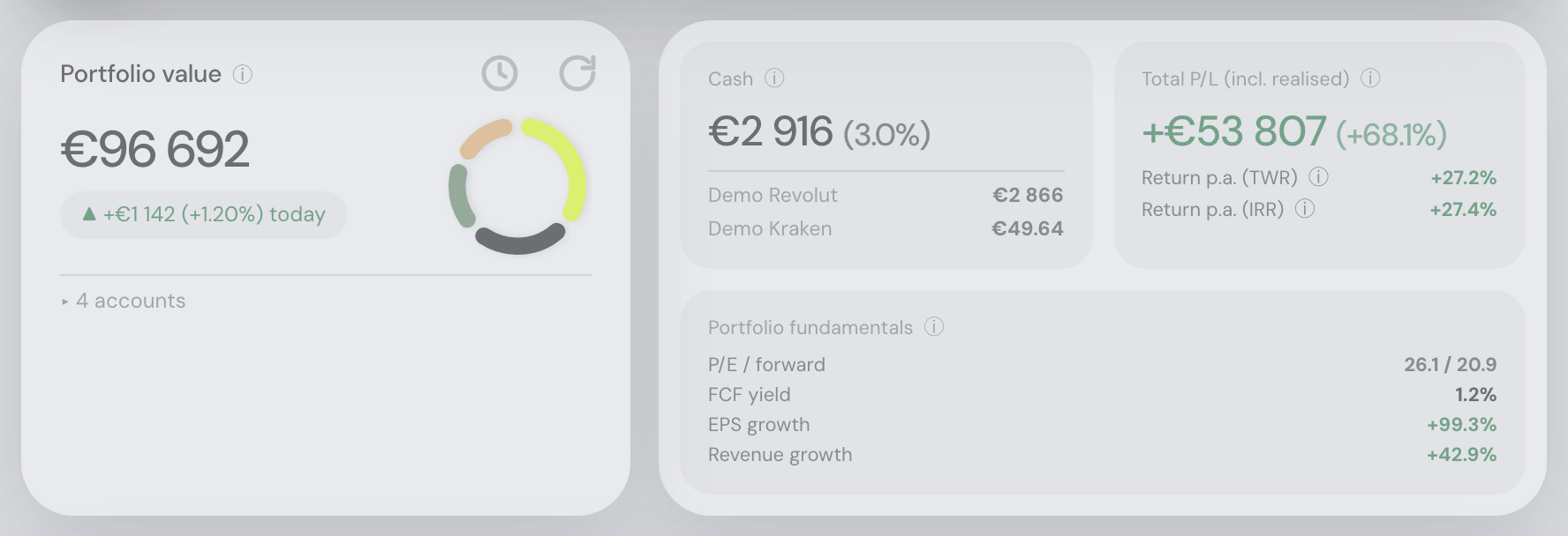
- The two rings on the Portfolio tab are finally the same ring: the donut in the Portfolio value tile and the Diversification dial on the Allocation card are meant to read as one object seen twice, and they were drawn at the same overall size — but not with the same bar. The donut’s was noticeably fatter (15.75px against the dial’s 12) and its painted ring a little smaller, which is enough to make the pair look like two unrelated widgets. Both now carry a 13px bar on a 104px ring, from a single shared specification rather than two sets of numbers that could drift apart again. The donut’s slimmer bar also helps the crowded case: with a great many accounts, or one account at 99% beside a sliver, the small marks no longer crowd their neighbours as hard.
12 August 2026
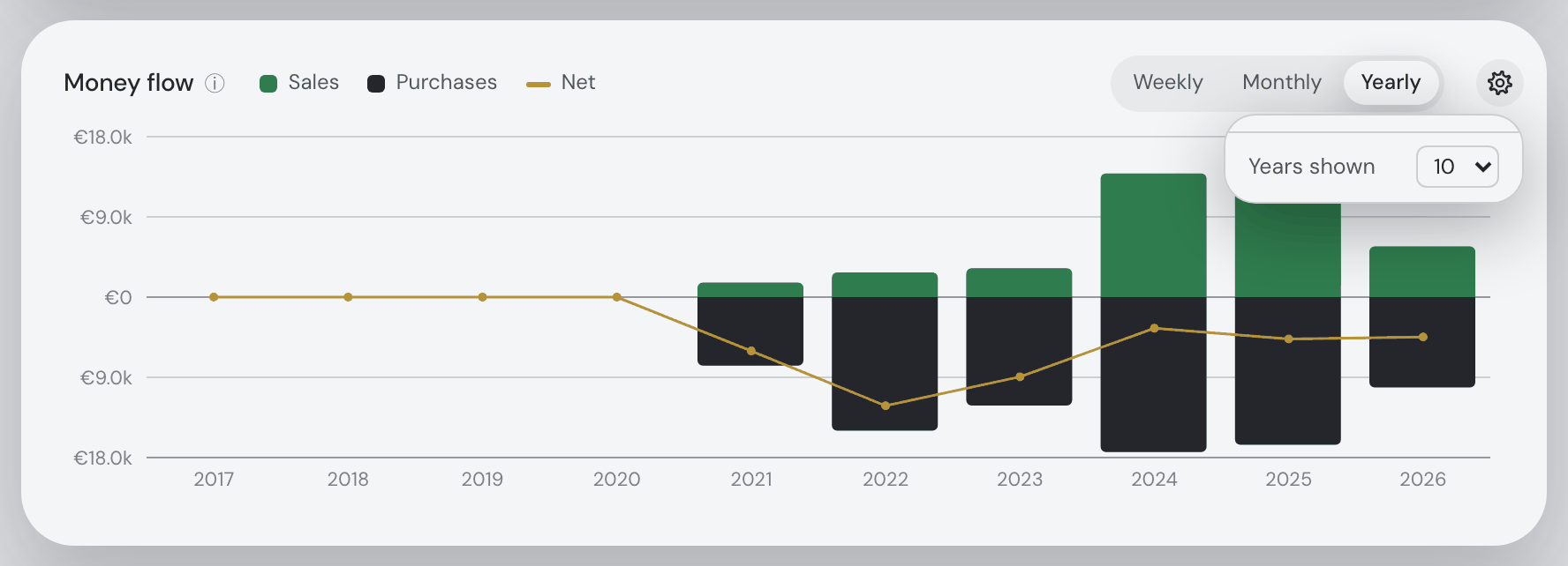
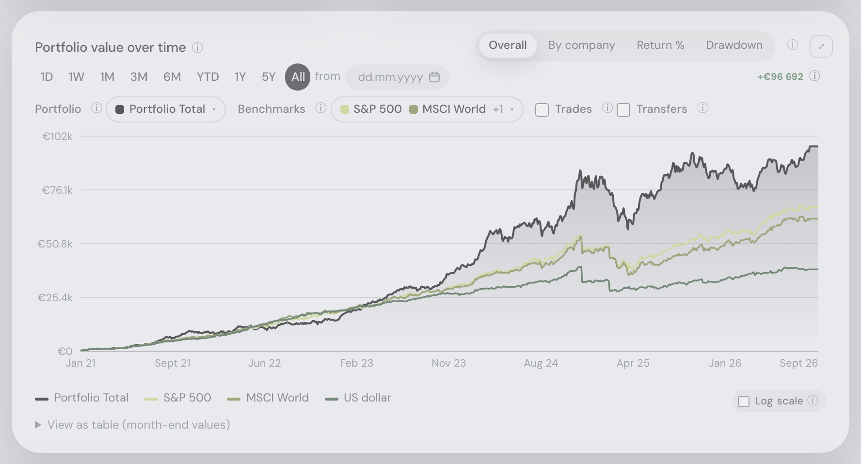
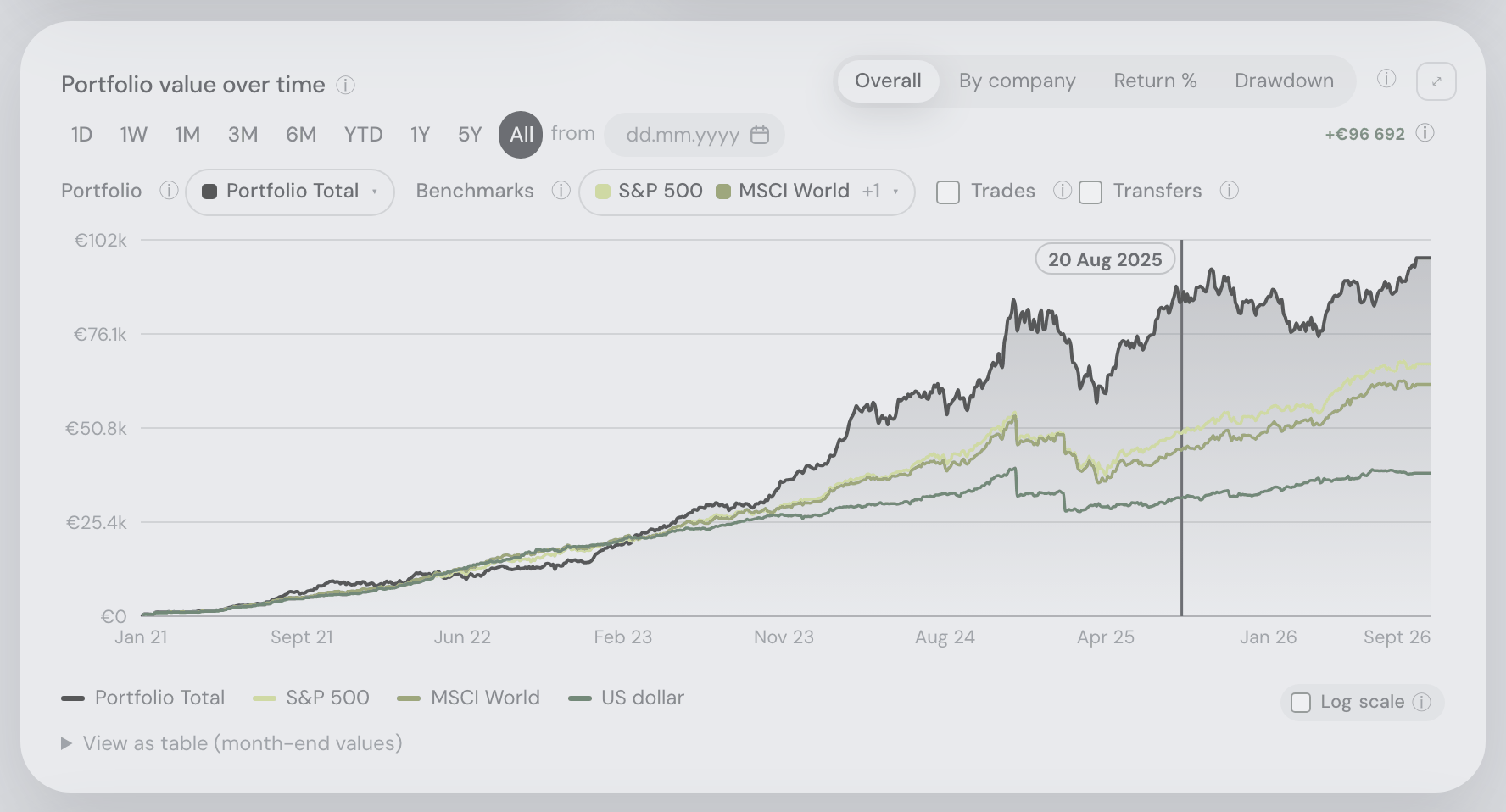
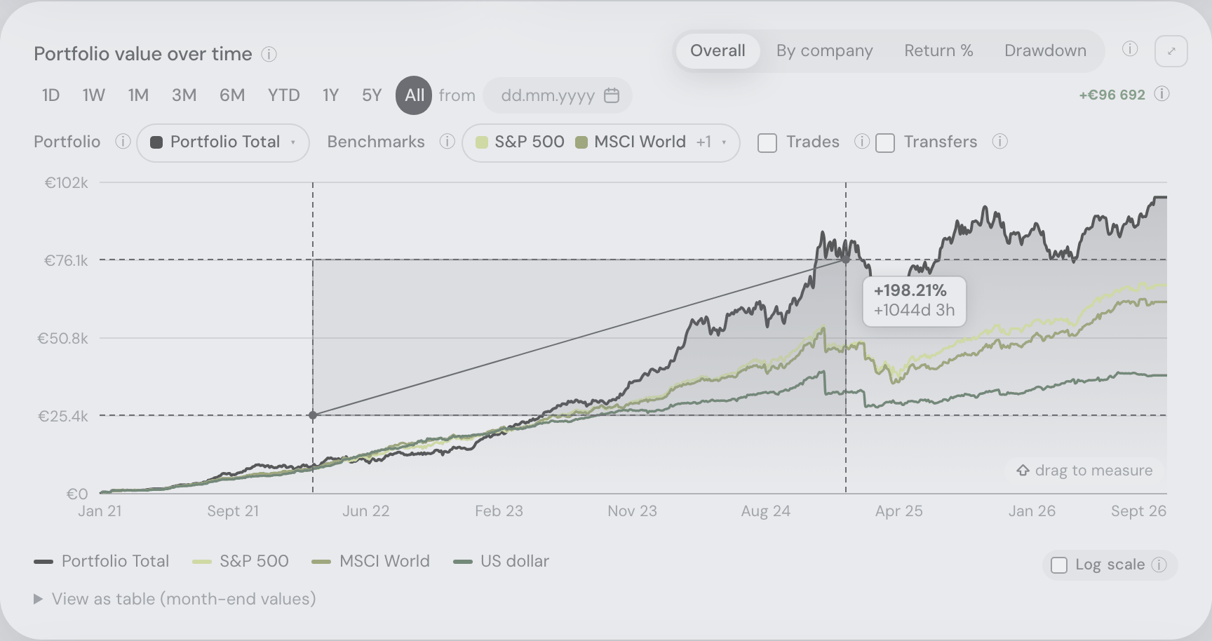
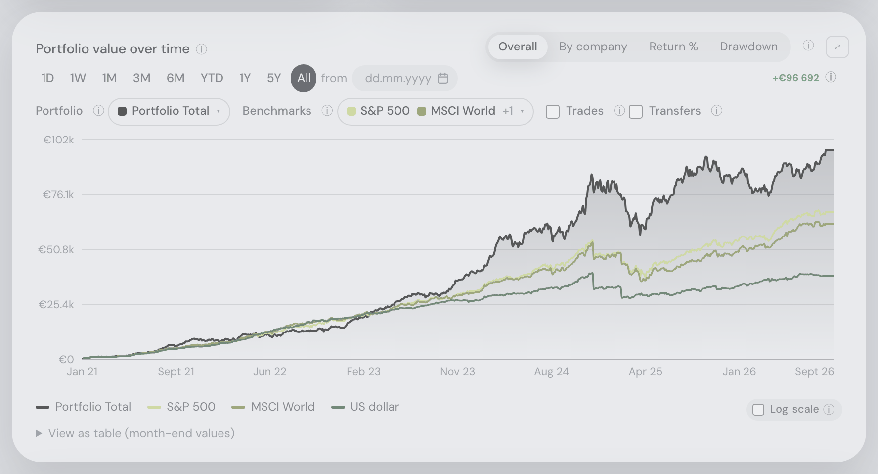
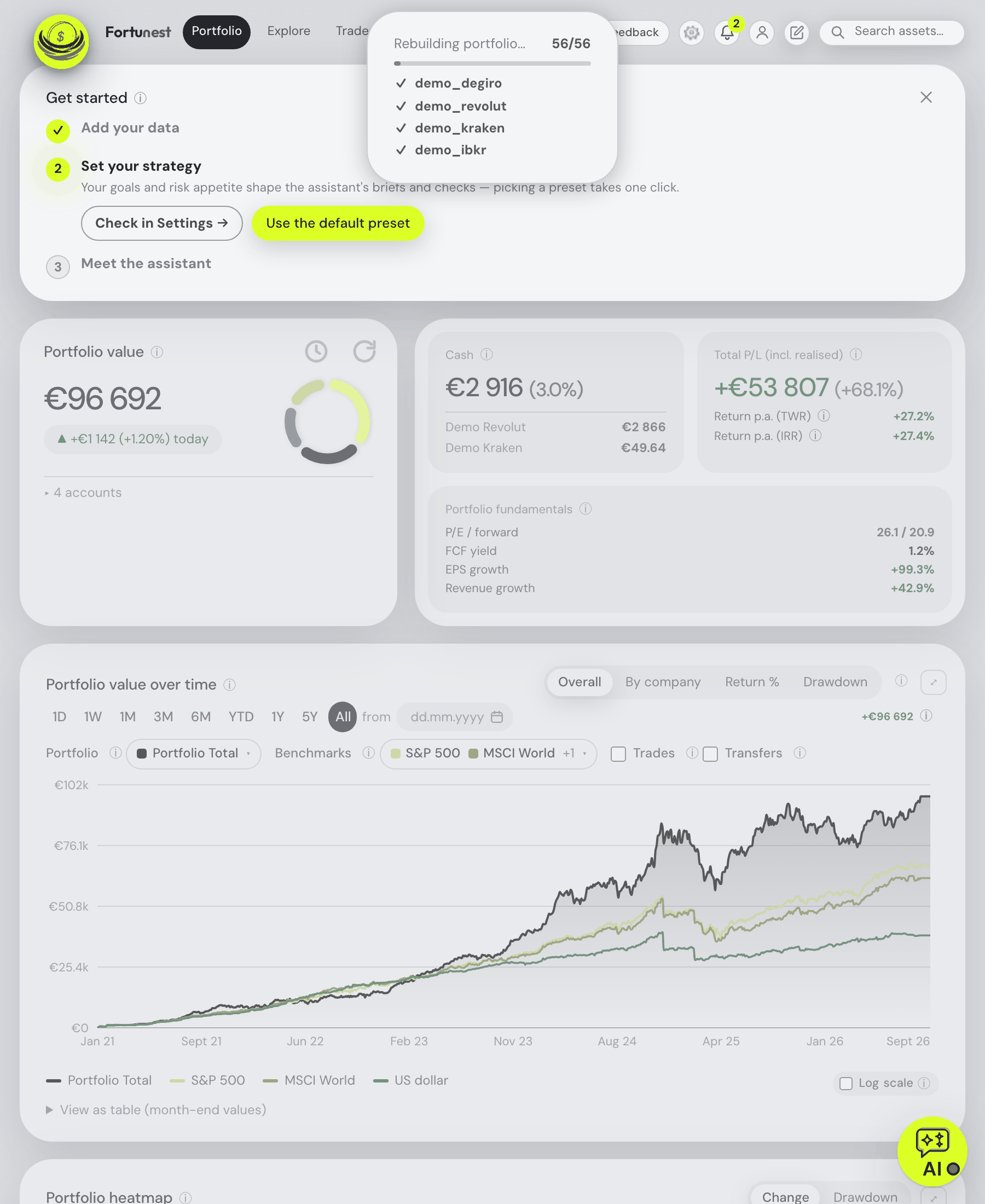
- The value chart now marks the money going in and out, not just your trades: a portfolio line that climbs to 13.2M CZK and collapses to almost nothing, with no purchase anywhere near either move, is not showing trading — it is showing deposits and withdrawals, and those were the one thing the chart never drew. (Binance serves that account no trade older than September 2022, while its deposits and withdrawals reach back to 2017.) A new Transfers checkbox sits beside Trades on the Portfolio value over time card and marks two more kinds of day. Transfers — value you moved in or out: cash paid in or taken out, and coins or shares arriving from (or leaving to) a wallet, another exchange or another broker. A filled diamond is value in, a hollow one value out, both in one neutral colour, because money moving is neither a gain nor a loss. Corrections — the bookkeeping rows that make an imported history end where your broker says your account actually stands: an opening lot for a position you bought before the export reaches, or a write-off for units the exchange says are gone. Those get a crossed square in the warning colour, deliberately the odd one out, because a written-off position leaving the books looks exactly like a catastrophic loss otherwise. Hovering any marker tells you the direction, the asset, the quantity and the value in your currency — and for a correction, what it corrected: which two numbers disagreed, and whether its date is the earliest day your imported rows could have lost the units or simply the day we noticed. The markers follow the Portfolio picker exactly like the trade dots, and use the very same classification as your return and profit figures, so a day marked here is a day they counted as a contribution or a withdrawal — staking rewards and fees paid in coin are deliberately not marked, because they are performance, not money you moved. Coins moved between two accounts you both track here show on each account’s own line but not on the portfolio total, since nothing entered or left. Over a long history the chart draws the biggest movements in the window you are looking at and says how many it is leaving out (“42 of 454 shown”), so zooming in brings the rest back.
- Fixed — a coin transferred in was drawn as a purchase in the holding drawer: the position chart you get by clicking a holding marks every change in quantity, and it treated all of them as trades — so a coin arriving from your own wallet appeared as a green “bought” dot, and a position written off against what your exchange reports as a red “sold” one. Neither was a trade you made. Those days now carry the same transfer and correction markers as the portfolio chart above, with the same shapes and the same wording on hover. The Share price chart deliberately still shows buys and sells only: it marks what you actually executed at a price, and a transfer has none.
- Fixed — the Return % chart kept answering for accounts you had just switched off: switching a data source off (or on) in ⚙ Settings → Data rebuilds your portfolio, and the rest of the dashboard followed — but the Return over time card could go on drawing the returns of the accounts you removed, until you reloaded the page. The cause was a race with its own slowest calculation: while the time-weighted return was still being computed for the first time, a rebuild landing in that window was ignored, and the half-finished answer — worked out from the old set of accounts — then installed itself for good. Every view of that card is fixed together: Return % in both its Cumulative and Monthly p.a. lenses, Drawdown, By company, the asset-type and sector splits, the trade markers and the flow-matched benchmark lines, at every date range. The card still keeps its last answer on screen while a fresh one is fetched, so coming back to the tab never flashes a “computing…” spinner — it simply cannot show you a stale one any more. As a bonus, returning to the Portfolio tab no longer re-runs all seven benchmark simulations when they are already up to date.
- Fixed — a coin transferred in showed its whole value as profit, so Total P/L was too high: the app had just learnt that units arriving without a purchase are money coming in rather than a gain — but only its return figures were told. Profit still treated an arriving coin as free, so its entire market value read as gain. On one real portfolio that was 1.43M CZK of invented profit: a hardware wallet holding 980 226 CZK of Bitcoin claimed all of it as gains when every satoshi had walked in from an exchange — while the exchange it came from showed a 755 558 CZK loss, because the purchase counted and the withdrawal did not. Units that arrive with no purchase behind them now start at what they were worth on arrival, so the profit shown is what has happened since. Two things stay pure profit, because nobody paid for them: staking rewards, Earn interest, airdrops and rebates, which the return figures now credit as performance too. A fee charged in coin (Binance’s BNB fee) counts as a cost on both sides. The app’s own numbers now reconcile exactly — portfolio value minus what you put in equals your profit — where before they were 1.43M CZK apart. Nothing on the Taxes tab changes: for tax, moving your own coins between wallets is not a purchase and the original price carries over, so the cost basis there is deliberately a different number — the tooltips on both tabs now explain why. Existing imports are re-read once on the next start so older uploads get the same treatment.
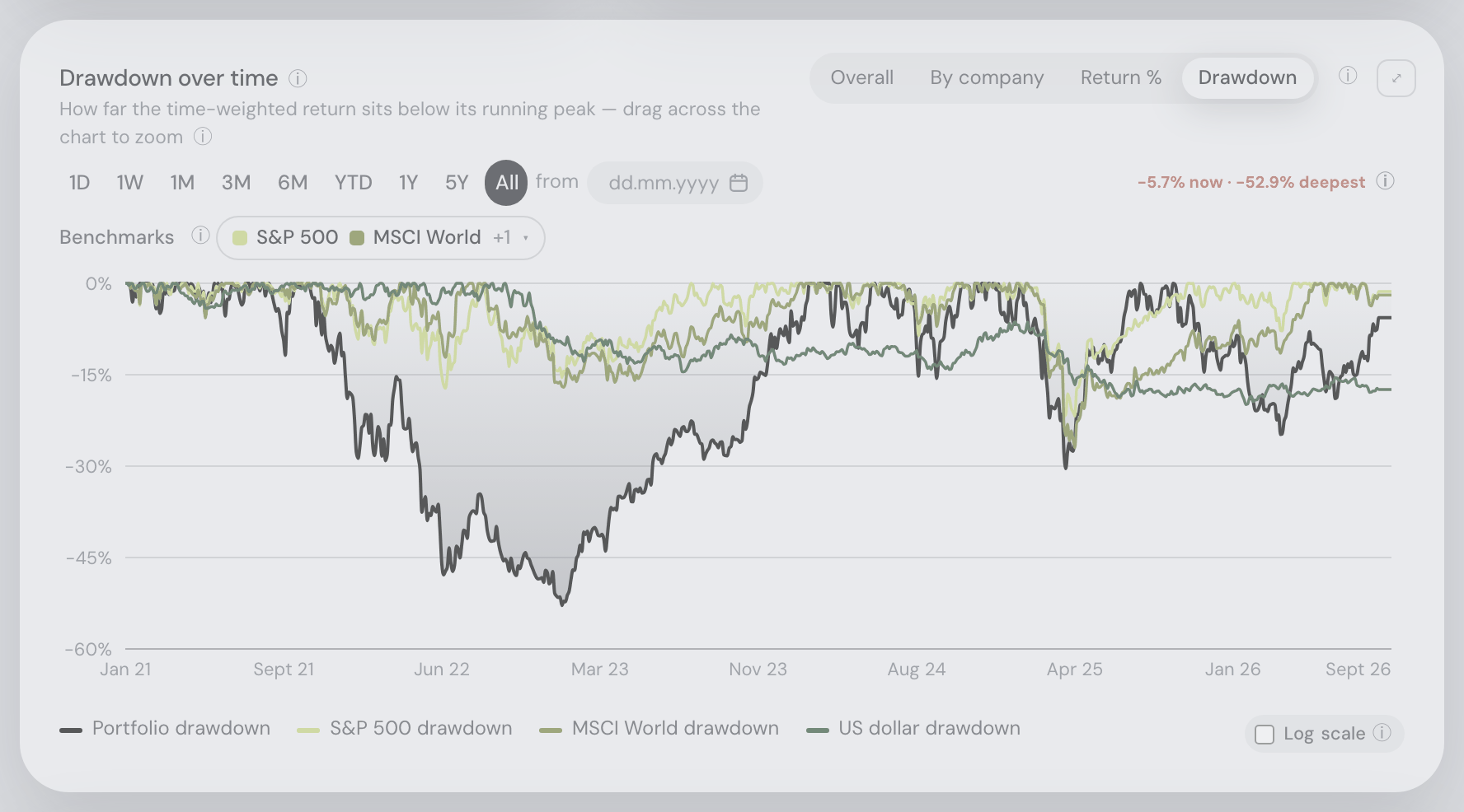
- Fixed — coins moved into an account were counted as profit, so every return figure was too high: money enters a portfolio two ways — you buy something with cash, or units simply arrive (a coin sent over from a wallet or another exchange, a staking reward, an airdrop, a correction crediting units your history is too short to explain). Only the first was counted. So when 46 990 USDT landed in one real Binance account, the portfolio jumped from 996 312 to 2 387 882 CZK with no deposit behind it — and the app called that a +139.7% day. Over seven years that account read +2 245.9% all-time where the truth is +1 003.3%. It is also why the “same deposits” benchmark lines were far too small: they buy the index with the deposits the app could not see, so an S&P 500 line drew 1.17M CZK beside a 4.74M CZK portfolio; it now draws 3.64M. Arriving and departing units now count as deposits and withdrawals at that day’s price. Two things deliberately do not: a share split, and coins moving between two accounts you already track here (that is your own money changing books — it uses the transfers you confirm on the Trades tab, so nothing is guessed). Your holdings, cash and profit are unchanged; everything the app says about return changes — including volatility and drawdown, which were reading those phantom days as the best and worst in the account’s history. This was never new: the same numbers come out of every earlier version.
- Fixed — the Social feed announced six sales that never happened: the feed works out your “bought / sold out” posts by comparing the holdings you last shared with the ones you share now, and treats anything that left the list as sold. But a position can leave that list without being traded: when an import finally squares your ledger against what your exchange actually reports — writing off units it says are gone, or crediting units it says you hold that your fetched history is too short to explain — several long-dead holdings can drop off at once, years after you really sold them. That posted as six “sold out of X” events, stamped with the moment of publication, for trades nobody made. Those corrections are now recognised for what they are and never post, in either direction and at any size — a written-off holding can be worth a third of your portfolio, so the small-position rule added earlier today could not catch this on its own. A position you genuinely sold still posts, including one you had owned since before your broker’s history reaches; a real sale sitting beside a correction is still told. Only names travel with your snapshot, under the sharing checkbox that already covers your holdings. Events already posted stay where they are — delete them like any other post of your own.
- Coins you hold on a connected exchange are now priced by that exchange: if Kraken, Binance or Coinbase custodies a coin for you, its own price is what Fortunest uses — that is the venue the units can actually be sold on, and the number you see when you open the exchange’s own app. Yahoo Finance is now the fallback rather than the source. Only the exchange’s public price data is read, so no API key is involved in pricing at all and a price lookup can never reach your account. It fixes holdings that were simply worth nothing before: on one real Binance account, SKY — 9 848 units, about 11 000 CZK — was carried at zero because the only ticker Yahoo has under that name is a different coin entirely, while Binance had been quoting it all along. Smaller disagreements on IOTX, ONE and LUNA went with it, along with three coins Binance has delisted but still publishes prices for. The account now values within 13 CZK of Binance’s own figure. If an exchange stops quoting a coin, Yahoo takes over again; if neither has it, the exchange’s last traded price is used and labelled as one; and USDT-quoted prices are converted at what USDT is actually worth rather than assumed to be a dollar. A holding priced this way says “priced by Binance” on hover instead of being called unlisted. Shares, brokerage connections and uploaded CSV files — including a Binance CSV — are priced exactly as before.
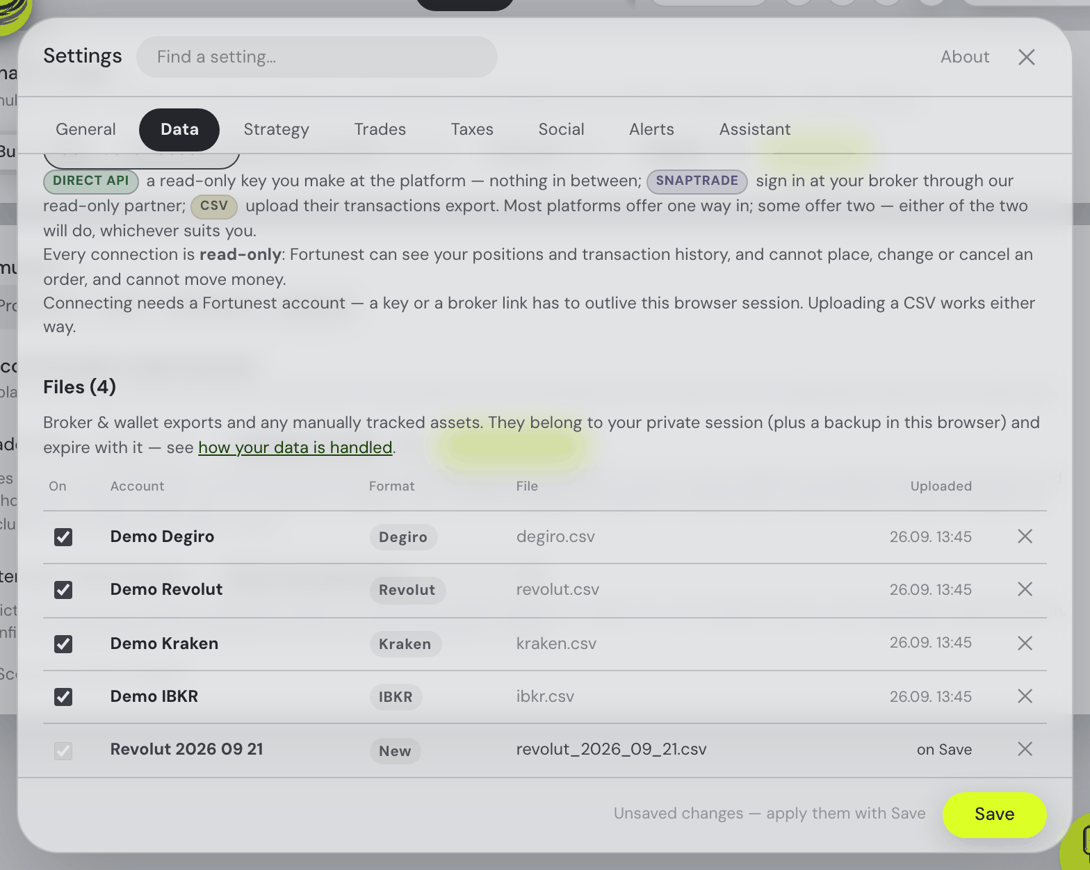
- One list of everything you have connected: ⚙ Settings → Data used to keep two separate lists of live connections — Exchange connections for the ones you link with your own read-only key, Connected brokerages for the ones going through SnapTrade — each with its own heading and its own long paragraph saying much the same thing. There is one list now, Connected accounts, with every link in it sorted by platform name. Each row says how that account is connected, with the same coloured mark the connect list below uses (Direct API or SnapTrade), and when it last brought anything in — “Synced 11.08. 12:12”, or plainly Never synced, which used to be an empty space that read as something being broken. Everything each row could already do it still does: the include tick, the health dot, the activity count, Sync now, and Disconnect that stages itself until you press Save and can be taken back with ↩ Keep.
- Two ways into the same platform now read as a choice: in the connect list, a platform offering both a live connection and a CSV import used to explain each of them one after the other, with nothing saying you only need one. The tooltip now opens by saying they are alternatives — pick whichever suits you, not both — and points at the live connection as the better of the two, since it keeps itself up to date where a file is a one-off you repeat by hand. Platforms with a single way in read exactly as they did.
- Fixed — a holding that went negative part-way through your history no longer drags the whole chart down with it: if an exchange reports a 2018 sale but cannot reach back to the 2018 purchase behind it, that position reads as a negative quantity for years — and a negative quantity at a real price is a negative value, which pulls the portfolio chart under the axis and pins the drawdown chart at −100% for the rest of your history. Fortunest now credits the missing units before your history starts, sized to the deepest the position ever went below zero, so every figure after that date is computed on real ground. Because the price you actually paid for those units is genuinely unknowable, it is never guessed: they get their own warning on the Portfolio tab, and the Taxes tab counts them at zero cost and says so for each holding — gains against them are overstated until you add a manual lot with the real purchase price. It never fires where your own history already explains the position.
- Binance: airdrops, fork credits and token swaps now arrive as real, dated rows — and Cross Margin counts as money you hold: when Binance renames or migrates a coin it pays you the new one directly, and no trade, deposit or transfer ever mentions it. Those distributions are now fetched, so for several coins Fortunest finally knows when and how you got them instead of assuming a starting balance — on one real account that covered five holdings, including its single largest distribution and the payout for a delisted coin. Your Cross Margin wallet is now read too, at its net value so a borrowed coin shows as the debt it is; on the same account that was about 1 900 CZK of real money the sync had never looked at. Isolated Margin and Futures wallets are still not read.
- Fixed — a very active Binance account could permanently lose its oldest trades on the first sync: for any trading pair with more than a thousand fills, the first sync fetched the most recent thousand and then only ever looked forward — so everything before them was missed, and stayed missed on every later sync. It now starts from your very first fill on each pair. Worth knowing either way: Binance's own API does not serve trades older than a cutoff it chooses per account — on one 2017-vintage account it would return nothing before September 2022, even for pairs still listed today. Deposits and withdrawals go back to day one, but for the trades themselves, uploading Binance's CSV export is the only way to fill in those years.
- Fixed — a connected exchange account could be worth several times what it really was: a connected account is anchored on what the exchange says it holds, but the anchor only ever worked in one direction. It topped up a holding your imported history under-explained, and did nothing when the history claimed more than the exchange reports — so a coin you had finished with, or moved somewhere the trade history never mentions, went on being valued at today’s price forever. One real Binance account holding about 133 000 CZK was shown as 438 000. It now works both ways: units the exchange no longer has are written off, dated at the sync and flagged, and an asset missing from the exchange’s balance list is correctly read as held in zero units rather than skipped. The same correction also clears the “sold further back than your history goes” warning where the exchange’s own balances explain it — and deliberately leaves it in place where a position really does dip below zero part-way through your history.
- Binance Simple Earn now counts as part of your holdings: a coin you have subscribed to Simple Earn is reported by Binance as an
LD-prefixed token (LDDOGE) that no market prices, so it was showing as worth nothing while your real holding of that coin read as only the part left loose in your spot wallet. Both halves are now added together, using Simple Earn’s own figure so the interest you have accrued is included. Note that Margin and Futures wallets are still not read. - Fixed — a Binance sync could die halfway through and lose the whole run: a full first sync takes minutes of continuous requests, and any single hiccup on the way made Binance reject everything that followed with a clock error. Syncs now recover from a dropped connection instead of starting over.
- A friend whose portfolio is the demo data now says so: anybody sharing a portfolio built (partly) from the “Try with demo data” seed wears a small demo label beside their @handle — in the feed, the friends list, the leaderboards and their profile — reading “uses demo data” on hover. Your own leaderboard row is marked too. It is there so a synthetic return and the place it wins are never read as somebody’s track record. The mark is worked out on your own device, from whether any demo file is still loaded, and travels as a single flag with your snapshot; it is the one thing shared without a checkbox, because a disclaimer you could untick would defeat itself. It says nothing else — no file name, no amount — and it clears itself the next time you publish once the demo files are gone.
- One list of every way to get your data in: ⚙ Settings → Data now has a single Connect an account button opening one searchable list of every platform Fortunest supports — instead of two separate pickers that each showed you half of them, and never mentioned the CSV importers at all. Each entry is marked with how it can be brought in: Direct API (a read-only key you make at the platform, nothing in between), SnapTrade (sign in at your broker through our read-only partner), CSV (upload their transactions export) — some platforms carry two marks. Picking one takes you straight to the right place. Platforms we can connect to directly — Kraken, Binance, Coinbase, Trading 212 and Interactive Brokers — are no longer offered through SnapTrade: the direct key reaches further back into your history, syncs faster and hands nobody else access, so the choice is simply made for you rather than put to you. Brokerages you already connected through SnapTrade keep working exactly as they are — nothing to redo. And because uploading a file never needed an account, the CSV entries stay usable even if you are not signed in.
- Fixed — “switch to …” in the chat changed the wrong model: asking the assistant to switch to a model sometimes moved the small background model (the one behind proactive tips, ✨ insights and smart search) instead of the one you are talking to — particularly when you named the model already sitting in that background slot. A plain “switch to X”, “use X” or “change the model to X” now always changes the main chat model; the background one moves only if you ask for it by name (“use nano for the fast model”).
11 August 2026
- Click anything a friend holds to see what it actually is: in a friend’s shared portfolio, every position in the Holdings list — including the small ones folded away behind “12 smaller positions” — and every pill in their monthly buy plan now opens that asset’s own details, the same panel you get from your own dashboard. Their portfolio stays open behind it, exactly where you left it: close the panel and you are back at the same place, with the same date range and breakdown still selected. To be clear about whose numbers you are looking at, the panel is yours: if you own the asset it shows your position, your transactions and your profit; if you do not, it shows the asset itself — price history, fundamentals, signal — and no position at all. Nothing of your friend’s holding travels beyond the weight and relative gain already printed on their row, and the card now says so above the list. A position their snapshot carried without a ticker stays plain text, since there is nothing to look up.
- A friend’s badges catch the light: open somebody’s shared portfolio and the badge marks in their trophy case turn slowly in 3D — a full turn every four seconds, the same four the app’s own logo coin takes — with a band of light crossing each one twice per turn, right to left, as it comes square to you. Same little drawings as before — they simply have a front and a side now. It happens in that one place only: the small marks beside names — in the feed, in your friends list, and in the header of the profile you just opened — stay perfectly still and unlit, and if your device is set to reduce motion, nothing moves at all.
- Tap a friend’s @handle in the feed to open their portfolio, and see their sharing change as it happens: the name above any post is now the way into that person’s shared portfolio — the same view the friends list opens. And a portfolio you have open no longer goes stale: if its owner unticks something in ⚙ Settings → Social while you are reading, that section disappears within seconds instead of staying on your screen until you close and reopen it. The picture at the top of that view is bigger, too.
- The Social feed got about three times lighter: profile pictures used to travel at full size with every single post in the feed — a page of 50 posts was 425 KB, almost all of it the same picture over and over, and it reloads about once a minute. Your browser now keeps a small thumbnail alongside the large picture, and that is what posts, friend rows and search results carry; the large one is sent only when you open a friend’s profile, which is the one place it is shown big. A 50-post page is now 151 KB and the friends list dropped by the same share — less waiting, and much less mobile data. Nothing looks different: the circles are the same size on screen and are still drawn from more pixels than they need. Pictures uploaded before today keep working exactly as they are; the next time you save your profile the small version is made for you, quietly.
- Profile pictures are sharp when you enlarge them: hovering or tapping the picture at the top of a friend’s profile used to show a soft, blown-up thumbnail — uploads were being kept at 128 pixels and then painted at nearly twice that. Uploads are now kept at 256 pixels (in WebP, where your browser can make one), so the enlarged view is drawn from four times the pixels it had — the same size on screen as before, far less of a stretch. Feed and topbar pictures are unchanged, and pages stay light: the picture travels with every post in the feed, so it is deliberately sized to the largest place it is shown and no further. Pictures uploaded before today keep working as they are — upload yours again to get the sharper version.
- Two more reactions, and a feed that stops shouting all of them at you: posts now take 😢 and 👎 as well, and a post no longer wears the whole palette. It shows only the reactions somebody actually clicked, with their counts — a post nobody has reacted to shows nothing but a small ☺ Add a reaction button at the end of the row, which opens the full set. Chips stay in a fixed order rather than jumping around as votes arrive, and taking a reaction back leaves its chip in place so a mis-click is easy to undo.
- Fixed — the Portfolio value card wiped the page in every view but Overall: switching the chart to Return %, Drawdown or By company replaced the whole dashboard with the error panel, every time. All three draw again. While we were in there we also made the zoom’s small print honest: dragging a rectangle zooms both the time and the value axis in the Overall view, and in the other three — whose value axis fits itself to what you are looking at — a drag zooms the time range only, which is what each view’s own one-line description says.
- Share your overall P/L percentage, and see each friend’s yearly return next to their name: the Performance box in ⚙ Settings → Social now also shares your overall profit and loss as a percentage — your total P/L including realised, against the money you put in. The percentage only: no amount, and nothing a currency figure could be worked back out of. In the Friends list, every friend who shares performance gets their headline return beside their handle — the annualized, money-weighted rate (IRR per year), which is the one that compares two portfolios of different ages fairly. Friends with under a year of history show nothing at all rather than a flattering guess, and unticking the box removes the number from your friends’ lists straight away.
- A friend’s shared portfolio now opens with the headline figures: a compact row of tiles sits at the top of the sheet, under the badges — the same three the dashboard leads with, said in percentages: Cash as a share of their portfolio (12.4% of it uninvested, never a balance and never a per-account one), Total P/L (incl. realised) against the money they put in, with their yearly time-weighted and money-weighted returns beneath it, and their Portfolio fundamentals — P/E and forward P/E, FCF yield, EPS growth, revenue growth. Three of those figures are new to sharing and ride boxes you may already have ticked: the cash share joins Allocation (it is the cash slice those breakdowns already show), the fundamentals join Holdings (they are ratios of the very companies that box already names), and the yearly time-weighted return joins Performance. The Settings → Social labels say so, and as ever there is no amount among them and none can be worked back into one. Friends who share less get fewer tiles, and one who shares none of it gets no block at all rather than a row of dashes.
- A page that crashes now shows a panel instead of going blank: if the dashboard ever hits an unexpected error and stops drawing, you get a short explanation, a Reload the page button and a Technical details section you can copy straight into a bug report — instead of an empty window. An anonymous report is sent automatically so the fault can be found and fixed: the error and where in the code it happened, never your holdings, amounts, or email.
- The Social tab got a tidy-up: its buttons now look like the rest of the app instead of plain browser buttons, and Unfriend and Block have moved off every row of the friends list into the friend’s own profile — where they finally ask before they act, and say what each one costs. The friends list is calmer for it: one clean line per friend, the “how friend requests work” note tucked into an ⓘ tooltip, five badges beside a name instead of three, and the “5h ago” stamp dropped from the end of each row (it is in the row’s own tooltip, and at the top of the profile it opens). In a friend’s shared portfolio the picture at the top is bigger (and bigger still on hover or tap), the badge tiles are more compact, the headline figures come first with the position-by-position Holdings list below them, and holdings under 1% fold away behind a “12 smaller positions · 6.3% of the portfolio” expander you can open when you want them.
- The Social feed now updates itself while you read it: the tab badge would tell you three friends had posted, but the feed underneath stayed frozen until you left the tab and came back. New posts now arrive on their own — quietly, when you are at the top of the feed, and behind a small “↑ 3 new posts” button when you are further down, so nothing ever jumps while you are mid-post. Whatever you had loaded with “Load older” stays put, and once the new posts are actually on screen the tab stops counting them as unread.
- A friend’s shared portfolio now reads like the rest of the app: the allocation breakdown is drawn with the same segmented bar and legend as your own Allocation card — one dimension at a time behind a picker (regions, sectors, market cap, types, currencies, asset classes) — with the diversification score as the familiar dial, and their allocation targets get the Trades tab’s drift bars, tick and tolerance band instead of bare rows. The row of green and red monthly figures finally says what it is (“Monthly TWR — last 12 months”, with months spelled out), and the plan / platform / accounts line at the bottom became a proper About this snapshot card with readable account names.
- Fixed — a friend’s performance chart drew one broken line instead of two curves: the TWR line stopped being drawn at the exact date the IRR line began, so the two read as a single line that changed colour halfway, and the IRR half climbed in steps rather than a curve. Both are now separate, clearly labelled series (solid and dashed, with a legend) over their own date ranges, and the card explains why the IRR line starts later — it needs about a year of history before it means anything. Long histories no longer lose their most recent points either.
- Collectible badges — titles your portfolio earns by itself: sixteen of them, from OG and Time Lord to Diamond Hands, Index Monk and Bag Holder, each with a line explaining how you got it. They sit in a trophy case — yours in ⚙ Settings → Social, a friend’s at the top of their shared portfolio — with the ones you haven’t earned greyed out as something to collect, and as a small row of marks beside your name in the feed. Badges are worked out on the server and, crucially, only from the sections you already share: if a badge’s rule reads something you keep private, the badge simply isn’t awarded, and unticking a section retires the badges that read it. Each badge remembers the day you first earned it, so losing one for a day and getting it back doesn’t reset the date.
- Pre-market and after-hours moves on the Portfolio value card: under today’s change, a second line now shows how your holdings have moved in the extended session — “▲ +412 CZK (+0.16%) pre-market” — and it is upfront about covering only part of your portfolio: crypto trades around the clock and European listings publish no pre/post price, so only US-listed shares and funds have a quote to report. The line names the share it speaks for, appears only while an extended session is actually running, and is deliberately kept out of your portfolio total and day change — these prints are thin and often gone by the next open.
- Managing your subscription is reachable again: the Manage subscription button now shows whenever Stripe holds your account — including a lapsed plan, which is exactly when you need to update a card. If your Pro was granted directly rather than bought, the panel says so instead of leaving you looking for a button that was never there.
- The Social tab — friends, shared portfolios and a feed: connect with friends by request and accept (their approval is the consent — nothing is visible before both sides agree), get an @handle and avatar, and share your portfolio the safe way: per-section toggles in ⚙ Settings → Social, all off by default, sharing only relative figures — weights, percentages and return curves, never amounts. Unticking a section hides it from friends instantly, “Delete shared data” wipes what was published, and friends’ return curves can join your Portfolio value chart beside the benchmarks. A free-plan feature for signed-in accounts.
- A feed with posts and reactions: share markdown posts with images, links and charts drawn by the assistant (every chat chart gets a Share button), optionally let the app post “bought a new asset” / “sold out” events for you, and react with 👍 👎 ❤️ 🙂 😢 😠 💸 💵 🚀 📈. An unread badge on the Social tab counts new posts and pending friend requests. On the desktop app, Social works through the Licence sign-in (a free account is enough) and simply asks for an internet connection when offline — the privacy chapter’s “what leaves your machine” list now names this one opt-in exception precisely.
- Opening a holding now morphs: click a position and its table row visibly expands into the details drawer (and folds back into the row on close) — a smooth, native browser animation in Chrome, Edge and Safari. Firefox and reduced-motion users keep the instant open, exactly as before.
- The morph got three fixes on day one: table rows no longer flash over the assistant panel while it plays, an asset picked from the search dropdown now grows out of the clicked search result instead of a hidden table row, and the opening animation is actually visible now — it used to snap while only the close was ever seen.
- Under the hood: the app now runs on React 19.2 — no visible changes, everything verified pixel-for-pixel, and it unlocks the smoother-UI groundwork landing next.
- The UI now auto-memoizes its re-renders (React Compiler) — snappier interactions on big portfolios, nothing to configure.
- Connect Kraken, Binance, Coinbase, Coinmate, Trading 212 and IBKR/Lynx directly with a read-only API key you create at the exchange — full history on the first sync (Kraken reaches back to account open), incremental updates after that, keys and data stored encrypted. Settings → Data → Exchange connections; SnapTrade stays for the hundreds of brokers without a native connection.
- The tax-rules settings honor the Pro gate: on the free plan, ⚙ Settings → Taxes no longer pretends its rules are in play — the panel now opens with the same “Taxes is a Pro feature” note (and See plans button) as the Taxes tab, with every field visible but muted and disabled. Pro users keep the fully editable panel, and saving from the other settings tabs is untouched.
- The signed-out account dialog got tidier: the “Sign in” / “Create account” switcher now sits at the very top, right under the dialog’s title, with the plan comparison (while creating an account) directly below it. The tab simply says “Create account”, the leftover “Plan Free” heading is gone, and the note about what an account gives you moved under the switcher on the sign-in tab (the create tab lets the plan cards do the talking) — ending with the reassurance that guest mode keeps working, with your data living in the browser for a limited time.
- Sign-in and account forms are real forms now: the sign-in / create-account dialog, the two-step code prompt, the password and two-factor sections and the password-reset page are proper browser forms — so password managers and autofill finally recognise them, and Enter submits natively from any field.
- Creating an account fits on one screen: the create view slimmed down until it fits without scrolling — the billing toggle and sale note share a row, the plan cards shed their extra air, the email/password fields stopped stretching across the whole dialog, and the password rules moved into a column beside the password fields instead of stacking under them — with a green checkmark on each rule your password already passes. The form sits centered in the dialog, the Create account button right under its fields, and the Taxes tab’s “See plans” button now looks like every other button instead of a browser-default one. The Free card also no longer says “Your plan” to a visitor who hasn’t signed up yet.
- The Taxes tab retries by itself: if it hit an offline or error state, simply switching back to the tab now reloads the tax lots automatically — and on every return the figures quietly refresh in the background while the previous ones stay on screen.
- Fixed: the account button briefly vanished from the top bar (taking the account dialog and the upsells’ “See plans” buttons with it) — restored.
- Your profile picture appears the moment you save it — and it is big enough to recognise: uploading a new avatar used to change the button at the top of the page only after a reload; it now updates straight away, as does a changed @handle. The picture on that button also grew from a small icon to nearly filling it, so a face actually reads — without the button or the row around it changing size.
- Fixed — an upgrade that couldn’t start said nothing, or blamed the wrong thing: if Upgrade to Pro failed, the button simply un-pressed itself with no explanation, and the server’s answer claimed the payment provider was “temporarily unavailable, try again in a moment” even when the problem was on our side and retrying could never work. The button now shows what happened, and a problem with our own store setup says so honestly instead of sending you off to retry — and alerts us the moment it happens, rather than leaving you to report it.
- Your friends list updates itself: when someone accepted the request you sent, your Social tab kept showing it as “Sent · pending” until you switched to another tab and back. It now refreshes on its own while you are on the tab — an accepted request becomes a friendship within seconds, a declined one disappears, and requests arriving show up without a reload. It pauses while the browser tab is in the background and catches up the moment you return.
- Ask the assistant about a friend’s portfolio while you are looking at it: opening a friend’s shared portfolio used to shut the chat out — the panel was dimmed behind the dialog, and clicking it closed the very portfolio you wanted to ask about. The assistant now stays live beside the dialog (on a phone it opens over it and hands the portfolio back when you close it), and it sees what you see: your feed, friends and pending requests, your own share settings, and the friend’s snapshot card by card — including whether you are looking at cumulative or annualized returns and which breakdown is on screen. So “is their tech weight higher than mine?” just works. As everywhere in Social, only relative figures exist to send — weights, percentages and return curves, never amounts — and they reach the assistant clearly labelled as your friend’s, kept apart from your own numbers.
- Trade dots now follow the account you picked: on the Portfolio value chart, narrowing the Portfolio picker to a single account used to leave every account’s buys and sells marked — dots hovering over a line that wasn’t on screen, with tooltips naming accounts you had just filtered out. The dots now show only the selected accounts’ trades, sit on the selected account’s own line, and re-decide each day’s colour from the trades still shown (a day that is a net buy for the whole portfolio can be a sell for one account inside it). Days none of the selected accounts traded on disappear, and switching accounts re-draws instantly.
10 August 2026
- Connecting a brokerage respects the account limit politely: on the free plan with all three account slots in use, the Connect button now explains the limit up front — with a “get Pro” link — instead of letting you authenticate at your broker only to be refused afterwards.
- Subscription status in plain words: the Plan section now says “Active”, “Trial” or “Payment past due” instead of Stripe’s raw
past_due-style codes, and buying or managing a subscription from the standalone account page returns you there rather than to the dashboard. - The Free/Pro cards work by keyboard: the plan chooser is a proper radio group — arrow keys move both the selection and the focus between the cards, Tab lands on the selected one.
- Swapping a file at the free-plan limit now works in one Save: staging the removal of one account plus a new CSV used to lose the new file — Save uploaded it first, the server refused it because the old account still held its slot, and only then did the removal apply. Save now removes first, so the freed slot is there when the new file uploads. Re-uploading a file you’ve staged for removal also keeps its original name instead of gaining a “_2” suffix.
- Buying Pro tells you it worked: coming back from the Stripe checkout, the app now says “Payment received — activating your Pro plan…” and flips itself to Pro the moment the activation lands — no more landing on a dashboard still badged “Free” with no explanation while the payment processes behind the scenes. And if a connection hiccup interrupts the checkout that opens right after you create your account, your chosen plan is no longer silently dropped — a note tells you to pick it again under Account → See plans, and the next visit can resume it.
- The account dialog starts with you: signed in, your email now sits at the top, above the Plan section — and the row says which providers have an encrypted API key stored on the server (e.g. “Stored API keys: OpenAI”), so “your keys live on the server” is a claim you can check at a glance. A subscriber also gets a “Manage my subscription” link right inside the plans view, and the plans view lost a redundant “Your plan” button (the badge on your card already says it). The “Sign in / Create account” button in the account popover is now a proper pill like every other button.
- Signing in and creating an account are now tabs: the account dialog’s form leads with a “Sign in” / “Create a new account” switcher at the top, so it’s clear which form you’re filling before you type — previously the two modes were told apart only by the buttons at the bottom.
- Deleting an account works with emailed-code verification: the delete form asked for a two-step code, but with the emailed-codes method nothing ever sent that email — only a recovery code could fill the field. The form now has an “Email me a two-step code” button, and an account that signs in through a provider (no password) with emailed codes proves its mailbox once instead of being asked for a second code that could not exist.
- The plans view stopped double-asking and double-linking: for a subscriber the Free/Pro cards no longer light up as if a plan could be picked there — they read as a plain comparison, since changing or cancelling a subscription happens through the “Manage subscription” button and Stripe’s own page. That button is also the one way into the portal now; the duplicate “Manage my subscription” link under the cards is gone.
- Quarterly reports stopped playing hide-and-seek: the reported-earnings rows on the Events card, the Earnings reports check and the season digest all depended on Yahoo’s earnings calendar, which sometimes answers with silence — and your holdings’ fresh reports vanished from the app even though the filings sat on SEC EDGAR. The app now checks EDGAR’s own filing feed whenever Yahoo goes quiet, so a filed report always shows up.
- The Macro card’s FRED dials are back: the credit-spread, inflation-breakeven, money-supply and Fed balance-sheet tiles (and the proper 10y−2y curve) had quietly stopped arriving because the free data host began blocking hosted servers. The app now reads the official FRED API instead, and those dials fill in again.
- Money supply on the Macro card: the risk-regime glance row now carries a US M2 tile (the broad money supply in $tn with its year-over-year growth) and a Fed balance-sheet tile (total assets, its YoY change showing whether the Fed is adding or draining liquidity). Both come from the same FRED source as the card’s other series, refresh daily, date their observation in the ⓘ explainer, and simply don’t render when the data can’t be reached. The assistant’s one-line regime summary carries them too.
- The 3-account limit tells you the moment you hit it: on the free plan, dropping a broker CSV beyond your three accounts used to look like it worked — it waited on the shared Save, recalculated, then quietly disappeared. Now the Data panel says so straight away: the extra file is turned away as you add it, with a note that names the limit and a link to sign in for unlimited. Anything you already loaded is untouched, a file that fills your last free slot still adds normally, and the note clears as soon as you make room.
- The Pro prompts now lead somewhere: the “Taxes is a Pro feature” panel and the account-limit note each open your Account settings, where a Pro account can sign in to unlock. (A way to buy Pro is coming.)
- See what the plans are: Account settings now opens with a Plan section — your current plan, and a “See plans” view comparing Free and Pro side by side, with a monthly/yearly switch and VAT-inclusive prices (€3.99/month or €39/year). A summer sale takes 50% off for new accounts until 30 September 2026. Buying isn’t wired up yet, so the upgrade button reads “coming soon” for now.
8 August 2026
- Taxes tab now works in the desktop app (Pro): a licensed Pro user can open the Taxes tab on the desktop. The tax calculations run on the Fortunest server — the app sends the transactions the calculation needs and they are discarded the instant it finishes; no credentials or API keys ever leave your machine (the tab says so in a footnote). Adding manual opening lots and confirming transfers works offline; the calculated views need a connection, and offline the tab shows a calm “connect to the internet” message instead of an error.
- Desktop app (Mac & Windows), early build: Fortunest now runs as a native desktop app that works fully offline — import your broker CSVs, see your whole dashboard (holdings, performance, risk, dividends), run simulations and trade recommendations, and chat with the assistant backed by a local LLM (Ollama or LM Studio), with nothing leaving your machine. Live brokerage connections stay in the hosted web app for now. These are unsigned early builds; installer signing comes next.
- Desktop licences work offline: unlock Pro on the desktop app by signing in once under Settings → Licence (or pasting a licence token if your account uses two-factor sign-in). It keeps working without a connection and refreshes itself when you’re next online; if it can’t reach the server for a while it tells you how many days remain before it reverts to the free plan.
- Free and Pro plans: the hosted app now has a plan split. Free keeps the whole dashboard — portfolio, risk, dividends, Explore, simulations, trade recommendations, the assistant — with up to 3 loaded accounts (CSV files and broker connections combined). Pro adds the Taxes tab and unlimited accounts. Everyone who already had an account keeps everything they were using: existing accounts were grandfathered to Pro. On the free plan the Taxes tab explains itself with a panel instead of vanishing, and nothing you already loaded is ever taken away — the limit only applies when adding a new account.
6 August 2026
- “Forgot password?” tells you what happened: it used to answer “if that address has an account, a link is on its way” whatever you typed, so the commonest thing that goes wrong — the address has a typo, or you signed up with your other one — looked exactly like success, and you found out by waiting for mail that never came. It now says which it was: the link is on its way to that address, spelled back out to you, or no account here uses it, or the mail could not be sent just now. Requests stay rate limited, and every one that reaches a real account still mails that person a note saying somebody asked.
- One less rule to puzzle over when choosing a password: the checklist dropped its “not a common or guessable password” line. Every other line tells you something you can do — add a digit, add a symbol — while that one was a verdict about a list you cannot see. Nothing got easier: a password that is a breach-list favourite underneath its substitutions, or that is built out of your own email address, is still refused, now as a sentence when you submit rather than as a permanently unticked box.
- Buttons that cannot be clicked stop pretending: Forgot password? with an empty email field still lit up under the pointer like a live button.
- Enter works in the account forms: typing your password and pressing Enter used to do nothing — you had to reach for the mouse. It now does what the highlighted button does, whichever form you are in: sign in, create the account, save the new password.
- The account dialog looks like one dialog: “Sign out” and “Set up an authenticator app” were drawn as plain grey system buttons while everything around them was an outline, and the word “Account” was printed twice — once in the title bar and again underneath it.
- The two-step QR code is scannable on every theme: it was drawn in black on whatever colour the page happened to be, which on the dark themes meant black on near-black. It now sits on its own white plate, with the clear margin readers need around it.
- Finishing a password reset takes you to the sign-in form: the button at the end of the reset dialog used to just close it, leaving you on the dashboard to find the sign-in form yourself. The “a link is on its way” note also lingered while you signed in with the new password, where it looked like the reason a mistyped password had been refused.
- Your trade history is actually requested now: a connected account could show every holding and no trades at all, indefinitely. Fetching holdings and fetching history are separate jobs at SnapTrade, and only the first one starts by itself when you connect — the second was never being asked for. Syncing now asks, for any connection that has never had one, and tells you it has: the history is fetched in the background, so it arrives in a later sync rather than the one that requested it.
- And when that history is ready, it imports itself: the broker prepares it in the background, and until now you had to notice it was done and press Sync again yourself. The broker’s own “history is ready” signal now reaches the open dashboard, which runs the usual import on its own and says so — “Trade history arrived — importing…”.
- Your trades show up even when the broker sends no transaction list: some brokers (Kraken among them) hand over an empty transaction history while their order book has the trades in it — dated, priced, with quantities. Those are now imported instead, and only when the transaction list is genuinely empty, so nothing is ever counted twice once the broker’s own record arrives. Only orders that actually filled count; a resting limit order is an intention, not a trade.
- An account with no trade history says so honestly: the tooltip used to state that the broker provides none at all. It cannot know that — SnapTrade lists Kraken as history-reporting — and the likelier explanation is a read-only key minted without the “query closed orders & trades” permission, which is something you can go and change. It now says no history has arrived yet, and why that usually is.
- A connected brokerage shows when it actually synced: the row read “Synced 02:00” whatever time it was — the stamp being kept was the date, and a date with no time on it is midnight, which is 02:00 here. It records the moment now, and says “Synced at 09:26”.
- Kraken's older coin tickers price correctly: Kraken names the crypto it listed before about 2022 with an X in front — XETH, XXBT — and those were being matched against unrelated tokens that happen to start the same way, so Ether showed up worth cents. Now mapped properly.
- Connected brokerages have their own section, above your files: a live connection was listed inside the table of uploaded files, where it had no filename and no upload time to show. It sits above that table now, with its own health, sync time and include tick — and the file list is only files.
- The brokerage connection window closes when it is done: after finishing at your broker it used to reopen the whole dashboard inside the small connection window, leaving you to hunt for the original one. It now closes itself and the dashboard you started from picks the connection straight up.
- Deleting your account now needs your two-step code too: not just your password. Turning two-step on is a decision that your password alone should not be enough to act as you — and deleting everything is the one thing that cannot be undone. A recovery code works if your phone does not. Accounts without two-step are unaffected.
- Account errors are readable: messages like “an account with that email already exists” were printed in the same muted grey as a footnote, below the fold of your attention. They are red and bold now. The linked-provider row no longer runs its email address behind the Unlink button, and an accent button keeps its colour when you hover it.
- A freshly connected account says what to expect on day one: holdings arrive the moment you connect, but the broker prepares your transaction history separately — normally in seconds, sometimes much longer, and the data itself runs a day behind. Meanwhile your trades from the last 90 days are already imported from the executed orders. The account’s row now says exactly that — holdings are live, the history is on its way and typically arrives within a day — so an empty trade list right after connecting reads as the wait it is, not as something broken.
- QuickSwap is priced as the token you actually hold: QuickSwap redenominated 1:1000 in 2022 and exchanges converted balances to the new token, but the price source keeps the plain “QUICK” ticker on the old one — so a Binance QUICK position was valued at the old token’s ~$9 instead of the new one’s ~$0.008, inflating it about a thousandfold into a fake top holding with fake profit. It now maps to the right generation, and the fix reaches accounts that already hold the coin, not only new connections.
- The Get started card asks its first question first: step one — register, or continue as a guest — posed a choice but offered only the “Create an account” button, and the glow that walks you down the card was already pulsing on step two’s demo button and drop area before you had answered. “Continue as a guest” is now a button of its own, both answers glow while the question is open, and step two’s buttons light up only once step one is settled — the demo button inside the card is now the same quiet grey chip as its neighbours, so the glow alone marks whose turn it is. And “Create an account” does what it says: it opens the account sheet directly on the registration form, not on sign-in with the registration one more click away. Answer with an account and step two also offers “Connect brokerage”, taking you straight to the connections panel; a declared guest is not shown a button that would only bounce them to the sign-up they just declined.
5 August 2026
- Connect your broker instead of exporting it: a brokerage account can now be linked directly under ⚙ Settings → Data — Schwab, Fidelity, Robinhood, Questrade, E-Trade, Trading212, eToro, Kraken, Coinbase, Interactive Brokers and others — and the dashboard keeps itself up to date instead of waiting for next month’s CSV. The access is read-only: it can see your positions and transaction history, and it cannot place, change or cancel an order or move money. Only brokers you authorise at the broker are offered — an OAuth sign-in there, or a read-only API key you create in your own account. Brokers that would want your broker password typed into a third party are deliberately not offered; for those, and for Degiro, the CSV importer remains the way in and works exactly as before. A connected account behaves like any other data source: the same tick to include or exclude it, the same removal, and its transactions run through the same engine — so connections and uploaded files mix freely.
- When a broker is in two places, you decide which one counts: connect a broker you already have a CSV export for and the same trades arrive twice — the same purchase looks quite different coming from a file and from an API, so they cannot be matched up automatically. Rather than guess, the Data panel asks once, with three answers: files first (the default — your uploads stay in charge and the connection fills in everything after the last transaction they cover, a date it works out from the transactions themselves and shows you), files only, or connection only (the overlapping files are switched off, never deleted, so one click brings them back). Switching between them re-reads what has already been downloaded, so trying all three is instant and costs nothing — and a later sync keeps whichever you chose.
- Shares older than your broker’s records still get a cost: a brokerage API hands over only as much history as it feels like — often a year or two — so a position you bought before that arrives with no purchase behind it, and its profit figure would be nonsense. The connection now reads the broker’s own reported average cost for each holding and fills the gap with a single opening lot dated before the history starts. It is flagged as such in the Portfolio tab’s warnings rather than quietly passed off as a real trade, so you always know which part of your cost basis came from the broker’s summary rather than from an actual transaction.
- You can see how fresh a connected account is: each one shows the health of its link to the broker and when it last synced, right in the Data sources list where the filename and upload time sit for a file. Prices and transaction history sync separately and their times genuinely differ, so both are kept and spelled out on hover. The Portfolio value chart repeats the last-contact time in the tooltip on its final point — where “what is it worth right now” is actually read, and where a day-old figure is worth knowing about.
- The getting-started card starts with the choice: where live connections are available it opens with “Register and connect your accounts — or continue as a guest”, naming the brokers you could link and stating up front that the access is read-only. It is a choice rather than a chore: it ticks itself off whether you sign in or simply get on with a CSV. The beginner walkthrough covers the same ground in its own words.
- Sign in with Google, a stronger password, and two-step verification: the account dialog now holds everything about your account. Where the deployment has set it up, Continue with Google sits above the email form and Link Google inside the dialog — an account made that way is an ordinary account, with the same server rows and the same first-sign-in claim of your guest data. If the Google address already belongs to a password account, the sign-in is refused and you are asked to sign in with your password first and link from the dialog: a provider vouching for an address must not be enough to walk into an account that was never created with it. Creating an account asks for the password twice and ticks a checklist as you type — 12 characters, upper and lower case, a digit and a symbol. A common password is refused as well, by a check that looks through the leetspeak, so “P@ssw0rd1!” does not get in even though it satisfies every line of the checklist. The rules apply when a password is set, never when you sign in, so an existing password keeps working until you change it yourself. And two-step verification is there to switch on: an authenticator app you enrol by scanning a QR code, or codes emailed to you where the deployment can send mail, either way with ten recovery codes shown once so a lost phone is not a lost account. It only switches on after a code from the setup you just did has actually worked.
- The Macro tiles sit in one channel, not two: the three tiles at the top of the Macro card were 12px apart but 24px from the card’s edges, so the gap around them read as twice the gap between them. They are pulled out to the same 12px the Risk tiles use, all the way round. The rates table under them and the Explore tables — the last two that were still on the narrower inset — now stand on that channel too, and pick up the edge fades that show when more table is hiding off the side.
- Explore’s category chips stand in a column of their own: the region, sector and size chips sat inside the ticker cell, which is right-aligned like every other cell in the table — so each row’s stack of chips started wherever that row’s ticker happened to end, and a column of chips came out ragged down both edges. They now have a cell of their own, headed Categories, beside Stock: every row’s chips start on the same edge. The legend’s toggle still switches them off, and with them off the column is gone rather than left empty.
- Every card frames its tiles and tables the same way: the Holdings card sets its Filters tile and its table slightly wider than its heading, on the same channel the Risk tiles use. The cards built the same way were not following it — the Trade recommendations card framed the identical Filters tile 12px further in, along with its two candidate tables, and so did the Taxes tab’s tables and the Simulation card’s strategy tiles. They all share one channel now.
- The highlight follows the shape it is drawn around: the advanced walkthrough’s step about the Taxes tiles drew a square-cornered ring around four rounded tiles, and the beginner step about the assistant’s report cards ringed the column holding them rather than the cards. The tile row keeps its group ring and takes the tiles’ own corner radius; the report cards are now ringed one by one, like the suggested questions.
- The walkthrough’s highlight is no longer cut off by the scrollbar: with the chat docked to the side, a card that runs the full width of the dashboard ended exactly where the column ends — so the highlight ring, which is drawn just outside the card, was clipped away down its whole right side, and the column’s scrollbar sat on top of the last few pixels of the card as well. The column now keeps an 18px channel there at every window size: the bar rides in it and the ring is drawn beside it, matching the gutter the column already keeps on the left.
- The walkthrough highlights the chip, not the block it sits in: the step that offers you questions to try ringed the whole row of them, and the step’s box-to-type-in ringed the paperclip and Send along with it. Each question is now ringed on its own, and one you have already asked drops out of the highlight — so what is lit is always what is still worth trying. At the bottom, only the text box is ringed.
- The links in your own chat messages are readable again: when the assistant names a place on the dashboard — “the Insights card”, “⚙ Settings → Data” — that name is a link, and inside your message bubble it was set in the chart accent. Your own bubble is the one surface in the app painted in the page’s ink, so that colour landed on the exact background it was chosen against the opposite of: barely visible in dark mode, and no better in light. Those links, the manual links and the ticker chips now take the bubble’s own text colour in there, and keep their dotted underline. In the assistant’s own bubble nothing changes.
- Three chart colour sets stop drawing their darkest colours as one: on Aubergine the portfolio total, the US dollar benchmark and MSCI World came out as three strokes of the same darkness. Measured as blocks of colour they were comfortably apart, which is the wrong measurement for a line — at a stroke’s width the eye goes by lightness first, and that set had three colours crowded into the darkest fifth of its range. Aubergine, Brights and Ember now keep one near-black each, and only on a light page, where it is the ink colour; their other dark slots are lifted clear. The hues are unchanged, so each set still looks like itself. The same fix cures the opposite fault on dark themes, where a near-black slot was not a dark line but an invisible one — Aubergine’s worst colour now stands more than twice as far off the card as it did. Nothing was traded for it: the closest pair in each set measures exactly what it did before.
- Four things that were a few pixels out of line: the Insights heading sat 12px from its card’s edge while every other heading on the page sat at the text margin — it is now level with “Portfolio value” beside it, and the pills keep their own frame. The Filters tile and the holdings table sat further in than the Risk tiles directly above them, and now share the same channel. In the three-column band, Insights and the stats card end on the same line — Insights had a minimum height that let it stand ~13px proud of a slightly shorter neighbour. And the walkthrough’s highlight now rounds its corners to match whatever it is ringing: it drew square corners around the row of suggestion pills and the message box, since those are not cards.
- The dashboard’s scrollbar moved in beside the assistant: with the chat docked to the side, the bar that scrolled the dashboard was drawn at the far right of the window — past the whole chat pane, a long way from the content it was moving. The dashboard column now scrolls itself, so its scrollbar sits on the edge it shares with the assistant, between the two, riding in an 18px channel of its own so it never sits on top of a card. The keys still scroll the page, and maximizing or restoring the chat leaves you at the card you were reading. Only the docked pane works this way — a floating or minimized chat, and the phone’s bottom sheet, overlay the page rather than standing beside it, and keep scrolling the page itself.
- Ask about a company’s results and you get the results: “what do you think about recent LMND earnings?” came back with an earnings date and nothing behind it — no reported quarters, no beat or miss, no filing — and the assistant answered from valuation ratios instead. The reported quarters hung on a single source that returns an empty page when it is throttled rather than saying so, and that emptiness was remembered for six hours; there is a second source behind it now, and a failed fetch no longer overwrites what was already known. The company’s own results filing was reachable only through an earnings date, so when the date was the thing that could not be fetched, the filing went with it — it is now found from the company’s SEC filing history directly. And the filing that was found was often the cover page rather than the press release inside it: for Lemonade that meant three kilobytes of SEC boilerplate instead of the Q2 shareholder letter, with its revenue, margins and guidance. Anything still missing is now named with its reason — “Yahoo’s earnings-dates table returned nothing for LMND”, “the SEC only covers companies that file with it” — instead of a flat “couldn’t retrieve it”. The assistant has also been told plainly that it can download the filing, because knowing the numbers were fetchable was the other half of the problem.
- The walkthrough rings the assistant when it is talking about the assistant: two of the beginner steps are about the chat panel itself — the chips it invites you to try, the box it tells you to type in, the report cards pinned above your first message — and they highlighted nothing at all while every step around them ringed the card it explained.
- The Insights card is level with the card beside it: it used to be as tall as its pills made it, which left it hanging below the tile next to it in one layout, well past the whole column in another, and short of its neighbour in a third. It now takes the height of whatever it stands beside and scrolls its pills inside that, down to a floor of about four pills — below that the other card simply ends first. Its pills are also framed at the same width the stats card frames its tiles, and the “Portfolio value” label is set like the “Insights” heading under it rather than as a small grey caption. Stacked in a single column — a phone, or the assistant pane stretched wide — there is nothing beside it and it keeps its own height.
- An assistant pill is marked by the sparks, not by a dashed outline: the pills the assistant writes wore both, which said the same thing twice, and on the default skin the sparks were painted straight over the severity dot. The outline is gone; the two marks now sit in one column at the pill’s left, sparks above the coloured dot. Five of the other skins had also stopped colouring their insights by severity at all after yesterday’s fix — they are back.
- One mark for the assistant everywhere: the Generate cards wore a single four-point star while the tips and the AI pills wore the three-spark cluster. There is one mark now.
- The Settings dialog is wider, and stops scrolling sideways: the Data tab’s “Other assets” row is eight controls wide and did not fit, so reaching the last field meant scrolling the dialog horizontally. The dialog is 100px wider and the row wraps. The remove buttons on the Strategy tab’s target rows are also the same plain ✕ the Data tab’s file rows use, instead of ringed chips.
- The detail panel’s ✕ matches the search box beside it: it was drawn a third larger than the pill it sits next to on the same strip.
- The assistant’s report cards are made of the same thing as its replies: in light mode the cards and the panel they sit in had drifted to almost the same tone, and the fill had been chased through three different creams trying to separate them. They now take exactly the wash the reply bubbles take — same colour, same transparency, in both themes — and their body text is the full ink instead of a grey, which is what makes them readable rather than the fill.
- The ⚡ on an action chip is drawn, not an emoji: the chip that stands in for something the assistant did to your dashboard wore the lightning emoji — orange on a Mac, and the last colour emoji left in a conversation. It is an outline mark now, in the same line style as the rest, taking the chip’s own colour including the red of an error chip.
- The Insights pills now say what they mean: the coloured dot and the assistant’s mark were never explained anywhere — the card’s ⓘ now carries a legend. Green means something went your way, yellow is worth a look (usually a concentration or a risk), red means something went against you, grey is neutral. The three-spark mark means the assistant wrote that pill after reading your whole portfolio; without it, a fixed rule found it. Separately, the neutral pills had been picking up the styling of the ⓘ help marks by accident — which is why they looked washed out, sat slightly indented from their neighbours, and showed a question-mark cursor and a hover highlight for a tooltip that did not exist. Fixed.
- The assistant can look up any company, not just the ones you own: ask about a stock you don’t hold — “is Palantir expensive?”, “how did ASML’s last quarter go?”, “what’s the news on Novo Nordisk?” — and it fetches the figures on the spot instead of answering from memory or telling you it can only see your portfolio. It pulls whichever of three things the question needs: the quote (price, market cap, the valuation, growth, quality and debt ratios, the 52-week range, the analyst target and the app’s own score with its reasons — the same row the Explore table would show), the latest news headlines with their links, and the earnings picture: upcoming earnings and dividend dates, the last reported quarters with their beat or miss against expectations, and the text of the company’s own results filing from the SEC. A company name works as well as a ticker, and it tells you which one it landed on. If a name doesn’t resolve or a source is unavailable, it says so plainly rather than inventing a number.
- The assistant’s ✨ mark is drawn, not an emoji: the proactive tips in the chat and the AI observations in the Insights card wore the sparkle emoji, which arrives in whatever colour and weight your operating system draws it — gold on a Mac, blue-grey on Windows. Both now use a three-spark outline mark in the same line style as the rest of the assistant’s icons, taking the colour of the text beside it. Tips already in your transcript pick it up too.
- The detail panels no longer slide under the maximized assistant: with the chat docked to the side, an asset, stock, report or Sell-optimizer panel ended a few pixels behind the chat pane — and those pixels are where its scrollbar lives, so the scrollbar was the part you could not reach. The panels now stop at the same gap the page content keeps, clear of the pane in every skin.
- The detail panel’s ✕ stays put, beside the search box: it used to scroll out of sight as soon as you scrolled the panel, while the “Search assets…” pill next to it stayed — and depending on where the page behind happened to be scrolled, the ✕ would sometimes land underneath that pill instead of next to it. Both are pinned now, side by side in the same spot on every open, and the ✕ does not move however far you scroll.
- Text on the frosted panels is readable in light mode: the Settings dialog and the assistant drawer are translucent, so they sit noticeably darker than a card — and the app’s two lighter greys had been chosen against a card. Descriptions on both were running at about a fifth of the contrast text needs. Those greys are darker now, fitted to the frosted panels rather than to the cards, and every description that a person actually reads — under a card heading, under a Settings section, on the assistant’s report cards — moved off the lightest grey onto the darker one. The lightest grey keeps its own job: ⓘ marks, placeholders and unit suffixes. Dark mode gains from the same change.
- The assistant’s report and tutorial cards look like cards: they were filled with a faint dark wash, which on the translucent drawer made them darker than the panel around them — they read as dents. In light mode they now take the same cream as the cards on the dashboard.
- The “new” flags on the Events card are filled pills: the “NEW” mark on a filing and the “N new” count beside the heading were lime text inside a lime outline, which on the cream card was very nearly invisible. They are lime pills with dark text now — the same treatment as the Send button and the Start tutorial pill.
- The Portfolio value ring no longer draws a second version of the biggest account’s colour: the largest account is drawn in the app’s signature lime, and on the default colours the next arcs came out near-black and then a pale yellow-green — which read as the lime again rather than as its own account. The remaining arcs are now picked to be as far from the lime as they are from each other, instead of merely skipping colours identical to it, so the third arc is a grey. It costs a little separation between the arcs themselves, which is the right way round: telling an account from the biggest one matters more than telling two small ones apart. Worth knowing if you use Contrast on a dark theme — that set has a violet that is indistinguishable from the default blue with red-green colour blindness, and this change brings the pair a few arcs earlier. On the light themes, where Contrast is the recommendation, it is unaffected.
- No benchmark line is drawn in your own line’s colour any more: in light mode your portfolio is drawn in black, and the US dollar benchmark was coming out in the colour set’s near-black — two black lines on the one chart whose job is telling your portfolio apart from its benchmarks. Benchmark colours are measured against your line already, but a colour can be picked for being far from the other benchmarks while sitting close to yours. The colour nearest your line is now taken out of the running before any benchmark is given one, so the seven share the ten that are left. The nearest benchmark to your line ended up roughly 60% further away in light mode and half again as far in dark, on every colour set. Your line itself is unchanged: black in light, lime in dark.
4 August 2026
- The chat sheet on a phone gives its rows back to the conversation: it said “Assistant” twice — once in the sheet’s own bar and again just below — so the second one is gone, and everything that was on that second heading moved into the bar beside the title: the model, the connection dot, the context and token figures and the ⓘ / ⟲ buttons, two compact rows deep. During a guided walkthrough the Step / Continue / Stop buttons also appeared twice; only the pair inside the step’s message remains. Desktop is unchanged.
- The chat sheet on a phone is bigger maximized, and the short one is settled: maximized it now fills the whole screen rather than 92% of it. The short version went 60% → 75% of the screen and then back down 15% to 64%, which gives back about half the page the taller setting had covered. That strip above the sheet is what a guided walkthrough scrolls each card into, so it is the number the two settings trade against.
- The Risk card’s tiles line up in one channel: the space beside the tiles used to be wider than the space between them. Both are now the same 12px, and the same as the gap between the cards at the top of the tab.
- The breakdown bars lost their grey background: the Regions, Market sectors, Company size, Asset class, Asset type and Listing currency rails had a faint grey track behind the coloured segments. Since each breakdown adds up to 100%, that track only ever showed in the thin gaps between segments — where it read as an outline rather than a rail. It is transparent now in both themes.
- The assistant’s charts and the account ring pick distinct colours too: both were still taking colours in the old fixed order after the rest of the app had moved to picking the most different ones — so an assistant scatter with two categories drew two greys, and the value ring could repeat a shade. Both now use the same rule as everything else.
- Charts with a handful of categories now use the most different colours available: colours used to be handed out in a fixed order, and the first few happened to be three shades of grey — so a chart with two categories drew two greys, and one with five drew three bars you could not tell apart. The order is now worked out from the colour set you picked: each new category takes the colour furthest from the ones already used. The three grey steps in the default set were also bunched at the dark end and are now spread evenly. On the worst-affected set the closest pair among the first five colours went from barely distinguishable to clearly distinct.
- The assistant’s suggestion icons match the rest of the app: the sparkle on the report cards and the speech bubble on the “ask this” chips were emoji, which meant they arrived in whatever colour and weight your operating system draws them — gold sparkles in a column of grey outline icons. They are drawn now, in the same line style as the tutorial cap beside them, and they take the colour of the card they sit in.
- Benchmark lines pick the most distinct colours available, and dark shades are further apart: the benchmark lines used to take fixed positions in the colour set, which meant that on some sets they came out as near-identical shades. They are now chosen by measuring the set you actually picked — each line takes the colour furthest from your own line and from the other benchmarks. The darkest two to four colours of every set were also too alike and have been spread apart. Charts with more holdings than the set has colours now borrow from the sets you did not pick, rather than redrawing the same colours faded. Ember’s bright red is now an orange, so a category is never drawn in the colour the app uses to mean a loss.
- Benchmark lines are easier to follow: every line on the “Portfolio value over time” chart except your own is a little thicker now, as are the small colour samples in the legend and in the hover tooltip. The thin weight was there so your line would stand out — it still does, it was just thin enough that a coloured line was hard to trace across a gap.
- Chart colour sets now have names, and there are five of them: House (follows your theme and skin), Aubergine (greys, olives and plums), Brights (black, greys, then purple and pink at full strength), Ember (new — red, plum, magenta, violet and orange, sweeping the warm side of the colour wheel) and Contrast. The numbered “Default 2–5”, along with Blue, Violet and Spectrum, are gone. If you had one of those selected you will be back on House. Contrast is now the one to pick for a chart with many holdings, and the one that stays readable with red-green colour blindness.
- Two more colour sets, and the picker shows every colour in each: Default 4 is black/white, two greys and then purple and pink at full strength; Default 5 blends it with Default 3 — the same olives and plums, pitched brighter. Both start with the greys: a chart of three holdings is black, light grey, dark grey, and colour only arrives from the fourth holding on, so small charts stay quiet. The swatches in Settings → General → Chart colours now show all eleven colours of each set rather than a sample of eight — with the sets that spell every colour out, two could look identical in the picker and draw different charts.
- A fourth colour set, “Default 3”: three greys, four olives and four plums, in the app’s own warm register — with the bright lime deliberately left out, because that colour is reserved for pointing at things (your portfolio’s line, the biggest account on the donut) and should not also be a category colour. The plums are doing real work: olive and grey are both hard to tell apart with red-green colour blindness, and plum is not, so it carries the difference. Like Contrast it is marked provisional while you look at it — it is drawn for the warm theme, and on the plain dark theme one of its near-black shades nearly vanishes into the card.
- Warmer chart colours, and a new high-contrast set: the chart palette’s third colour is now an olive rather than a slate blue, and Default 2 uses a khaki-gold rather than a terracotta — so both read grey, gold and green throughout. Worth knowing what that trades: olive is the same colour family as the palette’s green, so colours sit closer together than they did, and someone with red-green colour blindness will find them harder to tell apart. Blue, Violet and Spectrum are unchanged and still hold the full standard. There is also a new Contrast set — greys plus a hard green, yellow and violet/pink — for charts where telling many holdings apart matters more than the colours being quiet.
- A second colour set with no blue in it: the chart palette gained a third colour earlier today, and on the warm grey-and-gold theme that colour is a slate blue, which sticks out. Settings → General → Chart colours now offers Default 2, which swaps it for a terracotta so the set runs grey, gold, green and clay with nothing on the cool side. It is a second option rather than a replacement for a reason worth knowing: a warm colour there cannot be told apart from the green by someone with red-green colour blindness — that is the specific pair that collapses — so Default, Blue, Violet and Spectrum all keep that guarantee and this one does not. Around thirty colours were measured before settling on it; olive and moss turned out to be the same colour family as the green, and greys had too little colour to separate at all.
- Your own line on the portfolio chart is black, and no longer looks like the S&P: the “Portfolio value over time” chart draws your portfolio against its benchmarks, so the one thing it has to get right is which line is yours. In light mode it was a dark warm grey — close enough to the S&P 500 and Nasdaq lines that the three darkest lines on the card read as one colour. Your line is now pure black, which puts the nearest benchmark more than three times further away. The shaded area under it keeps the softer grey it always had. Two new checks measure your line against every benchmark from now on; the old one only checked which slot of the palette they were taken from, which said nothing about what they actually looked like.
- Chart colours are three colours now, not one green at six brightnesses: on a stacked “By company” chart with a dozen holdings, six of the bands were shades of the same green — far enough apart to measure, close enough that two mid-sized holdings genuinely looked the same. The set is re-cut so no more than three of its eleven colours share a hue: the house green keeps three, a gold takes two and a slate blue joins as a third colour, over three greys. The gold is the other half of the fix — it used to sit next to the green, which capped how saturated it was allowed to be, and read as a tan; it has moved away and is a proper gold. There is a new check behind all of it that counts how many colours share a hue, because the old ones only measured how far apart colours were, and six colours can each be far enough apart and still all be “the green one”. Colours are further apart on the numbers too, by about a third. Blue and Violet are unchanged.
- Chart colours are told apart wherever they land, not just where they touch: on the stacked “By company” chart every holding is drawn against every other one, and until now only neighbouring colours were ever checked. Measured properly, the closest pair in the palette was about a third as far apart as it should have been. The eleven colours were refitted against the harder question and are now roughly half again as separated, on every palette and both themes. Two of them turned out to be pinned to a straight line between the ink and the accent, which is what had been capping the whole set. The same pass found “Other positions” and “Cash” — drawn in the chart’s own grid colours rather than palette ones — sitting almost exactly on top of a holding’s colour; they are now held clear too, which more than doubles the worst pair on the chart you actually see. If you have ten holdings, Spectrum is still the palette that tells them apart best.
- Nvidia’s brown is a light gold, and Blue is blue: the palette’s second colour used to be laid over a dark step, which does not make a dark gold — it makes brown. It sits on the light side now. The Blue palette’s second colour was a magenta-purple, which made a palette called Blue spend three of its slots on purple; it is a light turquoise instead, so the set runs deep navy → blue → slate → light blue → turquoise.
- The short chat sheet on a phone is a fifth taller: pulling the assistant drawer down used to leave you half a screen to chat in, which was tight. It now takes 60% of the screen instead of 50%.
- A guided tour aims at the space it has: with the sheet up, each walkthrough step now centres the card it is talking about in the strip of screen left above the sheet, rather than lining it up with the top of the page and letting the sheet crop it. Steps at the very bottom of a long tab work too — the page gains room to scroll past its own end, so the last card can still come up into view instead of being ringed from behind the sheet. Cards too tall for the strip are shown from the top, where their heading and headline numbers are.
- The chat panel on a phone is now two sizes: the assistant drawer used to fill almost the whole screen, hiding the dashboard behind it. Its header gains a height control beside the ✕ that switches between full height and a shorter sheet — when it is short, the top of the screen goes back to the page and stops being dimmed, so you can read the card you are asking about while you type. The choice is remembered between visits.
- A guided tutorial makes room for itself: starting a walkthrough on a phone drops the chat sheet to its short height for as long as it runs, so the card each step scrolls to and rings is actually visible above it. Tapping the height control yourself overrules that for the rest of the walkthrough — and becomes your preference, which is what the sheet returns to when the tour ends.
- Cards that hold tiles breathe evenly, and 50% wider: the space around and between a card's sub-tiles is now one number across the app — 12px, 9px on narrow columns, up from 8px and 6px. The grouped Cash / Total P/L / fundamentals card keeps its frame and its gap identical at the new width, and the Risk metrics and the Macro card's VIX / dollar / Treasury-spread strip now use the same channel instead of the 6px and 8px they each had. Those two keep their tiles aligned with their heading, so the surface beside them stays the card's text margin — pulling the strip out to the card's edge was tried and reads as a misalignment. The rounded corners of a framed tile are still re-cut to sit concentrically inside the card's, measured at 12.00px around a corner against 12.00px along a straight.
- Every palette carries two hues: the Default, Blue and Violet strips used to run three near-identical greys through the middle, so a stacked chart with ten holdings turned grey in the centre. Each palette now carries a second colour — gold with Default, purple with Blue, pink with Violet — and the swatches in ⚙ Settings show it.
- The portfolio chart fits on a phone: its controls used to take more room than the chart — a mode switch that broke “By company” across two lines, a maximize button on a line of its own, two rows of ranges and three rows of pickers before any data. Same controls, now four lines: the ⤢ beside the title, all nine ranges on one row, Portfolio and Benchmarks sharing the last. That is 301px of controls instead of 391px on a 390px screen. On desktop and tablet nothing moves except the Trades checkbox, which now rides with the range buttons.
- The Allocation card fits a phone: its takeaway bullets used to be squeezed into a narrow column beside the Diversification dial, wrapping after four or five words. They now wrap around the dial and then use the card's full width, taking about a quarter off the card's height. Nothing changes on tablets or desktop.
- Numbers wrap as numbers on a phone: two figures around a separator now stay one value — 528 972 CZK / then 100 000 CZK, never a “/” stranded on its own line — in the tax tiles, the Portfolio fundamentals P/E row, both asset drawers, Risk's best / worst day and the assistant's counters. A currency code written after the amount is set a notch smaller than the number and scales down with a half-width tile instead of breaking mid-code.
- Chart gradients end in your palette, not in grey: when the assistant shades a chart by a number — bubbles sized by market cap, a binned score, a heatmap — the ramp now runs from a pale, almost neutral end to the vivid colour of the palette you picked, and follows a palette switch or a theme flip live. The steps are spaced so the shading always gets steadily darker (or, on a dark card, steadily brighter), which is what keeps the order readable if you can’t tell the hues apart.
- The palette swatches tell the truth: each strip in ⚙ Settings is now measured from the palette it stands for — picking Spectrum used to repaint the Blue and Violet strips in Spectrum’s own colours — and sorted dark to light. The charts still shuffle those colours on purpose, which is what keeps neighbouring slices apart, but a swatch strip is meant to show you a palette, not a chart.
- Recommendation history keeps the day’s top ten: the Trades tab’s history card used to log every recommendation it emitted, which meant dozens of sell rows all stamped the same date. Each history point now records the ten best buys and the ten best sells — per side, because a buy score and a sell score measure different things. Days logged before the change keep their rows, and the table reads newest day first, buys before sells, best score first.
- The lime means something again: the acid lime is no longer handed out to whichever chart category happens to land on it. Whichever palette you pick, it marks one thing — your portfolio's own line, the Diversification score, and the largest account on the value donut. The default greens are a ramp that heads toward it without ever reaching it.
- Pick your chart colours: ⚙ Settings → General gains a Chart colours row beside Theme and Currency, with four palettes shown as colour strips rather than by name — Default, Blue, Violet and Spectrum, whose eleven muted hues tell categories apart by colour rather than by lightness so a chart with many series stays readable. The pick previews on the dashboard behind the dialog and saves with everything else. It changes only the colours that stand for categories — donut slices, stacked areas, allocation bars, Explore’s chips, per-account lines and the assistant’s generated charts; gains stay green, losses stay red.
- The value donut is read before the list: the largest account wears the accent lime and the runner-up ink, accounts are listed biggest first to match, and each name carries a coloured dot tying its row to its arc. Everything under 5% stays one grey arc even when you expand the “▸ N small accounts” row — the list names them, the ring cannot. The arcs lost their grey backing and gained a slight shadow, so each has a defined edge on a pale card.
- The demo portfolio is better balanced: its largest account was 62% of the total, which made the donut a pie chart of one thing. The three demo accounts now sit at roughly 42% / 30% / 29% of a ~€59k portfolio, so the ring invites a comparison.
- Charts from the assistant come with a legend: when several accounts, sectors, holdings or years share one plot, the assistant tells them apart by colour — and always labels that colour.
3 August 2026
- Pebble becomes the default look: the app now opens wearing the Pebble skin, light by default — same build, same features, new coat of paint. The original design stays one click away as the Classic skin on the
/skinindex, and “System” still follows your operating system. - The accent has a job: the acid lime now marks the things you act on or look at — the chat’s Send button and the minimized assistant bubble, the Get-started beacons and checkmarks, the CSV drop area while there is no data, the account Sign-in buttons, and the focus ring of every text field, which is now the only mark a focused field draws. The animated 3D logo became a transparent wireframe sitting on a lime disc.
- Selection markers slide: the active-tab outline travels to the tab you clicked instead of snapping, and the chart-mode selector, the time-range rows and the drawer’s range pills move the same way.
- New chart primitives: the Diversification score is a ring gauge and the allocation splits are segmented bars, both drawn as separated round-capped arcs and pills on a pale track. The Portfolio value donut joins them and now spans the total and the day’s change beside it. Value-per-asset bars got domed corners, and the benchmark lines are thin solid strokes, so a skin restyles them too.
- Explore category chips at full strength: all caps, one size up and solid rather than a faint tint, each label automatically set in whichever colour reads on its own chip. The duplicate legend at the bottom of the tab is gone.
- Panels and tiles line up: the Portfolio value tile, the Taxes summary cards and the Trades/Taxes top strips share one light panel and one spacing, and the inner pill outlines inside the Cash, Next-lot-maturity, YTD-proceeds and Exempt-gains cards are gone — as are the outlines on the Macro glance tiles.
- Lighter frosted glass: every translucent surface — drawers, tooltips, Settings, the context dialog, Feedback, Investing notes, the floating assistant — is 10% more transparent and 10% less blurred, and an overlay now dims the page evenly instead of drawing a grey line over the assistant panel.
- The tutorial spotlight stays put: the ring around the card a step is talking about holds for the whole step instead of fading, in the accent, flush against the card.
- Assistant chat: the composer is one line tall when empty and no longer shows a scrollbar with nothing to scroll. The header’s context and token counters compact as the panel narrows while the buttons stay on the title’s row, and a maximized generated chart now covers the whole screen, the chat panel included, with data labels that follow the theme.
- Small accounts group on the value donut: the mini donut in the Portfolio value tile folds the same accounts the list below it folds — everything under 5% of the portfolio — into one neutral arc instead of scattering a dot per account around the ring; hovering it gives their count, combined value and share. A lone small account keeps its own arc, and a portfolio where every account is under 5% is drawn ungrouped.
- The hosted app runs on dedicated CPUs: rebuilding a large portfolio no longer competes for a slice of a shared core. The old machine guaranteed only a quarter of one core and held back anything past it — 3–5× slower than the CPU it was actually using, which is what made a busy tab feel like it had stalled. The dashboard’s heavy analytics genuinely spread across cores, so the new machine uses both.
2 August 2026
- Skin previews for testers: the hosted app now serves every experimental visual skin alongside the default look —
/skinlists them (Ledger, Aperture, Concrete, Voltage, Pebble, Neon Grid) and each entry (/skin/pebble, say) opens the full working app restyled by that one stylesheet: same build, same data, same features, different coat of paint.
1 August 2026
- Tax-lots data notes fold away: the data-quality bullets under the Tax lots table (unmatched tickers, zero-cost acquisitions…) collapse behind a “▸ N data notes” expander.
- Trades settings, better defaults: the monthly buy plan now leads ⚙ Settings → Trades, since that is where you configure how new money is traded, and starts at 10 000 per month with a 2 000 minimum order in your display currency. Allocation targets start empty for Sectors — no more prefilled 11.1% wall — and on the Balanced 60/25/10/5 preset for Asset classes. Saved plans and targets are untouched.
- Filters strip, unified: Type and Sector chips now truly share one wrapping line (each chip wraps on its own), Size sits next to the search box, and the Trades tab’s strip uses the same squircle chips as Holdings instead of pills.
- The breakdowns get room: the Allocation card’s Value-per-asset and Sector-tilt charts grow up to three donut-widths, side by side whenever the card has the room. The correlation matrix shows all N rows and columns with a muted diagonal, spins while a size change recomputes, and waits for an apply button (or Enter) instead of recomputing on every keystroke of a new “top N”. And the value chart keeps identical x-axis labels whether the Trades overlay is on or off.
- Token counters that mean something: the chat header's
tokens (in/out)now counts just the current conversation and resets with ⟲, while the session-wide tally moved to ⚙ Settings → Assistant → Token usage, joined by a lifetime account total for signed-in users. The header'scontext:figure always estimates what the next message will start from, showing a spinner rather than 0 until the first breakdown lands. The Context dialog's per-section counts are now calibrated to content — prose at ~4 characters per token, digits and JSON structure at ~2 — so the number-dense portfolio snapshot no longer estimates 25–35% under what providers actually bill. - Model controls that match the model: the Reasoning-effort picker offers each model’s actual ladder — gpt-5.6-sol reaches low…ultra, most models stop at high or xhigh — and a pick saved under a taller ladder snaps to the nearest tier the active model supports. The background insights & search slot no longer offers a Thinking toggle at all: thinking is always off there.
- Holdings columns, all on and all yours: every column, Period P/L, TER and Cost / yr included, now ships on by default, and any column but the Asset identity can be hidden from the ⚙ popover. Each header explains itself on hover.
- The assistant knows what time it is — your time: every chat message and proactive tip now carries the browser's current date, local time and timezone, computed fresh per request rather than the server's UTC clock, and each question is timestamped when you hit Send — the model sees "[asked 2026-08-01 08:31]" while the chat itself stays exactly as you typed it.
- Tablet chat floats instead of the bottom sheet: at tablet widths (~701–1080 px) the assistant keeps the desktop dock as the bottom-right floating window, draggable to nearly the full viewport width. The floating bubble and bottom-sheet chat now serve real phones (≤700 px) only.
- Assistant charts in the app's colours: every chart the assistant draws now uses the dashboard's own palette, with grey axes and legends; colours the model sets deliberately, say red and green for loss and gain, still come through.
- One notes button is enough: the Investing-notes button left the assistant chat header. The always-visible notes pill next to the topbar's asset search, and the editor under ⚙ Settings → Strategy, remain the way to open your notes — which the assistant still reads with every message, tip and report. That pill and the chat header's multimodal badge traded their emoji for monochrome wireframe icons.
- Sector tilt vs index (Advanced tools): the Allocation card's Full-breakdowns expander gained a per-GICS-sector block — your stock sleeve's weight as a bar over the S&P 500, MSCI World or Nasdaq 100 weight, with the difference in percentage points and the exact multiple on hover. ETFs, crypto and unknown-sector holdings are excluded and your weights renormalized over what remains, and the biggest tilt worth a headline ("2.1× the S&P 500 in Technology") joins the card's takeaway bullets.
- Economic-release dates in Events: with Advanced tools on, the Events calendar's 🏛 tier carries the next scheduled US CPI, euro-area flash HICP and US payrolls dates for the portfolios they matter to — release dates from the official BLS and Eurostat schedules, no forecast data. Click a release row to ask the assistant what the print could mean for your portfolio.
- FX attribution — what the dollar cost you: the Risk card gains an FX effect tile that splits your time-weighted return into what your holdings did in their own currencies and what converting them into your display currency added or cost ("FX effect −3.1% · last 12 months · mostly USD"). When the effect passes ±2 percentage points an insight pill says it in words, the assistant can cite the split, and portfolios entirely in the display currency simply don't show the tile.
- Earnings-season digest ✨: a fifth one-click report that appears as an earnings season wraps — once about three of your holdings have reported within six weeks, a Generate Earnings season digest card joins the chat's suggestion cards and a one-line summary tops the Events card ("Earnings season: 3 of your holdings reported — 1 beat, 1 miss, 1 in line"). One report aggregates the whole season: beats and misses from reported-vs-expected EPS, guidance changes read from the SEC filings, biggest surprises first, weighed by position size. It replaces the old ✨ Earnings reports check card.
- Fee X-ray: the Holdings table gained TER % and Cost / yr columns, showing each fund's expense ratio and its estimated yearly cost in your display currency. The Allocation card sums it up ("Your funds cost ~€87/yr — 0.19% weighted TER"), and the Insight strip flags a held fund with a materially cheaper same-class line, naming both funds and the yearly saving. Stocks, crypto and cash have no TER and simply show a dash.
31 July 2026
- Get-started polish: step ② is now "Set your strategy", the CSV drop area in step ① glows like its buttons, and the glow cascades — only the current step's number and buttons pulse. Opening the strategy Settings from step ② ticks it without requiring a save, and "Meet the assistant" checks off only on a real question or on starting the tour, not on stray clicks in the chat window.
- Imports show their work: bringing in account CSVs lists the files on the progress card with a ✓ as each uploads, then every account of the rebuild, and finally spells the long "Refreshing the dashboard…" wait out as named steps — portfolio rebuilt, summary recalculated, history and charts reloaded, dashboard cards refreshed — under one determinate bar covering the whole import.
- The tour brings its own data: starting the 🎓 walkthrough with no portfolio loaded seeds the demo portfolio automatically, and the assistant says so before the first step. Each step's title is now numbered ("5. Your holdings as one business"), and the assistant's empty-state card offers the Beginner / Intermediate / Advanced levels beside the tour chip.
- Tutorials teach the chat earlier: the Beginner tour's new second step has you drive the app from the chat with one-click try-it questions — switch the theme, re-price everything in USD, ask what a card or term means, pull a documentation answer with its screenshots shown right in the conversation. The Intermediate tour now opens with investing notes ("NVDA looks overextended, revisit after earnings") and a chip that files a real note straight from the chat.
- Today's move in the drawers: both asset detail drawers show the day's price change as a colour-coded ▲/▼ % delta — under Price in the market-stock drawer, under Position value in the holding drawer. Once the market has closed it reads "last session" rather than "today", since the figure then describes the previous close-to-close move, and outside regular US hours the cards add the live ☀ pre-market or ☾ after-hours price with its own change. Unlisted holdings derive the delta from their own series and hide it rather than pass off stale data.
- Sharper fast model: the assistant's background slot (✨ insights, smart search, proactive comments) now defaults to gpt-5.6-luna, and the retired gpt-5.2 / gpt-5.4-nano no longer appear in the model pickers — an already-saved pick of either keeps working. Proactive tips also treat a suggestion built on an already-mentioned observation as a repeat and stay silent, checking against the last 25 tips instead of 10.
- The recommendations show their work: re-scoring the Trades tab's buy and sell candidates now runs a determinate bar ("Scoring buy and sell candidates… 12 / 34") instead of a silent wait, and a new ⓘ on the card header spells out what feeds the scores — prices and fundamentals refreshed about every half hour, daily histories, current holdings and open tax lots, blended with valuation, momentum, analyst price targets, the latest reported financials, dividend yield, drift from your allocation targets and risk fit. Never a stale list; still illustrative orientation, not advice.
- Maximize the value chart: the "Portfolio value over time" card gains a ⤢ beside its view tabs that expands the whole card into a full-screen overlay sized to the window — mode tabs, range presets, start date, pickers, box zoom and legend all keep working, every selection survives entering and leaving, and ✕ or Escape returns to the normal card.
- Trades on the value chart: a new Trades checkbox beside the chart's Portfolio/Benchmarks pickers, off by default and remembered like your benchmark picks, overlays every buy and sell across all accounts on the Overall value line — one green or red dot per trading day by the day's net side, hovering lists each trade. Works in the maximized chart too.
- One glass recipe everywhere: every frosted surface — the Context, Settings and Investing-notes windows, the chat dock, the asset drawers, tooltips, hover cards, dropdown menus, the search pill and the account menu — shares a single lighter look, and the darkening layer behind every overlay is one shared shade, lightened so the light theme no longer reads grey.
- Tidier Trades cards: the buy-plan, allocation-drift and recommendations cards trim their explanation text to one line each, with the settings pointers, the tick/band legend and the candidate-universe details moved into ⓘ tooltips on the card headers. Hovering a sector or asset-class name in the drift card lists your top 10 holdings in that bucket, and hovering the bar spells out your current weight, the target and the ±20% tolerance range.
- One drawer per owned asset: assets you own open the same full position drawer — led by the market drawer's Price / Market cap / Signal cards, then the value-over-time chart, your buys and sells, transactions and analysis — no matter where you click them: Holdings table, Explore tables, smart search, chat ticker chips or the monthly buy plan, whose rows are now clickable too. Only symbols you don't own get the market-stock view.
- The assistant keeps up: applying new criteria weights in the Trades tab used to leave the chat citing the previous scores for a couple of minutes — its context now refreshes the moment any scoring input changes, and carries your exact slider values so it can explain what drives each score. It also stops reading the monthly buy budget as euros when your display currency is something else.
- Bigger correlation matrix: the Risk card's heatmap covers the top 20 holdings by default (was 12), and the count is settable right in the caption — "top [20] of 99 holdings", 2–40, remembered per browser — with the independent-bets headline recomputed for the chosen set.
- The assistant answers in markdown: ask for "the values driving each pick's scores in one table" and the chat renders a real table — plus modest headers, nested lists, italic, inline code, code blocks and quotes where structure helps; simple questions still get simple prose. Wide tables scroll sideways inside the bubble, and the clickable ticker chips with their hover mini-charts keep working inside table cells and list items. Proactive ✨ tips stay plain text.
- No more silent white charts: a chart spec that "zooms" a bar axis away from zero used to render as an empty card. The app now repairs the spec so the bars draw, and any chart that still ends up blank says so right in the bubble instead of showing polished whiteness.
30 July 2026
- Accessibility fix: hovering a control with a tooltip no longer freezes its spoken (screen-reader) name at the hover-time text — toggles like the Holdings filter chips announce their current state again.
- Asset classes: every holding classifies as equities / bonds / gold & commodities / real estate / crypto / cash; the Allocation card gains a class donut, allocation targets gain a class group with Conservative / Balanced / Aggressive risk presets, and an under-held target class makes the buy recommendations suggest 1–2 representative ETFs ("fills missing class").
- Settings dialog: the Trades tab split into Trades (allocation targets) and Taxes (country tax rules), mirroring the app's main tabs.
- Smoother first run: a three-step getting-started checklist heads the empty dashboard, its demo and tour buttons and its CSV drop area glowing so the way in is obvious — one spotlight at a time, with the dashboard below dimmed until all three steps are ticked or the tour starts. The "Rebuilding portfolio…" toast became a progress card with a real bar and, with several accounts, a checklist that ticks each account ✓ as its data lands. Portfolio changes — uploads, source toggles, currency switches — now refresh in place instead of reloading the page.
- Filter the candidates: the Trade recommendations card gains the Holdings filter bar — names, quoted ✨ assistant queries, type & sector chips — plus a new size threshold (≥/≤ a value or % of portfolio) available in the Holdings table too; new Monthly-buy-plan numbers re-score the Trades cards on Save.
- More in Context: the assistant's Context dialog now shows the Trades tab's top-10 buy/sell candidates, monthly plan and allocation drift as a labeled "Trades & recommendations" section, and central-bank policy rates with the risk-regime line as their own "Macro & rates" section — so the assistant argues from the same numbers you see.
- Investing notes & skills: short 📝 notes the assistant reads everywhere (topbar pill, editor under ⚙ Settings → Strategy, saveable from chat), and uploadable Markdown "skills" with standing instructions — including four ready-made examples.
- 30 display currencies with a searchable selector (USD is the new default), a user-settable period P/L column in the Holdings table (1W–1Y), and 10Y / 20Y / All ranges on the share-price chart.
- Risk, deeper: a rolling 12-month return/volatility view and a correlation heatmap with the "independent bets" count join the Risk card (Advanced tools).
- The assistant searches the manual, links documentation pages with hover previews, and can drop manual screenshots into its answers (click to enlarge).
- Macro card polish: the shell renders instantly with each value streaming in, the yield-curve chart is interactive, and central-bank rate decisions join the Events calendar.
- Tablet-width layouts fixed (~700–1100 px): the assistant collapses to the floating chat, dense tables scroll instead of overlapping.
- An About tab in ⚙ Settings: what the app is, the website, this changelog, contact and feedback.
29 July 2026
- Professional-investor batch: short interest (short % of float, days to cover) in the drawers and Explore tables; insider activity (SEC Form 4 open-market buys and sells) in the asset drawers; a Macro card with the central banks relevant to your holdings — rates, last change, next decision — plus a risk-regime strip (VIX, credit spread, inflation breakeven, dollar index) and a yield-curve mini-chart. All behind a new Advanced tools switch, on by default.
- Honest returns: no annualized TWR/IRR figure until a full year of history stands behind it — totals still show throughout.
- The Portfolio tab warns when sells exceed the tracked purchase history (a partial export), with deep links to the opening-balance lots that fix it.
- The demo portfolio was rebuilt to behave like a real one — historically accurate prices, monthly savings rhythm, a genuine 2022 drawdown.
- Fixes: ✨ AI insights now follow the portfolio instead of describing a stale one; garbled characters in streamed replies are gone.
28 July 2026
- EV/EBITDA joins the Explore tables and asset drawers — the valuation multiple that sees through leverage; "cheapest" now works in the smart holdings filter, following each metric's own good direction.
25 July 2026
- Everything the assistant names is clickable: "⚙ Settings → Data", "the Holdings table" or "the Trades tab" in chat text are buttons that take you there — full paths even scroll to the exact setting.
- The guided tutorials ring and scroll to every card they talk about.
- Security hardening across the app and site: stricter URL validation, security headers, API docs off in production, improved API-key custody.
24 July 2026
- Trades & Taxes tabs: tax lots with a visual pairing timeline, three pairing modes (FIFO / min-tax / year-sealed), annual realized-gains table with CSV export, a min-tax Sell optimizer, inter-account transfer review, manual opening-balance lots — and weighted buy/sell recommendations with adjustable criteria, a monthly buy plan and allocation drift bars. All illustrative orientation, not tax or financial advice.
- Tax rules (Czech defaults, every rule adjustable) and allocation targets configurable under ⚙ Settings; the assistant can drive the whole tab — "how much MSFT can I sell tax-free?".
- Drag columns to reorder them in the Holdings and Explore tables — saved per table.
- The assistant reads the product manual and quotes it in answers; guided tutorials (beginner / intermediate / advanced) run inside the chat, driving the real dashboard step by step.
- Edit a sent chat message to restart the conversation from there; compact one-line topbar.
23 July 2026
- The assistant drives the dashboard: typed commands act on the app — show a card, filter holdings, change the chart, run a what-if or goal seek, switch theme/currency/model, adjust settings — with results summarized from the real numbers.
- Per-holding risk (volatility, max drawdown, beta, 0–100 risk score): "show my 5 riskiest holdings" works.
- Future Simulator redesign: DCA and Goal seek as exclusive modes over one shared asset list; goal seek writes its solved plan into the rows so the chart shows it being reached.
- Metric filters answer instantly ("top 5 holdings", "best PEG") without an LLM round-trip; Enter saves the Settings dialog; the value chart remembers its view across tab switches; Explore tables page deeper on demand.
?notrackopts your own visits out of the site analytics.
22 July 2026
- Free built-in assistant (hosted): a small subsidized LLM budget means the assistant works out of the box — no API key, no Connect button; a quiet donut shows the remaining budget, and your own provider takes over any time.
- Account button in the topbar with a sign-in popover; "Try with demo data" seeds a relatable ~€50k portfolio.
- Benchmark lines survive quote refreshes without blinking; proactive tips never repeat themselves; the Data sources table shows upload timestamps.
21 July 2026
- Launch readiness: one-click demo data, an in-app Feedback button, and privacy documentation linked from everywhere it matters.
- Full documentation on the website — eight task-oriented chapters with real screenshots (this manual).
- Two model slots: the conversation model plus a fast background model for tips, ✨ search and summaries; replies stream token by token.
- ⚙ Settings moved to one shared Save button — closing without saving discards; Explore tables paginate with per-table row counts; near-black dark theme.
20 July 2026
- Optional accounts: email + password on the hosted app; your first sign-in claims the browser's guest data, and API keys live encrypted server-side only.
- Asset finder in the topbar: search the whole market from any tab — results show your position, the week's move and a price spark; pins to the corner as you scroll.
- ✨ Buy advice: a concrete monthly buy plan from the assistant, driven by new Monthly-buy-plan settings.
- Value-chart lines by asset type and market sector; per-table column pickers on Explore; a settable quote-refresh cadence; website restyle with the app's 3D logo.
19 July 2026
- Chat attachments: paste screenshots or attach images, PDFs and text files to a question — PDFs work with any model.
- The ✨ reports (brief, strategy check, earnings check) moved into the chat as one-click cards, each showing the exact prompt it sends; the assistant opens docked to the side by default and the dashboard uses the full width beside it.
- Frosted-glass design across every dialog and drawer; the product website went live.
18 July 2026
- Risk analytics: a Risk card (volatility, Sharpe/Sortino, max drawdown, best/worst day, beta vs benchmarks) and a Drawdown chart mode.
- Replies stream in token by token — chat, reports and tips alike; tickers in chat are live chips with a one-week hover chart.
- The Events card streams its calendar with real progress and lists filed earnings reports (SEC EDGAR) — click through to the actual filing with an ✨ summary.
- Thinking & effort controls for models that support them; your recent trades join the assistant's context.
17 July 2026
- Past earnings joined the Events card, with the company's actual results filing one click away and an ✨ Earnings reports check digesting them portfolio-wide.
- The portfolio brief and strategy check write into the chat, so follow-up questions build on them; generated charts stopped clipping their legends.
16 July 2026
- The assistant is everywhere: a floating window or full-height side pane on every tab — and it sees your live view and last actions, so "what am I looking at?" just works.
- Proactive comments: the assistant can volunteer a short remark as you work, tunable Off / Minimal / Active.
- ✨ Smart search on Explore ("ai stocks" in quotes proposes matching tickers); Explore tables stream row by row, persist across tabs and reloads, and their sizes are settable.
- Benchmark toggles draw instantly; a Context window itemizes exactly what each chat message carries.
15 July 2026
- One ⚙ Settings dialog replaced the scattered popovers — usable on phones, tabbed General / Strategy / Assistant / Data.
- Interactive Brokers exports are supported; CSVs can be dropped straight onto the empty Portfolio value tile.
- Intraday price charts on short ranges, zoomable asset charts, a log-scale Return % view, and assistant-generated interactive charts in the chat.
- Phone polish: the assistant as a bottom-sheet drawer, no more iOS zoom traps, stable dialogs.
14 July 2026
- Four LLM providers: OpenAI, OpenRouter, or free local models via Ollama and LM Studio — auto-detected, downloadable in-app; nothing calls an LLM until you connect.
- Other assets: track real estate, physical gold or collectibles by hand, valued at their acquisition price compounded at your APY estimate.
- Trezor Suite wallet exports reconcile exactly; per-broker export how-tos with screenshots; the Cash tile breaks down by account; drop a whole folder of CSVs at once.
- Light / Dark / System theme; per-browser private sessions became the deployment default.
13 July 2026
- True performance: annualized TWR and IRR, a cumulative Return % view, and flow-matched benchmarks — what the same deposits into an index would have done.
- Crypto support: Kraken ledger and Binance statement exports, with staking, conversions and renames handled.
- The chat assistant arrived, seeing the whole portfolio; ✨ AI insights, an on-demand portfolio brief, article summaries, a semantic holdings filter ("chip stocks"), and an investing-strategy profile with a ✨ Strategy check.
- Dividends & income card, upcoming-events calendar, trading-activity punch card, what-if and DCA simulators with goal seek, daily P/L columns, an insights strip.
10 July 2026
- First build: Degiro and Revolut CSV imports, a portfolio engine with day-accurate FX and split handling, live Yahoo Finance prices, the value-history chart with zoom, a sortable holdings table with per-asset drawers, Explore tables, allocation breakdowns with a diversification score, favourites, news, and a rule-based buy/hold/sell advisor.