Documentation
The Portfolio tab
The home tab. At the top: your value and accounts (your insights and alerts live in the topbar bell, on every tab). Below: the value chart, then cards for holdings, allocation, risk, dividends, events and your own trading activity. Every amount respects the display currency picked in the topbar — converted at each day's historical exchange rate, not today's.
On mobile, the fixed header fades gradually into the scrolled page. Its longer tint and blur transition keeps the lower part transparent.
Value & accounts
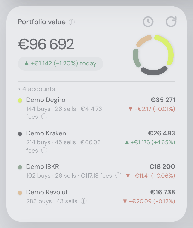
The Portfolio value tile shows your total (cash included — hover the value for what counts) and today's change. The refresh icon in the top-right corner fetches fresh prices. Its larger, thicker, lighter gray icon sits close to the card edges, with rounding that follows the card’s corner. Its tooltip shows the last update time and refresh help; the shared circular spinner appears while it works. A mini donut splits the value across your accounts — each named group of hand-added assets one of them; its colors tint the account names below. It keeps the same compact size as the Allocation ring as you resize the panel, with less empty space above it.
- To see per-account detail, expand the "▸ N accounts" row — or click the donut, which opens and folds the same list (its tooltip says Show the accounts or Hide the accounts; from the keyboard, Tab to it and press Enter or Space; a click on the grey small accounts arc opens the small accounts’ rows too, and a second click folds them again): each account's value with its own color-coded daily change (absolute and relative, on the same terms as the tile's headline change — the rows sum back to it), lifetime buy/sell counts and all fees found in its exports. During pre-market or after-hours trading, each account also shows its share of the extended-hours move on its own line, just as the tile's headline does. Accounts under 5% of the portfolio fold into a "small accounts" row; hand-added assets count under their named group, one account row per group.
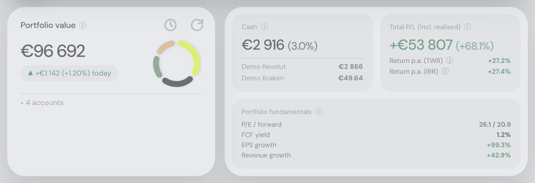
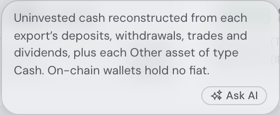
- The grouped card beside it holds cash (every export’s cash balance plus each Other asset of type Cash and each market-priced currency, with a per-account breakdown of where it sits, and what share of the portfolio that balance is beside the amount — 71 815 CZK (3.8%)), total P/L including realised gains (with the same profit as a percentage of the money you put in beside it), annualized TWR and IRR (methodology behind their ⓘ, the figures behind the numbers themselves — see below), and value-weighted portfolio fundamentals — harmonic P/E and forward P/E, FCF yield, EPS and revenue growth.
- That card shares the top row with the value tile alone (the Insights card that once stood in this band retired to the topbar bell, 31.08.2026): its three panels lay out for the width they have — side by side on a wide screen, two across with the fundamentals full-width beneath them on a narrower one. On a phone the cards stack.
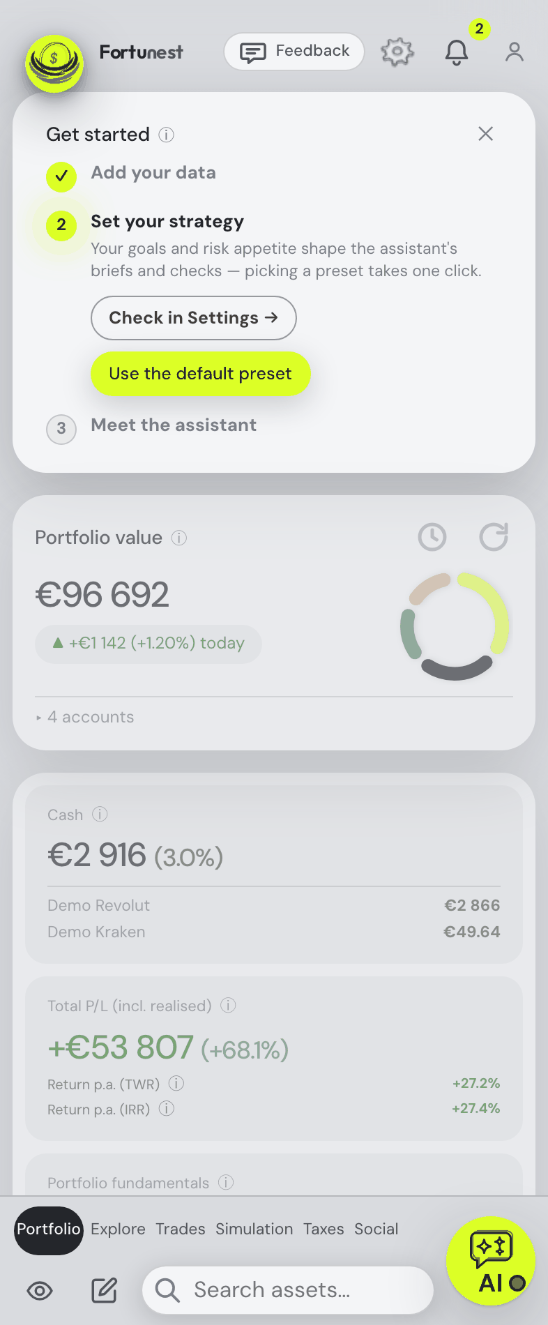
- The cards in this band all finish on the same line, the Portfolio value tile included. It grows to whichever of them is tallest and is never shortened to fit: expand “▸ N accounts” and the value tile becomes the tall one, so the row grows for it and the cards beside it stretch instead. When a card stretches, what is inside it stretches too: the Cash, Total P/L and fundamentals panels reach the bottom edge of the card holding them, so the border of space around them stays the same width on all four sides however tall the row gets. On a phone, where the cards are stacked, each keeps its own height as before.
P/L is total. It includes realised gains from earlier sells and everything you put in — not just the unrealised gain on what you currently hold. Units that arrive with no purchase behind them (a coin transferred in from a wallet or another exchange) count as money put in, valued at what they were worth on arrival, so the profit shown is what has happened since rather than the whole position. Staking rewards, Earn interest, airdrops and rebates are the exception: nobody paid for them, so all of their value is profit. The figures reconcile — your portfolio value minus your net contributions is your cumulative profit, and the tile differs from that only by the positions you have closed entirely, which it does not count.
The percentage beside it is that profit over the money put into these positions — every buy at its day’s exchange rate, so sale proceeds you re-invested count again — the same basis as the Return column per holding, taken over the whole portfolio (and the figure the Social snapshot shares). It is a simple profit ratio over the whole life of the portfolio, not a yearly rate; the TWR and IRR rows under it are the ones to compare with a fund or an index.
Two dialogs behind the figures. Click the Portfolio value figure — the amount itself opens the dialog, the title above it is plain text — for where it came from: deposits, withdrawals, dividends and interest, fees charged in cash, units transferred in or out, rewards in kind, profit on open positions (the Total P/L tile), profit on closed positions and a balancing “other cash movements” line — adding up to today’s value to the cent, each line with its own ⓘ — plus where the value sits (holdings vs cash) and the money moved into securities (buys including re-invested proceeds, sales, net). An account whose export has no cash history (a DEGIRO file) is named rather than shown as zero — and a deposits or withdrawals line that is zero says so right on the line (“no … rows in the imported data”), in neutral grey rather than a green positive. Click the Total P/L figure for every way to read it: the same profit over the gross money put in (the tile’s percentage), over the net capital in the positions (“value − P/L”), the whole account’s gain over net deposits, the profit including closed positions, and the yearly TWR and IRR — each with a one-line mental model and the full reasoning behind its ⓘ. The assistant can open either (“show me where my portfolio value came from”).
Every coloured number explains itself. Hover a percentage on this tile — or tab to it, the words are the same either way — and it says what it is measured over. Return p.a. (TWR): “Time-weighted return, annualized. +187.1 % in total. Since 2017-12-25 — 8.69 years.” Return p.a. (IRR): “Money-weighted return (IRR), annualized. Your deposit timing counts towards it, unlike TWR. Since 2017-12-25 — 8.69 years.” There is no cumulative IRR to show beside TWR’s: a money-weighted rate is fitted to your dated cash flows rather than compounded from a curve, so the tip names the span instead of borrowing the time-weighted total. Under a year of history there is no yearly rate at all, the row prints the cumulative total itself, and its tip says so. The Total P/L amount above them says what the figure is — the profit over the money put in, and the same Since… line — under its “click for every way to read it” invitation. It does not repeat the time-weighted numbers: those are the TWR row’s own, two lines below it, and that row explains them itself. Until 4 September 2026 this context sat in two small grey lines under the rows; moving it into the numbers gave the tile back two lines and let all three tooltips say it the same way. The friend’s shared copy of this tile on the Social tab gets the same tooltips, written by the same builder, in that sheet’s own date format.
The return rows never break in two. Return p.a. (TWR) and Return p.a. (IRR) stay on one line with their number at every window width, with the assistant docked, maximized or away. The tile has a floor — 196 px, measured as the widest row it can print — and when the band cannot give three tiles that much it lays out two, then one, rather than squeezing the card: the column count gives way, never the row. On a phone that means Cash and Total P/L take the full width one under the other instead of sharing a line, which is where the numbers used to drop under their labels. Same rule, same floor, on the friend’s copy of the tile.
The cash share is measured against the whole portfolio. The percentage beside the Cash balance is that balance over the Portfolio value tile’s own figure — every holding at today’s price plus that same cash — which is also the total each holding’s weight is measured against, so the tile and the Cash slice of the Allocation card’s asset-class donut always agree. One decimal; hover it (or tab to it) and it says so. A portfolio the app values at nothing has no share to show, so the tile prints the balance on its own; a real portfolio you are fully invested in genuinely reads 0.0%, and says it.
This is not the cost basis on the Taxes tab. For tax, moving your own coins between wallets is not a purchase: the original lot’s date and price carry over, and pricing the arrival at market would understate the taxable gain. That tab keeps its own cost, and the Cost column there explains the difference.
Time travel — the tab on a past day
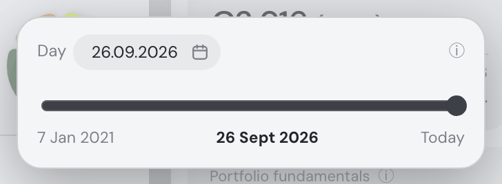
The clock in the Portfolio value tile’s top-right corner, beside the refresh icon, shows the whole Portfolio tab as your portfolio stood at a past day’s close: what you held that day, what it was worth, what it had earned. Click it and a small Time travel popup opens right below it.
- Pick the day in the popup’s Day field or on the slider under it — that is all the popup holds. The slider runs one step per calendar day from your first transaction (its left label) to Today (its right label), with the day under the thumb in bold between them. The stretch before the price data begins is shaded and cannot be chosen; a lighter shade marks days when one of your holdings had no closing price of its own and was valued by estimate. The popup’s ⓘ explains the rest, and on a past day names the holdings valued by estimate — “Valued by estimate on 12 Mar 2024: …”, with their share of that day’s holdings value. A day before the price data begins is refused in the popup with the reason, naming the earliest day that works; a day after today, naming today.
- There is nothing to approve. A day picked in the calendar (or typed) is shown at once and the popup closes when it has loaded; while it loads the popup says which day it is loading, beside a small spinning ring. The slider does the same with the day you let go on — or, with the arrow keys, the day you pause on: it shows that day and the popup closes once it has loaded; it never reloads for every day the thumb passes. Click outside the popup (or press Escape) to close it. Back to today: click the Today label at the slider’s right end — it applies at once — or drag the slider to that end, or pick Today in the calendar.
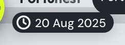
- The date is shown once, on a black pill that floats at the top left while a past day is on screen: a small capsule tucked beside the logo, its bottom level with the bottom edge of the logo and its clock right under the F of Fortunest. The first card starts just below it, with no gap left above. Click it anywhere on the page to open the same popup and pick another day. It stays in view as you scroll, and when you maximize a card (the value chart, the heatmap, Value per asset) it moves into that view’s top-left corner in the same style, where its clock works the same way. The pill belongs to the Portfolio tab alone: the other tabs never show it. The value tile’s clock stays highlighted too and takes the refresh icon’s corner.
- Every day is a calendar day at the close. A weekend or an exchange holiday shows the previous trading day’s close; crypto, which trades around the clock, moves every day. Amounts convert at that day’s ECB reference rate. There is no intraday view.
- Time travel from a maximized card. When you maximize a card on the Portfolio tab — the value chart, the heatmap, Value per asset — the pill stands in its top-left corner even while the tab shows today, reading Today. Click it for the same popup: the day you pick shows in the maximized card at once, and the card stays open. Close the card on today and the pill goes with it; the page itself never changes.
- Each card with a history shows that day — no card prints the date itself; the pill does: Portfolio value (with the day’s move; accounts you had not opened yet are left out), Cash, Total P/L with its TWR and IRR up to that day, the Portfolio heatmap (your holdings of that day, every window ending on it, each price as it traded that day — the Holdings row’s price, not today’s split-adjusted one), Allocation, Risk, Dividends & income and Holdings. Fair values are left out, since they compare today’s models with that day’s price. The dividend projection uses what each holding actually paid per share in the twelve months up to the day, not today’s declared rates. The Holdings card’s ✨ smart filter (and the assistant filtering it for you) asks about that day’s holdings too: “top 5 holdings” is the day’s five largest. Ranked by a fundamental such as P/E or PEG, which has no history, its note adds today’s figures (no history).
- Portfolio fundamentals and the Events calendar have no history. They stay on the page with one line instead of today’s figures: Current data — not available for past dates.
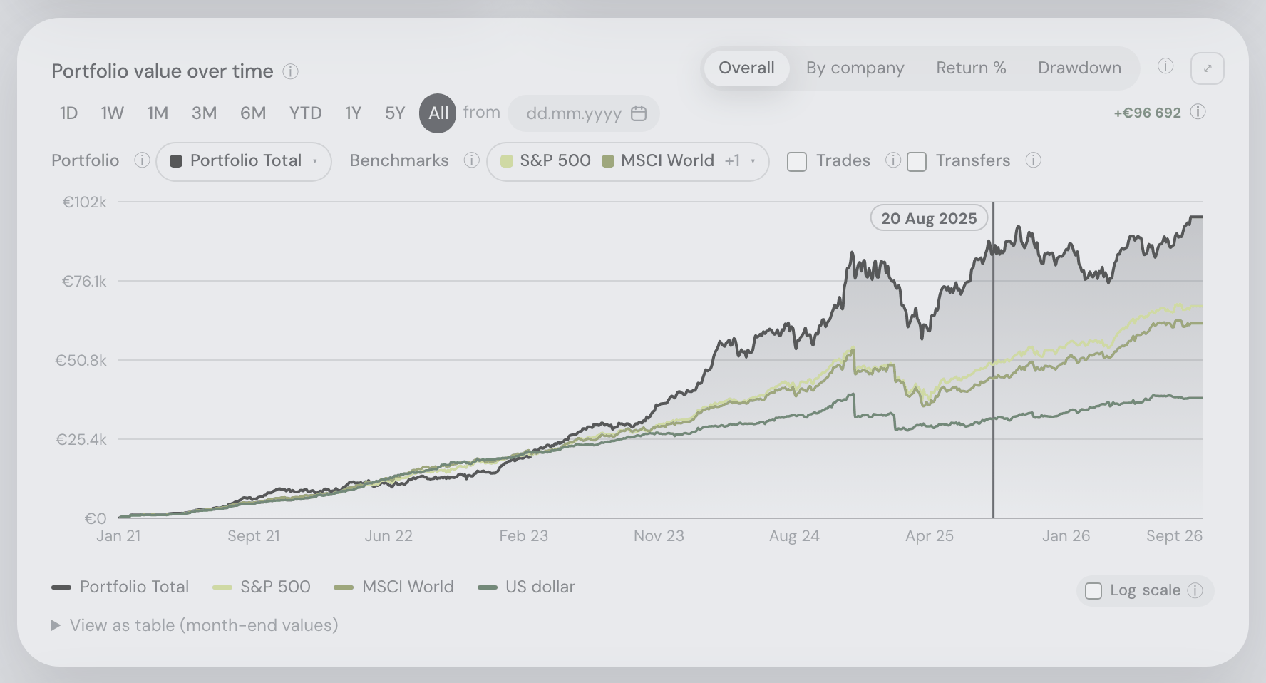
- The value chart keeps its data and draws a dated marker at the day on all four views — Overall, By company, Return % and Drawdown, maximized too — its date on a small label that stays readable over the lines; its range, lines and benchmarks stay as you set them.
- Click the value chart to pick another day. While a past day is shown, a plain click on the Portfolio value over time chart — no drag, no Shift, Alt, Ctrl or ⌘ — picks the day under the pointer; the hover readout says Click to show this day. It loads at once: the marker moves to that day reading Loading 12 Mar 2024…, and the chart takes no other click until the day has landed. A drag still zooms and Shift+drag still measures; on a phone a tap picks the day, while a swipe or a pinch does not. A click before the price data begins picks the earliest day it can show, and one at the right end goes back to today. If the day cannot be shown, the marker goes back and the reason appears above the chart.
- The day stays while you switch tabs and is gone after a reload. While it is set, prices are not refreshed in the background. The Market heatmap on Explore always shows today.
- The assistant knows which day you are looking at and can set it for you: “show my portfolio as of 1 March 2024”, “back to now” (
set_as_of_date).
Simple view
The whole tab, reduced to only the cards you pick, one under the other, in your order — made for a phone, where the full page is a long scroll past cards a glance does not need. Off by default, and while it is off nothing changes: the tab renders exactly as described on this page, and no other tab is ever affected.
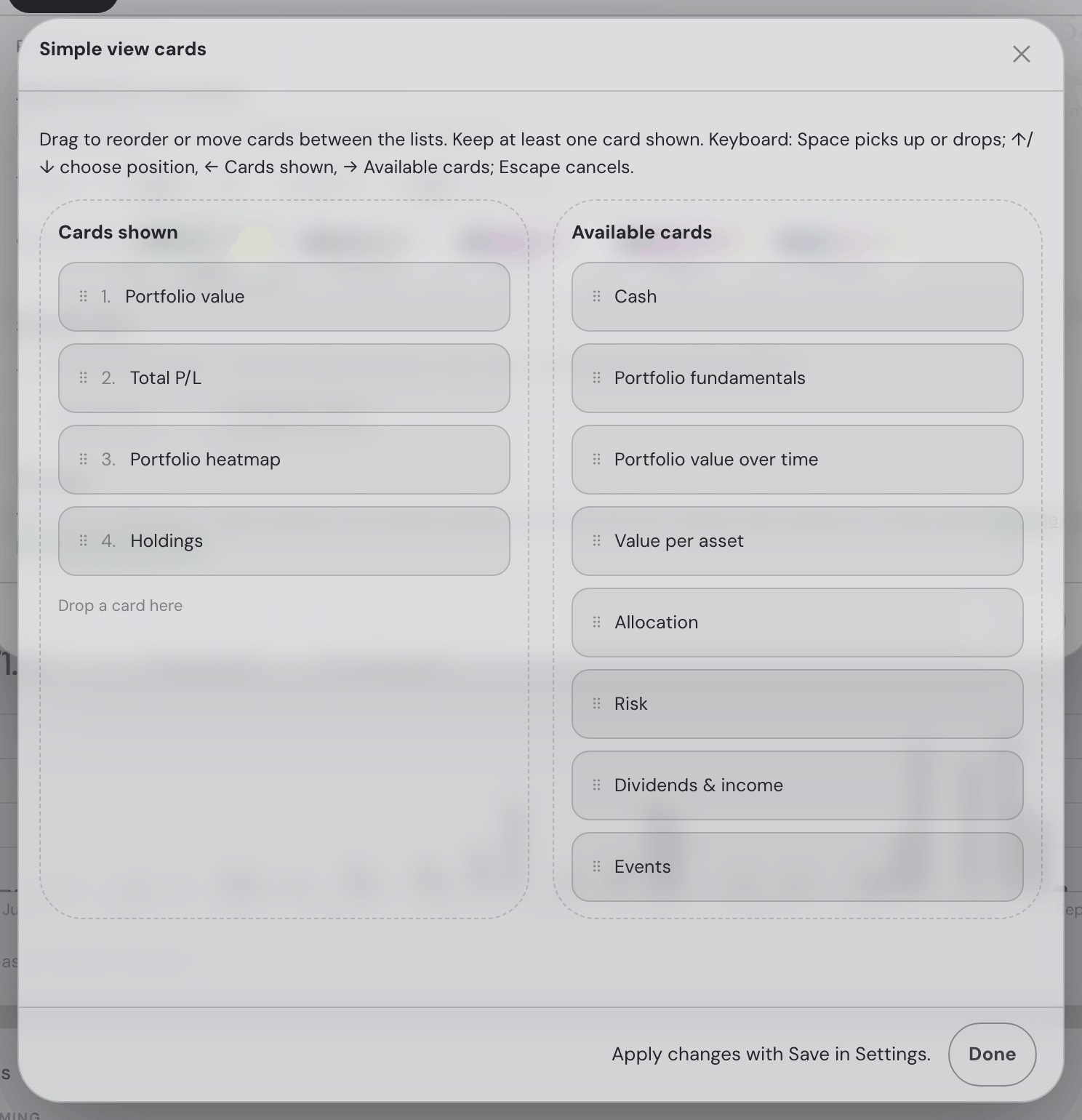
- On a phone, the small button left of the notes pad in the bottom control panel — a plain open eye — flips it; the button stays pressed while the view is on, and the eye’s pupil fills to say the same thing. It shows the starting four — Portfolio value, Total P/L, the Portfolio heatmap and Holdings — until you arrange the list.
- The list lives under ⚙ Settings → General → Simple view, behind Configure cards on every screen. The button opens an overlay; close it to return to Settings, then Save to apply the arrangement: any of the eleven cards — Portfolio value, Cash, Total P/L, Portfolio fundamentals, Portfolio value over time, Portfolio heatmap, Allocation, Risk, Dividends & income, Events, Holdings — dragged from Available cards into Cards shown, reordered there, or dragged back to remove it (at least one stays). Each card is in only one area. The picker supports mouse, touch and keyboard, and Done returns to Settings without applying the draft. The tab follows the list top to bottom, each card the full width — except that neighbouring hero tiles share a row wherever the screen has room: Portfolio value and Total P/L side by side on a desktop or tablet, ending together, one under the other on a phone. A card placed between two hero tiles keeps them apart. Switching the view off keeps your arrangement for next time.
- The assistant does both with one action,
simple_view— “just show me my holdings and the map”, “add the risk card”, “back to the full page”. It is told which cards are on screen, so asking it to show a card the view hides gets a straight answer (and the offer to add it) rather than a scroll to nowhere. - The warnings that can sit above the cards — short positions, opening balances, a skipped import, the getting-started checklist — stay in both views.
The animated Fortunest logo keeps a soft drop shadow in the header, including when WebGL is unavailable.
On a wide Portfolio view, the top summary runs horizontally: Portfolio value, Cash, Total P/L and Portfolio fundamentals. The three statistics share the space beside Portfolio value and wrap only when needed to keep their figures readable.
Insights & alerts
The Insights & alerts bell in the topbar, immediately left of your account button, is where the app tells you what deserves attention today — and, since 31.08.2026, its only home: the dashboard card it once minimised into is gone, along with the “Expand card” button and the remembered choice between the two. What the feed notices: the biggest mover by portfolio impact, earnings this week, concentration warnings, holdings near their 52-week high or low, idle cash, and a fund you hold that has a materially cheaper line on our shortlist — that last one naming both funds, both fees and the yearly difference, and saying in the same breath that the two were matched on broad asset class and nothing finer, so it is a fee comparison to look into rather than a swap to make (a developed-world fund and a US-only one are the same class and a very different exposure). Once the assistant is connected, up to four ✨ AI insights join — model-found patterns beyond the fixed rules, like correlated exposures or event-risk clustering — and every alert digest delivered by Settings → Alerts lands in the same list. The bell carries a count of everything still new on its corner. (It is the only bell in the app: the Social tab’s Friends & mentions button wears a people glyph, so the two never read as the same thing.) Hover the bell and the feed opens as a classic notification list: newest first, each row its glyph, its sentence, how long ago it arrived, and a dot while it is still new — clicking a row acknowledges an observation, or opens an alert’s digest in a dialog (the first open marks it read). It opens on click and on keyboard focus too (which is what a tap does on a phone, where the list is a bottom sheet), and Escape closes it. The bottom sheet is a phone posture only — screens 600 px and narrower, the same width the bottom control panel appears at. Every desktop window from 601 px up gets the 380 px popover hanging under the bell, with the page still visible and scrolling behind it; before 04.09.2026 the switch happened at 860 px, so a browser window around 800 px wide filled itself edge to edge with the list. The Social tab’s Friends & mentions list is the same component and moved with it. The bell rides every tab, so a delivered alert is one glance away wherever you are, and reading the list marks nothing as read by itself — only clicking a row does.
Every row also carries a small Ask AI button at the right end of its time line — the assistant’s three sparks and the words, “Ask the AI assistant more about this.” under the pointer. It closes the list and asks the assistant to explain that item, as your own message in the current conversation, and the answer starts straight away: an insight is quoted with when it appeared, a delivered alert with its title and when it arrived — plus the digest’s own words for the alerts the app writes from your own portfolio and market data (the brief, earnings, movers, drawdowns, fair value, events). A social or consensus-shift digest carries your friends’ words, and the question goes out as yours, so it is asked about by its title alone. Asking leaves the row as it was — the insight still new, the alert still unread. The same button sits inside every explanatory ⓘ tooltip in the app; Ask AI in the assistant chapter has the details.

Every mark in the bell’s list is an outlined glyph in the app’s own line style, never an emoji (26.08.2026) — a bar chart for the day’s biggest mover, a calendar for earnings, a warning triangle for concentration, an arrow into a ceiling for a holding at the edge of its 52-week range, a banknote for idle cash, a price tag for a cheaper same-class fund, an hourglass for a stale data source, the bell’s own glyph for a delivered alert, and the three-spark mark for anything the assistant wrote. They take the row’s own ink instead of the platform’s emoji palette, so the list reads as one set on every machine.
An unread row in the bell’s list is marked by its lime dot alone, plus a slightly bolder line — the whole row used to sit on a lime wash, which said the same thing far louder than it needed to and left the hover highlight nothing to say.
The value chart
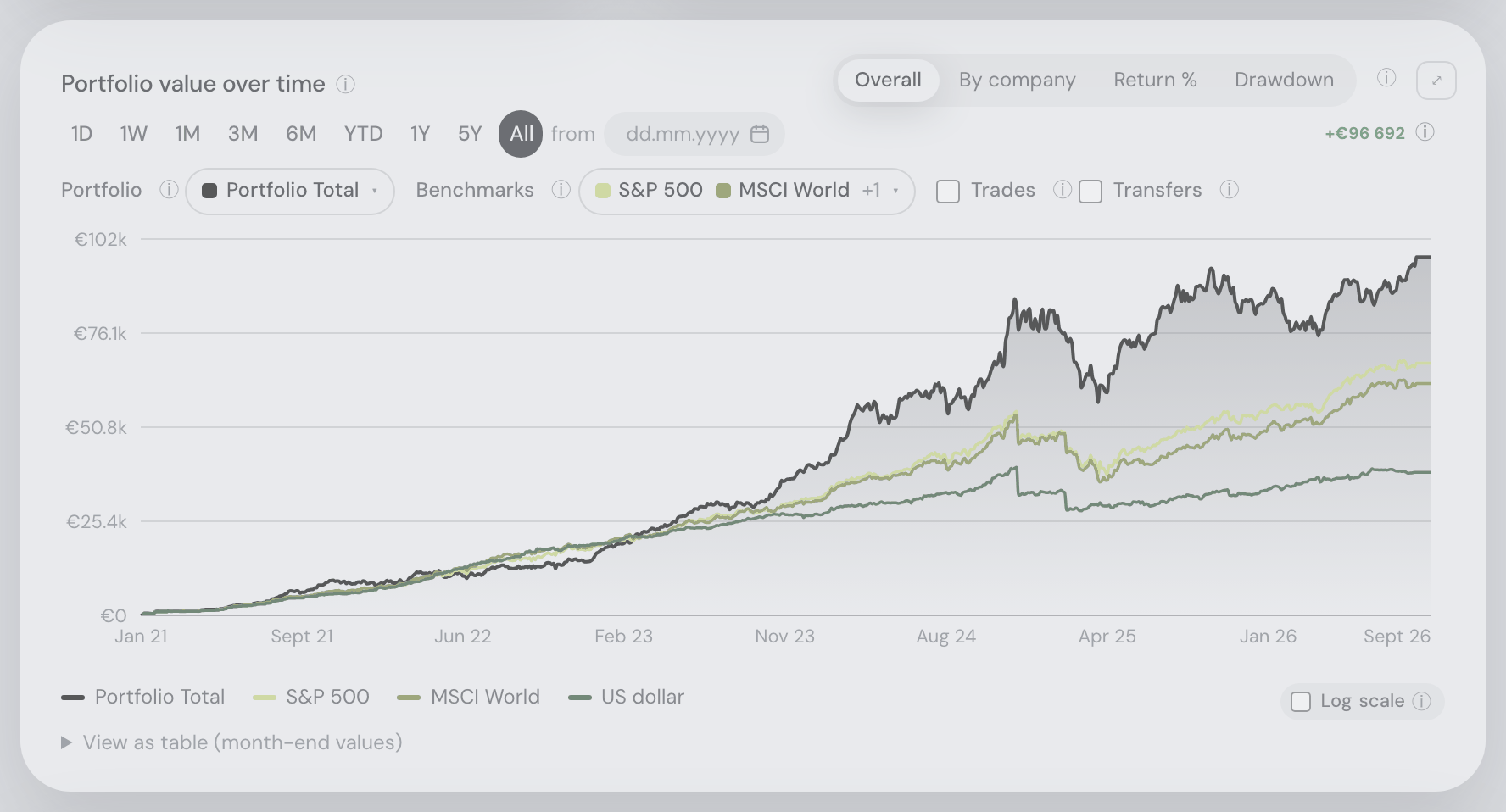
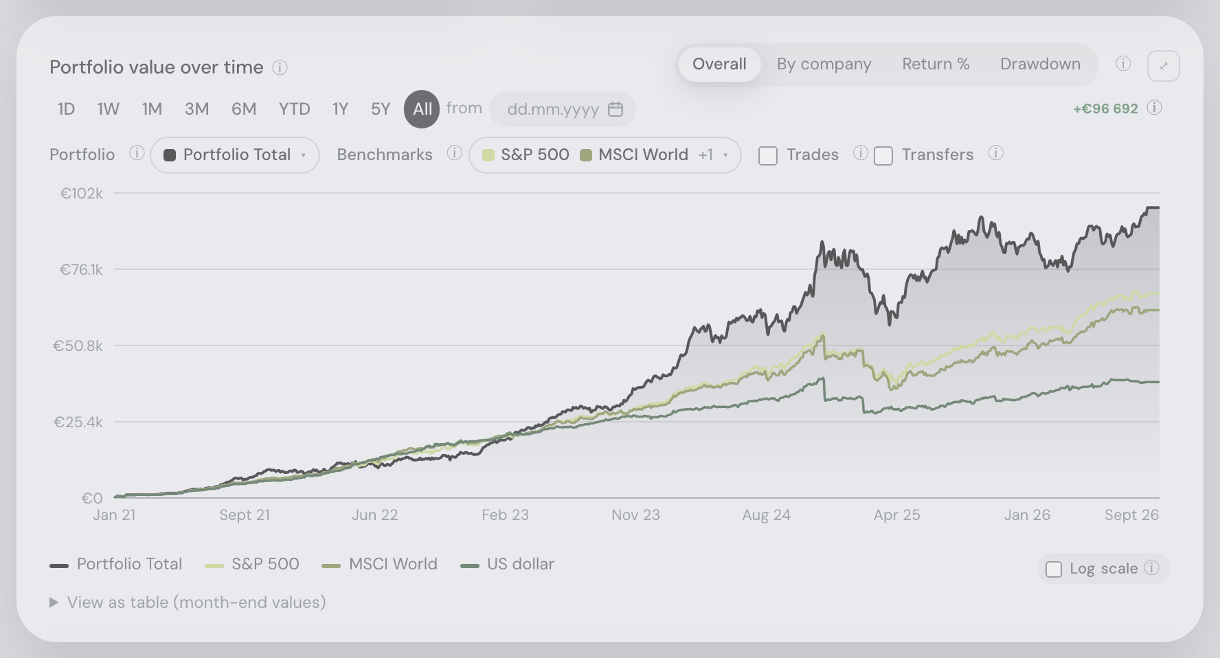
- What the chart shows, in one tip: the ⓘ right after the card’s title — Portfolio value over time, or Return over time and Drawdown over time in those views — opens a short, plain explanation of the chart: what the view on screen draws (in Overall, what your portfolio was worth on each day, in your display currency), one line on each of the four views, what a benchmark line is, how the range buttons and the “from” date pick the period, and that during Time travel a click on the chart shows another day. Like every explanatory tip it ends in the Ask AI button, which asks the assistant about the chart; clicking the ⓘ itself opens this chapter. The maximized chart carries the same ⓘ. The other, bare ⓘ at the right of the head, before the maximize button, lists the zoom, pan and measure keys.
- To mark what you did: the Trades and Transfers checkboxes above the chart drop your own buys, sells and cash movements onto the line as markers, so a step in the curve can be told apart from a deposit at a glance. Hovering a buy/sell dot lists that day’s trades — quantity and the price you paid, then what the trade cost or raised in your display currency (“▲ Bought 5 AAPL @ $123 · €615.40”). That total is your broker’s own cash amount, so fees are in it wherever your broker reports them, converted at the exchange rate of the day you traded rather than today’s — a €305.89 purchase with €1.38 of commission reads €307.27, not €305.89. Where the amount or that day’s rate cannot be worked out, the row shows the price alone rather than a guess. Each row’s leading mark wears its marker’s colour — the ▲ of a buy in the buy dots’ green, the ▼ of a sale in the sell dots’ red, and the ◆/◇ of a transfer and the ▣ of a correction in their markers’ hues — while the words stay in the tooltip’s ink; the asset drawer’s Price, Position value and Drawdown tooltips do the same. The key under the chart names ● buys and ● sells together for as long as the Trades layer is on; the transfer and correction shapes are listed only where one is actually drawn.
- When the card is narrow: the range presets slide sideways rather than wrapping onto a second line or shrinking into coins — the same one-line strip the tabs at the top of the app use, with the same soft shadow on whichever end still has presets hidden behind it. Flick or scroll it sideways to reach them; the highlighted pill travels with its preset. The strip is the first thing to give way: the ⓘ, the “from” date box and the change readout keep their places on that line while the presets slide, and only a card too narrow for half a strip plus all three of them wraps the row at all — the strip never gives up more than half its full width. Both this card and the heatmap below work this way.
- … and the two series pickers shrink to their colours before that row wraps: when Portfolio, Benchmarks, Trades and Transfers will not all fit on one line in full, the two buttons drop to the coloured squares of what is selected plus a “+N” count, which keeps the four controls together. The names are still there for a screen reader, the legend under the chart names every line that is drawn, and opening a picker names them all. What decides it is the width of the card, not of the window — the dashboard is two columns wide on a large screen, so a card on a 1400px window is narrower than the same card on an 800px one, where the full names come back — and it moves with your own labels: an account name in place of “Portfolio Total”, or one benchmark instead of three, changes where the switch happens.
- To keep a picture of it: maximize the chart with ⤢, then use the ⤓ button beside the ✕ to save a PNG of the current mode and range, named after the mode (
portfolio-overall.png). The download button appears only while maximized; returning to the card keeps your mode and range. - To get more room: the ⤢ button at the top right maximizes the chart over the page. While it is maximized the ✕ takes the ⤢’s place — one button to come back, or press Escape. The heatmap and the asset drawers’ charts work the same way. On a phone a maximized card fills the whole screen — edge to edge, top to bottom, with no page showing around it and no rounded frame; the notch and the home bar are still kept clear of the ✕ and the tools, and the page behind stays exactly where you left it. On a desktop the maximized card keeps its margin over the dimmed page, as before.
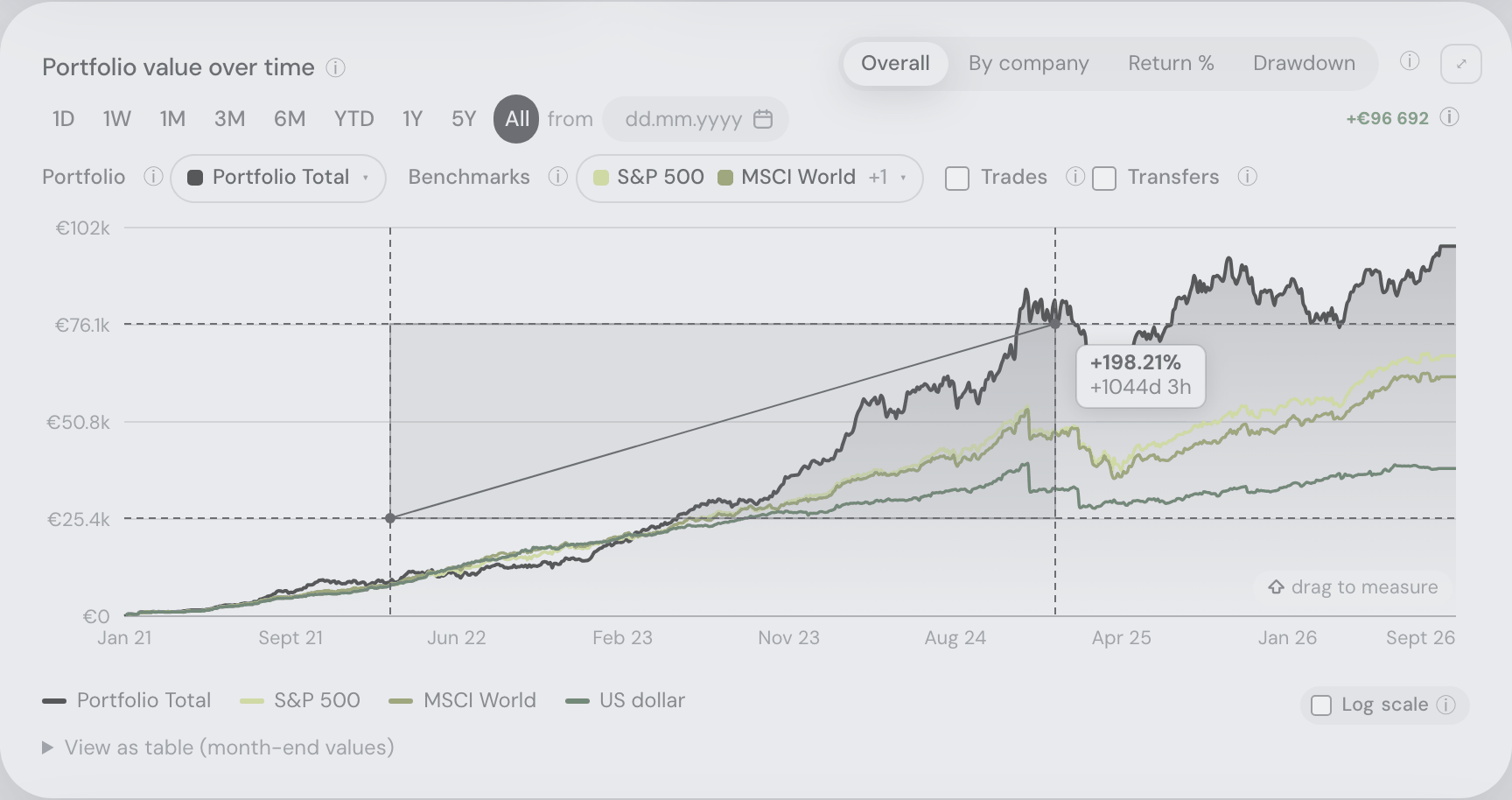
- To measure: hold Shift, press the left mouse button and drag on the plot. The ruler shows percentage change from the starting pointer value and elapsed time together in one small box beside the cursor, which follows the pointer as you drag and flips to the other side of it near the edge of the plot. It follows the drawn scale, including logarithmic charts. A zero starting value has no defined percentage. Release to clear the ruler; Escape cancels it. The bare ⓘ immediately before Download explains the chart controls.
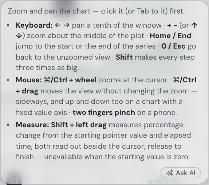
- To zoom: use the range presets, or drag a rectangle on the chart — a box zoom narrows both the time and the value axis (a flat drag zooms time only). On a phone, pinch the chart with two fingers: the time window narrows or widens around your fingers, in any mode, and can widen right back past the selected preset — the browser never zooms the page (a one-finger drag reads the tooltip along the line instead; while two fingers are pinching the tooltip stays hidden, until your next one-finger touch). “Reset zoom” or any preset clears it — and “Reset zoom” is a zoom’s undo only: it appears while one is standing and puts back whatever was underneath it, your “from” date or the selected range, never switching from one to the other. With a “from” date and no zoom there is nothing to reset, so the button is not there. On desktop, hold ⌘ (Mac) or Ctrl (Windows/Linux): the mouse wheel then zooms the time window, anchored at your cursor — the date under the pointer stays put — and dragging with the key held moves the view — sideways and up and down at once, without changing the zoom (the cursor turns into a grab hand, and the chart’s bottom-right corner says scroll to zoom · drag to move for as long as the key is down — on every zoomable chart in the app, and gone again the moment you release it, leave the chart or switch windows). Holding either modifier also puts the hover tooltip away (since 23 September 2026): the box, the vertical line under it and the dots on each series all disappear while ⌘/Ctrl or Shift is down, so nothing sits over the plot you are about to zoom, pan or measure — and the reading comes back by itself when you let the key go, with the pointer where you left it. Shift has a corner line of its own in that same place, drag to measure, naming the gesture below; with both keys down you see the ⌘ line, because that is what your next drag will do. The chart follows your hand: it shows exactly as many days as before, stopping at the ends rather than narrowing, and the value axis slides with it keeping the same span, so the shape you are reading never re-scales under the drag. Since 4 September 2026 a pan can also travel past the selected preset’s own start — the window you dragged to is the window you get. Let go and it stays; “Reset zoom” puts both axes back. On Return % and Drawdown the value axis fits itself to what is drawn, so there the drag moves sideways only, and stops at the baseline those views are measured from. A trackpad pinch does the same as the wheel. Without the key, the wheel scrolls the page and a drag draws the box, exactly as before. Or use the keyboard alone: Tab until the chart itself takes the focus ring, then ← → pan, + and − (or ↑ ↓) zoom about the middle of the plot, Home and End jump to the start or the end of the series, and 0 or Esc go back to the unzoomed view — hold Shift for a step three times as big. The keys only act while the chart has the focus, so an arrow over a chart you are merely hovering still scrolls the page; a screen reader is told the window after every press, and the whole list is in the bare ⓘ in the chart header, immediately before Download where that control is available. Shift + left drag measures percentage and elapsed time; release clears the ruler. Both ends of the measure are marked by dashed guides, and since 23 September 2026 each one crosses the whole plot — a rule straight across at both values, top to bottom at both dates — so either end can be lined up against any point in the series rather than only against the other end.
- To change what's drawn: two compact multi-select dropdowns pick the lines (total, each account, the diversification score — plus, under two expanders, the value split by asset type and by market sector) and the benchmarks. Sold positions keep their historical contribution; cash is its own type.
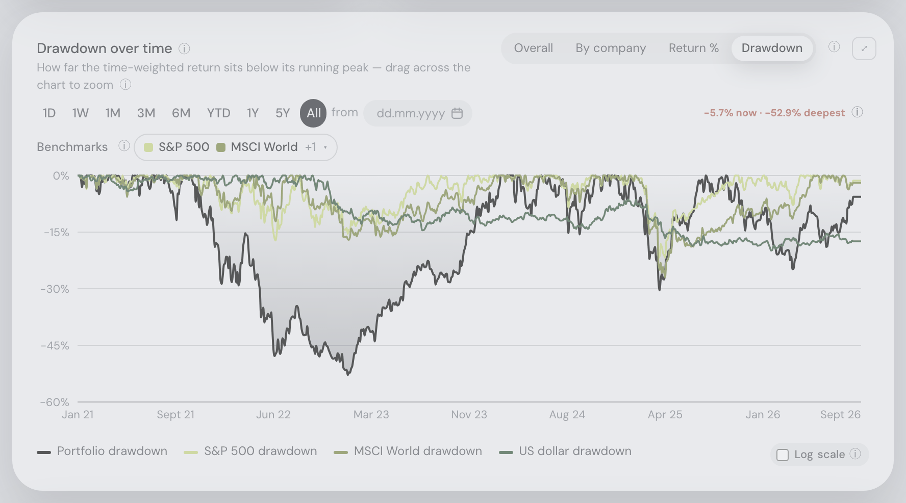
- To change the mode: Overall · stacked By company (top-10) · cumulative Return % (a Cumulative / Trailing 12M p.a. switch picks the lens: the cumulative TWR line beside the IRR compounded over the same span, or the trailing-12-month rates stepped monthly — each step is the return of the twelve months behind it, TWR chained daily and IRR from that year’s cash flows seeded with the value a year earlier, with the benchmarks read the same way; the first year of history is blank, the pair does not move with the range, and its last step is the last twelve months rather than the tile’s since-inception rate) · Drawdown, an underwater plot of how far the return sits below its running peak, recomputed for the period you select — every line, portfolio and benchmarks alike, starts at 0% on the window’s first day — with both of the portfolio line’s figures called out beside the presets: where it stands now and the deepest it went inside that period.
- Compact asset charts: Price captions and buy/sell legends sit beside the chart title. Every chart that marks trades names both sides in the same words — ● buys, ● sells — whether or not the range you are looking at happens to contain a sale, so a holding you have only ever bought says the same thing as one you have traded both ways. The Drawdown title carries an ⓘ — hover the title (or the glyph) for the explanation plus the selected period’s own current and deepest values. The readout at the end of that chart’s range strip prints both figures of the period you are looking at — “▼ −53.2% now · −82.2% deepest”, the same pair the portfolio chart’s Drawdown mode gives, with both spelled out in its tooltip. Pick a shorter range and the whole line is recomputed from the highest point inside it, so the readout always describes the days still drawn; a box or wheel zoom is a viewport, not a period, and leaves the peak where it is. The price charts’ badge is unchanged: there it is the change from the start to the end of the window. The same layout applies in full screen, wrapping when space is tight.
- To straighten a compounding curve: the Log scale checkbox, in the chart’s bottom-right corner — directly under the plot, on the legend’s own first line and set on two tight lines of its own, in the same place in every mode and at every window width. The tick, the two words and the ⓘ sit together inside a small grey pill, with “Log” and “scale” starting on one edge and the checkbox spanning both lines beside them, so the group reads as one control — and clicking anywhere on the pill flips the axis. On the two value views the axis steps by equal percentage rather than equal amount, so the early years read as clearly as the recent ones (a log axis has no place for zero, so it starts at the smallest positive value on screen). The percent views can’t take a raw log axis — a return crosses zero and a drawdown is never above it — so both plot the growth multiple instead (+300% is 4×, −40% is 0.6×) and label the axis straight back as a percentage; on Return % that keeps a huge TWR line and small benchmarks readable at once, and it turns on by itself when the spread is very wide. Each mode remembers its own answer, and yours always beats the automatic one. One caveat, which the ⓘ beside the checkbox repeats: on By company a stacked chart on a log axis stops being proportional — a band’s thickness no longer reads as its value, and only the top edge (your total) and the boundaries between holdings still mean what they did.
- To read the key: the legend under the chart names the lines and, on the same wrapping row, the marker shapes actually drawn — buy, sell, transfer in and out, corrections, and where an account’s trade record begins.
- To start later than your first transaction: set a date in the “from” field next to the presets and the chart shows exactly that day up to today. It replaces the range buttons rather than narrowing them: while a date is set none of them is selected, and pressing one empties the date — the two are one choice, and the ✕ beside the field is the way back to the buttons. The date also restarts every comparison there (see the baseline below). A date older than your first transaction simply means your whole history, and stays in the field. Both are remembered together, so a reload never brings back the one you left.
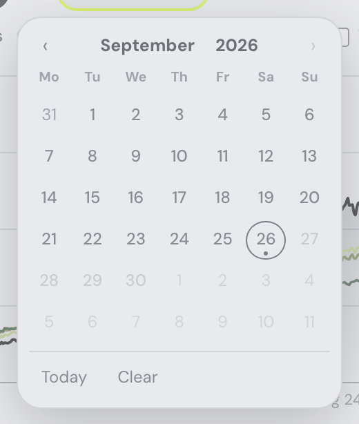
- The date is picked inside the app. Click the field (or its calendar button) and a small month grid opens under it, in the app’s own colours and type rather than the browser’s blue-and-grey date popup — the day cells are the same flat chips as the range presets beside them, and Today and Clear sit at the foot. You can still type instead: dd.mm.yyyy or 2026-09-22, both read the same. The month and the year in the heading are buttons: the year opens a grid of twelve years, a year opens its twelve months, and a month opens its days, so any date is three clicks away rather than a month at a time; the ‹ › arrows step whatever grid is on screen. From the keyboard the arrow keys walk the grid, PageUp/PageDown change the month (Shift with them: the year), Enter picks the day under the cursor — or, in the year and month grids, steps down a level — and Esc closes the calendar without changing anything. The grid only offers days your history actually covers; a date you type by hand is still taken as you wrote it. On a phone the box is not typed into at all — tapping it opens the calendar, and no keyboard slides up over the chart.
- To read exact numbers: switch to the month-end table view (full history, paged by 100 rows).
Seeing a holding on a date you know you didn't own it? Where an import cannot show when a holding arrived — an exchange API hands over only a few years of trades, a CSV only the range you asked for — the dashboard has to date those units by rule rather than invent a purchase, and the chart values them from that date onwards. The rules, what they deliberately get wrong, and how to close the gap are in Getting your data in.
The chart's baseline
Every comparison on this card is measured from one day: the start of the range you picked, or the “from” date when you set one — one or the other, never both. (“All” with no date means your first transaction.) Everything restarts on that day together.
- Each benchmark line opens at your portfolio's value there, so on 5Y the lines meet at the left edge and the comparison answers "what would the same money have done over these five years" — not "…since I started", which is a different question and, five years in, a very different-looking chart.
- The Return % line starts at 0, so a "+18 pp" read on the 1Y range is the return of that year rather than the all-time figure with its left edge hidden.
- The Drawdown's running peak is set on that first day — for every line on the card, benchmarks included — so a "−18% deepest" read on the 1Y range is a fall that happened inside the year, not an older crash showing through, and the "now" figure beside it is how far under that same window's high the portfolio sits today.
- The readout chip — beside the range presets, or beside the Return % lens switch — is the figure alone. Which span it measured lives in the ⓘ next to it, which names it exactly ("all time", "the last 1Y", "the period since 14 Mar 2024", "the zoomed period") and can never claim a span the chart is not drawing.
- In the value views that chip also carries the change as a percentage of the portfolio’s value on the first day drawn. Both halves include money you paid in or took out along the way, so this is the growth of the value rather than a return: a year in which you kept buying can end with the value clearly up while the holdings themselves lost money. For the returns that take your deposits out — time-weighted, and the money-weighted IRR — switch to Return %. The percentage is left off when the window opens at nothing, where any change at all would be an unbounded percentage of it.
One thing deliberately stays put: a box zoom does not rebase. It explores the window you already chose, and re-running every simulation on each drag would cost a server round-trip per benchmark.
IRR moves with the baseline too, but it is the one line the browser cannot work out for itself. A time-weighted return is a product of daily growth factors, so any window of it is just a ratio — the page rebases it instantly. A money-weighted rate needs your dated cash flows, so the server recomputes it for the window you picked, opening as if the whole portfolio had been bought on the period's first day (the same seeding the benchmark lines use). What you read is therefore a genuine IRR of that period, comparable to the TWR beside it, never the all-time figure relabelled. It is the only thing a range click waits for, and each window is remembered. Windows shorter than a year show no cumulative IRR line — an annualized rate over three months would be a guess — and the row beside the lens switch says "IRR needs a year in view". The Trailing 12M p.a. lens needs no round-trip and no minimum window: the year behind a month is the same year whatever range is on screen, so its pair is drawn from the full history and only cropped.
Benchmarks
Any combination of S&P 500, MSCI World, Nasdaq 100, US bonds (AGG), gold, the US dollar and Bitcoin — all total-return. In the value views they are flow-matched: the line shows what your same deposits on the same dates would be worth in that asset instead, starting from the baseline above. In Return % they follow the lens — their plain cumulative total return, or their own trailing-12-month returns, stepped monthly, under Trailing 12M p.a.
The Portfolio heatmap
The map shows nothing on an empty portfolio — the tile above already says there is no data yet — and appears on its own, without a reload, as soon as holdings arrive: the demo data, a first import, a source switched back on, a connector sync. It follows every later change to the portfolio the same way, re-asking which holdings you have and what they are worth after each one.
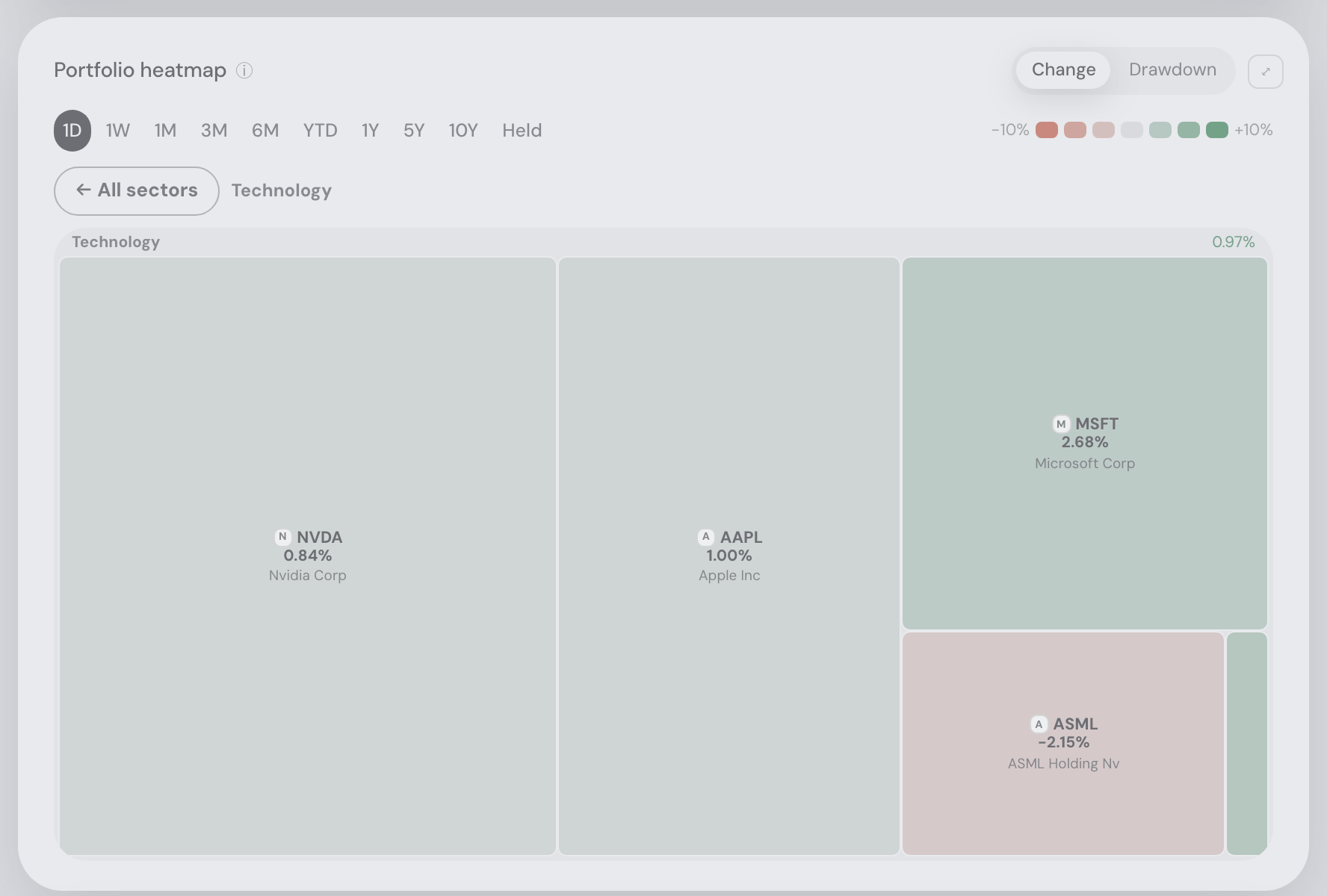
Click a sector label to zoom into it; its tiles fill the map and become easier to inspect. Keyboard focus plus Enter or Space works too. The flat All sectors button returns to the whole map. The colour scale, time window and metric stay consistent while zooming. Change and drawdown numbers in tooltips use the same coloured badges as the tiles, including tickers too small to draw. Missing drawdown remains uncoloured.
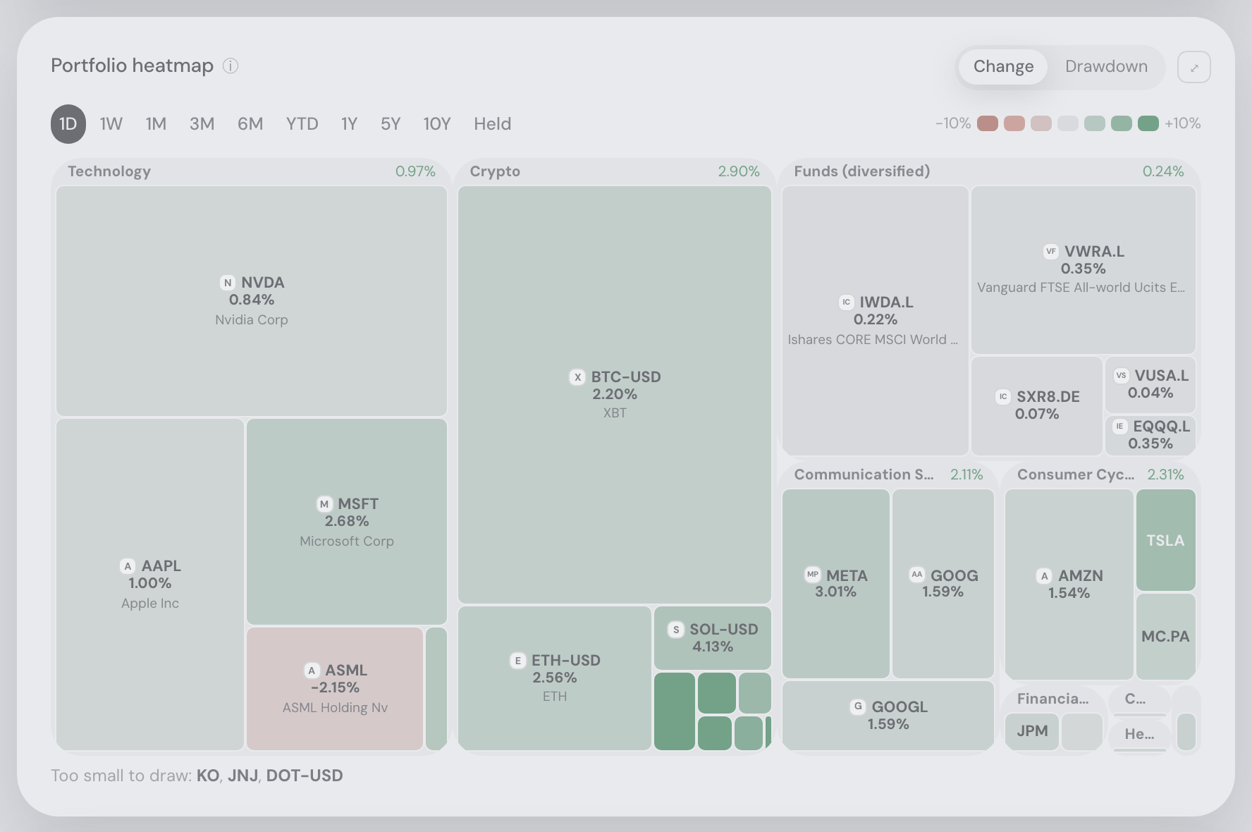
It shares a row with the value chart when the window is wide enough for both to stay readable, and drops underneath it when it is not — so minimising the assistant pane, or simply working on a wide screen, puts the two side by side. In that row the chart takes two thirds of the width and the map one third. What decides it is the space the cards actually have, not the size of your window: docking the assistant to the side takes width from them without changing the window at all. The pair now joins earlier than it used to — a window about 15% narrower is already enough — and the trade is visible and deliberate: in the narrowest side-by-side widths the chart’s own Portfolio · Benchmarks · Trades · Transfers row wraps onto a second line rather than keeping the map waiting; the controls flow, nothing is cut off, and a slightly wider window puts them back on one. In that row the map is never taller than the chart: it takes its height from the chart beside it and fills exactly the space it is given, so the two cards end in a straight line. Stacked, and on a phone, it sizes itself from its own width as before. Your portfolio as one picture. Every rectangle is a holding, scaled by what the position is worth and coloured by how its price moved; rectangles are grouped into labelled sector boxes, each showing its own size-weighted move, so a cell’s neighbours mean something. The chart above says how the whole thing did over time; this says which parts of it did it.
- Pick the window: 1D · 1W · 1M · 3M · 6M · YTD · 1Y · 5Y · 10Y, plus Pos — since you first held each position, which means a different start date for every cell. The window you last picked is remembered here, separately from the ones on the Explore heatmap’s grids. This card shows one thing — your holdings — so unlike the Explore one it carries no grid switch. On a narrow card the windows slide sideways instead of wrapping (the shadow on one end says there are more that way, exactly as on the app’s own tab strip), never below half their full width — the windows give way first, so the colour key keeps its place beside them, and only a card too narrow for the two together sends the key to the line underneath.
- Pick the metric: Change — the price move over the window in your display currency, the default — or Drawdown: where each price now sits below its own highest point within that window, in the same currency. In drawdown the map has no green pole — red deepens with the fall, neutral means “at its peak” — so “how deep under water is each of my positions?” is one glance. Remembered per grid, like the window; both numbers ride every cell’s tooltip, and switching repaints instantly with no reload.
- Give it the whole screen: the ⤢ in the card’s top-right corner stretches the map over the entire window — the same button the value chart carries, in the corner the column picker uses on other cards. The time windows and the colour key stay usable up there, and Esc (or the ⤡, or the ×) brings the page back.
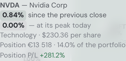
- Click any cell to open that asset — the full position drawer, exactly as clicking its row in the holdings table does. Hovering names the company, the move and the window it covers, the sector and the price of one unit — $2 689 per coin, per share for stocks and funds, per unit for commodity ETCs — plus the position: its value and weight (Position 535 983 CZK · 9.2% of the portfolio) and, on a line of its own, its profit or loss (Position P/L +30.7%). On a past day both are that day’s. Cells with room for it carry the issuer’s logo beside the ticker, the same mark the holdings table uses; the smallest keep the bare ticker rather than clipping a mark onto it.
The colour is the asset’s own price change over the window, in your display currency — the money the Holdings table beside it is in — green up, red down, grey for flat. The map is read against that table, so it measures the way the table does:
- 1D is each holding’s Daily P/L — the very percentage its Holdings row prints, not the exchange’s quote in the currency it trades in. A US stock in a CZK book moves with the dollar–koruna rate as well as with its price, in the row and on the map alike.
- Every other window, and the Drawdown, runs on the price converted at each day’s own exchange rate and ends at the value the latest price refresh gave the row. For a holding you did not buy or sell inside the window, the tile is therefore the row’s P/L over that window in percent.
- It says so: a tile’s tooltip reads −1.01% since the previous close, in CZK, the legend Change in CZK, and the ⓘ names the currency too. When prices refresh in the background, the map refreshes with the table rather than on its own ten-minute clock. The rare asset with no exchange rate into your currency is measured in the currency it trades in, and its tooltip names that one.
The Explore heatmap is the other way round: its grids are instruments, not your positions, so they stay in each listing’s own currency and say that. The scale is printed in the legend, and it adapts where no fixed number could: a quiet day still reads on the familiar ±3% scale, while “Pos” on a book held for years scales to what that book actually did rather than painting everything one flat green. Whatever cap is in force, the legend states it.
The heatmap only paints what it can measure. A holding with no usable price history is left out rather than shown as a grey “flat” cell — no data and no movement are not the same statement. Positions opened after the window began are still shown, counted in the legend’s caption, and say so in their own tooltip. Unless the card is genuinely wide, that caption tucks into a hover tooltip on the colour ramp itself. With nothing imported yet the card does not appear at all.
A position the map cannot show is named under it. A holding worth a tiny fraction of the book gets an honest rectangle — a hairline, or nothing where its sector box has run out of room — so a fine-print line below the grid lists them: “Too small to draw: … · Not placed (no market data): …”. Every ticker there opens that position’s drawer, exactly as clicking its cell would. If the map’s data cannot be loaded (“Market data is unreachable right now”), the card offers ⟳ Retry to load it again at once. Beside the value chart and when maximized, this caption has a stable two-line area with scrolling for longer lists, so its contents cannot repeatedly resize the map. The same line, and the same reasoning, as on the Explore heatmap — it is one card rendered twice.
On the first load the cells stream in behind a real progress bar; after that each window is cached, so flipping back is instant. The assistant can bring you here and set the window for you — “show me the heatmap of my portfolio since I bought”.
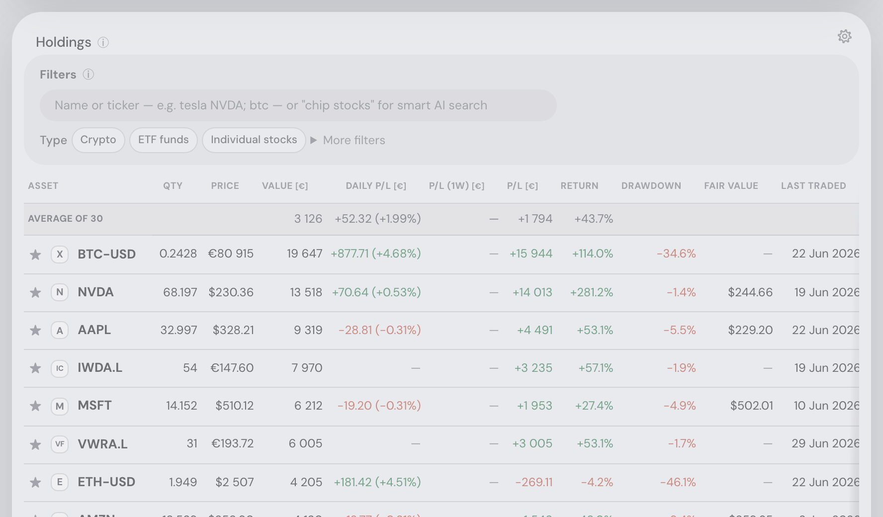
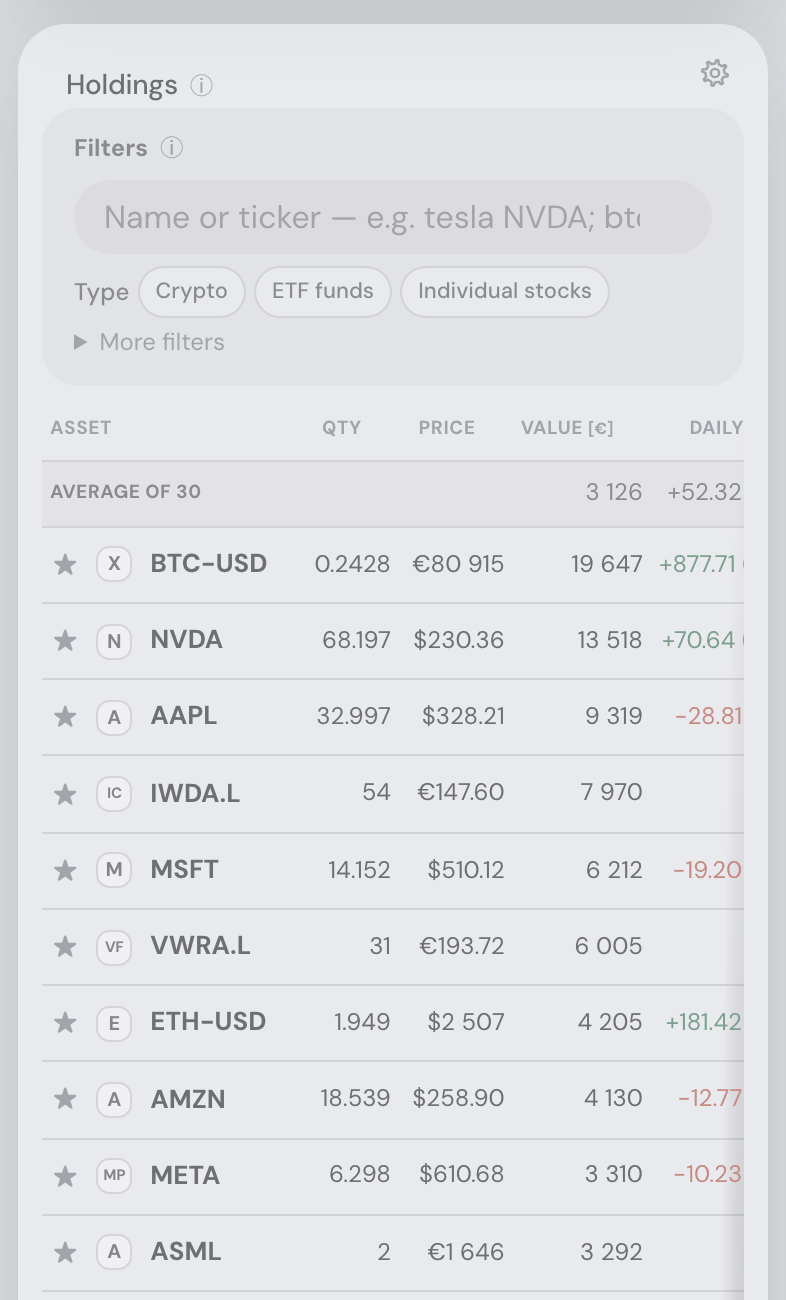
The holdings table
Long-table headers remain fixed during scrolling, including their sorting controls and horizontal column alignment. Small tables retain their normal scrolling labels.
Every ticker carries its issuer’s logo. Beside the symbol in the holdings table, in all four Explore tables, in the asset finder’s results, at the top of an asset’s details and on the tickers the assistant mentions in chat. A table of holdings is scanned rather than read — you already know which position you are looking for — and a mark is found faster than four capital letters, which are unusually hard to tell apart at a glance (AMD, AMZN, AMAT). The ticker never goes away; the logo is the fast path, not the name. A listing nobody draws a logo for — a small ETF, a newly listed company — shows a lettered tile instead, which is normal rather than a fault. The marks are fetched once, kept on our own server and served from there: nothing on the page reaches out to a stranger, so opening Explore tells nobody which shares you were looking at.
- The label row stays under the top bar while you scroll. Once the first rows have passed the top of the window, the header row — Asset, Qty, Price, Value and the rest — holds its place just below the app’s own top bar, so you always know which column a number is in, however far down the table you are. It works the same on a phone, it pans sideways with the columns when the table is wider than the screen, and the sort arrows in it stay clickable the whole time. It lets go again when the table itself has scrolled past, rather than standing over the next card. The same is true of every other long table in the app: the Explore tables, the Trades tab’s buy and sell candidates, and the Taxes tab’s lots and annual gains.
- To sort, click any column header: quantity, price, value, daily P/L (absolute and percent), total P/L, all-time return %, weight, drawdown, fair value — and, for funds, TER and what that fee costs you a year at your current position size (Cost / yr), so an expensive tracker is visible in the same place you read its return.
- The currency is named once, in the header. Value, Daily P/L, the period P/L, total P/L and Cost / yr are all in your display currency, so their headers carry it — VALUE [€], DAILY P/L [CZK], P/L (1W) [$] — and the cells print bare figures, the averages row included. Price and the fair-value columns are in each instrument’s own trading currency: while every row on screen shares one, the header takes it (PRICE [$], say, once you filter to US stocks); a table that mixes currencies keeps a plain PRICE and each cell names its own — “$224.58”, “€12.50”, “496.00p” for a London quote in pence. Symbols and codes follow the one rule for amounts.
- How many decimal places a quantity gets depends on how big it is (since 10 September 2026). A whole number shows none (1 447), a quantity in the thousands or above one (3 039.6), in the hundreds two (897.55), from one upwards three (16.358), and anything under one keeps four significant digits so a small crypto position never rounds away to zero (0.2428, 0.000123). Josef, of a coin count printed as 6 009.256: large numbers “shouldn’t display so many decimal points, 1 is enough”. The same rule applies to every quantity in the app — the holding drawer’s Shares held, the Taxes tab’s lots, the Trades plan’s units. Prices are unaffected: they have their own rule.
- To check how your data was read, open ▸ N data notes under the table. These are the footnotes the importers leave when an export does not fully explain itself — an opening balance that had to be assumed, units written off to match the balance an exchange reports, a sale that exceeds the purchases your files know about. They are folded away because a long crypto history can produce a dozen of them, and they matter only when a number looks wrong. The assistant reads them whether the fold is open or not, so you can simply ask it about one instead.
- Only the search box and the Type chips stay open. Everything else in the Filters box sits behind a collapsed ▸ More filters expander — the same fold as the data notes below the table — so the tile costs two lines instead of five. Its summary counts what it is hiding (“More filters · 2 active”), so a size threshold or a sector chip left switched on behind a shut fold can never quietly drop rows.
- To filter by size, open More filters and use the ≥ / ≤ selector and the amount box, in the currency you pick next to them — "everything over $2 000" without sorting and counting.
- To see a longer window than a day, switch on the period P/L column in the table's ⚙ popover — it appears next to Daily P/L and shows each position's profit over a window you pick there (1W by default; 1M, 3M, 6M, YTD or 1Y), honestly net of any buys and sells inside the window, with a dash where your history doesn't reach back that far. Both choices are remembered in your browser.
- Where a price has gone quiet, both P/L columns show a dash rather than a zero. Prices are carried forward so a position always has a value, but if its price feed has gone quiet for longer than that instrument normally goes between quotes — a delisted token, or an instrument valued from your own fills — how much it moved is unknown, and unknown is not “0,00 €”. A market that is merely closed is not the same thing: your US holdings before the New York open read a plain 0.0%, and Friday’s close still counts on Sunday.
- To filter by name, type names or tickers into the Filters box (separated by spaces, commas or semicolons).
- To filter by meaning, wrap the text in quotes —
"chip stocks"✨ asks the assistant to select the matching tickers semantically (needs the assistant connected). - To filter by a metric, quote a top-N or metric query —
"top 5 holdings","my best PEG holdings","7 of my highest free cash flow holdings". These are answered instantly without the assistant; the rows come back ordered by the metric with a small caption explaining the sort, and clicking a column header still re-sorts as usual. - To filter by category, use the opt-in chips: the Type chips (asset types) sit in the open box, the Sector chips under More filters. Chips within one dimension are an OR, the two dimensions an AND.
- The count, combined value and daily P/L of the visible subset are always shown, so a filter doubles as a quick "how much is my tech worth" answer.
- An averages row opens the table — Average of 52 over the currently filtered set, with each column’s equal-weighted mean in the column’s own format. Re-filtering re-averages; positions missing a value are skipped rather than counted as zero; Price averages only while every visible position trades in one currency (a mean across currencies is not a price, so it shows a dash). It appears from two visible positions up.
Last traded shows the latest recorded buy or sell date across accounts and sits before Weight by default. Click its header for newest first, then oldest first. A dash means no recorded trade; these rows stay last in either direction. Transfers, rewards and reconciliation rows do not count as trades.
The card’s own Holdings ⓘ says what the table does with a click — “Click a position to see its history and analysis” — on hover rather than as a permanent grey line above the filters.
The header stays while the rows scroll (since 4 September 2026): on a desktop, wherever the table fits the card’s width, the column labels stick under the top bar as you scroll down a long list. On a phone the Asset column stays put instead — the ticker, its logo and the watchlist star hold the left edge while the numbers scroll sideways under them, and since 10 September 2026 that column is also kept to under half the screen. A holding with a long name — the kind an exchange gives a liquidity token — used to run it across most of a 393 px phone, which pushed Qty off the right edge and Price out of sight behind the sideways scroll. Long names now shorten to an ellipsis earlier, with the full name a tap away in the cell’s own tip, so Asset, Qty, Price and Value are all on screen at once. A portfolio of plain tickers keeps its own narrower column, and nothing changes on a tablet or a desktop.
The Asset column shows the ticker only — hover briefly for the full company name. Every listed row opens with its watchlist star, left of the asset mark and the ticker — the same favourites the asset finder and the Explore tables toggle, kept in sync live, and in the same place they show it — so a holding is starred right where you already read it; the star takes the click for itself, and clicking anywhere else on the row still opens the drawer. Assets without a ticker show their name greyed; the same hover tip says they are unlisted (and whether their value is estimated from your transactions) — an unlisted asset has no market symbol a watchlist could hold, so it shows no star, though its slot stays reserved so every row's mark still starts on the same edge. A rare over-long name is cut off with an ellipsis rather than widening the column — the tip always carries it in full. Account badges show which broker holds each position.
The Drawdown column says how far below its own 52-week high each position trades right now — 0.0% at that high, −31.2% a third below it, with the date of the high on hover. It is where the position stands today, not the worst fall it ever took, and that is the useful one: it answers “what of mine is beaten down?” in a column you can sort. It is measured on the holding’s own price in your display currency, so a currency move counts the way your account feels it, and it shows a dash — never a zero — where no price history covers the year, because a position nobody can price is not a position sitting at its high. The Explore tables ask the same question of any listed stock, measured against the market’s own reported 52-week high — that one is an intraday figure, so the same ticker reads a point or two deeper there than here, where the reference is the highest daily close. Both are honest answers; the column tooltips say which is which. The assistant can rank on it (“what’s most beaten down?”, “good companies that just sold off”).
The Fair value column carries the asset drawer’s Fair value card into the table: the confidence-weighted average of six textbook valuation models (DCF, Graham, Lynch, EV/EBITDA, dividend discount and sector multiples) for every position you hold. It is on by default; behind the ⚙ sit seven more — FV upside, the gap to today’s price as a signed percentage, and one column per model (FV DCF … FV Multiples) — so you can see where the average came from. All eight sort. The fair value is stated in the holding’s own trading currency, the same unit as the Price column beside it, so a euro-listed position shows a euro fair value against its euro price and the row never compares two currencies; the upside is a ratio and reads the same whatever the money. A model the outlier guard left out of the average is still shown, dimmed, with the reason on hover — asking for the DCF and being given a blank would make the column look broken. Anything the models cannot value shows a dash: an ETF trades at the value of what it holds, a coin has no cash flows, and a manually tracked asset has no fundamentals at all. The Explore tables carry the same eight for any listed stock. Illustrative orientation over public fundamentals — not financial advice, and not a price prediction.
Per-asset drill-down
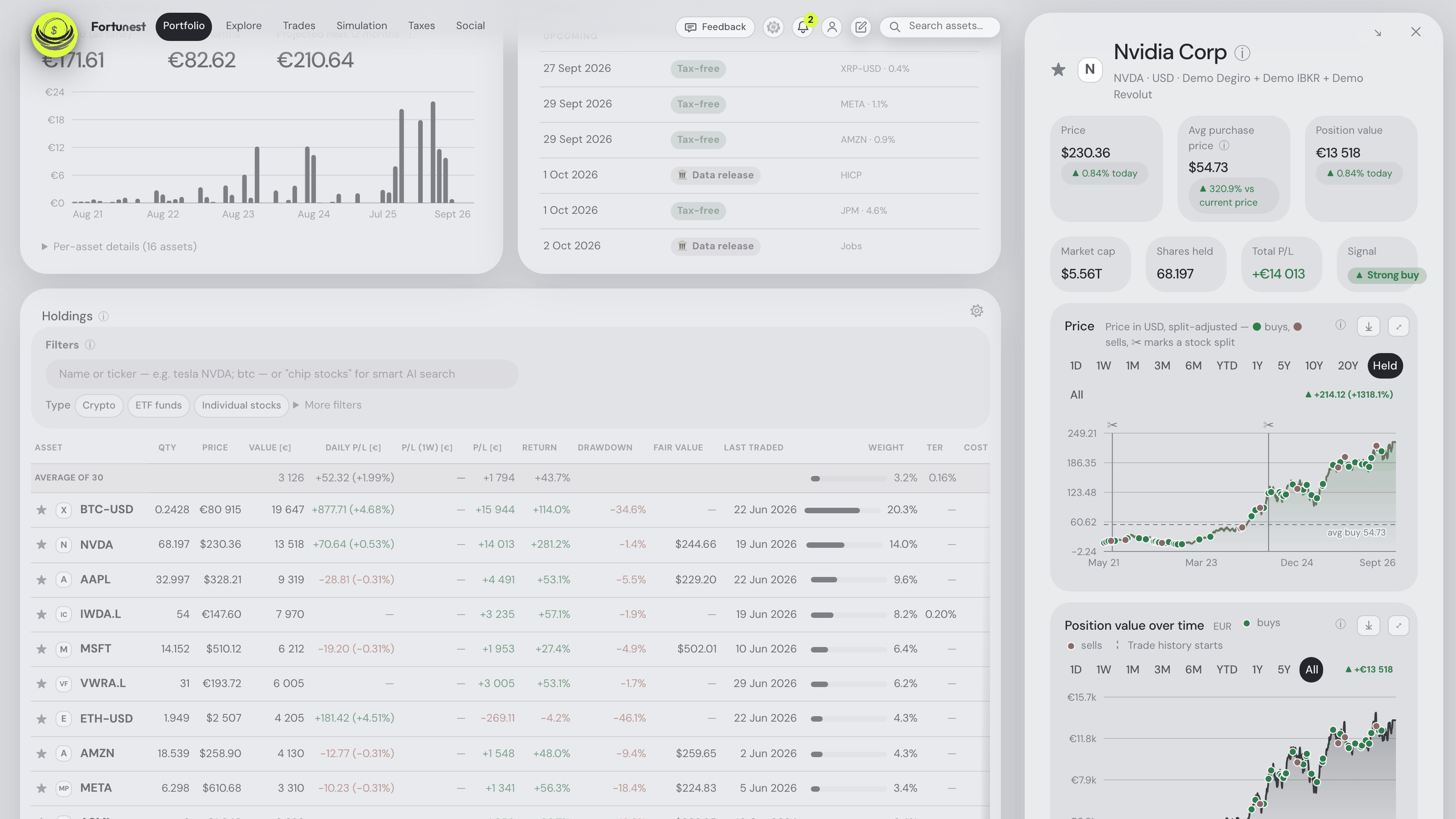
Click any holding to open its detail panel. Its head opens with the watchlist star, left of the asset mark and the name — it says at a glance whether the open asset is already a favourite, and one click stars or unstars it, with the Holdings table, the finder and the Explore tables following instantly (the unowned-stock drawer has the same star; an unlisted holding, having no market symbol, has none). Below that:
On a wide window the panel opens beside the dashboard rather than over it. Given room for three columns it docks as the middle one — dashboard, asset details, assistant chat — with nothing dimmed behind it. The dashboard stays fully usable: it scrolls on its own, and clicking another heatmap cell, holdings row or favourite swaps what the panel shows instead of asking you to close it first. It docks from about 1900 px of window width with the assistant chat docked beside it, and from about 1480 px with the chat closed or floating; narrower than that it is the familiar overlay with its dimmed backdrop. The arrow button next to the panel’s ✕ switches between the two by hand — the same control the assistant chat uses — and your choice is remembered for the rest of the browser-tab session. On a phone there is no such button: a phone screen can never hold the column, so the panel keeps just its ✕. Both buttons look like the assistant chat’s own: plain icons that light up on hover, taking a frosted backing only while the panel is scrolled under them. And with the panel docked, the header’s search box and quick-notes pad stay exactly where they always are — on the row with Feedback, Settings and your account, their right edge on the dashboard’s; only the overlay pulls them out of the bar to clear its ✕. While it is docked, maximizing a card fills the dashboard column only: the ⤢ on a chart card or on the Portfolio heatmap ends the enlarged view exactly where that column ends, just as it already stops short of the assistant chat, and the panel stays beside it at full brightness and still clickable. A chart maximized from inside the panel spreads over the dashboard for the same reason. Esc closes one surface per press there — first the enlarged card, then the column — and the press that closes the column leaves the assistant chat docked beside it exactly as it was.
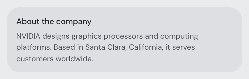
- About the company — what the asset is, in two sentences: what the company does, where it is headquartered and where it operates. It has a section of its own, directly above Recent news, titled by what the asset is: About the company for a stock, About the fund for an ETF or a fund, About the coin for a cryptocurrency, and About this asset for anything else, such as a gold ETC. The same two sentences appear when you point at the asset’s name or logo at the top of the panel, and a small ⓘ right after the name marks that they are there — point at it, tab to it, or tap it on a phone to read them. An asset with no description has no ⓘ. The text is the company profile the market-data feed publishes — its first sentence and the one naming the head office, with the country added when the profile leaves it out — and a coin’s price and supply figures of the day are never picked. Only when the feed has no profile does a fast AI model write one from the listing’s name, type, sector and country; it may say it does not know the asset rather than invent something, and like any AI text it can be wrong — read it as background. The panel does not print where the text came from; the assistant knows, if you ask it. The paragraph everybody sees is written only by the app’s own model, on the free assistant budget. One written by your AI provider — your own key, or your Ollama or LM Studio server, as on the desktop app — is kept for you alone and never shown to anybody else. Shared descriptions are kept for everybody, so an asset is looked up once rather than on every visit; a generated one is replaced as soon as the feed has a profile, and an asset the model does not know is not asked about again for up to a week. A holding you track by hand, and an asset nobody can describe, show no section at all. The unowned-stock drawer carries the same section, and the assistant can read it too — as background from a third party, never as instructions.
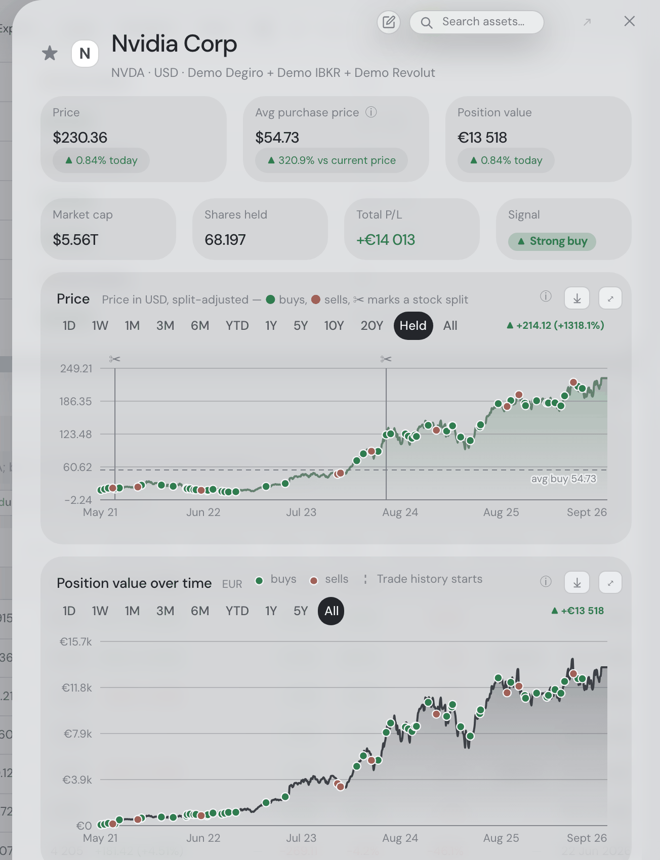
About the company · Demo - A row of stat cards above the charts, reading Price, Average purchase price, Position value, then Market cap, Shares held, Total P/L and the signal — the signal always last. The three cards that carry a daily ▲/▼ figure share the top row and the short ones the row below, each row divided equally over its full width so no card is ever left beside a gap; on a phone they pack two to a row and the odd card out takes the full width. Price, market cap and the signal are there only for listed holdings, and the average purchase price only once one is known. Market cap names the currency its figure is in, as Price does (“$5.56T”) — dollars for a non-US listing, whose market figures are converted to USD. The daily ▲/▼ under Price and under Position value is the price’s own move in the currency it trades in, and each card’s ⓘ says so: the Holdings table’s Daily P/L for the same position is in your display currency, so an exchange-rate move can put the two apart. The Drawdown chart’s tip names the listing currency too.
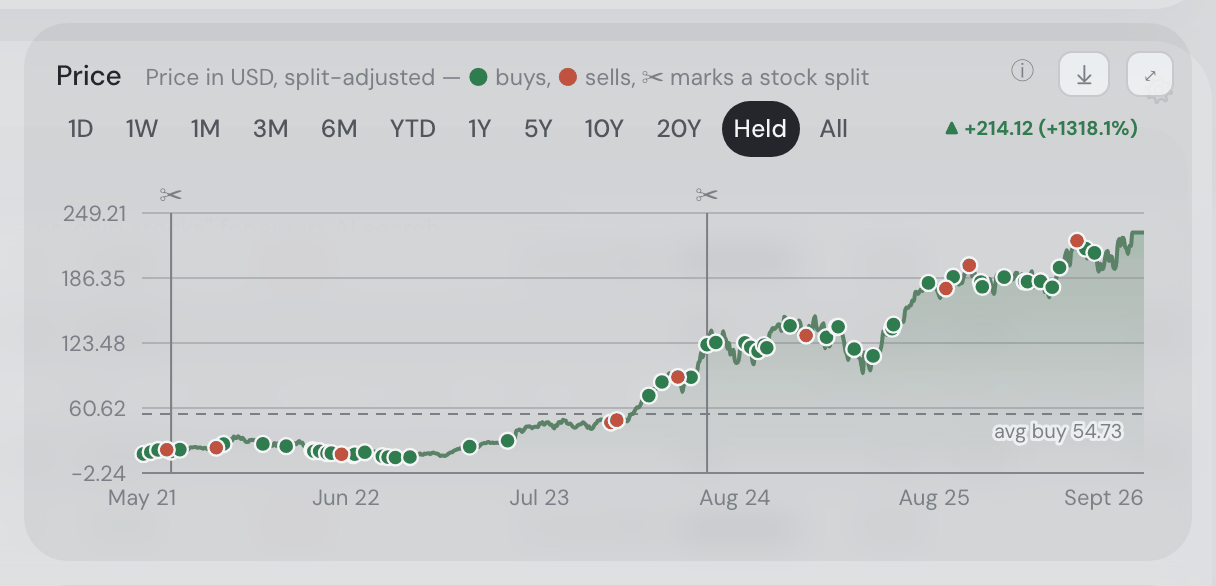
- Two zoomable charts — the split-adjusted Price chart first, then position value over time under it — with range presets (down to 1D/1W), drag/box zoom, pinch on touch, ⌘/Ctrl + wheel or drag on desktop, the keyboard once tabbed to (arrows pan, +/− zoom, 0 resets), and green/red buy/sell markers (hover lists each transaction — quantity, the executed price and what it cost or raised in your display currency, the same row the portfolio chart’s dots show) plus ✂ split markers. Short ranges load intraday prices (5-minute to hourly). Both lines are color coded by the selected period: green when the period ended at or above where it started, red when it ended lower — the same verdict as the ▲/▼ figure at the end of the range row, and it changes with the range you pick. Both charts maximize to full screen (the ✕ where the ⤢ sat, or Escape, brings them back) and export as PNG. Maximized, every drawer chart — Price, position value and Drawdown, and the Price and Drawdown charts of a stock you do not own — has the portfolio chart’s Log scale checkbox under the plot. It is remembered while the drawer stays open; the small chart in the drawer always uses the linear axis. On the Drawdown chart, log scale plots each point as the multiple of the peak that remains (−50% is 0.5×), with the axis still labelled in percent. The position chart keeps its title, currency and marker keys in one left-aligned wrapping row. Complete labels stay together; correction and trade-history keys share a line wherever they fit. Hover a marker for transaction details.
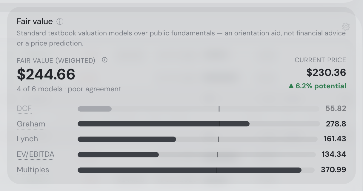
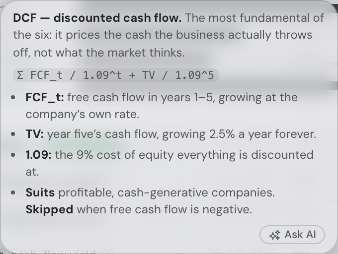
- A Fair value card, sitting directly above the Analysis card: six textbook valuation models run over the same fundamentals the drawer already shows, plus the confidence-weighted average they add up to and the percentage gap to today’s price. DCF discounts five years of free cash flow at the company’s own growth rate and a 2.5% perpetuity after it, at a 9% cost of equity. Graham is his revised formula, growth capped at his own 15%. Lynch gives a company the P/E its growth plus dividend yield earns it. EV/EBITDA asks what the whole business would fetch at its sector’s typical multiple, less the net debt that comes with it. DDM values the dividend stream alone. Multiples puts next year’s earnings on the sector’s median P/E. Each is one bar on a shared scale with a hairline where today’s price falls, so a bar reaching past the mark is a model calling the share cheap; hover a bar for the assumptions that produced it, or a model’s name for what it prices and which kind of company it suits. Both tips open where the pointer is: a model’s name gives a bold one-line summary, its formula set apart (Graham’s
EPS × (8.5 + 2g) × 4.4 / Y), and short bullets on what the numbers mean and where the model suits or misleads; a bar gives that model’s value and the inputs behind it. Like every explanatory tooltip, both stay open while you move onto them and end in an Ask AI button. The card opens with what it is — standard textbook valuation models over public fundamentals, an orientation aid rather than financial advice or a price prediction — and keeps the rest brief: under the weighted value a compact “4 of 6 models · poor agreement” says how many models the average stands on and how far to trust it, and the explanations sit in the two ⓘ tips, formatted as a bold lead and bullets. The heading’s ⓘ says how to read the bars; the weighted value’s ⓘ (the one a tap opens on a phone) says what went into this average — how many models could be evaluated and how well they agree, the weight each carries here, the outlier rule and any currency conversion. A model that cannot be evaluated is never guessed — that tip lists it with the reason (no dividend, a bank’s enterprise value, negative free cash flow) and the remaining weights renormalize — and a value more than 2.5× away from the median of its peers is shown dimmed but left out of the average, so one wild input cannot move the verdict. Only companies get a fair value: an ETF trades at the value of what it holds and a coin has no cash flows, and the card says exactly that instead of disappearing. Stocks you do not own get the same card in their Explore drawer, and the same figure drives the Fair value criterion on the Trades tab and the Below fair value alert. - A drawdown chart third from the top, under those two: an underwater plot of how far the price sits below its own running peak, 0% at every new high, with the wash filling from the axis down to the line — the portfolio chart’s Drawdown mode asked of a single asset. The title’s ⓘ states where it stands now and the deepest point of the period on screen. The peak belongs to the selected period: on a one-month view the line opens at 0% on that month’s first day and measures everything against the highest price inside it, so the readout answers “how far under this month’s high is it, and how deep did it get?” rather than quoting a high set last February. Pick All for the whole history’s peak. Stocks you do not own get the same chart in their Explore drawer.
- Long price history — for listed assets the price chart adds 10Y, 20Y and All ranges pulling everything the market-data feed has, back to the IPO where available. Pos (the default) keeps the position window, so the chart opens on the same span as the value chart below it.
- Average purchase price — FX- and split-aware — as a position stat tile. The Price chart’s avg buy line applies the same average-cost rule to the trades inside its selected period (including custom zooms): buys move it, sells take units out at the running average, all in the listing currency and split-adjusted units — so over the whole position it is the tile’s number. A period that leaves nothing held draws no line. The caption sits under the line where the curve leaves it room, with a halo so it stays readable over the trade dots. Hover the chart’s ● buys, ● sells legend for the displayed period’s plain average buy and sell prices, with their counts and units.
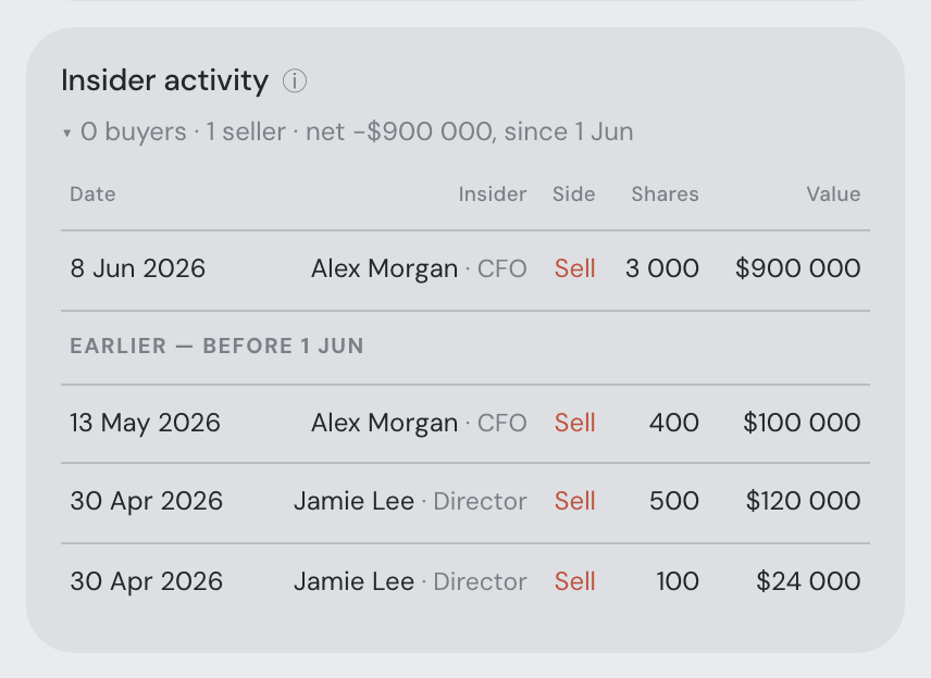
- Fundamentals with the rule-based buy/hold/sell signal, short interest where reported (short % of float, days to cover, and whether shares short rose or fell vs the prior month), recent insider activity (SEC Form 4 open-market buys and sells, clustered — US-listed stocks; the counts cover this calendar month plus the three previous whole calendar months and the summary line names the day that window starts, “0 buyers · 1 seller · net −$1.9M, since 1 Jun”; expanding the card lists the trades those counts were taken from first, with anything older under an Earlier — before 1 Jun separator naming the same day, so the buyer and seller counts can be read straight off the rows), recent news (with an ✨ AI summary of the full linked articles once connected) and the complete transaction list.
Keyboard shortcuts
Press ? anywhere no field has focus and the app shows this list in a sheet. Every table row, star and mark that opens on a click opens on Enter or Space too, and every dialog — a holding’s panel, Settings, the maximized chart, a picture — keeps the keyboard focus inside it while it is open and hands it back to what opened it when it closes.
| Keys | What happens |
|---|---|
| ⌘ K or Ctrl K, or / | Search any asset — the caret lands in the asset finder. / only counts when no field has focus, so a slash typed into a note stays a slash. |
| ? | The shortcut sheet. |
| Esc | Closes the open dialog or panel. With nothing open on a desktop, minimises the assistant pane to its button. |
| Tab / Shift Tab | Moves between controls. Inside a dialog the focus stays in it and wraps from the last control to the first — the page behind is never reached by accident. Two surfaces stay reachable over an open panel on purpose: the assistant pane and the finder. |
| Enter / Space | Opens the focused row — a holding, a dividend line, an event — or presses the focused ★ / ⊞ mark, exactly as a click does. |
| ← →, + −, 0 | In a chart, once tabbed to: pan, zoom, reset. In a picture opened from the feed: previous and next, zoom, fit. |
The holdings table’s sort is remembered in your browser along with its columns and period window, and each sortable header says which way it sorts to a screen reader (aria-sort). Chart range and mode strips are announced as tabs, the correlation heatmap on the Risk card has a View as table fold beside it, and the Insights & alerts count and every “Saved.” line are read out when they change.
Allocation & diversification
The Allocation card leads with verdicts, not sentences. Every takeaway is a check with a colour — ● red a real problem, ● yellow worth a look, ● green fine, grey just a fact — and the card shows only the flagged ones, worst first, at most four, each as a dot, the key number in bold and a few words: ● 0% bonds · target 25%, ● 42% in Technology, ● ~3 independent bets, ● 15% in Bitcoin, each with a tiny bar beside it (the asset-class bar carries a thin strip of your targets, so a missing class is visible as a slice with nothing above it). The fine ones fold behind ▸ N more (all fine); a portfolio with nothing to flag shows one green line, Nothing to flag — N checks passed. The descriptive facts — the asset-class mix ("67% equities · 26% crypto · 7% other"), top currency, top company size, effective number of positions — are a row of small chips under the caption. On a wide card those chips stack into a column of their own with the flagged rows beside them in a second column, so the space beside the diversification dial is used; a narrow card — including a window narrowed by the docked assistant — stacks them one above the other as before. Hover any line or chip for the full sentence; click it and the Full breakdowns open, scrolled to the matching breakdown and ringed for a moment (the lines are buttons, so the keyboard works too) — a line about your positions (the biggest one, the effective number, the independent bets) scrolls to the Value per asset card just above instead. The card’s ⓘ walks it the same way: what shows at a glance (the flagged lines and their colours, the chips, the score), then what Full breakdowns holds, with an Ask AI button for anything it leaves open. What turns a line red: one position over 15% (a broad fund that size is a grey fact — a gold or commodity fund is not broad and stays red), over 40% in one sector, an asset class more than 10 points of the portfolio short of your target, three or fewer correlation-adjusted independent bets, a fund sleeve costing 0.75% a year or more, a sector held at three times the index's weight; yellow is the milder version of each (over 70% in one region, a class under half its target, up to six bets, a TER from 0.40%, any tilt worth a headline). Beside the list sits the diversification score (0–100, category-based). Expand the card for the full breakdowns: segmented bars — one rounded pill per category — over regions, sectors, asset classes (equities / bonds / gold & commodities / real estate / crypto / cash — a bond ETF finally counts as bonds, not just "ETF"; ETFs classify by their fund category with a curated override list for the usual UCITS suspects — the list also catches the European physical-gold ETCs that market data lists as ordinary shares, such as Xetra-Gold (4GLD), so they count as gold rather than equities — and manual assets carry the class you pick in their form), company sizes, asset types and currencies (per-dimension sub-score beside each title, constituent tickers when you hover a segment, color-coded daily P/L per category), then the sector tilt and the drift bars. Crypto is its own bucket; gold and commodity products — US gold ETFs such as GLD and the European gold ETCs on that curated list alike — are the Commodities asset type, so an ETC the market data lists as a share is typed, sectored and sized as the fund it is rather than as a company; manual assets appear as "Other assets".
Value per asset. A card of its own, directly above the Allocation card and always in view: every holding by its current value, colored by asset type, the ones under 0.1% of the portfolio folded into one other bar. The Bars | Pie switch in the card’s top-right corner draws every positive-value holding and cash in a category pie — a color per investing category, shades per holding, categories grouped by their market sector (largest sector first, then its largest category — the same order with or without the Market sector circle) and holdings largest first inside each category. The pie has no legend: every category (and sector) is named on its own wedge, and a name that does not fit is shortened — Consumer Cyclical becomes Cons. Cycl., Communication Services Comm. Serv., Healthcare Health. or Heal. — with the full name in the wedge’s hover readout. Where the card is wide enough the pie stretches from the title’s line down to the Market sector circle checkbox, standing between the title, the switch and the checkbox; its outside labels never run over them. Hover a holding’s bar or slice for its asset card — the week’s mini chart, the price and today’s and the week’s move in the asset’s own currency, and the position’s value and share of the portfolio (of the category, when the pie shows one category); the other group, cash and the category and sector wedges show the asset or group, value and share. The Log scale checkbox under the bars (one line, in the corner under the chart, like every chart’s) — the same one the value chart carries — steps the axis by whole decades, so the small positions in the tail stand tall enough to compare; a bar’s height is then no longer proportional to its value, and the axis starts one decade below your smallest holding, since zero has no place on a log axis. The pie has no Log scale checkbox (a share of a whole has no log version); the bars keep their setting for when you switch back. ⤢ stretches the chart over the whole screen, with the same switch and controls; Esc or ✕ brings it back. The bars carry their tickers slanted underneath, in the card and full screen alike — all of them or none: where they are crowded the labels get smaller and steeper, then every second one drops to a lower row on a thin line up to its bar, and only when even that cannot fit do they go away altogether. A holding with no ticker, shown by its name, is labelled with the name’s first word and … (“Invitae…”); hover it for the full name. With only a few holdings the bars get rounder tops. In the card, the pie writes each wide slice’s ticker inside it — level, or along the ring where it cannot stand level — and the smaller slices’ tickers beside the ring on a thin line, skipping the smallest where they crowd together. Full screen, the bars’ legend moves up beside the title, and the pie slices show their ticker, value and share — inside the slice wherever the label fits in it, on fewer, longer lines if that is what fits, otherwise beside the ring on a thin line leading to it; where the small slices crowd together, the smallest ones go unlabelled rather than have their labels pile up or their lines cross, and hovering one still shows its details. Click any bar or outer holding slice to open that holding’s details (the other bar is several holdings, so it only shows its hover readout). The slices are drawn like the account ring on the Portfolio value tile: a ring of the same thickness, separate slices with its rounded ends and soft shadow, a small gap between each two. The chart remembers bars or pie, and log or not, for as long as the browser tab is open.
The Pie view groups holdings by editable investing categories. Pale rounded category wedges extend behind outer holding slices, with curved labels and colors from your selected chart palette. Categories and their holdings sort largest first within their parent. Cash appears in both levels. Click a category to expand its holdings-only pie; Back to all categories restores the overview. Detail percentages are shares of that category. The regular pie is 348px tall; maximize it for more room.
Market sector circle is unchecked by default. Enable it below the pie to add a third, innermost level: market sector → investing category → holding. Crypto, funds and cash retain their own portfolio buckets. The choice is remembered while the browser tab stays open. Switching it off only takes the sector ring away: every category keeps the colour and the place it had under its sector. Each category refines one market sector; a new assignment that would mix sectors shows an error. Existing cross-sector labels stay saved and appear qualified by sector in the three-level chart.
The small/fast assistant model assigns missing categories during ingestion, with market sectors as context and examples such as Semiconductors, SW, Fintech, Insurance, Health and Aerospace. Categories persist and manual edits survive reimports. Edit them in the last Category column of Holdings; use Category chips under More filters or type a category in search. Custom and market-priced asset add/edit forms also include Category, synchronized with Holdings. Leave it blank for Other; explicit blank choices are not classified again. Existing imported portfolios get a background backfill. If the assistant is unavailable, missing categories appear as Other and remain editable.
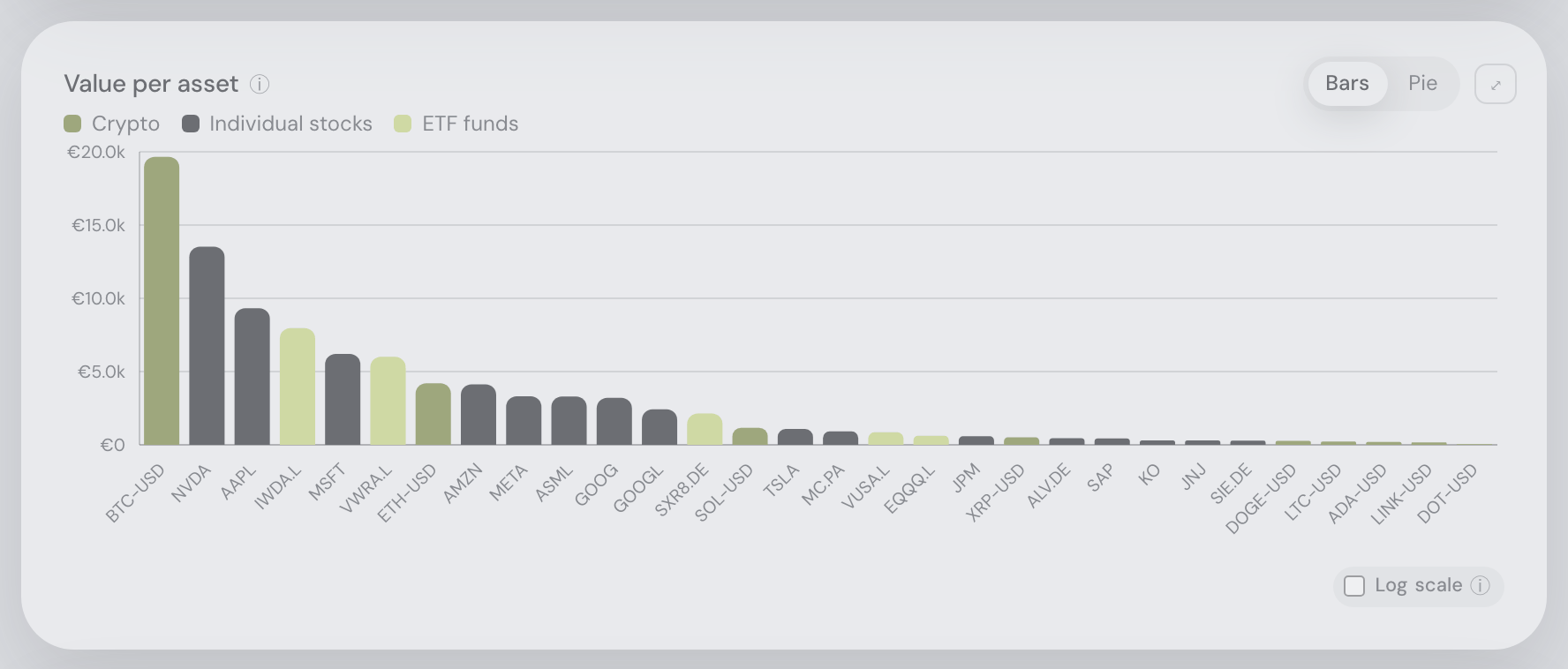
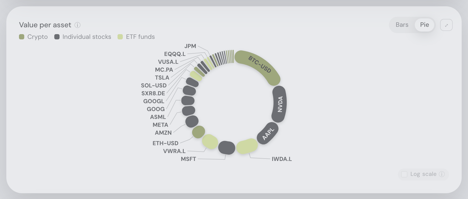
Index funds count as what they hold. A broad ETF's value is split proportionally across its real sectors, regions and company sizes (look-through): live fund sector weightings where the provider publishes them, otherwise a static factsheet table for the index the fund tracks (S&P 500, MSCI World, ACWI, FTSE All-World, Nasdaq-100, MSCI EM, EURO STOXX 50, STOXX Europe 600, FTSE 100, MSCI Europe and more — refreshed quarterly, with the as-of date shown). The diversification score, its sub-scores, the score history and the Sector-tilt comparison all use the split view, so a portfolio of index funds scores as diversified as it really is. The fund is recognised from its own name (iShares, Vanguard, UCITS, ETF…) when its market metadata has not arrived yet, so a freshly imported portfolio never shows its biggest fund as "Unknown". More generally, “Unknown” only ever means we asked and nobody has the data: a holding whose market data is still on its way is counted in no category at all, and the card shows a progress bar where the diversification score goes (“Fetching market data 14 / 15”) with the holdings it is waiting for named, refreshing itself until they land. The currency bar is the exception that rarely waits: a holding’s trading currency is taken from the market first and from your broker’s own export second, so a slow market feed no longer empties that bar down to your cash and leaves the card claiming everything you own is cash. If the data never arrives, after about fifteen minutes the card stops and offers a Try again button, and those holdings do move to “Unknown” — by then a genuine answer rather than a wait. Only a fund with no look-through data at all stays lumped as "Funds (diversified)"; bond, gold and real-estate funds keep their own asset-class buckets. The holdings-table filter still shows one stable "Funds (diversified)" chip per fund.
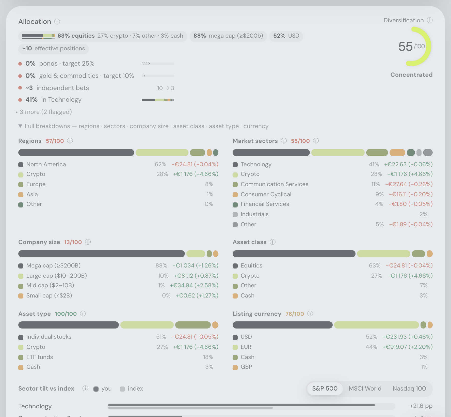
Allocation drift — where you meant to be
Behind the card's Full-breakdowns expander. The drift bars are the last thing the Allocation card's ▸ Full breakdowns row opens, under the six breakdowns and the sector tilt — so the card stays short until you ask for the detail, and the bars stay at its very bottom. The verdicts' ▸ N more row is a different fold and does not show or hide them. Asking the assistant to show the allocation drift opens the expander for you.
The card's last section, under the breakdowns: current weight against your target, one bar per line, biggest miss first, in three groups — Assets, Sectors and Asset classes. Each bar carries a tick at the target and a tolerance band of ±20% of that target (never narrower than one percentage point): inside it the bar is green, outside it turns amber, and the delta is printed in percentage points. Hover a bucket name for its top ten constituents and their weights; hover a bar for current x% · target y% and the tolerance range.
Sector weights are computed with the same fund look-through as the breakdowns above, so an ETF contributes its own sector mix rather than counting as one opaque holding. Edit targets beside the heading jumps straight to ⚙ Settings → Trades → Allocation targets, and the same link sits in the Trade plan card's heading on the Trades tab, where the allocation-drift and sector-drift criteria score every candidate by that gap. Set no targets at all and the section is not there — drift needs something to drift from.
These bars were a card of their own on the Trades tab until 10 September 2026. They belong here: they measure the very weights this card draws. They moved behind the card's expander on 22 September 2026, and their heading lost its Illustrative badge with the move — a bar of your own target against your own weight is not an estimate.
Risk
Compact tiles computed from your daily time-weighted returns — deposits and withdrawals never count as gains or losses. They pack tightly: on a wide screen all seven stand on one row, beside the docked assistant six do, and on a phone two to a row; the best and worst day always share one line.
- Annualized volatility, Sharpe and Sortino ratios — for the whole history and the last 12 months. The last-12-months figures cover exactly the same year as the Rolling 12-month lines below, and appear at the same length of history, so the two never disagree about the same twelve months.
- Max drawdown with its peak → trough → recovery dates and duration, the current drawdown with days since the last peak, and the best/worst single day.
- Expand the card for the vs-benchmark comparison: your portfolio's beta and correlation against every benchmark, plus each benchmark's own volatility and max drawdown measured the same way. The headings say whose number each column holds — Your beta and Your correlation are your portfolio measured against the benchmark on that row, Its volatility and Its max drawdown are that benchmark's own. Your portfolio's own line at the top is the reference, so it shows neither a beta nor a correlation: both statistics only exist between two return series, and there is nothing to compare your portfolio with on its own row. Hover either — and it tells you that. A benchmark that is your display currency — the US dollar line on a dollar dashboard — is left out: it is cash rather than a market, and comparing it with itself says nothing. Beta and correlation also read — for any benchmark whose returns barely move, because both of them divide by exactly that.
- The Correlations section: a heatmap of pairwise daily-return correlations across your top holdings, headlined by the honest companion to the diversification score — "your N positions move like ~M independent bets". Uncorrelated holdings count fully, near-duplicates barely count.
- The Rolling 12-month view: trailing-12-month return and volatility lines over your whole history — the regime shifts a single point-in-time number averages away. Appears once the portfolio has more than ~13 months of history. The lines zoom like the value chart: drag across them on desktop (or ⌘/Ctrl + wheel to zoom and ⌘/Ctrl + drag to pan), pinch on a phone, or Tab to them and use the arrows, + / − and 0; a ⟲ Reset zoom chip brings the whole history back.
The methodology is spelled out in the tooltips (√365 annualization on the calendar-day series, 0% risk-free rate).
If the risk figures cannot be fetched the card keeps its heading and says “Data temporarily unavailable.” with a ⟳ Retry beside it — the same one control every card on the dashboard offers (see one Retry, everywhere).
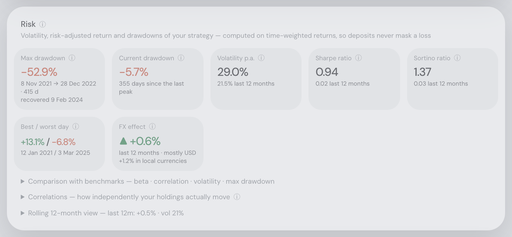
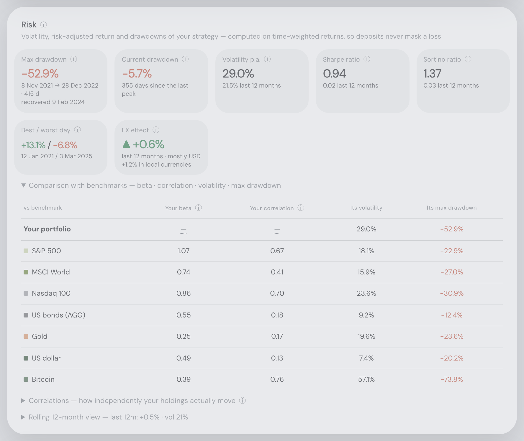
Dividends & income
A monthly income chart, all-time and last-12-month totals, and a forward projection per holding with forward yield and yield-on-cost.
What the card covers — “Dividend cash received across your accounts, and what your holdings should pay going forward” — opens the Dividends & income ⓘ tip beside its title, ahead of where the numbers come from, rather than sitting as a grey line under the title. The Events card does the same.
Events calendar
Earnings reported in the past 4 weeks come first — click a row to read the actual filed report in a side panel (from SEC EDGAR; the 8-K earnings release, or 6-K for foreign US-listed issuers), with a text excerpt, links to the full filing and an ✨ AI summary once the assistant is connected. Below: upcoming earnings, ex-dividend and pay dates for your largest holdings. 🏛 central-bank rows join the calendar: the next scheduled rate decision of each bank relevant to your portfolio, and its rate changes of the last four weeks — clicking one opens the Macro card. The same tier carries 🏛 data-release rows: the next scheduled US CPI, euro-area flash HICP and US payrolls release dates (dates only, from the official BLS/Eurostat schedules — no forecast data), shown when the series' central bank is relevant — clicking one asks the assistant what the print could mean for your portfolio.
The same calendar can come to you instead: ⚙ Settings → Alerts has a Coming up digest that mails what is on it within a window you choose (1 week to 2 months), filtered to the kinds you care about — earnings, dividends, or central-bank and data days. It is the only alert that looks forward rather than reporting something that already happened.
The card’s own Events ⓘ opens with what it lists — “Earnings, dividends, central-bank and data-release days for your holdings” — followed by what each kind of row means; the sentence is no longer a grey line under the title.
The card streams one holding at a time behind a progress bar naming what it's checking, remembers results across reloads, and marks filings that appeared since your last visit with a new badge. Rows are compact — ticker and portfolio weight, full company name on hover. Beside Dividends & income the list scrolls within that card’s height; on a phone, in any window narrower than 900 px and in Simple view, where nothing sits beside it, the list shows about ten rows and scrolls for the rest.
The card never reports a failure as an empty calendar. If the holdings feed cannot be reached it says “The events calendar could not be loaded” and offers ⟳ Retry; if the stream stalls with holdings still outstanding it names them (“N holdings didn’t answer — retry”) rather than leaving the progress bar parked; and a refresh that fails after a good answer keeps the answer you had and labels it (“Couldn’t refresh — showing the last answer”). The rule across the app is the same: a card is pending, empty, failed or stale, and it says which in words instead of disappearing or showing nothing.
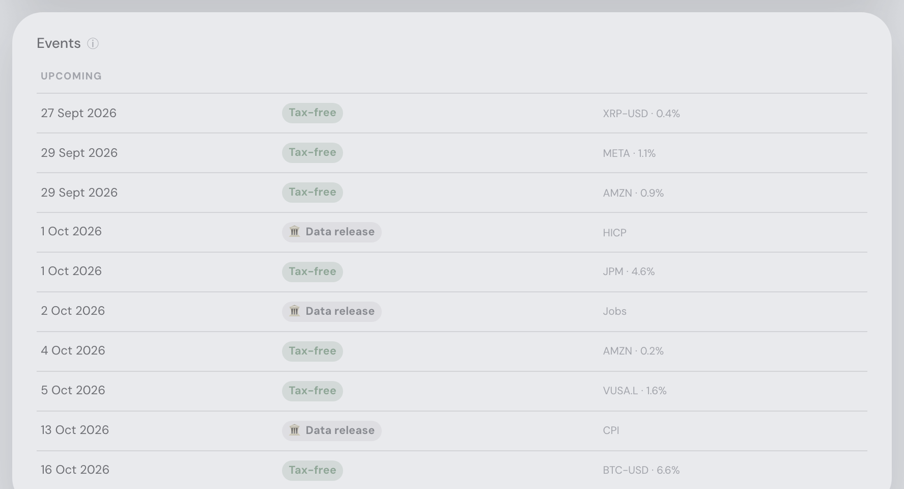
One Retry, everywhere
Since 22 September 2026 every way back out of a failed fetch is the same control: a flat ⟳ Retry in the card’s own muted type, with no box around it, tooltipped “Ask the server for this data again”. It asks the one endpoint that failed — not a page reload — and while that request is out it reads ⟳ Retrying… and cannot be pressed twice.
It now appears in the places that had no way back at all: the Risk card, which used to tell you to refresh the browser, and Trading activity. And it replaces the outlined capsule the Events calendar’s “Couldn’t refresh” and “didn’t answer” lines and the Explore tables’ stale line used to draw — three different-looking buttons for one job, sometimes within a single screen.

Trading activity
At the very bottom, a collapsed one-liner expands into a punch card of your buys and sells per month across all years — your own behaviour at a glance.