Documentation
Quick Start
Fortunest turns the CSV exports your brokers and exchanges already give you into one live dashboard. Here is the shortest path from nothing to seeing your whole portfolio — and the handful of things worth knowing on day one.
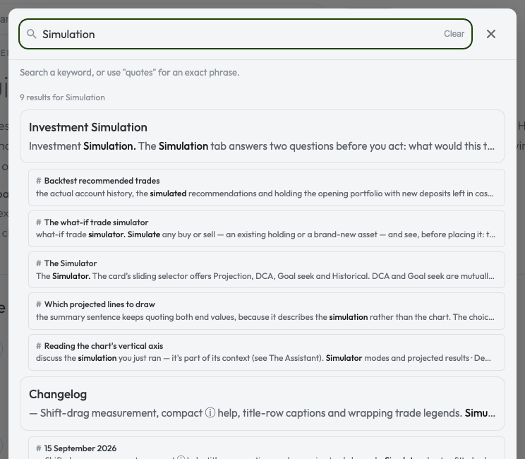
Find a page or section: use the documentation search bar above, or press ⌘/Ctrl K. Search a keyword or put an exact phrase in quotes. Results link directly to matching sections; arrow keys navigate them and Escape closes search.
Three steps to a live dashboard
- Open the app Go to app.fortunest.ai. There is nothing to sign up for — you start as a guest and everything works. Your browser gets its own private session; an optional account comes later if you want your data to follow you across devices (see Privacy & your data).
- Drop in your broker exports Export your transaction history as CSV from your broker or exchange — Degiro, Revolut, Interactive Brokers, Kraken, Binance and Trezor Suite are supported, and Getting your data in shows exactly where each export hides. Then drag the files onto the Portfolio value tile (before any data is loaded, the tile itself is a dropzone) or open ⚙ Settings → Data and drop them there. The format is detected automatically; you can drop a whole folder and every supported CSV inside is imported. No exports at hand? Press Try with demo data on the same tile to explore the whole dashboard on a realistic sample portfolio (synthetic transactions, live prices) — four accounts spanning stocks, ETFs and crypto, so you can see what a loaded dashboard looks like before you export anything. Remove it any time in ⚙ Settings → Data.
- Read your portfolio The engine values every position with live market data, split-correct, converted at each day's real exchange rate. Within a minute you're looking at your total value and today's change, a value chart against real benchmarks, and a sortable table of everything you hold.

Take the tour
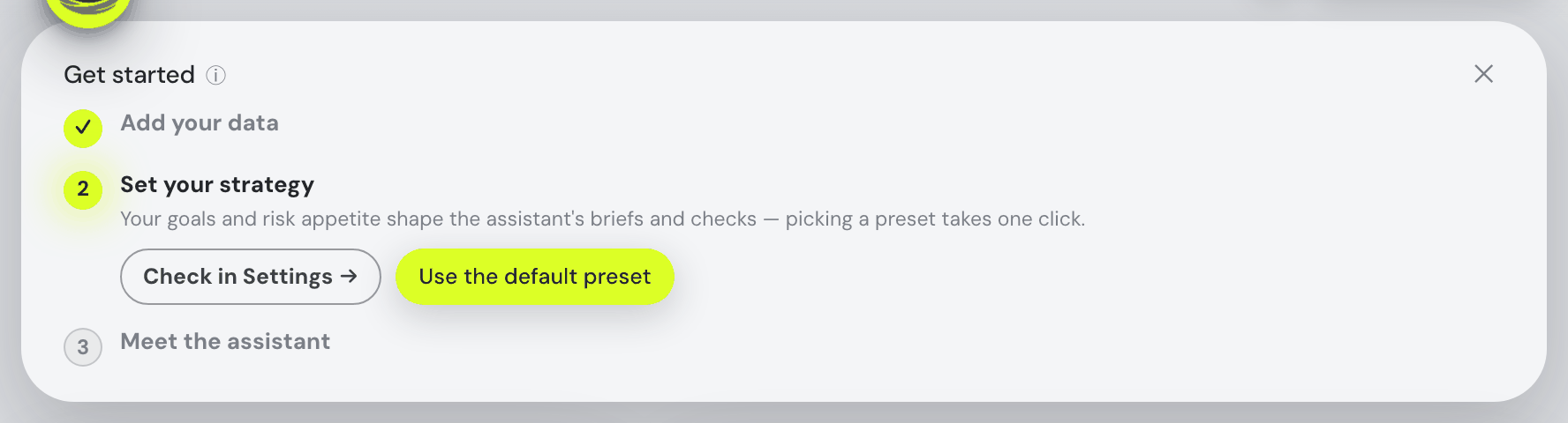
A fresh dashboard opens with a Get started card — the steps above, ticking themselves off as you do them. Only the current step shows its buttons; the later ones sit folded to their titles so the card stays short — click a folded title to open it early, the steps work in any order. While the card is showing, the assistant waits minimized to its AI button in the corner, so the first screen is just the card and your dashboard — click the button any time to open it yourself. The card's last step, Meet the assistant (Ask the assistant anything — how the dashboard works, what a number means — or talk through your strategy. Or take one of its interactive tutorials.), has one button: Open the AI assistant chat opens the assistant — docked beside the dashboard, or the bottom sheet on a phone — with the caret already in the ask box, ready to type, and ticks the step. Once you have met the assistant — sent it a question, started a walkthrough or pressed that button — or the card is finished or closed, it opens docked on every new visit, as it always did.
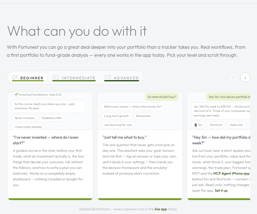
The tutorials are in the chat's Learn card, and the empty Portfolio value tile's 🎓 Take the tour starts the tour straight away. The walkthrough is the same one the Learn card in the chat starts — and asking for it works too ("start the tutorial"). Each step scrolls to the card it is about and rings it, drops a short plain-language explanation into the conversation, then waits: you can ask anything in between without losing your place. The Learn card sits under the assistant's report cards and offers both walkthrough kinds as two equal tiles, in the learner's order: the 🌱 Investing Foundations Course first, the 🎓 Dashboard tour second (New here? A guided lap — each step scrolls to the card it explains; ask anything in between.). The tour has three levels, picked on a sliding Beginner / Intermediate / Advanced control with the Take the tour button at the end of the same row (it wraps under the control, right-aligned, when the chat is narrow) — the pick is remembered, and only the button starts anything; a level you have begun shows n of N done beside the control and the button reads Continue tour, picking up at the furthest step you reached; the ⓘ beside the tile's title says what each level covers: Beginner (every number on the Portfolio tab, plus the assistant, your watchlist and sharing with friends), Intermediate (the rest of the Portfolio tab and the Trades tab) and Advanced (what-if trades, the simulator, your tax position and the professional extras). A level you have finished shows a ✓ on its pill and the tile reads Done ✓ Advanced · Retake — unlike the course, a finished tour level keeps its offer, because replaying one lap of the app is a normal thing to want; with nothing picked the control defaults to your first unfinished level. Playback is local, so the tour runs even with no model connected — only the questions in between need one — and started with nothing loaded it seeds the demo portfolio first, so every step has real numbers to point at.
Never invested at all? The Learn card's first tile is for you: 🌱 Investing Foundations Course — New to investing? 25 short steps: stocks, index funds, risk, fees, strategies, … ~30 min. It teaches investing itself rather than the app — what an investment actually is, what decides your outcome, how to write your own plan — and it runs on a completely empty portfolio: nothing is loaded for you. Its button follows where you are: Start course, then Continue course with n of 25 done (it picks up at the furthest step you reached, not step 1) — and then it collapses: once you have finished the course its tile folds into a small chip on the Learn card's own title line, Investing Foundations ✓ with a green tick. The chip stays clickable — one click brings the whole tile back with a quiet Restart course, another folds it away — and the course is one sentence away besides: type "restart the investing course" (or "I want to do the Foundations course again") into the chat and it starts from step 1, exactly as on a fresh account. The dashboard tour collapses the same way once every level is done (Dashboard tour ✓, clickable back open to a Retake), so a card with both finished is a single line: Learn and two ticked chips. Exactly one button on the card is lime — the course's until the course is finished, then the tour's for a level you have not taken; a tile reopened from its chip is a retake and never takes it, so once both are done there is no lime left at all. The Get started card offers the course too, on its Add your data step: a quiet …or learn about investing for complete beginners: line prefacing the same 🌱 Investing Foundations Course pill with the tile's subtitle beside it — the same words as in the chat — for the reader who has nothing to import yet because they have never invested.
Your portfolio at a glance
Five things on the Portfolio tab answer most day-to-day questions:
- Portfolio value & day change — the big tile, top left. Cash is included (the tooltip spells out what counts), a mini donut shows how the value splits across your accounts, and a collapsed "▸ N accounts" row expands into a per-account breakdown. Next to it: cash, total P&L, annualized TWR/IRR and your portfolio's value-weighted fundamentals.
- The Insights & alerts bell — in the topbar, left of your account button, on every tab: today's biggest mover by portfolio impact, earnings this week, concentration warnings, holdings near their 52-week high or low, idle cash — plus AI-found patterns once the assistant is connected, and every delivered alert digest. Hover or tap it for the list.
- The value chart — your portfolio's full history. Pick benchmarks (S&P 500, MSCI World, Nasdaq 100, bonds, gold, Bitcoin…) and they're drawn flow-matched: what the same deposits on the same dates would be worth there instead. Range presets, drag-to-zoom, Return % and drawdown modes. Details in The Portfolio tab.
- The holdings table — everything you hold, sortable, with price, value, daily and total P/L, weight and account badges. Click any row to drill into that position's own charts, buy/sell markers and transactions.
- Search — the pill at the topbar's right edge finds anything a portfolio can hold that the market-data feed covers: shares, ETFs, mutual funds, cryptocurrencies, indices, futures and currency pairs, on every tab. Focus it empty and it offers your 7 largest positions; wrap a phrase in quotes —
"ai stocks"— and the assistant finds matching tickers for you. More in Search & Explore.
The top bar packs itself down as the window narrows, and the assistant panel counts: docking it to the side takes width from the page without taking any from your screen, which is why the header changes shape when you open it on a window that was comfortable a moment before. In order: the tab strip shrinks and scrolls in place behind the buttons; then it takes a row of its own, lined up with the Fortunest wordmark and clear of the logo, while the Feedback, ⚙, bell and account buttons stay exactly where they were on the first row with the search pill; and below the width where even that fits, the assistant panel folds back into its button rather than squeezing the header any further. It gives way gradually before that — the panel narrows toward its own minimum first, so the page keeps the room the header needs — and re-opening it at that width is respected, not undone. Narrower still and you are on the phone layout, where the controls move to a panel at the bottom of the screen and the strip of page beside a card halves, so the cards take almost the whole width and there is more room for what is in them; the bottom panel and the assistant’s key line up with the same edge. The Fortunest name stays on the bar the whole way down. It used to stand down a little before it had to — the name vanished while a visible gap was still sitting where it had been — so the four header buttons now close up slightly at the tightest widths instead, which buys the name more room than the header can ever run out of. If some future arrangement did run out, the name is still what gives way first (a row of buttons wrapped on top of the logo is worse), and the tab row underneath keeps its place either way.
The compact phone header stays fixed while the page scrolls beneath it. Its veil fades smoothly from fully transparent and unblurred at the lower edge into strong blur and the opaque page colour above. Desktop keeps its existing translucent glass. When a table’s labels are pinned below the header, the space above them stays solid so earlier rows cannot show through.
The Fortunest logo at the left of the top bar — the nest with a coin turning inside it — holds still if your system asks for reduced motion (Reduce motion on a Mac, iPhone or iPad; animation effects switched off on Windows; Remove animations on Android): the coin rests face on, showing its dollar side. Change the setting while the page is open and the logo follows straight away, stopping or turning again. The Fortunest name beside it honours the same setting: its letters rise into place once when the app opens, and with reduced motion they are simply there from the start.
The tabs across the top — Portfolio, Explore, Trades, Simulation, Taxes, Social — switch the whole view, and the tab you are on is written into the address bar (#explore, #trades, …): reloading keeps your place, your browser’s Back and Forward buttons walk the tabs you visited, and a tab can be bookmarked or its link shared. Portfolio is the plain address with no # at all — the URL you already know keeps opening the dashboard exactly as before. Back closes an open panel first: with an asset’s details, a report, ⚙ Settings or Manage account open, the first Back closes that panel (the most recent one when two are stacked) and only the next moves through the tabs; a panel closed with its ✕ leaves no extra step behind. On a phone you can also swipe the page sideways to move through them: left for the next tab, right for the previous one — and a run of swipes counts as one step in your history, so a single Back returns to the tab you started swiping from (tapping a tab adds a step of its own, as does a link inside the app; the assistant’s own tab hops coalesce like swipes). The page follows your finger the whole way — right off the side of the screen if you swipe that far — and fades toward the tab it is about to hand over to, so you can see the switch coming and let go early to call it off; the header and the bar at the bottom stay exactly where they are, and at the far end of the row — past Social — the page barely moves, which is how it tells you there is nothing further that way. The other end does have something further: swipe right on Portfolio, one step past the first tab, and the ⚙ Settings dialog opens — the page nudges and dims as you drag, exactly the dimming that means “letting go will commit”, and past the same distance that would switch tabs, releasing opens Settings just as tapping the gear would; let go early and nothing happens. While you drag, the empty space the page reveals names what letting go will bring — “Explore”, “Taxes”, “Settings” — written vertically along the edge, so you never have to guess where a swipe leads; a dead end shows no name at all. The Settings edge keeps going: swipe the same way again inside the Settings dialog and Manage account opens; swipe the opposite way to walk back — Manage account to Settings, Settings to the page you were on — with each sheet following your finger and the revealed space naming the destination. Swipes that already mean something else — panning a wide table, dragging a zoom on a chart, anything inside the assistant or an open dialog — are left alone.
On a phone, a gesture only ever goes one way. Whichever direction you set off in during the first few millimetres is the direction that touch keeps until you lift your finger: pan a wide table sideways and the page behind it stays put, start scrolling the page and the table cannot slide out from under you, however much your thumb wanders. Nothing ever drifts diagonally, and a scroll that curls sideways at the end can no longer flip you into the next tab by accident. Scrolling up and down is your phone’s own, everywhere — the tables included — with its full native glide and momentum; only the sideways pan on a wide table is drawn by the app, and it is drawn only when the vertical scroll was genuinely not started, which is what makes the lock hold every time rather than most times. The whole thing is touch-only — a mouse or a trackpad behaves exactly as before. And since 1 September 2026 a pinch never zooms the page: two fingers on a chart zoom that chart’s own time window (see the value chart), and anywhere else the pinch simply does nothing, so the layout can never end up half-zoomed under a stray gesture. A tap or a sideways drag on a chart reads the chart — the tooltip follows your finger with the date and values — while a sideways drag anywhere off a chart is still the tab swipe above. The two never talk over each other: while two fingers are pinching, the tooltip stays hidden for the whole gesture and comes back on your next one-finger touch. And since 4 September 2026 every hover tip opens on a tap: the ⓘ glyphs, the price-trend sparklines, 52-week ranges and weight bars in the Explore tables, the lot timeline on the Trades tab and the Maturing-lots bars on the Taxes tab all carried their detail in a tip a finger could not reach. Tap one to read it; tap it again, tap anywhere else, or scroll on, and it goes away.
Add it to your Home Screen and it opens like an app. There is no app store and nothing to install — on an iPhone, open app.fortunest.ai in Safari and tap Share › Add to Home Screen; on Android, the browser menu’s Add to Home screen. It gets its own icon on the Home Screen, and tapping it opens the dashboard full screen — no address bar and no tab strip, straight into your portfolio. It is the same app and the same data as on your desktop, signed in the same way; nothing is downloaded to the phone and nothing works offline there (the desktop app is what runs without a connection). If you would rather not, the ordinary browser tab keeps working exactly as it always did.
On a phone you can also pull down from the very top of the page to refresh your prices. A gap opens above the content as you drag, and the text in it tells you where you are: Pull down to refresh prices, then Release to refresh prices once you have pulled far enough — let go earlier and it simply springs shut without fetching anything. When you do let go, the same gap reports each step as it happens: fetching live prices & FX from the market feed, then recalculating your summary, reloading the charts and refreshing the cards, with a tick beside each one as it lands. Only the market data is re-fetched — the app itself is not reloaded. Your tab, your place on the page and anything you had open all stay exactly as they were, which is the one thing your browser’s own pull-to-refresh could not promise: it reloads the whole app to show you the same numbers. If the market feed cannot be reached, it says so rather than claiming success — Couldn’t reach the price sources — showing the last known prices, with a red ✗ against the step that failed, so you always know whether the numbers in front of you are the ones you just asked for. The gesture only starts at the top of the page and only on a downward pull, so it never interrupts a scroll, and it leaves the assistant, dialogs, charts and sideways-scrolling tables to themselves. While you pull, the app takes the whole gesture, so the browser’s own pull-down (the rubber band, or Chrome’s reload actions) does not run underneath it; and once the gap has closed the page settles back to the very top, so the first card is not left tucked under the header — unless you scrolled a screen or more away while the prices came in, in which case you are left where you were (since 18 September 2026). On the Social tab the same pull refreshes only the social side (since 21 August 2026) — the feed, the unread badge and your friend requests, with the gap reading Release to refresh your feed and closing on Feed up to date — and touches no price at all, which is why it finishes almost at once; on every other tab the price refresh runs as described, with the social badge check fired first, since it is the quick half.
Optional: connect the assistant
The chat pane on the right becomes an analyst once you connect a language model — it sees your holdings, your screen and your last actions, writes one-click reports, adds the ✨-marked AI features everywhere, and can even drive the dashboard for you: type "Go to allocation" or "What if I sell half of my Tesla?" and it performs the action, then comments on the result. Nothing calls an LLM (and no tokens are spent) until you press Connect.
Open ⚙ Settings → Assistant and pick a provider:
- OpenAI, Anthropic or OpenRouter — paste an API key, pick a model.
- Ollama or LM Studio — free and fully private, running on your own machine; local servers are auto-detected, and Ollama models can be downloaded right from the dialog.
The full setup — including the two model slots and what each one powers — is in The Assistant.
Where to go next
- Getting your data in — per-broker export walkthroughs, managing files, manual assets.
- The Portfolio tab — every card explained: charts, allocation, allocation drift, risk, dividends, events.
- Search & Explore — the asset finder and the market comparison tables.
- The Trades tab — scored buy and sell candidates and the trade plan.
- Investment Simulation — what-if trades, DCA projections, goal seek.
- The Taxes tab — tax lots, the time test, sale pairing and realized gains (Pro).
- The Assistant — providers, reports, chat abilities, driving the dashboard from chat, proactive tips.
- Settings — how saving works, strategy profile, data sources, appearance.
- Privacy & your data — guest sessions, accounts and where data lives.
- Changelog — what changed, day by day, newest first.