Documentation
Settings
Everything configurable lives in one frosted-glass dialog behind the ⚙ button in the topbar — on a phone you can also swipe right on the Portfolio tab, one step past the first tab, to open it (the revealed edge says “Settings” as you drag; the same swipe again inside the dialog goes one deeper, to Manage account, and the opposite swipe walks back out) — organized into eight tabs — General, Data, Strategy, Trades, Taxes, Social, Alerts and Assistant — plus a quiet About button up in the dialog's header, beside the closing ✕. Your account is not among them: identity sits behind the bust icon in the topbar, next to the ⚙ — see Your account.
When Unsaved settings opens from the keyboard, Apply receives initial focus. Keep editing returns focus to the control that opened the prompt, including in Safari; your staged changes remain available.
How saving works
The tab strip scrolls horizontally whenever the dialog is narrow, including beside a wide Assistant panel. Selecting or keyboard-focusing a tab brings it into view.
The dialog has one Save button, shared by every tab, in a footer that stays reachable even on the phone bottom sheet. Edits on any tab — theme, currency, table sizes, refresh cadence, strategy, trade plan, assistant model, data sources — are staged:
- Staged edits survive tab switches, and the theme previews live while staged.
- Nothing is written until you press Save, which applies everything at once — in a single portfolio rebuild when one of the changes needs it.
- Closing with edits still staged asks first — clicking outside the dialog, pressing Esc or the ✕ raises a small Unsaved settings prompt: Apply saves the staged edits, Discard throws them away, and anything else (Keep editing, Esc, a click beside the prompt) returns to the dialog. With nothing staged the dialog just closes. A footer note also warns while there are unsaved changes.
- The Save button lights up only while there is something to save.
- Save always answers (04.09.2026). When it lands, the footer says Saved ✓ for a moment and the dialog closes. When the server refuses part of it, the dialog stays open and the footer names what did not go through — “Couldn't save: Currency, Trade plan — retry”, with the server's own reasons on hover — while everything it did accept is saved. The refused edits are kept staged and Save reads Retry, so pressing it once more sends exactly those. Every field is judged on its own: one value the server will not take no longer drops the rest of the panel's save.
- Closing the browser tab with edits staged asks too — the browser's own “leave site?” prompt, so staged settings are not lost to a stray ⌘W.
- A list that grows by an + Add chip scrolls itself. Once the single-day move rules (Alerts) or the allocation targets (Trades) outgrow the dialog, adding a row brings that row — and the button you are clicking — back into view above the Save bar. Only when they would otherwise fall out of sight, so a short list holds still; an instant jump rather than a glide if your system asks for reduced motion.
Every screenshot below is the same dialog, so the chrome around each panel is the same: the tab strip across the top with its sliding pill marker, the ✕ at the top right, and the shared Save in the footer. The dialog is frosted glass — the dashboard stays visible, and blurred, behind it.
Glass surfaces are less transparent and more blurred, to make text easier to read over busy backgrounds. The 7 September adjustment reduces partial transparency by 10% and strengthens blur by 20% across the app, in both light and dark themes — except the grey fills behind inner cards and pills, which were restored to their earlier, lighter tone on 16 September.
General — appearance & behaviour
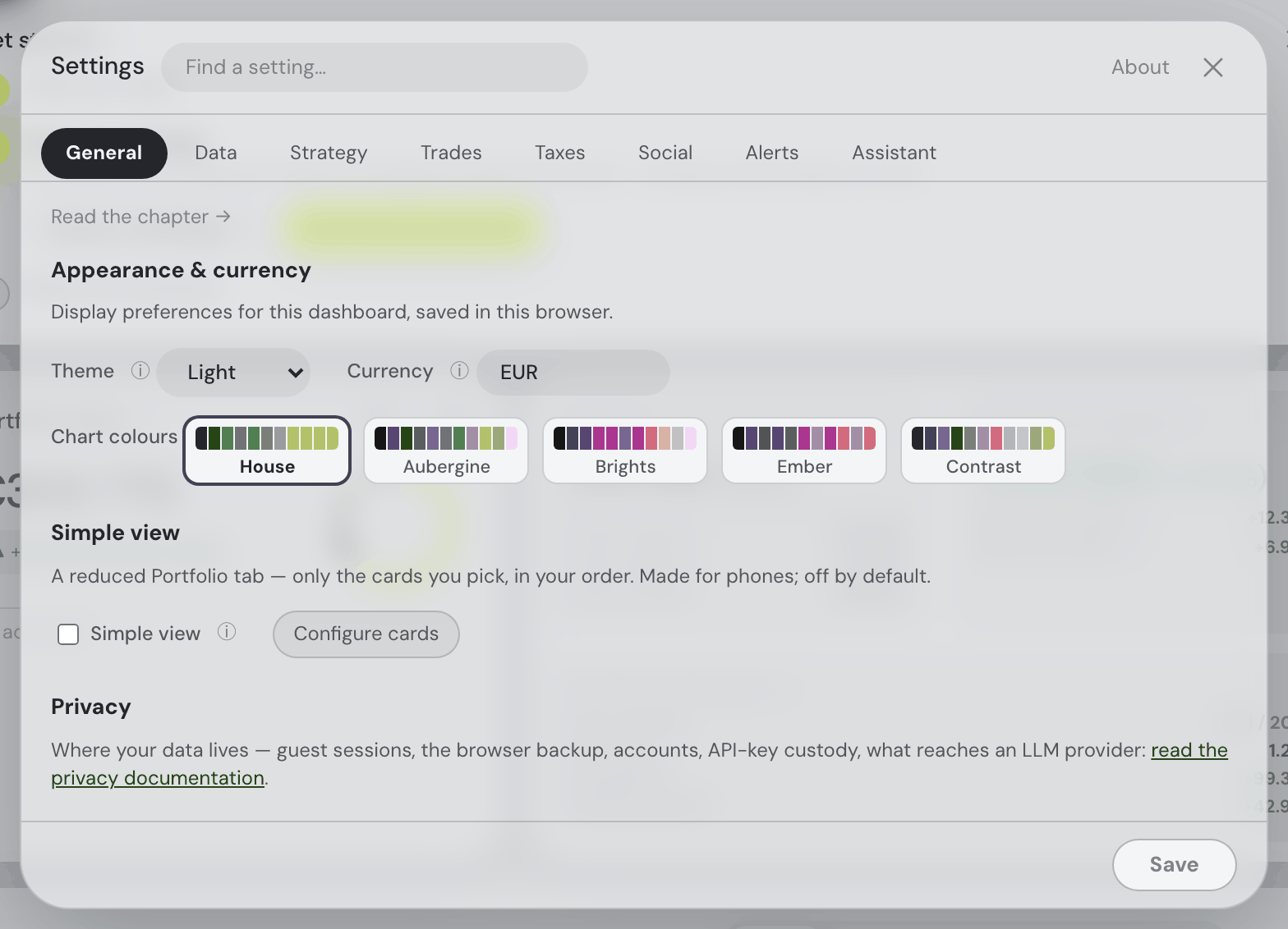
- Theme: System (follows your device's light/dark setting), Light or Dark. Saved in this browser; previews instantly while staged. The browser’s own chrome follows it too (since 4 September 2026) — the status bar of the Home Screen app and a phone browser’s tab strip take the page colour of the theme in force, dark included.
- Display currency: any of 30 world currencies — USD (the default), EUR, GBP, JPY, CHF, CZK, CAD, AUD, NZD, SEK, NOK, DKK, PLN, HUF, RON, TRY, CNY, HKD, SGD, KRW, INR, BRL, MXN, ZAR, ILS, AED, THB, MYR, IDR and PHP. The selector has a search box: type a code or a currency name ("swiss" finds CHF) and pick with the arrow keys and Enter, or the mouse. Every amount — including each historical chart point, trade flow and dividend — converts at that day's exchange rate, not today's. Changing it rebuilds the portfolio. (Also switchable by asking the assistant.)
- How amounts name their currency: one rule everywhere — your display currency and an asset’s own trading currency alike. A currency with a symbol of its own leads the number with it: $ US dollar, € euro, £ pound, ¥ yen, and ₹ ₩ ₪ ₱ ₺ ฿ for the rupee, won, shekel, peso, lira and baht (“$224.58”, “−$32.05”, “$5.42T”). Every other currency is written as its code after the number — “7 335 582 CZK”, “12.40 CHF” — and so are the other dollars and yuan (CAD, AUD, HKD, SGD, MXN, CNY…), so a bare “$” always means US dollars. A London price quoted in pence reads “496p”, never as pounds. Tables that would repeat the same currency on every row put it in the column header instead — see Holdings and Explore. Downloaded CSV files keep plain codes.
- Chart colours: the palette every chart, donut and heatmap in the app draws from — House (the default greens and lime), Aubergine, Brights, Ember and Contrast. Each button shows the palette's actual swatch row, so you pick by looking rather than by name, and the choice applies everywhere at once.
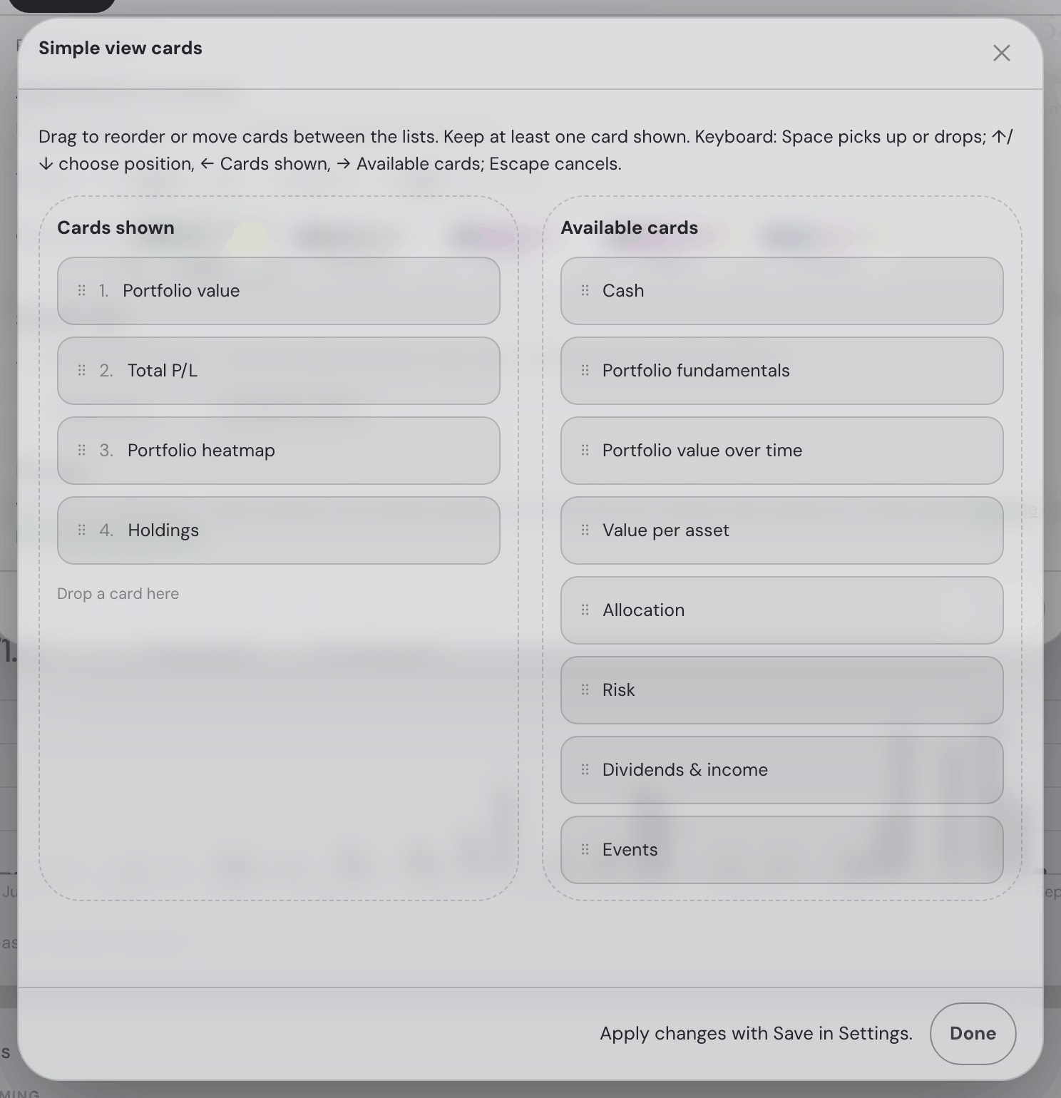
- Simple view: the Portfolio tab reduced to a chosen subset of its cards, in your order, one under the other (neighbouring hero tiles share a row where the screen has room) — made for a phone screen. The switch stays in General; Configure cards opens the Cards shown list in an overlay, even while Simple view is off. Close it with Done, Escape, Back or ✕ to return to Settings with your draft; Settings Save applies it and Discard clears it. The overlay has Cards shown and Available cards: drag a card into Cards shown at the position you want, drag within it to reorder, or drag back to Available cards to remove it. A card appears in only one area, and at least one stays shown. Mouse and touch are supported. With a keyboard, Space or Enter picks up/drops, left/right selects the area, up/down selects the position, and Escape cancels the move; Reset to default appears once the list differs from the starting four — Portfolio value, Total P/L, Portfolio heatmap, Holdings. Off by default; while off nothing changes anywhere. On a phone the small button left of the notes pad in the bottom bar — a plain open eye, its pupil filled while the view is on — flips the same switch. Saved in this browser; applied on Save. (The assistant can do both:
simple_view.) - Explore rows per page: use the gear menu on the Markets or Favourites table. Choose 10, 15 (default), 20, 50 or 100; changes apply immediately and are saved per table. These controls are no longer in this dialog.
- Privacy: a link straight to the privacy chapter — where your data lives, the browser backup, API-key custody and what reaches an LLM provider.
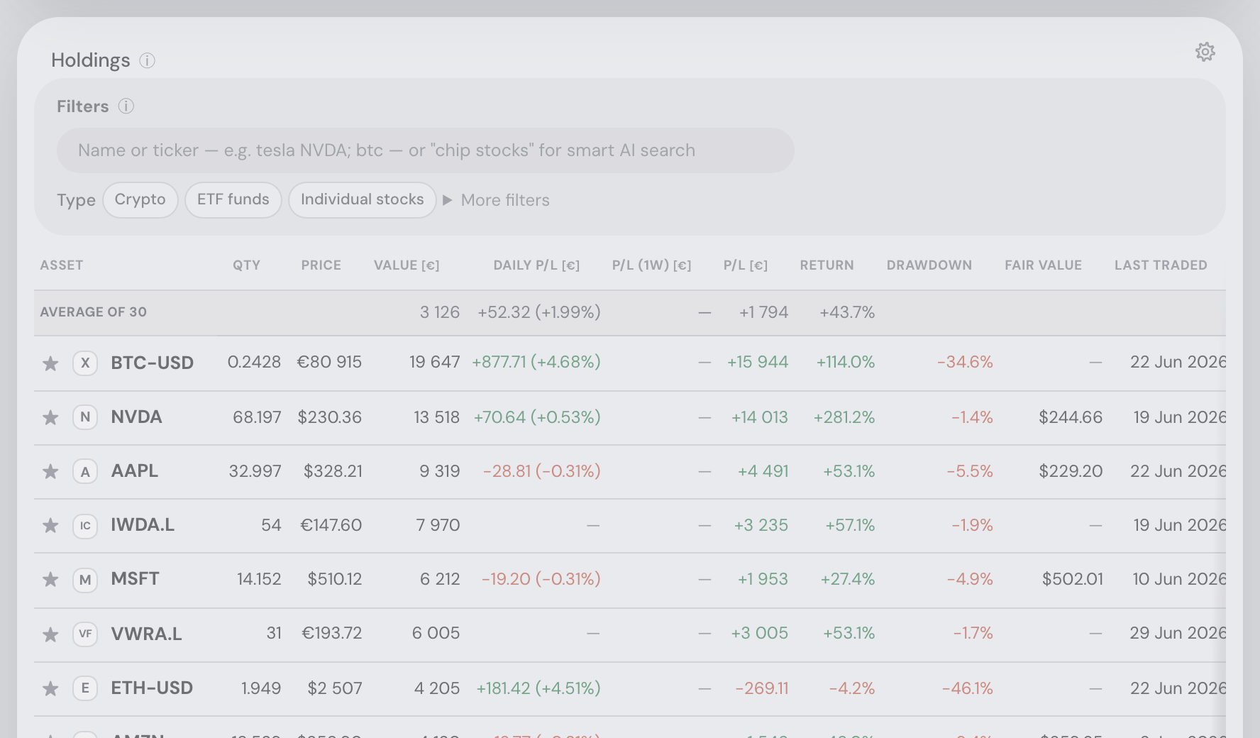
Data — sources & refresh
The Data sources card: drop CSVs or folders, enable/disable or remove files, rename an account by clicking its name (a new file or connection is named in a small dialog first — see naming an account), and manage Other assets (manual entries) and Market-priced assets, each kept in named groups that count as accounts in the Portfolio value card — rename a group, add one, drag assets between them. Connect an account opens the one searchable list of every platform — a read-only key, a broker sign-in or a CSV — and everything you have linked sits above it under Connected accounts, each row marked with its route and its last sync; see Connecting an account. Also here: the automatic quote-refresh cadence and the last-updated time. The cadence is a picker with eight steps — 15 min, 30 min, 1 hour, 2 hours, 4 hours, 8 hours, 12 hours, 24 hours — rather than a number you type, because anything between two steps is a distinction the market feed cannot make: it publishes new 15-minute bars, so a faster setting would only re-read the same data, which is also why the default is 15. The top step is a whole day, for a portfolio you look at once a day. Fetches are timed to land just after each quarter-hour publication, and every step divides the day evenly, so the schedule repeats identically across midnight. If you set an in-between value in an older version, it moves to the nearest step (a tie goes to the more frequent one). Source changes are staged like everything else and applied in one rebuild on Save — details in Getting your data in.
Strategy — your investing profile
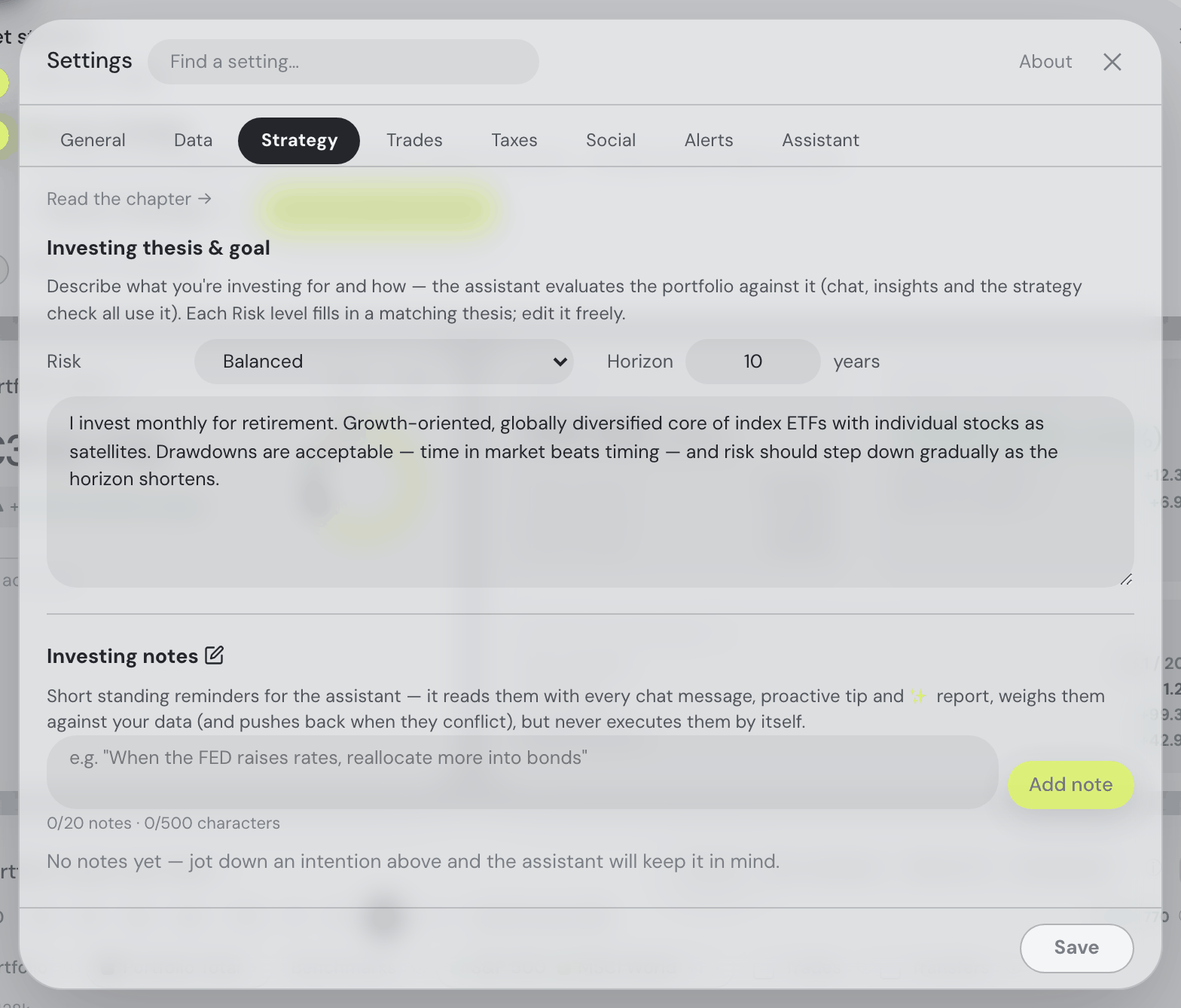
At the top sit Risk (Balanced by default) and, beside it, Horizon in years (10 by default). Under them is your investing thesis, and the Risk selector writes it: each level fills in a matching thesis — Cautious the capital-preservation text, Balanced the saving-for-retirement one a new account starts with, Aggressive the active-investor one — which you can then edit freely. Once the text is your own, changing the risk no longer replaces it: the risk changes, your words stay, and a line under the selector offers Use the … text or Keep mine. Horizon is never changed by the risk. As everywhere in Settings, the change waits for Save, and Discard puts the saved thesis back. The strategy is part of the assistant's context everywhere, and the Strategy check ✨ report evaluates the portfolio against it.
Investing notes are short standing reminders — "When the FED raises rates, reallocate more into bonds" — up to 20 of them, 500 characters in total. The assistant reads them with every chat message, proactive tip and ✨ report, weighs them against your actual data and pushes back when they conflict with it, but never acts on one by itself. The ✎ button beside the heading opens the same list as the topbar's notes button.
Trades — buy candidates, trade plan & allocation targets
Configure the current suggested plan, in your display currency:
| Knob | Default |
|---|---|
| Invest | 10 000 (in your display currency) |
| Number of buys | 3, subject to eligibility and capacity |
| Minimum single order | 2 000 |
| Sell | 0 — nothing is ever sold until you set an amount here |
| Number of sells | 3 |
| Minimum single sale | 2 000 |
Order counts, minimum sizes and eligible capacity all apply. A buy budget of 10,000 with a 3,000 minimum can fund at most three orders. The plan explains any further shortfall.
Buy and Sell settings share a row on wider screens; the Sell heading’s ⓘ explains that its sales rebalance. Number of buys and Number of sells are both counted in orders. Numeric fields use a decimal point.
Invest is new money; Sell is independent and its proceeds stay cash. Invest 30,000 and Sell 15,000 requests up to 30,000 of purchases and 15,000 of sales. Sell 0 disables sales.
Save applies the staged settings. Changing display currency converts the four monetary fields at the available rate, including when changed through the assistant; a missing rate leaves the amounts unchanged and reports the issue.
Buy candidates from: owned companies, favourites, or both — a labelled row inside Trade plan, with the mode switch and the watchlist picker on one line where the window allows. Choose a watchlist when using favourites. The choice is the whole buy table: only that universe is rated and listed under Buy candidates, so under Favourites only a company you own but have not starred is not scored at all. Sale candidates remain your holdings; explicit fund/crypto targets are separate.
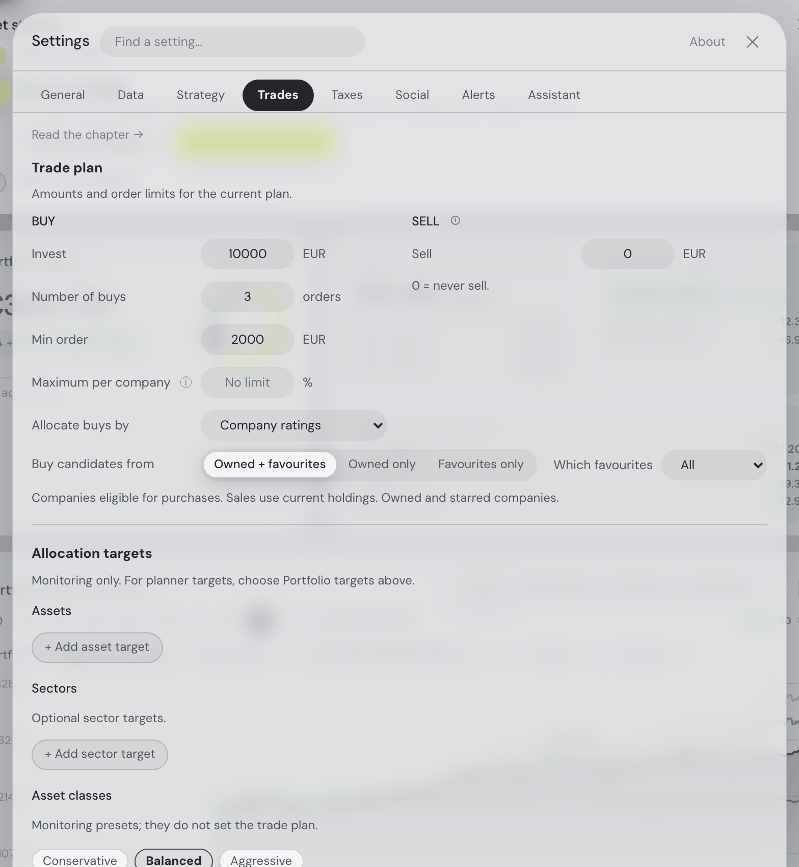
Planner settings
Part of Trade plan, not a section of its own: Maximum per company and Allocate buys by are the last two rows of the Buy column, under Min order and spaced like every other row of the section. Both configure purchases, which is why neither sits beside Sell.
How the simplified planner works, with an example.
- Maximum per company: optional portfolio percentage; blank disables it. Unset by default. Its ⓘ states the rule in the row: the largest share of the portfolio one company may hold after the plan, counted on its value plus the money you are investing; a buy that would pass the limit is reduced or skipped and holdings above it are sold first; share classes of one company count together, funds and crypto are exempt.
- Allocate buys by: Company ratings by default, or Portfolio targets with named funds, crypto, an individual-stock percentage and cash (one of the curated gold ETCs, such as SGLD or IGLN, counts as a fund target). Type a ticker or name to choose a matching fund or crypto asset. Active targets must total 100%.
Allocation monitoring: the existing asset, sector and class targets feed drift bars. They do not enable planner targets or select investments. Criteria weights live beside the rated candidates on the Trades tab.
Taxes — tax rules
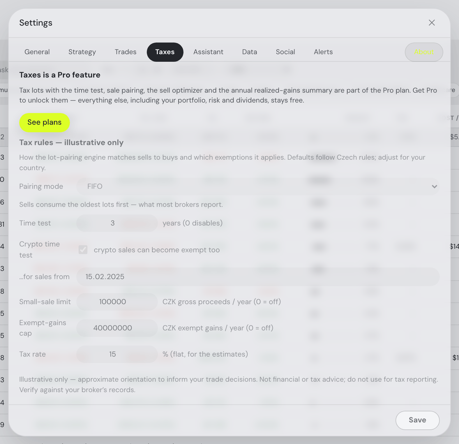
Taxes is a Pro feature, and this tab says so first: tax lots with the time test, sale pairing, the Sell optimizer and the annual realized-gains summary come with the Pro plan, and a See plans button leads to them. On the free plan the rules below stay readable but greyed out — everything else, including your portfolio, risk and dividends, stays free.
The rules themselves drive the lot-pairing engine and are illustrative only: the pairing mode (FIFO — sells consume the oldest lots first, what most brokers report — or min-tax, or min-tax with already-closed years sealed), the time test length in years (3 by default, 0 disables it) and whether crypto joins it from a chosen date, the small-sale limit and exempt-gains cap (gross per year, 0 = off — each carries its own currency, CZK out of the box, and both follow the display currency when you change it: the amounts are converted at the current rate, and left alone if no rate is available), and the flat tax rate the estimates use. Defaults model the Czech regime — every rule is adjustable or disableable for other countries, and everything derived from them (tax badges, the Sell optimizer, annual gains) is orientation, not tax advice.
Social — what friends may see
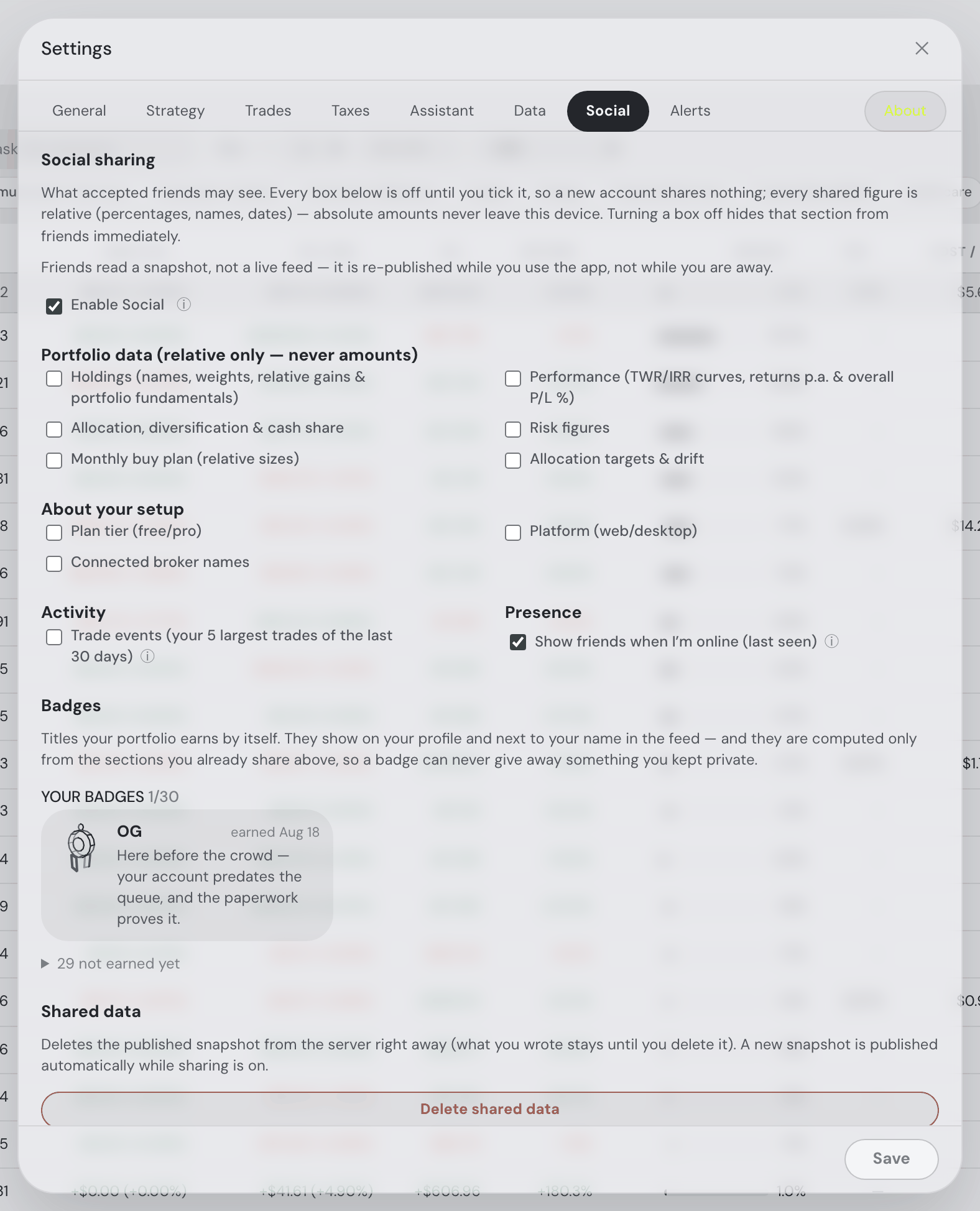
The one place your sharing is controlled. A master Enable Social switch makes the tab work at all — you get an @handle, friends can find you, requests can be sent and accepted — and publishes nothing by itself. Under it, one checkbox per section, grouped: Portfolio data (relative only — never amounts) holds Holdings, Performance, Allocation, Risk figures, Trade plan and Allocation targets & drift; About your setup holds Plan tier, Platform and Connected broker names; Activity holds Trade events; and Presence — the only one on out of the box — shows friends when you are online.
Below the checkboxes sits your badge trophy case (Your badges — 1 of 30, with the rest folded behind "not earned yet"), and a Delete shared data button that wipes your published snapshot from the server on the spot. The whole model — what a snapshot is, why a badge can never leak an unticked section — is in The Social tab.
The tab needs a signed-in (free) account: friendships and shared data belong to the account, not to this browser. As a guest it shows a one-line explanation and a Create a free account button instead of the panel above.
Alerts — server-side digests
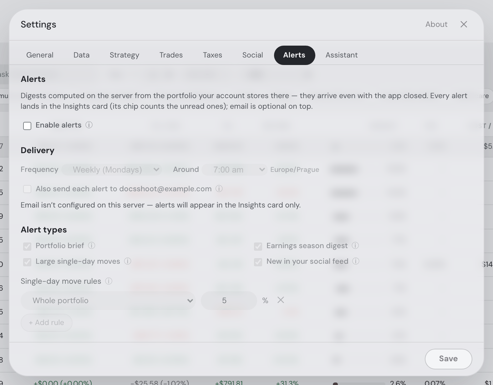
Settings → Alerts turns on digests that the server computes and delivers without the app being open — for signed-in hosted accounts, because they are the one kind of user whose portfolio actually lives on the server (a guest session’s data is wiped after a few hours of inactivity, and the desktop app’s data never leaves its machine — the panel says so instead of silently not delivering). Every alert lands in the topbar bell’s Insights & alerts list — each alert a row led by the bell’s own glyph, with the count riding the bell, that opens the digest in a dialog when clicked (the first click marks it read) — with the same tables the email sends: the brief’s totals, best/worst movers and largest positions, the movers columns, the earnings ✓/✗ table. Symbols inside it are clickable, so a mover in the table opens that asset. Press Escape, click outside or use the ✕ to close it; the assistant stays reachable beside it, if you want to ask what a number means. Optionally, alerts are also emailed to your account address — as one combined digest per delivery, at most one email per your chosen period: a proper HTML email with real tables (the earnings digest shows Symbol, report date, EPS vs. estimate with a green ✓ for beats and a red ✗ for misses, and not-yet-reported holdings dimmed below; movers get day-move and change columns — plus the rule each move crossed when your move rules differ; the brief its totals, best/worst movers and largest positions), the plain text kept as a fallback for mail clients that want it. The brief’s movers table ranks only positions that actually moved and that it can price: a holding nothing has quoted since the day the change is measured from is named in a dimmed footnote instead of ranked (a delisted coin is not a “worst mover” — nobody knows what it did), a position that really was flat is written 0.0% and coloured neither green nor red, Worst appears only when it has rows Best does not, the Best/Worst labels appear only when there are both, and on a day when nothing moved the brief says so in one line rather than filling three rows. The email opens with the Fortunest mark, animated — a small four-second loop of the nest with the coin turning inside it, beside the name at the top of the card. It travels inside the message rather than being fetched from our server, so it arrives complete in mail apps that refuse to load linked pictures (Seznam Email, Outlook, Apple Mail with privacy protection); a mail app that plays no animations shows a still of it, and one that blocks images altogether simply shows the name on its own, with the email reading exactly as it did before. Under the last section sits a Go to app → button — the same lime pill the app uses for a primary action — because the logo at the top has always been a link and nothing said so. (19.08.2026, Josef: “make it more obvious that it links out”.) Plain-text readers get the address written out instead. If you read weekly or monthly, moves and earnings that happen mid-period still appear in the Insights & alerts list the same day — the email simply waits for your next delivery day and carries them along under “since your last digest”. If the server has no outbound mail configured, the panel tells you rather than pretending. Under the frequency and hour pickers the panel names when the next digest is due — e.g. “Next digest: Monday 7 Sept, 7:00 am (Europe/Prague)” — computed from the same rule the server delivers on (daily every day, weekly on Mondays, monthly on the 1st, at your local hour) and following the pickers as you change them, before you save.
You choose the frequency (every day, weekly on Mondays, or monthly on the 1st) and the delivery hour — any hour of the day, from 12:00 am to 11:00 pm (default 7:00 am) — delivered in your timezone, which travels along automatically whenever you save. Until 19.08.2026 the picker only offered a 5:00–11:00 morning window on the 24-hour clock; it now covers the whole day in am/pm form, so a digest waiting for you at 9:00 pm is as ordinary as one at 7:00 am. Seven alert types, each with its own checkbox — three of them (largest drawdowns, below fair value and Coming up) have sections of their own below: the portfolio brief (total value, the period’s change, best and worst movers, largest positions); the earnings season digest, sent once a quarter when more than 80% of your report-filing holdings have published quarterly results (who reported, who beat or missed estimates); large single-day moves — a list of rules you add and remove, each watching the whole portfolio, one asset class (the Allocation card’s categories — equities, crypto, bonds, gold & commodities…) or a single holding, with its own threshold (1–50%; the default is one portfolio-wide rule at 5%). Per holding the most specific rule wins — its own symbol rule beats its class rule beats the portfolio-wide one — and a holding no rule covers simply isn’t checked; when your rules differ, each alert line names the rule it crossed. The assistant can edit these too (“alert me when crypto moves 10%”); and a social feed digest — what friends posted since the last one, plus a second table for the replies to your own posts, naming the post each one answers (the subject line counts both). Every digest is written in Fortunest’s own plain wording, and its numbers are always the ones Fortunest computed — no model writes any part of an alert. Between 19.08.2026 and 24.08.2026 the panel carried an optional “Let my AI model polish the text” tick box, which had your own configured model (never the free budget) rewrite the digest prose. It has been withdrawn: in a real daily brief the polished paragraph restated the total, the change and the movers in longer sentences directly above the tables that already showed them. If you had it ticked you do not need to do anything — it is switched off server-side as well as removed from the panel, so the digests you receive from now on are the plain ones.
The Alert rules in Settings → link sits inside the digest dialog, aligned with its content and clear of the rounded bottom edge, including when the digest needs scrolling.
Largest drawdowns is the movers alert’s twin, one axis over. The movers alert asks how far a position fell today; this one asks how far below its own peak it still sits — the question behind “what’s on sale?”. It takes the same rule list, with the same targets (whole portfolio / one asset class / a single holding) and the same most-specific-wins resolution, plus one setting the move rules do not need: which peak. Each rule says how far below it a position must sit (1–99%, 20% by default) and the window that peak is taken over — 1 month, 3, 6, 52 weeks by default, 2 years, or the all-time high. That window is the whole point: “20% below its high” means something quite different measured against a 52-week high than against a three-month one, and a stock can be deep in the first while sitting near the second. Each line names the position, how far down it is, the date of that high and what the position is worth — deepest first — so you can see at a glance how much of your money is down there, not just which tickers are. Unlike movers, it runs on your chosen frequency rather than daily, because a drawdown is a state and not an event: a position 30% off its high is still 30% off it tomorrow, and a daily key would mail you the same list every morning until it recovered. The same figure is a sortable Drawdown column in the Holdings table and in the Explore tables, and a Drawdown chart in every asset’s details, so the alert and the app never disagree about what “down 31%” means. The assistant can edit these rules too (“tell me when anything is 30% off its high”).
Below fair value is the drawdowns alert’s sibling, one question over. That one measures the price against its own past; this one measures it against what the company is worth — the six valuation models behind the Fair value card in every asset’s details (DCF, Graham, Lynch, EV/EBITDA, the dividend discount model and sector multiples). It takes the same rule list, the same targets (whole portfolio / one asset class / a single holding) and the same most-specific-wins resolution, with two settings of its own: how far below fair value the price must sit (1–95%, 20% by default) and which model judges — the weighted average of all six, or one you trust on its own. That choice is the point: a DCF suits a steady cash generator, the dividend model a mature payer, and the same share can be cheap on one and dear on another. The threshold is measured against the fair value, so “30% below” means the price is 0.7× what the model says the share is worth — the reading the wording promises, not the larger-sounding one measured against the price. Each line names the holding, the gap, the fair value, the price, the model that produced it and what the position is worth, biggest discount first. Like drawdowns it runs on your chosen frequency rather than daily, because being under fair value is a state and not an event. Only companies can be named: an ETF trades at the value of what it holds and a coin has no cash flows, so those never appear — and neither does a company whose reported figures none of the six models can work with. The assistant can edit these rules too (“warn me when Apple falls 25% below its DCF”).
What each plan delivers. The portfolio brief is free — into the Insights & alerts bell and, if you tick Email, by email. The other seven — earnings season, large single-day moves, largest drawdowns, below fair value, Coming up (the events calendar) the social feed digest and consensus shift — are part of Pro, and their rows wear a Pro chip with their rule editors greyed out. What you tick on the free plan is kept, not silently untidied: nothing on the server rewrites your choices, so the day you upgrade the types you already asked for start arriving.
Coming up is the one alert that looks forward. Every other type reports something that has already happened — a move, a drawdown, a quarter reported — and this one exists because the useful moment for an ex-dividend day or an earnings date is before it: learning on Thursday that the ex-dividend day was Tuesday tells you nothing you can act on. It is the Events card’s calendar as a digest, read from the same data, so the two can never disagree about what is coming. Instead of a rule list it has two settings, because there is one calendar and not one per holding: the look-ahead window (1 week, 2 weeks, 1 month or 2 months — 2 weeks by default) and which kinds it carries — earnings (the report dates of the companies you hold, which can still shift until confirmed), dividends (ex-dividend days and pay days, the first being the one with a deadline) and central banks & data (rate decisions for the currencies your portfolio touches, and the scheduled statistical releases). Each line gives the date, how far off it is — “tomorrow”, “in 8 days” — the event, the holding and what it weighs; a central-bank or data row has no ticker and no weight, and leaves those cells empty rather than printing a zero. Match the window to your frequency: a weekly digest looking 7 days ahead names each event exactly once, while a 60-day window re-names the same date every week until it arrives. Switch every kind off and no events digest is sent at all. Tax-free lot maturities are not in it — those are computed in your browser and live on the Taxes tab, which puts them in front of you already. The assistant can set both (“just tell me about earnings, a month ahead”).
On the desktop app this tab explains why there are no server-side alerts there, and houses the Offline mode switch: one checkbox that stops every outbound call the app makes on its own (licence refreshes, exchange-connector syncs, the Social and Taxes tabs, which run against the hosted server). Your portfolio, charts and history keep working from the data on your machine and cached prices keep serving — they just freeze at their last fetched values until you go back online; a local AI model keeps answering too. Fresh prices, Social, server-computed taxes, cloud AI models and alerts need the network. The licence keeps working through its normal offline grace period.
Assistant — models & tips
Assistant controls appear after saved settings load. A failed read offers Retry instead of editable default values; choices already staged in this Settings session remain intact.
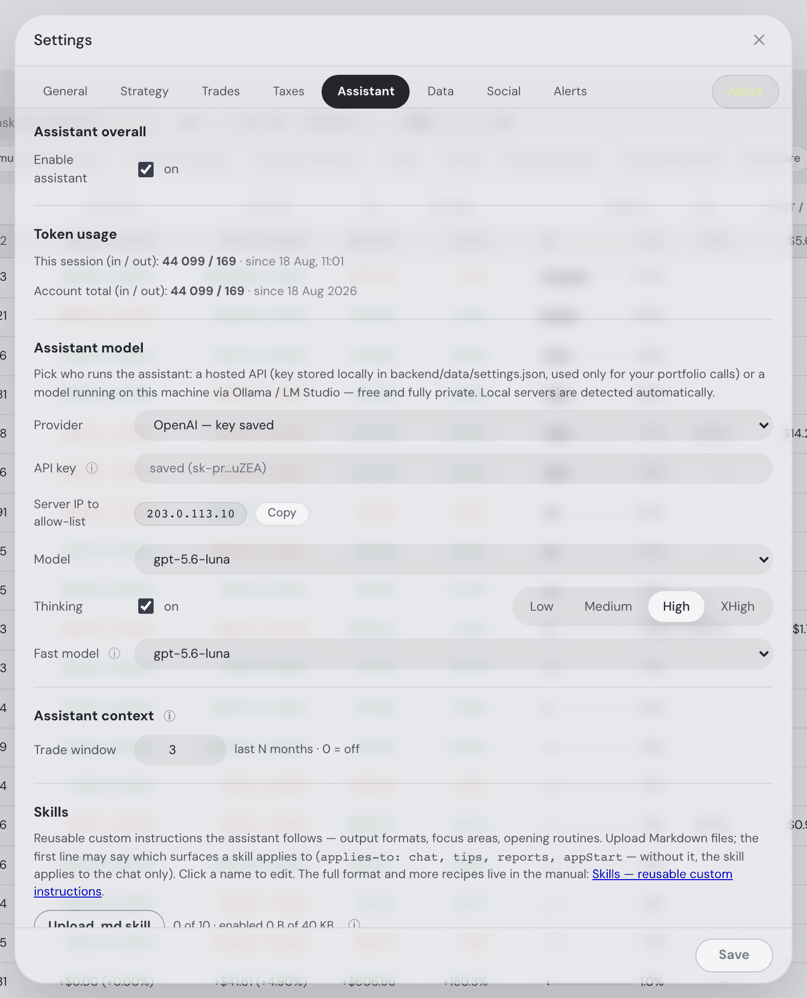
One Enable assistant switch turns the whole thing off. Beside the free-budget bar under it, Token usage counts this session's in/out tokens since the app started — with a lifetime account total when you're signed in — so the cost of a chat is never a surprise.
Assistant model picks who runs it: a hosted API (OpenAI, Anthropic, OpenRouter — the key is stored locally and used only for your own portfolio calls) or a model on your own machine via Ollama / LM Studio, which is free and fully private and is detected automatically. Provider and API key share one line; if you lock your key to an IP allow-list at the provider, Server IP to allow-list sits under them with the address to paste and a Copy button. There are two model slots — the main Model, which carries its Thinking switch and effort selector (Low / Medium / High / XHigh, and further for models that offer more) on the same line, and a Fast model for the short work. Covered in depth in The Assistant.
- External agents (Pro) — the button beside Assistant overall opens the connection dialog; choose Codex app, Codex CLI, Claude Code, the Claude app or ChatGPT for step-by-step connection instructions, copyable commands and a read-only check. See the full setup guide, including desktop synchronization and troubleshooting.
- Your connected agents — a separate External agents subpanel sits to the right of Assistant overall, or below it on a narrow screen. Its External agents Pro button opens the detailed Connections view. The quick list below uses the same connections: name, the Last active date and time, then a short client-id prefix, a live activity dot and Revoke. The rows share one grid, so each of those columns begins at the same place in every row, close to the connection name. The detailed dialog’s cards repeat the same facts as plain lines — Last active or Never used yet, Connected and the client-id prefix — beside the expiry and permissions. About four rows are visible; scroll vertically for more. The id shows its first eight characters; hover it or a truncated name to read the full value. Each cell has one tooltip, and none of them repeats what the row already prints: the dot gives the relative age (Last active 22h ago), the date and time beside it gives the Connected stamp, the id gives its Client ID in full — the same sentence the dialog card’s Key shows — and Revoke says what revoking does. A live dot means the connection is driving a tab or has called within three minutes; an unused authorization says Never used yet. Revoke disables access and removes the connection from both views; reconnecting requires authorization again. Paid Pro only.
- Assistant context — a checkbox per part of the context, deciding what rides along with every message. Anything you leave unchecked is not sent: the assistant reads it with a focused read when a question needs it, so it costs nothing until then. Checked to start with: Investing strategy, Investing notes, Memories, Macro & rates and Recent trades. Unchecked to start with: Upcoming events, Favourites, Recent news, Trades & recommendations, Product docs index and Full portfolio snapshot — the last one replaces the compact core digest and already includes every section above it, so while it is checked the other boxes have no effect. The trade window sits on the Recent trades row: how many months of your buys and sells travel (3 by default; 0 sends none, exactly like clearing the box). Under the list, one line says whether the model in play can call tools at all — if it cannot, everything is sent with every message whatever the boxes say. Covered in what each message carries.
- Skills — upload Markdown files with standing custom instructions the assistant follows (output formats, focus areas, opening routines), up to 10 files and 40 KB enabled at once, each targetable at specific surfaces via an
applies-to: chat, tips, reports, appStartfirst line; without one a skill applies to the chat only. See Skills.
About — what this is, and a way to say so
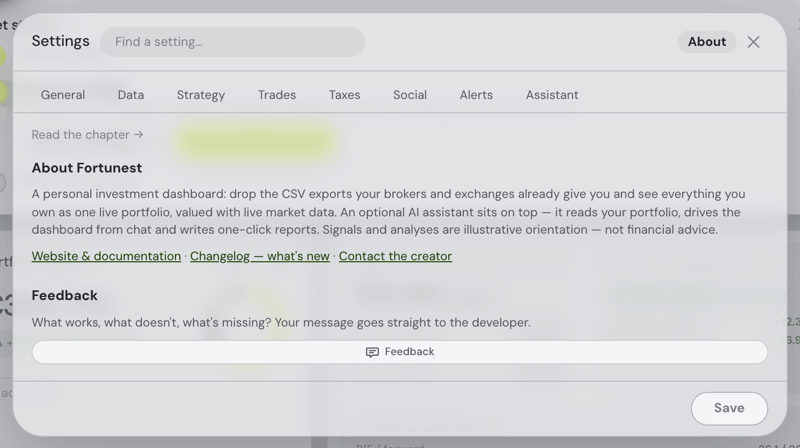
One paragraph saying what the app is, and three links: Website & documentation (these pages), Changelog — what's new and Contact the creator. Under them a Feedback button — what works, what doesn't, what's missing — goes straight to the developer; the same button also sits in the topbar.
Your account — the bust in the topbar
There is no Account tab. Identity lives behind the small bust icon in the topbar, beside the ⚙ — configuration in Settings, who you are next to it. Clicking it opens a popover: as a guest, an entry point to sign in or create an account; signed in, your email address, Manage account and a direct Sign out. The full panel — the sign-in form, a Download my data row (one JSON file with every row the account owns, offered right above Delete), and permanently deleting the account (password-confirmed — it removes every row the account owns) — opens as its own compact dialog rather than inside the popover, so typing a password cannot dismiss it and browser autofill works. What an account changes about where your data lives — and what happens to data you built up as a guest — is explained in Privacy & your data.
Confirming your email address. Creating an account emails you a one-click confirmation link, good for a week and good once. Nothing is gated behind it — you are signed in the moment you sign up, whatever you built as a guest is claimed as usual, and every tab works. The one thing it changes is the size of the free assistant allowance: until the address is confirmed the account is metered at the amount a signed-out visitor gets, and confirming starts a fresh budget at twice that (see the free budget). Until it lands, the account panel carries a dismissible notice with a Resend the link button, and the budget bar in Settings → Assistant says unverified rather than pretending otherwise. Signing up with Continue with Google skips the step entirely — Google has already proved the address — and linking Google to an existing password account confirms it too, as long as it is the same address.
On the desktop app the same bust opens the same sheet, but there is no server account behind it: it holds the Plan section and the offline licence flow instead.
Or do it all on the website, without opening the app. fortunest.ai/account is the same account in the website’s own pages: sign in or create an account there (email and password, a handle, or Continue with Google, with two-step verification and password reset handled the same way), and once you are signed in your picture appears at the top right of every page on the site, with a menu behind it. From that one page you can change your handle and picture, set or change your password, turn two-step verification (2FA) on or off, link or unlink Google, read your current plan and renewal date, upgrade to Pro or change and cancel a subscription through Stripe, generate a desktop licence token, sign out, and delete the account. It loads none of the dashboard, which is the point: changing a card or cancelling a plan should not mean waiting for a portfolio to build. Your email address is the one thing it cannot change — that is fixed once the account exists.
Desktop app licence: the account page also holds a Copy licence token button — the way to activate the desktop app when its email-and-password sign-in can't serve your account: one created with Google (there's no password to type) or one with two-step verification on. Copy the token here, paste it into the desktop app's account dialog under Have a licence token instead?, and it activates with your current plan (the app renews the token by itself from then on). Accounts with a password can simply sign in on the desktop directly — or set a first password in the Password section right above, which also unlocks the direct sign-in for Google-created accounts.
Recovery and account safety
If a guest session has expired, browser recovery retains its original backup until each item is acknowledged and verified. The recovery notice shows completed items, failed files or settings, and Retry. New binary imports retain their bytes and account currency; older binary backups already saved as text need the original file to be re-imported. Switching accounts stops replay into the new owner. A replacement-file conflict keeps both browser copies saved until recovery can be verified.
Saved settings are validated before the portfolio rebuilds, and an older settings response cannot repaint a newer save. Password-reset and verification links from before the September 7 security upgrade need a fresh email. Two-step and recovery proofs are accepted only once, including simultaneous requests.
Deleting an account also records any pending subscription cancellation. If the payment provider is unavailable, Fortunest retries after the account has been removed and resumes those retries after a server restart.