Documentation
The Social tab
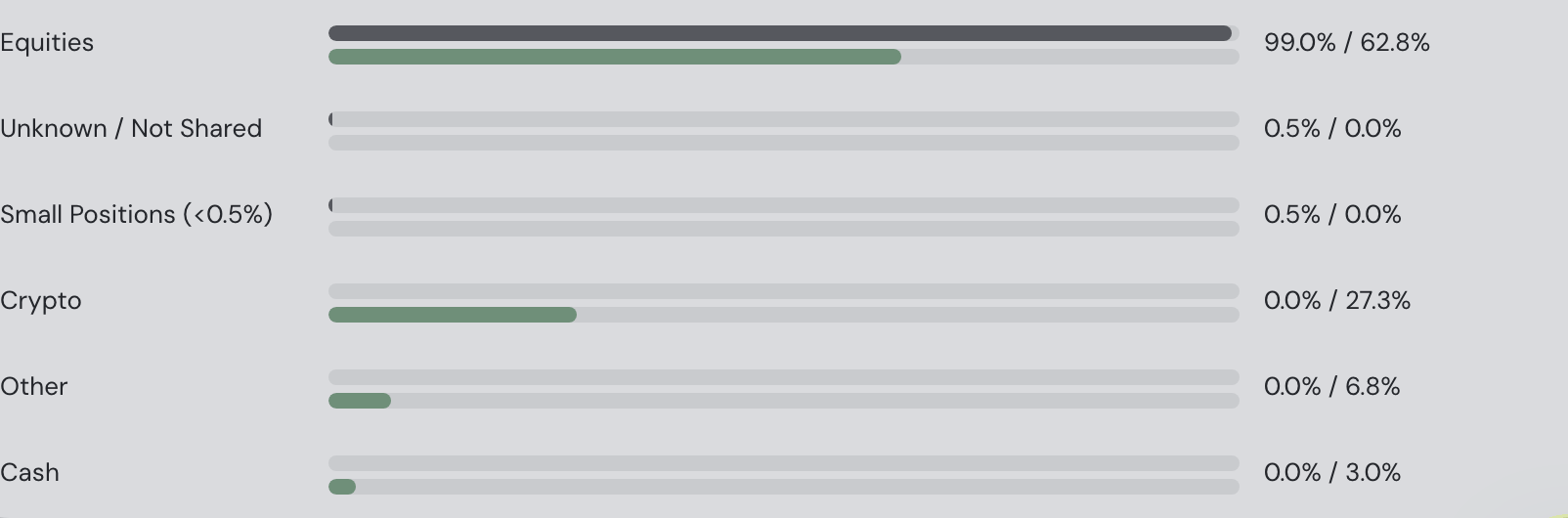
Friend details include a category pie built from the owner's shared holding categories. Its inner ring groups categories and its outer ring shows holdings in matching shades. Click a category to inspect its holdings and use Back to all categories to return. Only percentages are shared and shown, never portfolio money values. Cash appears when the owner also shares Allocation. Enable the optional Market sector circle checkbox to add the owner’s market sectors inside the categories. It is off by default and remembered for the browser tab; switching it off keeps every category’s colour and place, and names that do not fit their wedge are shortened (Cons. Cycl.), in full on hover. Older snapshots without categories or sectors use Other until their owner republishes.
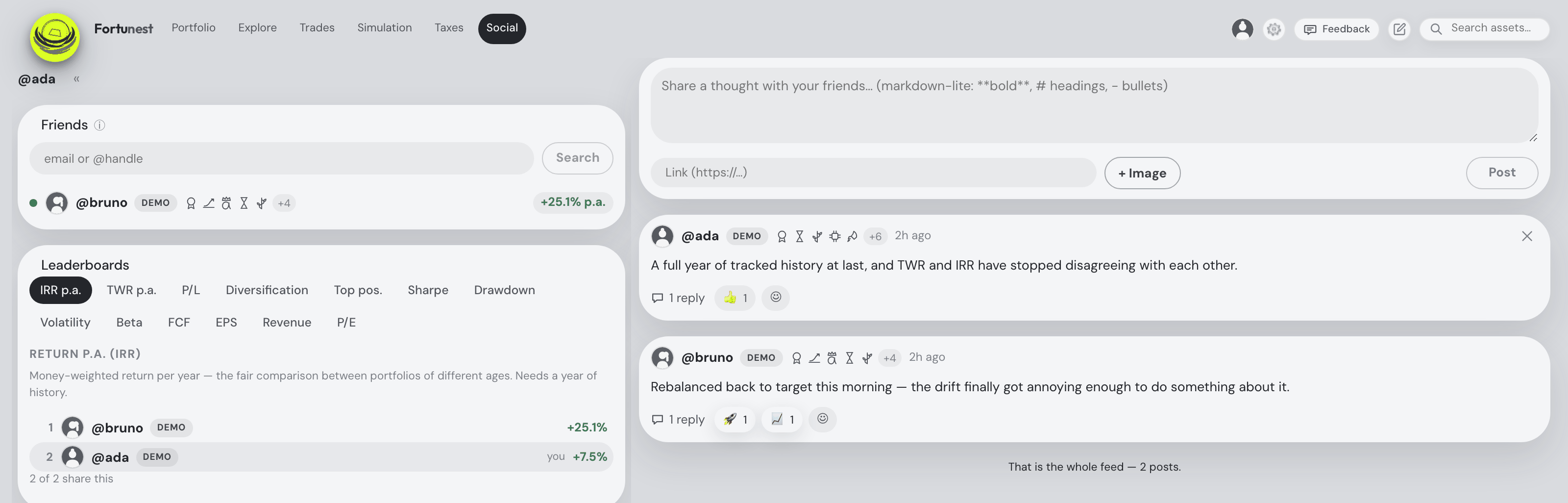
Investing is more fun compared. The Social tab connects you with friends — you see their shared portfolios, they see yours, and a shared feed carries posts, charts and reactions. Sharing is built the safe way round: only relative figures (weights and percentages, never amounts), only the sections you tick, and nothing at all until you tick one.
Connecting with friends
Friendships are request and accept — never one-way:
- Search for a friend by their exact email address or @handle in the Friends pane. Social is on for a new account, so a friend who has opened the app can be found — but anyone who has switched Social off is invisible to search, and being findable is not the same as sharing anything (see below).
- Send the request. Your friend sees it as an unread badge on their Social tab, with approve and decline buttons.
- Only when they accept do the two of you become friends — and acceptance is the consent: nothing about your portfolio is visible to anyone before both sides have agreed.
Either side can unfriend at any time, which immediately ends all visibility in both directions. There is also a block list: blocking someone removes any existing friendship and pending requests both ways and makes you unfindable to them.
The number beside each name is that friend's Total P/L as a percentage of the money they put in — the same figure your own Portfolio tab's Total P/L tile prints beside its amount, formatted the same way (+47.8%, no “p.a.”), green or red — and the list is ordered by it, best first, with friends who share no figure last. Hover the pill and it says what it is and since when: “+47.8% — Total P/L as a share of the money put in, since 28 Sep 2021”, the first day of their shared performance history. It shows only for friends who share Performance right now; a friend who shares nothing, has published nothing yet, or publishes from an older app version wears a greyed-out N/A pill in the same slot instead. The yearly money-weighted rate (IRR p.a.) that used to sit here is still on the leaderboards and in the friend's portfolio dialog, where comparing portfolios of different ages belongs.
The tab needs a signed-in account (it's how friends find you), and it's a free-plan feature — see Accounts & plans.
What sharing means — and what it never means
Everything you share is controlled from ⚙ Settings → Social: a master Enable Social switch, and one checkbox per section of your portfolio. Every section checkbox is off by default — the only things on out of the box are the master switch itself and presence, neither of which reveals any portfolio data. Tick exactly what you're comfortable with:
Saving a sharing change tells you what it published. Since 4 September 2026 Save waits for the snapshot to go out and the footer reads “Saved ✓ · Snapshot published just now · 11 of 12 left this hour” — the number being the hourly publish allowance. If the publish is refused (the allowance spent, or the network down) the dialog stays open and says so, with a Retry that publishes again without re-saving the settings: your friends never keep seeing the old selection while the app says “Saved”.
The master switch being on is what lets the tab work at all: you have an @handle, friends can find you, and you can send and accept requests. It publishes nothing by itself. A brand-new account is findable and shares absolutely nothing — accept a friend before ticking a box and they will see your @handle and an empty profile. The first thing of yours that ever leaves the device is a section you ticked. Switch the master off later and you go quiet without dismantling anything: your friendships, badges and settings are kept, and one tick brings you back.
| Share toggle | What accepted friends see | Default |
|---|---|---|
| Holdings | Asset names with their portfolio weight and relative gain in %. | Off |
| Performance | TWR and IRR — total %, cumulative and monthly return curves. | Off |
| Allocation | Allocation groups in % and the diversification score. | Off |
| Risk | The Risk card's relative figures — volatility, max drawdown, Sharpe, beta. | Off |
| Buy plan | Your trade plan — names and relative sizes only. | Off |
| Targets | Allocation targets and current drift, in %. | Off |
| Plan tier | Whether you're on the Free or Pro plan. | Off |
| Platform | Whether you use the web or the desktop app. | Off |
| Brokers | The names of your connected brokers/accounts — never the names of your groups of hand-added assets. | Off |
| Trade events | Automatic feed events for your five largest trades of the last 30 days — "bought NVDA · about 3% of the portfolio". Sizes are always a share of your portfolio, never an amount. | Off |
| Presence | Online dot and last-seen time — no portfolio data. | On |
How it works under the hood matters for privacy: your app builds a snapshot of only the ticked sections, computed locally, and publishes it to the Fortunest server, where only your accepted friends can read it. Sections you didn't tick are never part of the upload — they don't leave your machine at all. Publishing is automatic (shortly after your portfolio data changes, while sharing is on), and friends always see a "last updated" stamp on what they're looking at.
- Relative values only, always. Weights, percentages and return curves — never amounts, never currency values, never quantities. There is no toggle that shares an absolute number; friends can see that NVDA is 12% of your portfolio, never what that 12% is worth. Your raw transactions, CSV files and account balances are never included in the Social snapshot.
- Opting out is instant. Untick a section and it disappears from your friends' view immediately — the server filters every read by your current settings, so you never wait for the next upload. Turning the master switch off hides you entirely: your profile stops resolving in search and nothing of yours can be read.
- Delete shared data — a button in ⚙ Settings → Social wipes your published snapshot and its three prior relative snapshots from the server on the spot. Unfriending someone (or them unfriending you) also ends their access immediately.
The full privacy story — including what the desktop app does and doesn't send — is in Privacy & your data.
What the room holds
For the filing lag, comparison limits and a step-by-step investor example, see compare 13F investor groups with your own portfolio.
Current group holdings appear before allocation classification and quarterly history finish. Progress names the fund and quarter being read, or the position batch being classified, with completed and total counts for each stage. A progressing load can continue beyond 30 seconds; if a later stage stalls, already available holdings stay visible. Large consensus tables show 100 holdings per page; Previous and Next reach every holding.
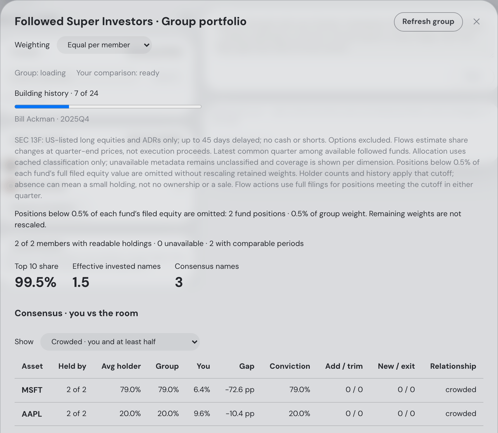
Select Group portfolio in the top row of the Friends or Super Investors card. It opens an overlay over the existing feed; close it with the cross, Escape, or the backdrop. Friends are free; the investor group requires Pro. Each readable member has equal weight by default. Investor groups can also weight by filed equity AUM; friends never share amounts.
The consensus table shows held-by breadth, average weight among holders, group weight, your weight, the gap (yours minus the group, in percentage points), and conviction (breadth × average holder weight). Filter crowded names (you and at least half the room), blind spots (the room holds it, you do not), or lonely names (only you hold it). Hover any consensus column label for its definition, including how weights are averaged, what the flow counts include and what missing values mean. The Group explanation follows the selected weighting. Click a ticker to open its asset drawer.
Compare regions, sectors, size bands, instrument types, listing currencies and asset classes beside your allocation. Unknown or unshared classification stays visible with a coverage percentage. Top-10 share, effective invested names, member overlap and member turnover describe the group’s shape. Your comparison weights are built on your device and are never uploaded to Social.
In both Friends and Super Investors group portfolios, switch between Regions, Sectors, Caps, Types, Currencies and Classes using the allocation sliding-pill switcher. The selected dimension updates the Group / You comparison below it.
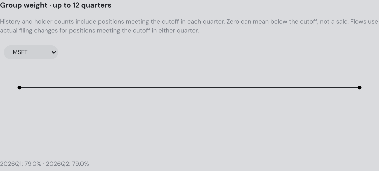
Investor groups use the latest common quarter among followed funds with available filings, with up to 12 common quarters of weight history. Filings describe US-listed long equities and ADRs, arrive up to 45 days late and omit cash and shorts; options are excluded and their share is listed per member. Net buys and sells estimate share-count changes at quarter-end prices, not actual execution proceeds. Missing funds and comparison periods are counted explicitly.
Friends’ flow estimates compare consecutive publications in a four-snapshot ring. Cached listing-price drift is removed where prices cover both dates; otherwise flows are unavailable. The result is approximate: FX, deposits, withdrawals and corporate actions can also change weights. Current sharing toggles, disabling Social, blocks and friendship grants apply to every history read. Delete shared data removes the current snapshot and its history. Use Refresh group to read the current published state.
The group and your comparison load independently, with a status for each. Readable group holdings appear even while your comparison is loading or unavailable. Investor allocations use cached classification: coverage is stated, missing metadata remains unclassified, and positions at or above 0.5% of each fund’s filed equity keep their original weights; smaller positions are reported separately. A timed-out request offers a refresh instead of staying at one of two forever.
Pro users can add Held by followed funds through Explore’s column picker, adjust Group consensus in Trades’ criterion weights, and enable Consensus shift in Settings → Alerts. The alert reports a crossing of 50% breadth or a net sale, at the selected delivery frequency. It starts off. Ask the assistant “show my friends’ group portfolio” for the same relative comparison.
Investor groups omit positions below 0.5% of each fund’s full filed equity value, retaining exactly 0.5% and original weights. Omitted counts and weight are visible, including per-fund details. Holder counts and history apply this cutoff; absence can mean a small holding, not no ownership or a sale. Flow actions still use actual filing changes for positions meeting the cutoff in either quarter. Interrupted sections are labelled incomplete, including in assistant context.

A friend's portfolio
Click a friend and their shared snapshot opens: holdings as a weight histogram with relative gains, TWR/IRR cumulative and monthly charts (with a from date that re-bases the curve at any day you pick — typed, or chosen from the same in-app calendar the value chart’s own “from” field opens; the ✕ beside it hands the whole history back), allocation groups and the diversification score, risk figures, the buy plan, targets with drift — whichever of those the friend has ticked — plus the "last updated" stamp.
The Return p.a. (TWR) and Return p.a. (IRR) rows at the top of that sheet behave exactly like the ones on your own Portfolio tab, and say the same sentences: hover or tab to the coloured percentage and it names the measure, gives the cumulative total behind an annualized TWR, and closes on the span — “Since 18 Mar 2024 — 2.46 years”, read off the curve the friend actually published. The dates are printed the way this sheet prints dates rather than in the ISO form the tile uses, because the two surfaces know the date from different places. Until 4 September 2026 the same context sat in two small grey lines under the rows here too.
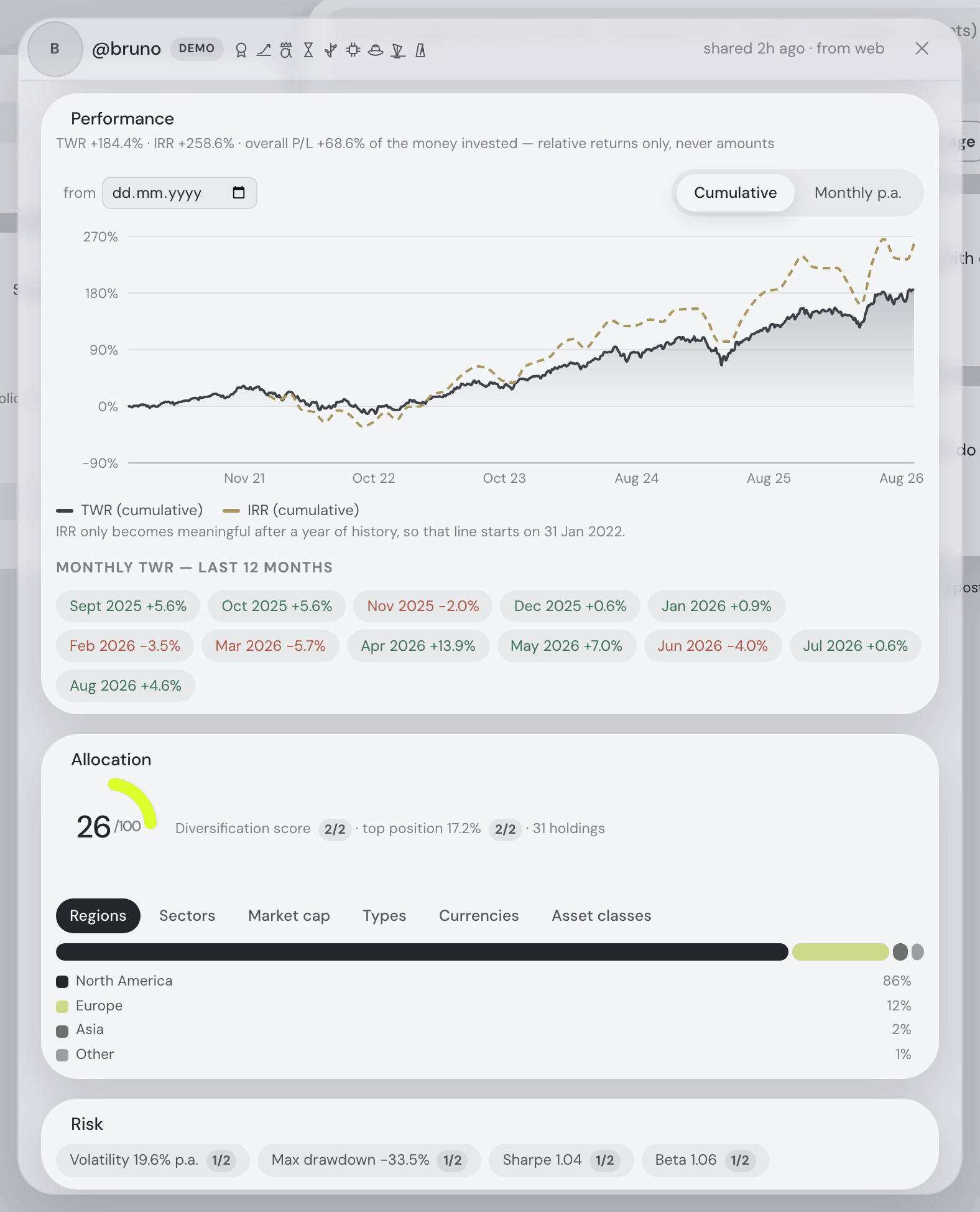
"uses demo data". A portfolio built (partly) from the demo seed — what the "Try with demo data" button loads — wears a small demo label beside its @handle, everywhere the handle appears: the feed, the friends list, the leaderboards and this dialog. Your own leaderboard row is marked too. It says what it says and nothing more: those returns and places were computed over synthetic data, so they are not a track record. The flag rides no share toggle — a disclaimer you could untick would let a synthetic return pass as a real one — and it clears itself on your next publish once the demo files are gone.
Friends who share performance also appear as selectable overlay curves in your own Portfolio value chart, right next to the benchmarks: "@handle TWR", "@handle IRR", and a drawdown curve in drawdown view. They're available in the Return/percent modes only — friends share no absolute values, so there is nothing to draw in value mode. Both Return % lenses draw them: what they publish is a cumulative-return curve, and Trailing 12M p.a. reads it year-on-year on the same monthly steps the benchmarks are put on, so nobody has to publish a rate for you to compare pace with pace.
…and your own, seen the way they see it
Your own @handle — at the top of the Social tab, on your leaderboard row, on the byline of your own posts — opens the very same dialog, pointed at you. It answers the one question the rest of the app cannot: what do my friends actually see?
The important part is that it shows what is published, not a fresh calculation of what would be. Your stored snapshot is read back off the server and filtered by your share toggles exactly as a friend's read of it is, so this view can legitimately disagree with your dashboard — and those disagreements are the reason to look:
- a section you have ticked but which has not been re-published yet;
- a snapshot from earlier today, while the figures behind it have moved — the header's "shared 2h ago" stamp says which vintage you are reading;
- a section that is empty for a reason — no history yet, nothing to report.
Everything in it stays written in your friends' words ("@handle's badges", "the plan @handle is on"), because that wording is the answer; a short line at the top says whose sheet it is. There is no Unfriend or Block on your own — the way out of your own sharing is ⚙ Settings → Social.
Two plain answers replace a spinner when there is nothing to draw. Nothing published yet — a brand-new account, or every box unticked — says so, and says that ticking a section sends the first snapshot within seconds. A snapshot that exists but carries no sections says that instead: it is on the server with its timestamp, and a friend opening it sees your @handle, your badges and nothing else.
Leaderboards
Under the friends list sits one ordered list of you and your friends per figure, best first — starting on the same figure the friends list prints beside each name (Total P/L as a share of the money put in), so first place and the number beside the name agree — and falling back to the IRR-per-year board when nobody in the pool publishes that ratio. The sliding pill row offers every board somebody can actually fill, so a pill never opens a column of dashes, and the selected board lists everybody: no fold, nothing to click for the rest. Ties share a place (1, 2, 2, 4), your own row is marked and stays in its real position, and clicking any row opens that friend's shared portfolio, where the same standings appear as chips.
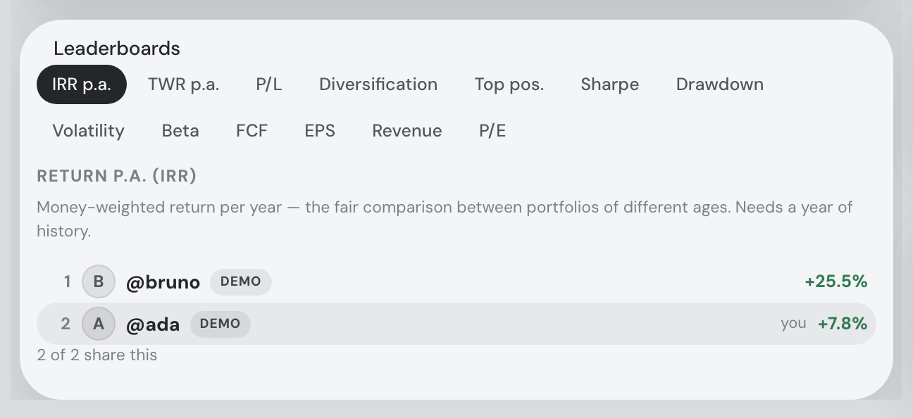
A friend with no number for that figure still appears, at the bottom, with a dash — dropping them would turn "they didn't say" into "they came last". The dash's tooltip says which of two things happened, because only one of them is about their privacy settings. If they don't publish that section at all, it reads "@x does not share Return p.a. (IRR)." If they do share it and only this figure is missing, it says so instead: "@x shares their performance, but no Return p.a. (IRR) came with it — they may have none to show yet, or publish from an app version that predates this figure. Not something they chose to hide." That second case is ordinary: a portfolio of ETFs reports none of the five company fundamentals, a beta needs a benchmark, and a portfolio under a year old has no annualized return at all.
One figure never goes missing for the wrong reason any more. A friend publishing from an older app version sends the return curve without the yearly rate on top of it, and the rate is recoverable from that curve exactly — the server has always done so for the yearly rate it carries on the friends list's payload, and hands the recovered figure to the boards and the friend's portfolio dialog as well. So the yearly rate a friend shows on the board and in their dialog can no longer disagree with itself.
Every row shows what that person holds. After the name and before the figure, a leaderboard row carries the same row of company logos the friends list does — that person’s biggest positions, largest first, each one opening that asset’s details, each hover naming the weight. Your own row has one too, built from the same local snapshot the board uses for your figures, so you see your own book on a board even when you publish your holdings to nobody. A friend who does not share their holdings has no logos and no stand-in for them: a row of grey circles where the honest answer is “they didn’t say” would be inventing the look of an answer. And the logos follow what somebody holds, not how they placed — a friend who shares their holdings but not their risk figures sits at the bottom of the Sharpe board with a dash and keeps their logos. It costs nothing to fetch: the boards were already reading each friend’s shared snapshot to rank them, and the holdings were in it all along.
When the column is narrow, the logos give way — your friends’ names never do. Squeeze the column (drag the divider, or open the assistant beside it) and the logos drop off one at a time from the right, smallest position first, so the largest holding is the last to go. After them the badge marks fold into their +N chip and then away. The @handle keeps its full width throughout — where a long name like @rostislavpetrovic used to be clipped to @rostislavp… while the marks beside it kept their space. The return figure stays put on the right the whole way. Unlike the badges, the logos leave no +N chip behind: the strip is a glance at composition rather than a count, and the full list is one click away in that person’s own dialog.
Widen the column and you get more of them — not five, but as many as fit. Drag the divider out and each row keeps adding logos until it runs out of room, up to twelve. It works the other way with equal patience: every row spends its own width, so a short name carries more marks than a long one on the same screen. The Super Investors rail behaves exactly like the friends list now — it used to drop every logo in the rail at once below a fixed width, and show a flat five above it.
Every strip in a list ends on the same line. The logos sit just left of the return figure, and the figures are all set to the width of the widest one in that list — so “+7.9%”, “+151.5%” and “N/A” occupy one column and the logos beside them form a second. Rows holding fewer positions simply start their run further right; the gap falls beside the names, where the column is uneven anyway, rather than beside the figures, where the eye reads down.
The boards are computed on your own device, and there is no leaderboard endpoint. They're assembled from your friends list and the snapshots your app has already fetched — each one already filtered by that friend's current toggles — so a board can never show a figure its owner doesn't share. Your own row is the exception that proves it: it's built locally with every rankable section switched on, whatever you publish, so you can see where you stand on a figure you share with nobody. That row never leaves your device, and it's labelled "not shared" on the board so the asymmetry is never mistaken for a leak.
Super Investors
Between the friends list and the boards sits a card of a different kind of company: famous investors' portfolios, rebuilt from their public SEC 13F filings. Funds managing $100M+ in US-listed stocks must report their holdings to the SEC every quarter, within 45 days of quarter end — and that public record is what these cards show. The roster of 25: Warren Buffett (Berkshire Hathaway), Bill Ackman (Pershing Square), Stanley Druckenmiller (Duquesne), David Tepper (Appaloosa), Seth Klarman (Baupost), Dan Loeb (Third Point), David Einhorn (Greenlight/DME), Carl Icahn, Terry Smith (Fundsmith), Li Lu (Himalaya), Chase Coleman (Tiger Global), Mohnish Pabrai (Dalal Street), the Gates Foundation Trust, Soros Fund Management, Cathie Wood's ARK, Ray Dalio's Bridgewater, Howard Marks's Oaktree, Ken Griffin's Citadel, Jeff Yass's Susquehanna, Alexander Sacerdote's Whale Rock, Leopold Aschenbrenner's Situational Awareness, JPMorgan AM, Capital Research, Dodge & Cox and Baillie Gifford. Most wear their real portrait (free-licensed photographs; a handful with no free photo anywhere keep the app's generated figure — Citadel's and Susquehanna's blurbs also say plainly that a market-maker's filing is not a conviction list).
A fresh filing is feed news. When an investor you follow files a new 13F, the Social feed's first page carries a card of its own: their portrait, which quarter was filed, and the top ten portfolio changes — the verb color-coded (New / Added / Trimmed / Sold out), each asset as the app's live ticker chip (hover for the spark card, click to open its details), the weight before → after with the share-count change, and the filed dollar change — the fund's own public figures, the one place an absolute amount appears in the Social tab. The card sorts into the feed by the filing day and stays there as history; under the @mentions filter it steps aside. React and reply to it like to any post — the emoji row and the written replies are the feed's own, and your replies on a filing are visible to you and your friends who follow the same fund. What a filing card does not have: a delete button (nobody owns it) and @mention tags (a fund has no friends to resolve them against).
A row of little logos says what a portfolio holds. Each friend's row, each leaderboard row, each followed investor's row — and each row of the Browse investors… roster — ends in asset marks, as many as that row has room for (up to twelve on a wide column), the biggest position leftmost, each opening that asset's details. They drop off one at a time from the right as the column narrows, so the name beside them always reads whole. An investor's row keeps the fund's name in the tooltip — hover the row and it names the fund — and prints it inline after the investor only when the row is wide enough to show the full strip and the whole fund name side by side. Hover for the figures: a friend's mark shows the position's weight ("NVDA · 8.1% of @ada's portfolio" — never a value, because a shared snapshot carries no amounts at all), an investor's mark shows the filed weight and the filed dollar value converted to your dashboard currency ("AAPL · 33.0% · $60B ≈ 1.4T CZK" — public filing figures).
Followed investors are chart benchmarks too. In the Portfolio value chart's Return % and Drawdown views, the benchmark picker grows a Super Investors group beside Friends: each followed investor's reconstructed curve drawn against your own, labelled "(13F)" so the legend itself carries the caveat, with their drawdown derived from the same curve.
Finding one. The card's heading always says where your plan stands — 1 of 2 follows on the free plan, nothing on Pro — so the wall is announced before the fold is opened, not met inside it. Inside the Browse investors… fold a filter box narrows the roster by name or fund as you type: li lu finds Li Lu, berkshire finds Buffett. The ⓘ beside the heading opens this chapter.
Following is one-way. Press Follow in the card's Browse investors… fold and the fund is in your list — no request, no approval (there is nobody to approve), unfollow any time from the card or from the portfolio sheet itself. A followed investor's row shows their approximate yearly return and opens the same portfolio sheet a friend's row does: holdings by filed weight, a sector breakdown, and a Quarterly changes card — what the latest filing did against the one before: New, Added, Trimmed, Sold out, with the weight and share-count moves.
Read the banner before the figures. Every sheet opens with its provenance: which quarter, when it was filed, and what a 13F can and cannot say. It is a quarter-end snapshot, published up to 45 days later — so a position opened last month is not in it, and a position bought and sold inside a quarter never appears at all. It covers US long positions only: no cash, no shorts, no bonds, no non-US listings (Fundsmith's European names, Pabrai's Indian book and most of Baupost simply aren't there), and filed options — which 13Fs report at headline-inflating notional share counts — are excluded from the holdings and disclosed as a percentage instead. The return curve is a reconstruction: quarter-end filing weights held between filings, priced on total-return history. It is an approximation of the filed book, never the fund's actual performance — and when less than 70% of the filed value can be priced, no curve is shown at all rather than a fictional one. Super Investors never enter the leaderboards for the same reason: a synthetic curve does not race real track records.
Plans. The free plan follows up to 2 investors — any two. The whole roster is a Pro feature: past the cap the remaining rows wear a Pro pill, and if you downgrade, every follow is kept but only your two oldest stay readable until you unfollow down or upgrade back. Opening one of the follows your plan does not reach says so plainly, with the way out beside it — unfollow another investor, or get Pro. It is never dressed up as missing data: the filing is there, and telling you to wait for the next quarterly 13F would be waiting for something that changes nothing.
The assistant knows who you follow from any tab — ask "what is Buffett holding?" or "what did Ackman buy last quarter?" and it reads the filed portfolio (caveats attached), and "follow Li Lu" works too.
Setting the split yourself
The line between the left column and the feed is a grabbable divider. Drag it and the two columns resize against each other — a wider friends list when you are catching up on people, a wider feed when you are reading. The pointer changes to a resize cursor over it and the line lights up when you take hold; it is the same grip the assistant’s docked pane uses on its own edge.
Each side has a floor, and the feed’s is the higher one — a post carries prose, a screenshot, a chart and a thread of replies under it, so it needs more room than a list of names and figures does. The column cannot be dragged narrower than the width at which the longest @handles still read whole, which means the line you cannot pass is never hiding a name behind it. Double-click the divider to put the split back to its original proportion.
Your width is remembered — across a reload, and across visits — because a split you set is a layout you arranged, not a passing choice. Until you drag it for the first time the split stays proportional, so it keeps responding to the size of your window and to the assistant opening beside it. Collapsing the column with « (below) does not disturb the width you set: » brings the column back exactly as wide as you left it.
Keyboard. The divider can be tabbed to. ← and → move it a step at a time (hold Shift to move four times as far), Home and End go to the two extremes, and Enter resets it. On a phone — where the two columns stack one above the other — there is no split to set, so the divider is not there at all and the keyboard skips straight past it.
Collapsing the side column
On a desktop window the « button beside your @handle collapses the whole left column — friends list, Super Investors and leaderboards — to a narrow rail of vertical buttons, and the feed takes the freed width. Click Friends, Investors or Leaderboards to open that card, full size, in an overlay dialog (close with ✕, Escape, or a click outside; a friend’s row inside still opens their shared portfolio on top). The count of pending friend requests stays visible on the minimized Friends button, so a waiting request never hides behind the collapse. The choice is remembered across visits; » expands the column back. The split is by pointer, not window width: on a desktop the minimized rail stays a rail however narrow the window gets, while touch devices keep the fold described above.
Badges
Badges are collectible titles your portfolio earns by itself — Diamond Hands, Index Monk, Bag Holder. They show in your trophy case (⚙ Settings → Social, and at the top of your profile when a friend opens it) and as a small row of marks next to your name in the friends list and at the top of your profile. The feed itself stays clean: a post or a trade row carries no badges beside the handle — click the @handle on any post to open that person’s profile and see their collection. There is nothing to claim, buy or turn on: the server works them out from what you already share, on every publish.
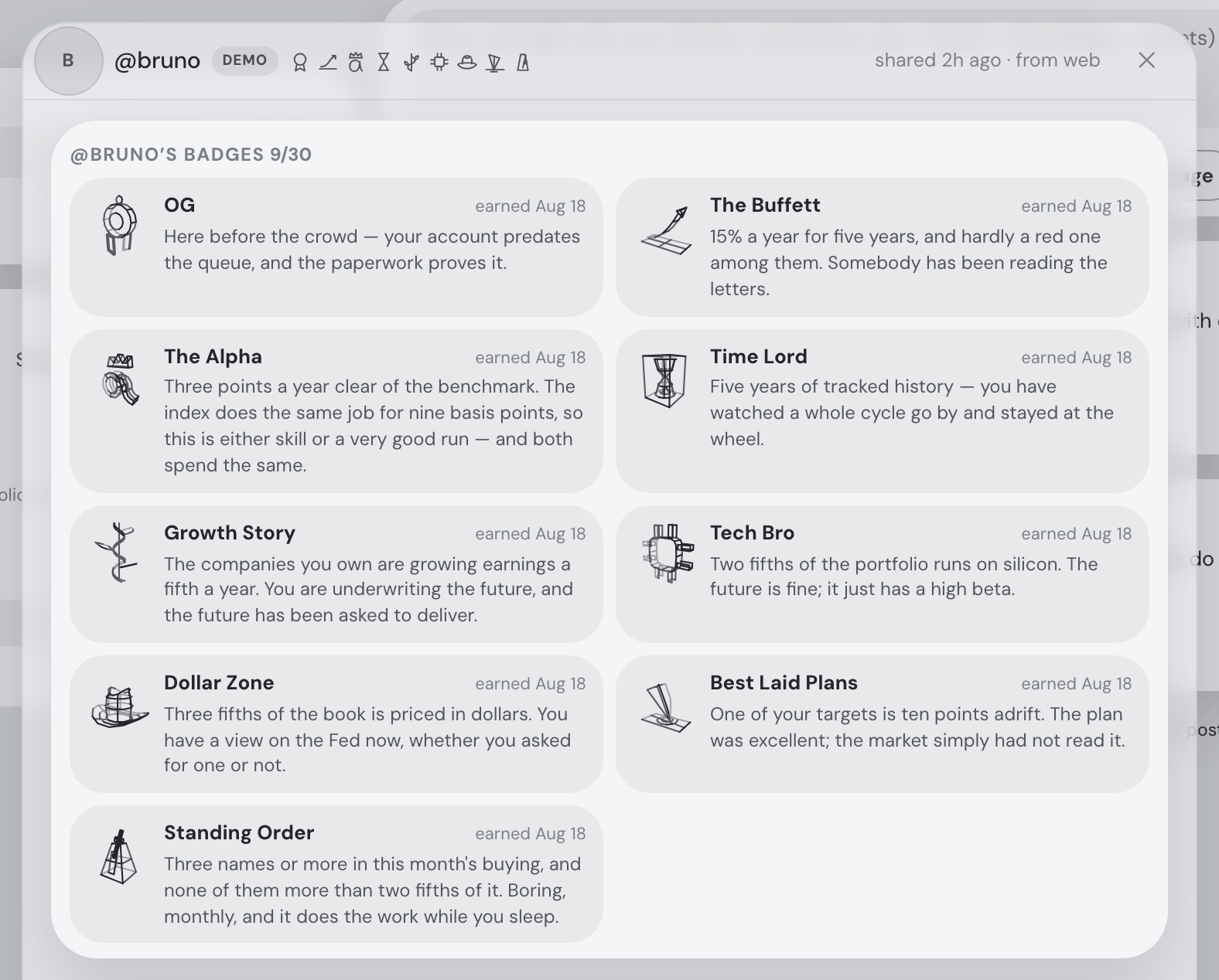
Hovering a badge tells you how it was earned, and the case keeps a "since" date — the day you first earned it. A badge you stop qualifying for quietly steps out of the case, and if you earn it again it comes back wearing its original date rather than starting over.
Where the name is a reference, an ⓘ beside it tells you who or what it refers to. The Graham opens on Benjamin Graham (1894–1976), who wrote Security Analysis and The Intelligent Investor, gave investing the margin of safety and Mr Market, and taught Warren Buffett — and on why the badge waits for a portfolio trading at fifteen times earnings. Only the badges with a story carry the glyph.
Badges never reveal what you didn't share
This is the rule the whole feature is built around: a badge may only be derived from a section you already share (plus your own account facts — when you signed up, how many posts you wrote, how many reactions you handed out, when you last published). If the section a badge reads is unticked, the badge is simply not awarded, however well the portfolio fits the rule.
The reason is that a badge is public — it sits beside your handle. If Tech Bro could be earned without sharing Allocation, it would announce your sector concentration to exactly the people the toggle was meant to keep it from. So the locked tiles in your case name the section their rule reads, untick a section and the badges reading it retire with it (no re-upload needed), and badges are computed on the server from your stored snapshot — never claimed by the app, so no modified client can invent one.
Badges for what you hold
Fourteen badges read the shape of the portfolio — what it is made of, how concentrated it is, where in the world and in which currency it sits. Each one needs its section ticked, and the percentages are the same relative figures the rest of Social shares — weights and returns, never amounts.
| Badge | How you earn it | Needs shared |
|---|---|---|
| The Graham The book trades on fifteen times earnings. You paid for what the companies earn, not for what they might. | A value-weighted P/E of 15 or less — and above zero, so a book of loss-makers cannot slip under the bar from below. | Holdings |
| Growth Story The companies you own are growing earnings a fifth a year. You are underwriting the future, and the future has been asked to deliver. | Earnings growing 20%+ a year and revenue growing 10%+. Revenue is the check: earnings alone can be buybacks. | Holdings |
| Tech Bro Two fifths of the portfolio runs on silicon. The future is fine; it just has a high beta. | The Technology sector is 40% or more of the portfolio. | Allocation |
| Small Capper A third of the book sits in small caps — the companies nobody at the party has heard of yet. | The small-cap bucket is 35% or more. | Allocation |
| Degen A quarter of everything is crypto. Sleep is optional; conviction is not. | The Crypto asset class is 25% or more. | Allocation |
| Boomer Portfolio Bonds and cash carry 40% of the load. Boring is a strategy, and it compounds beautifully. | Bonds plus cash are 40% or more. | Allocation |
| Index Monk Nothing above 10%, twenty-five positions or more. You made peace with the average, and the average is undefeated. | No holding above 10% and at least 25 positions. | Holdings or Allocation |
| Long Tail Twenty positions under half a percent each. Individually irrelevant, collectively a hobby. | At least 30 positions, 20 or more of them under 0.5% each. | Holdings |
| All In Two fifths of the portfolio in one position. That is not an allocation, that is an opinion. | The largest holding is 40% or more. | Holdings |
| To the Moon Something you own is up 200% and you still own it — which is by far the harder half. | A position is up 200% or more. | Holdings |
| Bag Holder A position is down 50% and you are still standing beside it. Everyone has one; most people just don’t say so. | A position is down 50% or more. | Holdings |
| Globalist Three continents, none of them more than half. You have decided not to have a view on any one government. | Three or more named regions carrying 10% each, and no single one above 50%. Unknown and Other are not continents and are left out of both counts. | Allocation |
| Dollar Zone Three fifths of the book is priced in dollars. You have a view on the Fed now, whether you asked for one or not. | 60% or more of the portfolio is priced in US dollars. | Allocation |
| Dry Powder A seventh of the portfolio is sitting still. Cash is a drag right up until the week it isn’t. | Uninvested cash is 15% or more of the portfolio (read off the cash share, or off the Cash segment of the class breakdown on older snapshots). | Allocation |
Badges for how it has behaved
Ten more read the record rather than the contents: the returns, the ride, and whether the plan survived contact with the market. Same rule — no ticked section, no badge.
| Badge | How you earn it | Needs shared |
|---|---|---|
| The Buffett 15% a year for five years, and hardly a red one among them. Somebody has been reading the letters. | Annualised TWR of at least 15% over five or more years of tracked history, with positive returns in at least four of the last five whole years. | Performance |
| The Alpha Three points a year clear of the benchmark. The index does the same job for nine basis points, so this is either skill or a very good run — and both spend the same. | At least 3 percentage points a year more than your chosen benchmark, over a year or more. Your app works it out at publish time from the same benchmark line you have on the portfolio chart (the US-dollar line doesn’t count — it is cash, not a market); under a year of history publishes nothing rather than an extrapolation. | Performance |
| Time Lord Five years of tracked history — you have watched a whole cycle go by and stayed at the wheel. | Five or more years of tracked history, whatever the return. | Performance |
| Diamond Hands You sat through a 40% hole and came out more than 20% ahead of where you started. The chart still has the dent in it. | A 40% drawdown at some point in the shared return curve, and a cumulative TWR of at least +20% today. Both read off the curve your friends can actually see — the badge and the chart beside it are the same measurement. | Performance |
| Iron Stomach 30%+ volatility and still in profit — you clearly open your statements less often than the rest of us. | Volatility of 30% or more and a positive TWR. | Risk + Performance |
| Quiet Life Beta under 0.7 and volatility in the low teens. When the market has a bad day you hear about it from other people. | Beta of 0.7 or less and volatility of 15% or less. | Risk |
| The Sharpe Sharpe above 1.5. The returns are good, and the ride was not the price you paid for them. | A Sharpe ratio of 1.5 or more. | Risk |
| On Target Nothing more than two points from where you said it should be. Somebody in here actually rebalances. | Three or more stated allocation targets, and every one of them within 2 points of its target. Positions you set no target for are not counted — they are not missed targets. | Targets |
| Best Laid Plans One of your targets is ten points adrift. The plan was excellent; the market simply had not read it. | At least one stated target 10 points or more adrift. The mirror of On Target: 10 is bigger than 2, so no portfolio can wear both. | Targets |
| Standing Order Three names or more in this month’s buying, and none of them more than two fifths of it. Boring, monthly, and it does the work while you sleep. | Three or more names in this month’s buy plan, and the largest of them no more than 40% of it. | Buy plan |
Account badges
The other six read nothing about your portfolio at all — only your own account: when you signed up, what you posted and reacted to, and how recently you shared.
| Badge | How you earn it | Needs shared |
|---|---|---|
| OG Here before the crowd — your account predates the queue, and the paperwork proves it. | An account created before 1 January 2027 — the early-adopter era. | Nothing (your account) |
| Paper Hands Three sales inside a month. Decisive — or possibly just a spot of spring cleaning. | Three or more SELL trade events in the last 30 days. Needs the Trade events toggle on — with it off, those events are hidden from friends, so the badge is too. | Trade events |
| Chatterbox Twenty posts and counting. The feed would be a very quiet place without you. | Twenty or more posts written. | Nothing (your posts) |
| Good Sport Twenty-five reactions handed out to other people’s posts. Somebody has to do the clapping. | Twenty-five reactions or more put on other people’s posts. Applauding your own does not count. | Nothing (your reactions) |
| Lurker Ninety days in, publishing away, and not one word written. Read-only is a perfectly good setting. | An account 90 days old or more, still publishing (something shared in the last 30 days), with no posts written at all. Deliberately impossible to hold alongside Ghost. | Nothing (your account) |
| Ghost Sharing is on, but nothing new in 90 days. Your friends are waving at an empty chair. | Sharing is enabled but nothing has been published for 90 days or more. | Nothing (your snapshot) |
The feed
The feed is a chronological stream of your own and your accepted friends' posts — nobody else's, there is no public timeline. A post can carry:
- Text, written in markdown.
- Images and animated GIFs — up to four. Drag them onto the composer or paste them straight into the text box (since 1 September 2026 — there is no attach button): each appears as a small thumbnail with a ✕ below the text before you post. Most images are downscaled client-side; an animated GIF is kept exactly as it is, under a 400 KB cap — and in the feed it holds still on its first frame until somebody clicks it (see below). One bad file costs only itself: drop four pictures with one oversized GIF among them and the three good ones stage, with a single line naming what was skipped and why. And a paste from a spreadsheet keeps the cells rather than the screenshot of them — a spreadsheet puts both on the clipboard, and the tab-separated text is the half that can be read back. A posted GIF waits to be asked (since 3 September 2026): it shows its first frame with a “▶ Play GIF” mark on it, a click starts it, another click stops it — a feed of a dozen posts is no longer a dozen loops running at once. Its full-window view sits on a ⤢ in the picture’s corner instead of on the picture itself, since the click is the play switch now; opened there, the GIF plays freely. Click any other posted picture to open it full-window (since 21 August 2026): the picture takes the whole screen and stays zoomable inside — the mouse wheel or a trackpad pinch zooms about the cursor, dragging pans, a double-click (or double-tap) toggles between 1× and 2.5×, and on a phone two fingers pinch while one finger pans. Escape, the ✕, a click beside the picture, or a downward swipe at 1× closes it; with several pictures in the post the arrows, ← →, or a sideways swipe move between them.
- Links — pasted straight into the text (since 1 September 2026 the composer has no separate link field), or dragged onto the composer, which types the address into the body where the caret is: left to the browser, a link dropped on the page navigates the whole tab to it and your unsent post goes with it. (A link dropped inside the text box is still the browser’s own — it already puts it at the caret.) Every plain
http(s)address in a post becomes a clickable link that opens in a new tab; anything that is not plain http(s) —javascript:,data:and friends — stays inert text, by design. A link that points at a picture (.png,.jpg,.gif,.webp…) shows the picture itself in the post — a GIF still and waiting for a click, like an attached one, and if the picture cannot load, the post shows the plain link instead. One thing to know: an embedded remote picture is fetched by each reader’s browser from wherever the link points, like in any chat app. Posts written before this change, with the old separate link field, keep their link — and when that link points at a picture, it shows the picture inline under the same rules. - A chart from the assistant — every chart the assistant draws gets a Share button that drops it straight into the post composer as a live, interactive chart.
You can delete your own posts at any time. Since 4 September 2026 the ✕ asks first: it turns into Really delete / Keep it in the row itself — the same pair the “delete shared data” button in ⚙ Settings → Social has always used — and only the second click removes the post. The same goes for an event card and for a reply on a thread.
The composer takes ⌘/Ctrl + Enter to post (plain Enter is a new line, which is why the placeholder says so), and it counts your last 500 characters down as you approach the 10,000 cap instead of silently refusing the next keystroke.
Accepting a friend request answers straight away with “You and @bob are now friends” rather than leaving the row to disappear whenever the next refresh lands.
You can delete your own posts at any time. Hover a post's 3h ago for the exact date and time, the way the trade events and the bell already show theirs.
An empty feed offers the next step. Before you have any friends the feed says so — and its Find a friend button opens the friends pane (on a phone it unfolds it), the same place the assistant's "open my friends" lands.
Every “ago” in Social is the same age wherever you read it. The times behind a post, a reply, a notification, a friend’s last seen and the shared… ago on a shared portfolio are kept in UTC and sent labelled as UTC, and your browser turns them into an age against its own clock — so a post made a second ago says “0m ago” in Prague, in New York and in Kathmandu alike. Until 2 September 2026 the label was missing, and a browser reading an unlabelled time assumes it is local: a friend’s brand-new post showed as “2h ago” in central Europe, which is exactly how far Prague is from UTC in September. Nothing that had already been posted was wrong — the times were always UTC, they simply did not say so.
On a phone, pull down from the top of the feed to refresh it. The same gesture that re-fetches your prices elsewhere in the app refreshes only the social side here — the newest posts, the unread badge and your friend requests — so it lands in a moment, and the gap that opens above the content says so: Release to refresh your feed, then Feed up to date. Your prices and portfolio are left alone (since 21 August 2026).
The feed grows further back as you scroll down it. There is no page to turn: the next stretch of history is fetched while you are still a screen above the bottom, so the list is usually already longer by the time you get there. The foot of the column says where you are in numbers rather than with a spinner — “50 posts loaded”, then “Loading older posts… 50 loaded”, then “+50 older · 100 loaded”, and eventually “That is the whole feed — 137 posts.” If a page fails to arrive it says so there, with a Try again beside it, rather than stopping quietly: a feed that has given up on your history looks exactly like one that has reached the end of it. The Load older button is still there too, for a browser that cannot watch the page for you, for that retry, and for reaching the older posts from the keyboard.
Automatic trade events
With the Trade events toggle on, your five largest trades of the last 30 days are posted to your friends' feeds as compact one-line events — "bought NVDA · about 3% of the portfolio", "sold Alpha Corp · about 12% of the portfolio". Every kind of trade counts: opening a position, closing one, adding to something you already hold, trimming something you are keeping. They are ranked by size, so what a friend reads is the trading that actually moved your portfolio rather than whatever happened to be most recent.
Each event is dated by the trade, not by the moment it was published, so a month of trading sent in one go reads as a month: the rows sit at the days they happened, newest first, rather than arriving in a block stamped with the same minute. The stamp is a day — “today”, “yesterday”, “3d ago”, then the date, with the full date on hover — because a day’s buying and selling of one asset is summed into one decision before anything leaves your device, so there is no clock time to publish. Because the stamp is a day rather than a moment, it is read as a day at both ends: a trade you made today reads “today” to a friend in Honolulu as surely as to one in Prague. Your friend’s unread badge still counts by arrival: an event for a three-week-old trade is new to them the day it is posted.
The size is always relative, and it is the only size there is. A trade is ranked and described by what it was worth as a percentage of your portfolio. No quantity, price, amount or total is included in the Social event, so there is nothing in an event a reader could work a figure out of — the same promise every other section on this page makes. The wording is deliberately coarse for the same reason: your friends do not know how big your portfolio is, so a second decimal place would be telling them something that means nothing to them.
Only your five largest go out, and the set is worked out afresh every time you publish. A trade you made today can therefore enter the top five and be posted; one that has already been posted stays posted, because it happened. What cannot happen is the same trade being posted twice — the server remembers every trade it has already written an event for, and that memory outlives the event itself. Deleting an automatic post, or pressing Delete shared data, will not cause it to come back.
What is never posted. A trade worth less than 0.05% of your portfolio is dust — a residue swept out of an account, a rounding leg, a few cents of staking income — and is skipped. So is anything that is not a decision you made: a transfer between your own accounts, a ledger correction (the closing rows an import writes to make your history end where your broker says it stands), income paid in kind, a fee, a corporate action. Those carry real sizes and would rank beautifully; none of them is a trade, and announcing one as a trade is worse than saying nothing. Beyond that, a friend adds at most five automatic posts a day to your feed, whatever the window contains.
How long they stay: 30 days — unless somebody answers one. An automatic event is news for a few days and a steadily worse description of your portfolio after that — the position it announces may have been trimmed or closed since — so it stops being shared a month after it was posted, and drops out of your friends' feeds by itself. That is the same month the rule looks back over, deliberately: an event can never expire while the trade behind it is still shareable, so nothing flickers out of a feed and back into it. Posts you wrote yourself never expire: you chose to write them, so they stay until you delete them, or until you delete your account, which takes all of it with you. Unticking Trade events is the other way an event goes away, and it is instant: every read is filtered by your current setting, so the events you already posted stop being visible to your friends the moment the box comes off. Ticking it again brings back the ones that are still inside the month.
An answered event is permanent. The month applies to rows nobody chose — the app wrote them, and after a while they are noise. The moment somebody reacts to one or writes a reply under it, it stops being machine output and becomes a conversation, so it stays in the feed for good. Nothing else about it changes: it is still yours to delete, and deleting it still does not cause the trade to be posted again. The rule is that an answer is standing on it, not that one once was — if the last reaction is taken back and the last reply removed, the row is an unanswered automatic event again and rejoins the month, which is the honest reading of an empty conversation.
…and an answered event is one you can see yourself. Your own automatic events are normally kept out of your feed: you already know what you traded, and reading a list of your own decisions back is noise in the one place that is meant to be news. The exception is the same moment that makes an event permanent — once a friend reacts to one or replies under it, it appears in your feed too, because it is no longer a readback of your own trading but half of a conversation, and the half you cannot see is the half you cannot answer. Events nobody has answered stay hidden from you, exactly as before. They keep the date of the trade, not of the reply, so an answer to an older trade appears where that trade sits rather than at the top — the Social tab's unread mark is what tells you it arrived.
Two things that are not obvious. This toggle does not need Holdings — you can share what you trade without sharing what you own. And events are only ever created at the moment you publish: ticking the box today posts your top five of the last month straight away, but nothing reaches back further than that window, however long you have been trading.
Auto events are posts like any other: you can delete them, your friends can react to them and reply to them, and with the toggle off none are ever created.
Reactions
Every post takes reactions from a fixed set of ten: 👍 👎 ❤️ 🙂 😢 😠 💸 💵 🚀 📈. Click to react, click again to take it back; each post shows the per-emoji counts with your own reactions highlighted.
Replies
Reactions answer a post with a tap; replies answer it in words. At the left of the emoji row every post carries a Reply control — with a count on it once there are any (“3 replies”) — which opens the conversation and a box to add to it. Enter sends, Shift+Enter starts a new line, and a reply can run to 600 characters. Replies are plain text: the post above one can use markdown, a reply cannot, so nothing in it turns into a heading, a link or an image. You can delete your own reply anywhere, and any reply on your own post — your post is your page.
You see replies from people you can see. Yourself, whoever wrote the post, and your own friends. The author’s other friends are strangers to you, so their replies are not shown to you — they are counted at the end of the thread instead (“2 more replies from @ada’s other friends”), which is the same rule that decides whose names a reaction chip tells you. And when somebody replies to a post of yours, the Social tab’s unread mark counts it: a post is broadcast, a reply is addressed at you. Your own replies never mark anything unread, and reading the feed clears them.
A post wears only the reactions it has — the emoji somebody actually clicked, in the order above rather than by popularity, so a chip never moves under your cursor as other people vote. The rest of the set is one click away behind the ☺ Add a reaction button at the end of the row, which is all you see on a post nobody has reacted to yet. Taking a reaction back leaves its chip in place (at zero, no longer highlighted) until you leave the page, so a mis-click is easy to undo. Reply and the reactions are one row: the control comes first, the chips follow it, and the chips wrap onto a second or third line beside a Reply that stays where it is. It is deliberately plain text with a speech-bubble outline rather than a pill, so the one thing on the row that is not a reaction does not look like one; opening it drops the conversation full width underneath.
@mentions
Type @ in the post composer or in a reply box and a list of your friends drops under it (or opens above it, when the phone keyboard leaves no room below) — avatar and @handle, narrowed as you type. ↑/↓ move, Enter or Tab take the highlighted one, Esc closes it, and on a phone you tap a row; the half-typed word becomes @handle and you carry on typing. It offers only people you are friends with, because those are the only people a tag can reach.
In a post or a reply, an @handle you can open is a chip. That is a friend’s handle, your own, and the handle of anybody already on the page — the post’s author, the people replying under it. Click a friend’s or an author’s and their shared portfolio opens, exactly as clicking their name on a post does; click your own and you get your own shared portfolio, as your friends see it. A handle naming nobody on the page and none of your friends — somebody you do not know, or a name nobody owns — stays ordinary text, since there would be nothing for it to open.
A mention reaches only people who could see the text anyway. When you post or reply, the handles in it are resolved then and there, and only your accepted friends (with Social on) count; in a reply, only those who can also see the post it sits under — the post’s author and the author’s own friends. Your own handle tags nobody. The first 20 mentions in one text count; the composer tells you if you pass that.
Being mentioned shows up in three places. The Social tab’s unread badge counts it. The feed marks it: a post that tags you wears a small “@ mentions you” pill and an accent on its edge, a reply that tags you a mentions you mark beside its byline, and the All / @ Mentions you row above the feed shows only the posts that mention you — in the post or in a reply under it — with the count on the chip. And if you have the social digest turned on under ⚙ Settings → Alerts, it gains “@anna mentioned you in a post: …” lines.
Trade events take both as well. An automatic trade row — “sold Apple Inc. · about 4% of the portfolio” — carries the same Reply control and the same reaction bar a written post does, on a second line of the same compact row. It is the most conversational thing in the feed: a friend’s decision, sized and dated, and until now the one thing there you could not answer. Everything on this page applies to it unchanged, including whose names a chip tells you and whose replies you are shown. Answering one also stops it expiring.
Ticker chips
An asset named anywhere in the feed is a live chip. In a post, in a reply — under a post or under a trade row — and in the trade row’s own sentence, a ticker the app knows (NFLX, vwce.de) or the written name of a company you hold becomes the same chip the assistant’s answers carry: hovering it shows a one-week mini-chart with the latest price, and clicking it opens that asset’s details. What counts as “known” is your own app’s vocabulary — your holdings and the symbols you have looked at — so the chips you see are the ones you can actually open.
When an asset has no logo, its initials stay centered together in a square badge sized to the surrounding text, including in trade rows.
Ordinary words stay words. A ticker that is also an English word (LOW, NOW) chips only when written in capitals — the capitals are your friend’s own signal that they meant the ticker — and everyday shorthand never chips at all, however it is written: a reply reading “IMO the ETF strategy beats DCA” names no asset. An @handle is a person, never a ticker.
Your @handle & avatar
Everyone on Social has an @handle — lowercase letters, digits and underscores, 3–24 characters. A default is derived from your email's local part the first time you use Social; change it whenever you like under ⚙ Settings → Social (the old handle is freed for others). Friends can find you by handle or by exact email. Your own handle is also a button: pressing it anywhere on the tab shows you your shared portfolio as your friends see it.
You can also upload an avatar (downscaled in your browser before upload); without one, the app draws you a default avatar: a friendly flat figure — one of eight, with a different haircut or hat — on one of seven grey discs, each a slightly different shade, picked from your handle. It is always the same one for the same handle, on every device, and it is drawn in your browser rather than fetched from anywhere. The avatar shows on your posts, in friends' lists and on your account button in the topbar — and, since 18 August 2026, on your account page here on the website too, which used to draw a different picture for the same account. Your browser makes two sizes of it: a small thumbnail, which is what travels with every post and every friend row, and a larger one used only where the picture is actually shown big — the enlarged view at the top of your profile. It keeps feeds light: the picture is repeated with each post, so the small size is the one that gets paid for over and over. Pictures uploaded before 11 August 2026 have only the large size and keep working; saving your profile once makes the small one.
Presence
Friends see a small online dot and a last-seen time next to your name. Presence reveals no portfolio data, which is why it is the one toggle that defaults to on — and it has its own switch in ⚙ Settings → Social if you'd rather not broadcast it.
The unread badge
The Social tab's button in the navigation carries a badge with an unread count: new posts and trade events from friends, replies and reactions to your posts, @mentions of you, pending incoming friend requests, and a friend accepting your request. It is the same number Friends & mentions wears — one count, one source of truth. A mention counts once — a post or a reply that tags you is the mention, not also the post or the reply. Opening the tab clears the feed part of it, opening the list clears all of it, and reading the feed clears the posts it has actually shown you. There are no push notifications or pop-ups — the badge, the list and the optional social digest email are the whole notification system: the digest is the push, the list is the archive.
Friends & mentions
Everything the badge counts is also kept: the small people button on the row with your own @handle — at the right end of the side panel’s head on a desktop (or in the collapsed rail’s strip), the first line of the tab on a phone, above the friends & leaderboards fold — opens a chronological, browsable list of it — a popover on a desktop, a bottom sheet on a phone (a phone being 600 px and narrower; since 04.09.2026 the switch is the app’s own phone width rather than the 860 px this tab folds its columns at, so a narrow desktop window keeps the popover). Each row is one sentence with the person’s avatar and a relative time: “@anna replied to your post: …”, “@bob mentioned you in a reply”, “@carl sent you a friend request”, “@dana posted”, “@erik bought NVDA”, “@fay reacted 🚀 to your post”, “@gus accepted your friend request” — with a line of the post or reply under it and an accent dot while it is unread. Newest first, twenty at a time; older rows load as you scroll down, and the bottom of the list says what is happening in numbers (Loading older… 20 loaded, +20 older · 40 loaded, That’s everything — 53 notifications), with a Load older button for the keyboard and for a retry.
Opening the list marks everything in it read — a moment after it opens, so a mis-click clears nothing — and the tab badge goes to zero with it. Clicking a row takes you there: a post, reply, reaction or mention scrolls the feed to the post (fetching older pages if it is not on screen yet) and rings it for a moment; a friend request or an acceptance opens the friends pane. Esc, the ✕ or a click outside closes it.
It opens on hover — rest the pointer on the button and the list appears after the same short beat every tooltip in the app waits, and stays while you move across into it. Clicking still opens and closes it (which is what a tap does on a phone, where the list is a bottom sheet), keyboard focus opens it, and Escape closes it and puts the focus back on the button. The button wears a people glyph, not a bell, and is named Friends & mentions: the bell belongs to Insights & alerts in the topbar, which is about your own portfolio, and with the side column collapsed to its rail the two used to sit inches apart looking identical.
It follows the feed’s rules exactly. The list is not a second copy of anything — it is read from the posts, replies, reactions, mentions and friendships themselves — so a blocked or unfriended person’s rows leave it as they leave the feed, a friend’s trade events are listed only while they share them and until they expire, and a friend who switches Social off goes quiet here too. It reaches back through your whole history from the day it shipped. The assistant sees the unread count while you are on the Social tab, and the rows while the list is open.
On the desktop app
The desktop app joins the same social network as the hosted app — friends on the web and friends on desktop see each other identically. Social uses the hosted service even when your portfolio is stored locally:
- Sign in via the Licence flow: connect your Fortunest account under Manage account → Licence (the bust icon in the topbar, beside the ⚙) — the same sign-in that activates a Pro licence also signs you into Social, and a free account works. Creating an account and editing your profile happen on the website; the app links you there.
- Online only: the tab talks to the Fortunest server, so offline it shows a calm "connect to the internet" message instead of the feed. Cached portfolio analysis and local AI can work offline; fresh market data, cloud AI, hosted sync/MCP and Pro tax calculations also need connectivity.
- Snapshots are built the same way as on the web — locally, from only the sections you ticked. What the desktop app sends is spelled out in What leaves your machine, and why.
Accounts & plans
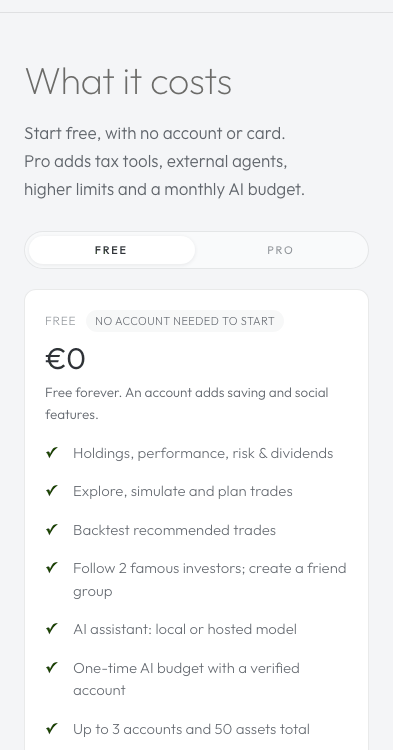
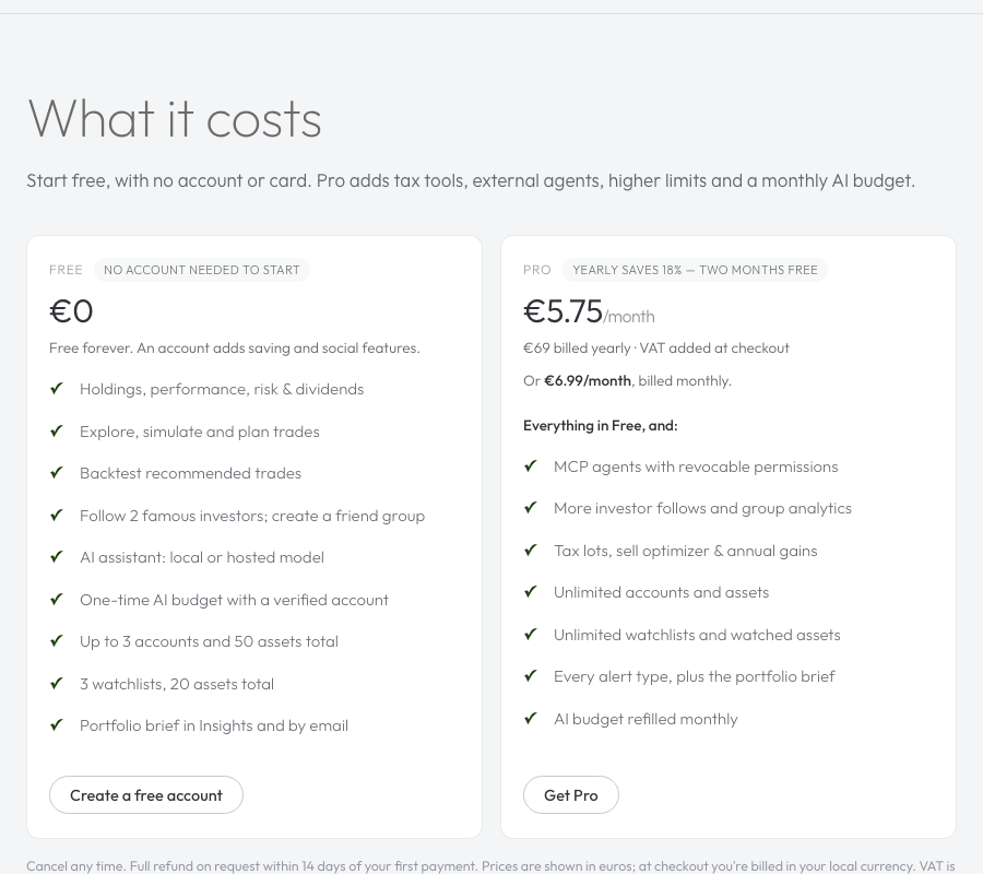
Friendships, relative portfolio sharing and friend-group comparisons are Free with an account. Free accounts can follow two Super Investors; expanded investor access, investor-group analytics, the Group consensus scoring criterion and Consensus shift alerts require Pro. It does require a signed-in account: friendships need a durable identity to attach to, so guests see a "create a free account" prompt instead of the tab's content. Deleting your account removes everything Social knows about you — profile, friendships, snapshot, posts and reactions — along with the rest of your data.
Consensus freshness
Recommendations refresh their consensus signal after follows, unfollows, filing amendments or access changes. They read current fund holdings without calculating group history. Turning Social off removes that signal while leaving other recommendation criteria available. A temporary hosted-consensus fetch failure on desktop asks you to retry instead of caching an empty result.