Documentation
Search & Explore
One search pill finds anything a portfolio can hold that the market-data feed covers — shares, ETFs, mutual funds, cryptocurrencies, indices, futures and currency pairs — from every tab. The Explore tab adds side-by-side comparison tables — the market's largest and most active names, and your own watchlist.
Paging while an index loads: Next waits for the next batch and shows progress. A partially loaded first page is followed by the next unseen row; Back remembers the actual boundary. Changing sort or page size returns to page one. If new rows belong earlier under the active sort, the table restarts at page one with an explanation so the changed ordering is visible.
The asset finder
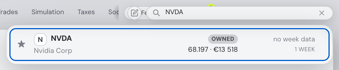
The compact pill at the topbar's right edge (past the account button and the quick-notes pad) works on every tab. It grows when focused, and pins itself to the window's top-right when you scroll down, so search stays reachable at any depth.
- To look something up, type a name or ticker — anything on any exchange the market-data feed covers (US, Xetra, LSE, Euronext, …).
- To search by idea, wrap a prompt in quotes:
"ai stocks"✨. The assistant proposes matching tickers market-wide (the closing quote is optional — just press Enter). Needs the assistant connected. - Focus it empty and it opens with your 7 largest positions — the assets you most likely want are one click away before you type.
Every result is shown in portfolio context: a watchlist star left of the ticker (the same favourites the Explore tables use — star or unstar right from the list), the current price right next to the ticker, an In-portfolio badge with the quantity and value you hold (portfolio weight on hover) — or its exchange when you don't hold it — plus the last week's absolute and % move, color-coded, with a one-week price spark.
The price is in your display currency, converted from whatever the asset actually trades in — a London pence listing, its Frankfurt euro line and the New York listing of the same company all read as the same number, and switching the display currency moves every price with it. It arrives with the one-week spark, so it costs the search nothing extra, and it is the same conversion the assistant's hover cards use, so the two never disagree. An asset whose currency or exchange rate the price feed cannot supply shows its price and its weekly move with its own code instead ("226.44 SGD"), and one with neither shows no price at all — never a number under the wrong symbol.
Clicking a result opens its detail panel — the full position drawer for a holding, the market drawer for anything else — and resets the finder. Clicking anywhere outside dismisses the list and shrinks the pill (your query is kept, so focusing again restores the same search). With a detail panel open, the frosted results panel floats on top and stays searchable, so you can hop between assets without closing anything.
Down from the search field focuses the first result; Up focuses the last. Arrow keys move between results and back to the field, Enter opens the focused asset, and Escape from a result returns to the field. Falling weekly moves show one minus sign; unchanged prices use a neutral indicator. The weekly absolute move is money in the same currency as the price beside it — a foreign listing reads, say, “$72.49 ▼ −$3.32 (−4.4%)”, never a dollar price next to a move in pesos.
The Macro card
The compact bank-rate table keeps its header with the table while scrolling; it does not create a fixed header.
At the top of the Explore tab — the market's weather above the market's tables, sharing that row with the heatmap whenever the window is wide enough for both. It has three parts, each loading independently the moment its data arrives (values show a small spinner until then):
- The regime strip — the dials professionals glance at first: VIX with its percentile over the last year, the high-yield credit spread, the 10-year inflation breakeven and the dollar index, plus the money pair: US M2 (the broad money supply, in $tn with its year-over-year growth — a monthly series) and the Fed balance sheet (total assets, weekly — rising means the Fed is adding liquidity, falling means it is draining it). Each dial has a plain-language ⓘ explainer; the money tiles date their observation in it, since those series publish with a lag. A series without data simply doesn't render.
- The Treasury-spread chart, on the same row — long minus short US government yields, with inverted (negative) stretches shaded: the classic recession signal. Hover it for the exact date and value; the ⓘ explains what a steep or inverted curve historically meant for stocks and bonds.
- Central-bank policy rates — one row per bank your portfolio is actually exposed to, derived from where your companies are domiciled, the currencies they trade in, your cash and your display currency (the "why shown" chip explains each row). Columns: the current policy rate, the direction and date of the last change, and the next scheduled decision from the banks' official calendars.
The Trades tab echoes the same data as a one-line decision ribbon above the trade plan, linking back here. The card is always there (the Advanced tools switch that used to hide it went on 4 September 2026), and the assistant carries a compact form of it in its context, so you can ask "what do current rates mean for my cash position?" in plain words.
The heatmap: the market, and your watchlists
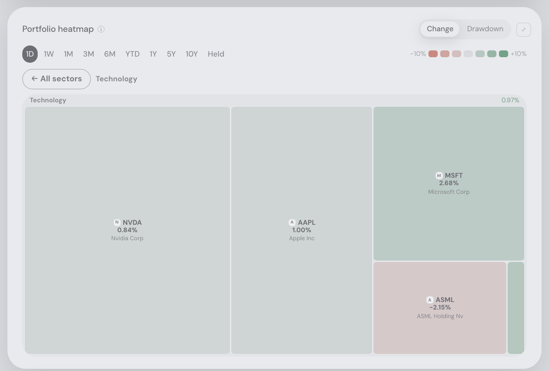
Click or keyboard-activate a sector label to fill the map with that sector; The flat All sectors button returns to the overview. Zoom keeps the full grid's colour scale and your selected range and metric. Tooltip change and drawdown numbers use the matching tile colours, including the small tickers below the map. Switching grids clears sector focus, and a sector removed from a list returns you to the overview.
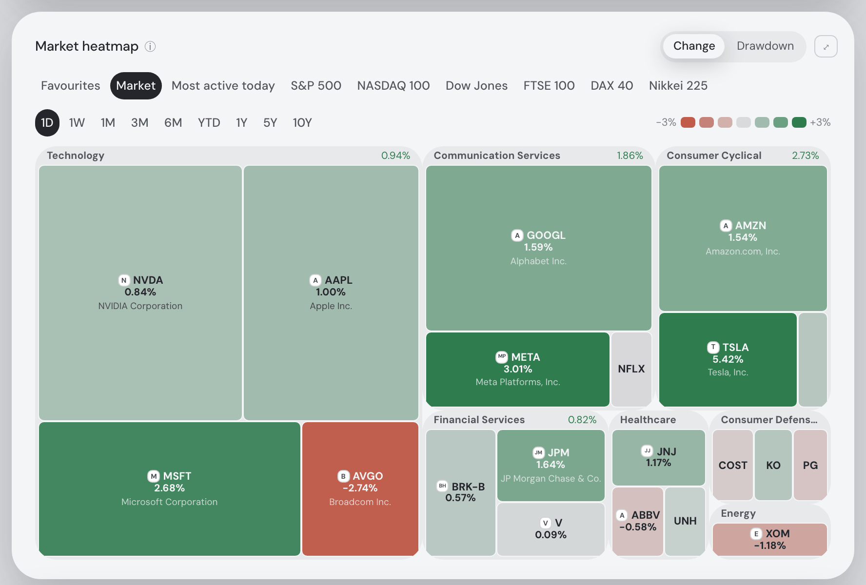
Beside the Macro card when the window is wide enough for both to stay readable, and directly under it when it is not — so minimising the assistant pane, or working on a wide screen, puts the two at equal width, side by side. When no central bank maps onto the portfolio there is no Macro card and the map takes the full width on its own. Side by side, the two cards end level — the row takes the height of whichever is naturally taller and the other fills it, so nothing is cropped to fit. In practice that is the map, and the Macro card grows to meet it; it is not shortened to the Macro card the way the portfolio one is to the value chart, because Macro is the short card and matching it would squash the map to a strip. The market as one picture. Every rectangle is one of the largest listed companies, scaled by market capitalisation and coloured by how it moved; rectangles are grouped into labelled sector boxes, so a cell’s neighbours mean something. It is the view most people have in mind when they ask “how did today go?”
The same map, over the stocks you actually follow. A strip switches the grid — up in the card’s title line when there is room for it, on its own row above the windows when there is not: Favourites (everything you have starred), one option per named list you keep, then Market, Most active today and the six index lists — so “how did my AI names do this month?” is a click, not a table you have to read. A watchlist grid is built exactly like the market one, cells and all, and is scaled by market capitalisation for the same reason: a watchlist holds instruments, not positions, and has no position values to size by. (Your own holdings do — that map is the Portfolio heatmap.)
- Pick the grid: Favourites · your named lists · Market and public index lists. Personal lists come first so they are immediately reachable. The one you last picked is remembered, and the strip pans sideways if you keep more lists than fit. A list you delete simply stops being offered; the card falls back to Market.
- Pick the window: 1D · 1W · 1M · 3M · 6M · YTD · 1Y · 5Y · 10Y. Each grid remembers its own — “the last month of the market”, “the year my AI list had” and “since I opened these positions” on your Portfolio heatmap are three different questions, so switching between them brings each window back rather than resetting it. On a narrow card the windows slide sideways rather than wrapping onto a second line — the same one-line strip, and the same edge shadow marking the hidden end, that the tabs at the top of the app use — and never give up more than half their full width; the colour key takes the line underneath.
- Pick the metric: Change — the price move over the window, the default — or Drawdown: where each price now sits below its own highest point within that window. In drawdown the map has no green pole — red deepens with the fall, neutral means “at its peak” — and the legend flips to a one-sided scale. Remembered per grid, like the window; both numbers ride every cell’s tooltip, and switching repaints instantly with no reload.
- Click any cell to open that asset — the full position drawer for something you hold, the market drawer for anything else, exactly as clicking a search result does. Hovering names the company, the move and the window it covers, the sector, the price of one share (per coin for crypto, per unit for a commodity ETC) in the listing’s own currency and the market cap with the currency it is in — USD for a non-US listing, whose cap is converted to dollars, so a Frankfurt stock reads a EUR price beside a USD market cap, each labelled. Cells with room for it also carry the issuer’s logo beside the ticker; the smallest keep the bare ticker rather than clipping a mark onto it.
- Give it the whole screen: the ⤢ in the card’s top-right corner stretches the map over the entire window — the same button the value chart carries. The grid strip, the windows and the colour key stay usable up there, and Esc (or the ⤡, or the ×) brings the page back.
- An empty watchlist says so. Favourites with nothing starred points you at the tables below; a named list you have not filled in yet names itself — neither shows a blank map.
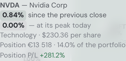
The colour is the asset’s own price change over the window, in the currency it trades in — green up, red down, grey for flat. An exchange-rate move is not part of it, and every tile’s tooltip names the currency (0.34% since the previous close, in €). Your own holdings are the exception: the Portfolio heatmap sits beside the Holdings table and measures in your display currency, as the table does. The scale is printed in the legend, and it adapts: a quiet day still reads on the familiar ±3% scale, while a ten-year window scales to what actually happened instead of painting everything one flat green. Whatever cap is in force, the legend states it.
The heatmap only paints what it can measure. An asset with no market capitalisation or no usable price history is left out rather than shown as a grey “flat” cell — no data and no movement are not the same statement. Assets that started trading after the window opened (a recent listing on a ten-year view) are still shown, counted in the legend, and say so in their own tooltip.
Nothing in the grid goes missing in silence. A company ten times smaller than the smallest one you can see gets an honest rectangle — which is to say a hairline, or, where its sector box has run out of room, nothing at all. So a fine-print line under the map names them: “Too small to draw: BHP, LIN, PEP · Not placed (no market data): JPM-PC, …”. The first group is what the layout could not draw, the second what had no market cap or price history to draw from. Hover or focus a Too small to draw ticker for the same company, change/drawdown, sector, price and market-cap information as a drawn cell, updated for the chosen range and metric. Entries without market data retain their explanation. Every ticker in that line opens the asset, exactly as clicking a cell does, so a member the map cannot show is still one you can look at. When maximized, the caption uses a stable two-line area and longer lists scroll, so the map does not resize as names appear or disappear. The sizing itself does not change — market capitalisation is the point of a treemap — and the list stops at twelve names with a “+N more” tail so it can never crowd out the map above it.
On the first load the cells stream in behind a real progress bar; after that each grid and window is cached on its own, so flipping back is instant. Starring something puts it on the map straight away — as does adding it to a list, taking it out again, or deleting a list. Only the grid you changed reloads, and the cells already drawn stay put while the new one lands, so nothing flashes. The assistant can open the card, switch the grid and set the window for you — “show me the market heatmap over the last month”, “heatmap my favourites”, “show my AI plays list as a heatmap over the year”. Ask for a list you do not keep and it answers with the ones you do.
Your own holdings have a heatmap of their own, built the same way but scaled by what each position is worth: it lives on the Portfolio tab, right under the value chart, and is documented in The Portfolio heatmap.
The Explore tables
Every ticker carries its issuer’s logo. Beside the symbol in the holdings table, in the Explore tables, in the asset finder’s results, at the top of an asset’s details and on the tickers the assistant mentions in chat. A table of holdings is scanned rather than read — you already know which position you are looking for — and a mark is found faster than four capital letters, which are unusually hard to tell apart at a glance (AMD, AMZN, AMAT). The ticker never goes away; the logo is the fast path, not the name. A listing nobody draws a logo for — a small ETF, a newly listed company — shows a lettered tile instead, which is normal rather than a fault. The marks are fetched once, kept on our own server and served from there: nothing on the page reaches out to a stranger, so opening Explore tells nobody which shares you were looking at.
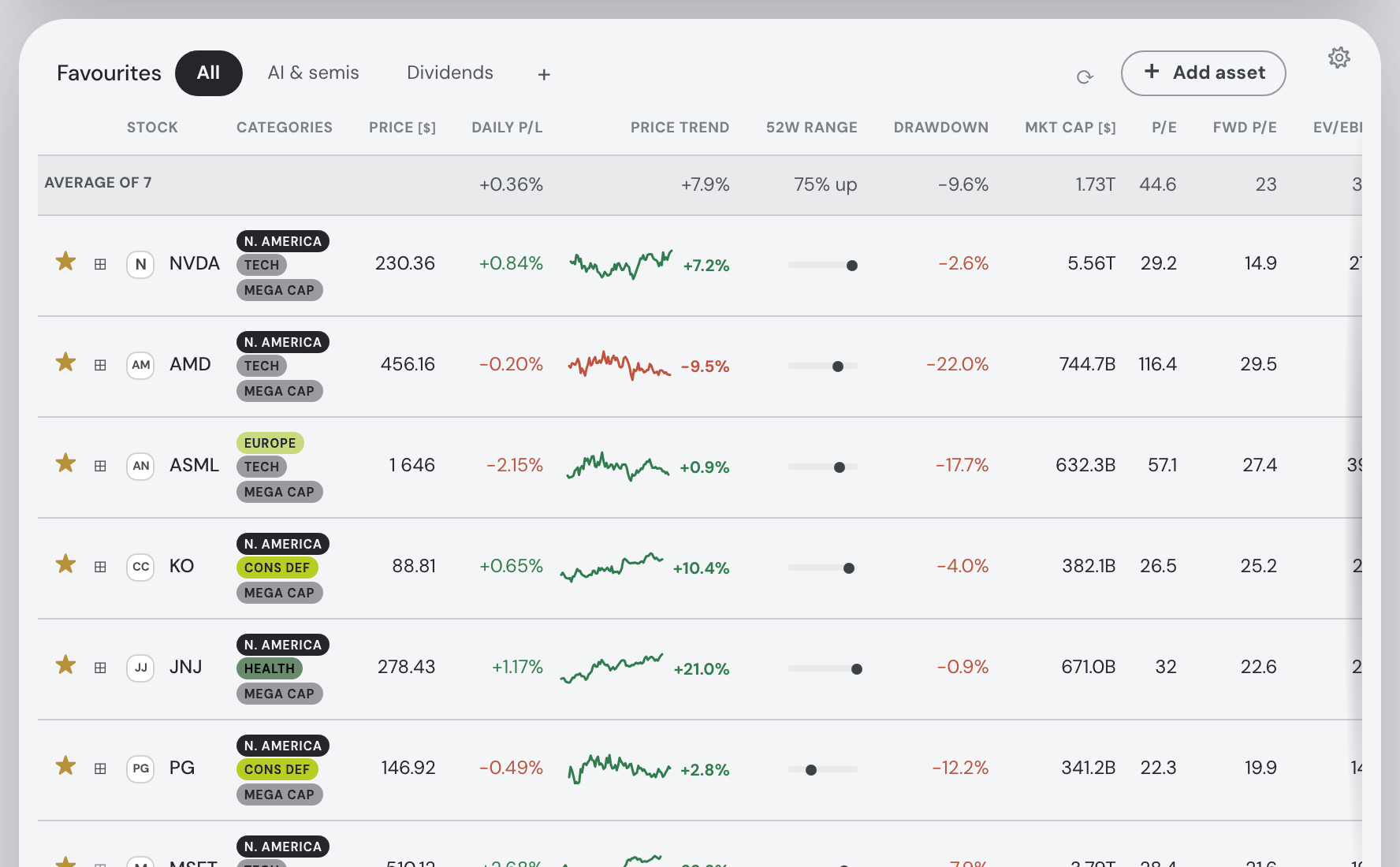
The Explore tab compares stocks in Favourites and one Markets table. The sliding list switcher beside Markets offers Largest companies, Most active today, S&P 500, NASDAQ 100, Dow Jones, FTSE 100, DAX 40 and Nikkei 225. Each index shows a composition date and source links. The heatmap above offers these same lists alongside your favourites. The full Largest companies screener list uses the existing 15-minute cache and is saved for the background warmer. All members of all six indices are also warmed automatically on the hosted app, before anyone opens a list. Companies shared across indices, Largest companies and Most active are processed once per sweep, using the same per-company caches. The first cold sweep still needs time to populate them. Index pages load on demand; unavailable quotes keep their member row with missing metrics. Largest companies and indices share the column and rows-per-page preferences; Most active today retains its own. On the first load of a session they stream in row by row behind a real progress bar; after that they persist across tab switches and refresh quietly every 10 minutes — the Favourites card head carries a refresh icon with the last update time and refresh help in its tooltip. It shows the shared circular spinner while refreshing. On a phone it has a 44 × 44 px target, beside a compact 32 px-tall Add asset button. A table that failed to load says so (“These stocks could not be loaded”) with a Retry, rather than reading as an empty market; one that failed to refresh keeps the rows it had and marks them stale.
The Favourites list strip's edge fades disappear whenever its buttons all fit, including after selecting or deleting a list and after resizing.
While a table’s labels stay pinned under the navigation, the area above them is opaque so scrolling data cannot show through. The normal frosted header returns when the table releases.
Numeric headings align with their values. The compact Drawdown heading keeps the 52-week-high explanation in its hover tooltip.
Every percentage in these tables is the listing’s own move, in the currency it trades in — today’s change (the Daily P/L column), the Price trend’s change and the Drawdown. Prices print in US dollars, but one conversion rate cancels out of a ratio, so no exchange-rate move is in them. Each of those columns’ tooltips says so. The Holdings table’s Daily P/L is in your display currency instead, so the same ticker can read a little apart there on a day the currency moved.
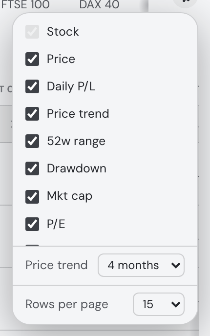
The Price trend column is a mini price chart with its overall change printed beside it — +17.4% in green if the price rose over the window, −6.2% in red if it fell. Since 10 September 2026 that number stands where a ▲/▼ glyph used to: an arrow says which way but never how far, and the size of the move was the one thing you had to open the tooltip for. The tooltip still carries the price range and spells the whole thing out (“Last 4 months: +17.4% overall · range 100 – 117.4”), on hover at a desk and on a tap on a phone. You choose the window: the ⚙ in the table’s corner carries a Price trend select offering 1, 3, 4, 6 or 12 months, and the tables reload over the window you pick — behind their usual progress bar, since the change is computed from the price history rather than trimmed from what was already on screen. Four months is the default, so a table you never touch reads exactly as it did. The choice is remembered in this browser and covers every Explore table at once (unlike the columns and rows-per-page, which are per table): the rows come from one shared row cache, so there is one window rather than one per card. Sorting by Price trend, and the averages row’s Price trend cell, both follow the same window.
Columns cover price (USD-normalized), today's % change, the price-trend sparkline above, 52-week range, drawdown — the 52-week range bar stated as a number: how far below its 52-week high the stock trades right now (0.0% at the high, −25.0% a quarter below it), which is the version you can sort by when you are looking for what has sold off, the same question the Holdings table’s Drawdown column asks of a position you own. Here it is measured against the market’s reported 52-week high, which is an intraday figure; the Holdings column measures against the highest daily close of your own series, so one ticker reads a point or two shallower there — market cap (USD-normalized like the price), P/E and forward P/E, EPS growth with 16-quarter trend bars, revenue growth, FCF and FCF yield, market-cap payback years, PEG, ROE, net debt/EBITDA, short interest (short % of float and days to cover — crowding and squeeze context) — plus the weight each stock already has in your portfolio, and a transparent buy/hold/sell signal with its reasons spelled out.
The money columns — price, market cap, FCF and the fair values — name their currency once, in the header, whenever every row in the table shares it: PRICE [$], MKT CAP [$] over bare figures (“4.19T”), and the averages row follows its column. A table that mixes currencies — a listing no exchange rate could convert — keeps the plain header and marks each cell instead (“$4.19T”, “€220.0B”), because one unit over mixed rows would misstate some of them. Symbols and codes follow the one rule for amounts.
Eight more columns bring the Fair value card into the table. Fair value — the confidence-weighted average of the six models — is on by default, formatted exactly like the Price column so the pair reads against each other: above the price the models call the share cheap, below it dear. The other seven start hidden in the ⚙ picker: FV upside, the gap between the two as a signed percentage, and one column per model (FV DCF, FV Graham, FV Lynch, FV EV/EBITDA, FV DDM, FV Multiples) for when you want to see where the average came from and which model is pulling it. Sort a mixed table by the upside rather than by a fair value: it is a ratio, so it compares across companies, while a €900 share’s fair value and a €4 one’s have nothing to say to each other. A model whose answer landed too far from the other five is left out of the average but still shown — dimmed, with the reason on hover — and anything the models cannot value (an ETF trades at the value of what it holds; a coin has no cash flows) shows a dash, never a zero. Every figure here is USD-normalized, like the Price column beside it.
- To choose columns: click the ⚙ in the table card's top-right corner and untick what you don't need — it hides instantly (the Stock column always stays). The choice is saved per table in your browser; columns added in later releases start visible, except a short opt-in list (days to cover, and seven of the eight fair-value columns) that would otherwise crowd the table — those wait for you to tick them, and a table you had already arranged does not sprout them on upgrade. Since 4 September 2026 the same popover carries Show all columns whenever something is hidden — one click brings every hidden column back, so the opt-in ones need not be found and ticked one at a time.
- To page through: tables show 15 rows per page by default, with a pager underneath when there's more. Index lists show the full membership and the loaded count, for example
1–15 of 503 · 15 loaded · More rows available. Screener lists label the loaded count and say when more rows can be fetched. Largest companies supports up to 500 companies; Most active today up to 100. Pick 10 / 15 / 20 / 50 / 100 rows per page at the foot of the same ⚙ popover — saved independently for Markets and Favourites, under the Price trend window described above. Increasing the size loads enough rows to fill the first page when available. The old Explore load-count fields in Settings → General are gone. - To sort: click any header — sorting reorders the loaded set (and jumps back to page 1).
Category chips (region, sector, company size) are color-coded, with the key at the very bottom of the tab, under the last table — along with the switch that turns the chips off. Clicking any row opens the stock's detail drawer — its head carries the same watchlist star as the row you clicked, so the drawer both shows whether the stock is already a favourite and stars or unstars it on the spot — with split-adjusted history, fundamentals, the Fair value card (six valuation models — DCF, Graham, Lynch, EV/EBITDA, dividend discount and sector multiples — each a bar against today's price, with the weighted verdict above them; see the drawer), short-interest detail, recent insider activity (SEC Form 4 open-market buys and sells, clustered over this calendar month and the three previous whole calendar months, with the summary line naming the day that window starts — US-listed stocks) and news.
The signal is a deliberately simple, explainable screen — its reasons are always listed, and it knows nothing about your taxes, currency risk or time horizon. Not financial advice.

Favourites (your watchlist)
- To star a stock, click the star in any Explore table, in the finder's results, or in a stock drawer. Starred names collect in the Favourites table on Explore.
- Stars stay in sync everywhere — finder, tables, drawers.
- To group the watchlist into lists, use the tabs beside the Favourites table's title. All is the whole watchlist;
+makes a named list, ✎ renames the one you are on and ✕ deletes it. The three stay together at the end of the list strip — on a phone they are full-size tap targets, and the tabs beside them slide sideways rather than wrapping, so the controls stay where you left them however many lists you keep. The title, price freshness/refresh and + Add asset stay on the first header row; the list strip shares it when there is room and moves below otherwise. On a phone the list row uses the full card width without repeating its label. Resizing keeps the selected list visible; long names shorten within their pill and remain available in its tooltip. Editing and delete-confirmation controls fit the narrow row too. A stock can be in several lists at once — click the ⊞ beside a row's star to tick the lists it belongs to, or name a new one right there. - + Add asset fills a list straight from the list. The button on the line above the table opens a search over the whole market; pick a result and it goes into the list you are looking at, starred on the way in (on All it simply stars it). It works for something you have never starred, which is the point — a list you just made no longer has to be filled by starring elsewhere first and then re-filing. Type two letters, press Enter for the top match, Esc to close. If it cannot go in — the plan's watchlist cap, or 200 symbols in one list — the reason is printed under the field and the search stays open.
- The first row is the table, summed up — and not just here: every Explore table (Favourites, Largest companies, Most active today, search results) opens with Average of 15, and under each column what those stocks look like together — the average P/E, EV/EBITDA, growth, ROE, daily move and so on, over the whole table rather than the page you are looking at, with every stock counted once. Two columns are deliberately different: Owned % is their combined weight rather than an average, and Price is left blank, because the average of two share prices is not a price. A table with a single stock gets no averages row.
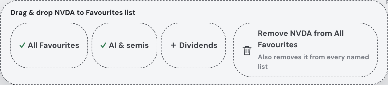
- Or drag it there: drag any row — from the Favourites table, from Largest companies or Most active today, or a result straight out of the search at the top of the page — onto a list tab (into that list, starred on the way in), onto the Favourites table itself (into whichever tab it is showing — on All the drop simply stars it), or onto the + (the new-list naming opens with the cursor ready and the ticker waiting: Enter creates the list holding it, Esc drops the idea). A tray labelled Drag & drop TICKER to Favourites list, with dashed squircle targets for All Favourites and your named lists, matching the card corner radius, appears as soon as dragging starts, so destinations remain reachable below the card. A compact ticker preview keeps the wide table out of the chat area. A green checkmark replaces the plus on every list that already contains the dragged company, including All Favourites. Each target rings itself as you hover it; dropping something that is already there answers with a quiet note rather than an error. On a touch screen use the ⊞ instead — drags need a mouse. The star cell of every row says so: the cursor turns into a grab hand over it and its tip reads Click or drag onto a list tab to add to Favourites.
- A list is a view of your watchlist, not a separate one: putting a stock in a list stars it, unstarring removes it from every list, and deleting a list never unstars anything. The tab you were last on is remembered.
- Remove a favourite: drag a Favourites row onto the removal target on the right of the list targets in the same shared tray, with matching dashed squircle styling. Its label and scope note refer to the list the drag started from. From a named list, this removes only its membership and keeps it in All Favourites. From All, it unstars the asset and removes every list membership. The row’s ⊞ popover also offers Remove from All Favourites, with the scope explained below the button. Cancel a drag to leave everything unchanged. A failed global delete keeps the row and memberships available for another try.
- Every list is also a heatmap. The grid strip on the heatmap above offers Favourites and each of your lists first, followed by the public market grids, so a list you keep is a table and a picture without any extra setting up.
- The assistant can do all of it too — "add ASML to my AI list", "take NVDA out of my Semis list", "make a list called Dividends", "what's in my dividends list?".
- Your watchlist's fundamentals are part of the assistant's context, and the Buy advice ✨ report considers watchlist names for new buys — the whole watchlist, whatever you have grouped where.
- How many you can keep. The free plan holds 3 lists and 20 starred assets between them — the cap is on the watchlist as a whole, so three lists of twenty is not sixty. Past either one the
+and the star say so instead of failing quietly — and the star says it where it was pressed: above this Favourites table, above the Holdings table on the Portfolio tab, or under the head of an asset's drawer, with Get Pro beside the sentence. Unstarring something frees its slot immediately. Pro lifts both: as many lists as you like, as many assets in each.